Sometimes photography isn’t enough to draw visitor interest. You want to add a more personal, artistic touch, a lighthearted tone, or a unique branding element. Illustration and drawings can really make a website stand out, whether they’re tastefully placed or make up the entire site.
If you’re thinking of adding art to your website to make it more memorable, check out these impeccable examples of illustration in web design!
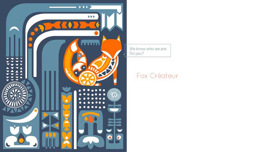
The beautiful image design along with the fun and expressive animations immediately capture attention. For a branding and design company, they certainly have that aspect down. This isn’t a landing page you’ll soon forget.
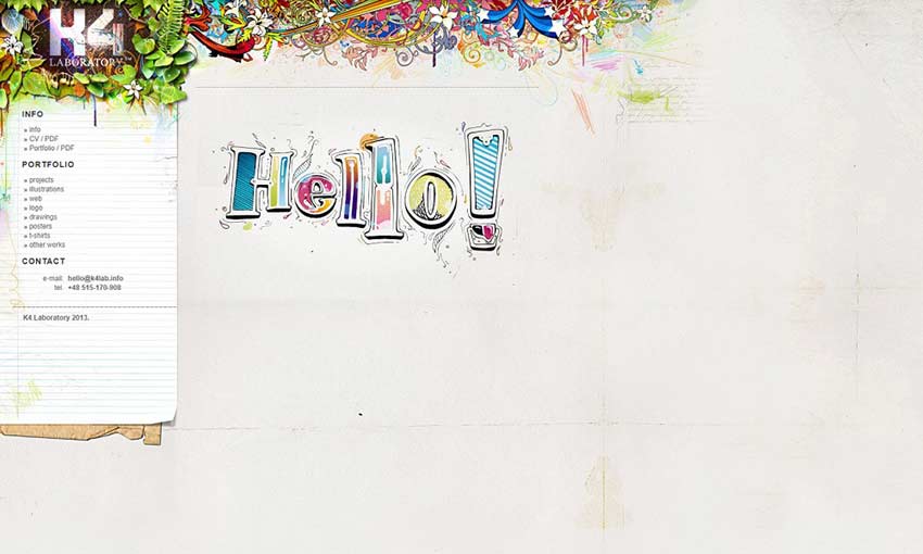
This gorgeous website looks like a colored pencil drawing come to life. The beautiful background gives the portfolio a lot of personality, with all its bright colors and imperfections such as stains on the paper background. It may not come with flashy animations, but K4 Laboratory does more than enough with its design.
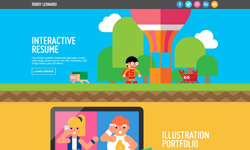
Portfolios are meant to immediately grab attention, and this interactive experience is one-of-a-kind. The unique art style and presentation is a bold choice, one that immediately separates this portfolio from the rest.
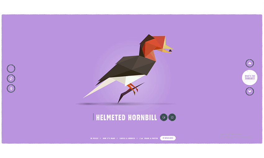
Species in Pieces attempts to raise awareness about endangered animals, and it does so with beautiful digital artwork. The site is made in CSS and each set uses 30 pieces to create a stunning low-poly exhibition. If you’re looking to make your site memorable, take note.
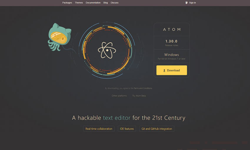
Atom uses a dark theme with a great palette to bring focus to its mascot and illustrations. The calming animations and beautiful colors lead you down the page, gripping you to the very bottom. This is exactly how you should design a site around illustration.
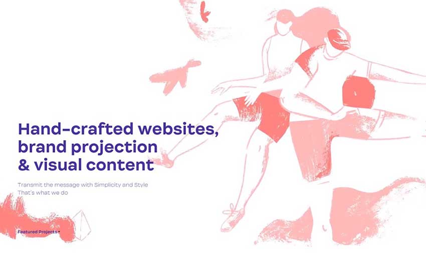
The sketchy, distinctive look of this site immediately drags you in. The chalk-like drawings create a unique aesthetic while subtly blending into the background, allowing the main content to take focus. This is an impeccable execution of illustration in web design.
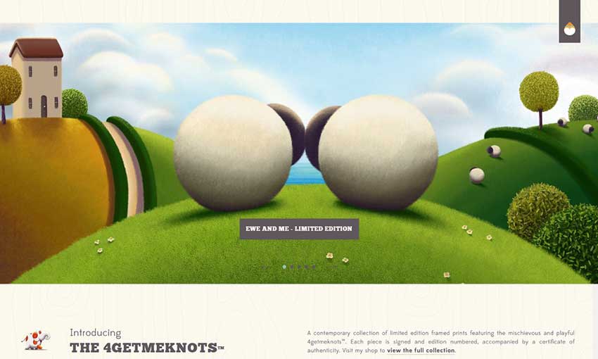
When the subject of a website is your art, it only makes sense to incorporate it into the design. Besides simply displaying the art pieces available, scenic pieces are incorporated into backgrounds and sliders.
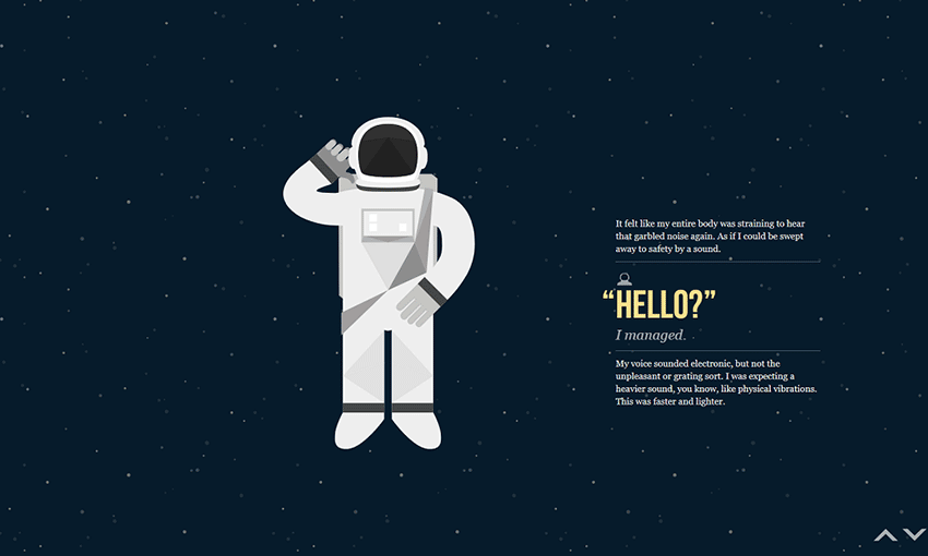
Illustration can be used to tell a story on a website. NASA: Prospect demonstrates this perfectly. The use of graphics and web animation is simple but creative, piecing together a story as you scroll down the page.
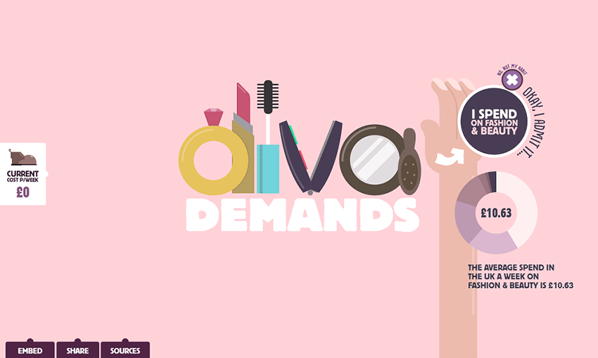
This site uses a cartoony art style and bouncy animations to draw you in and eliminate bad habits. The animation is the most prominent part of the website; all of it is eye-grabbing and fun to watch.
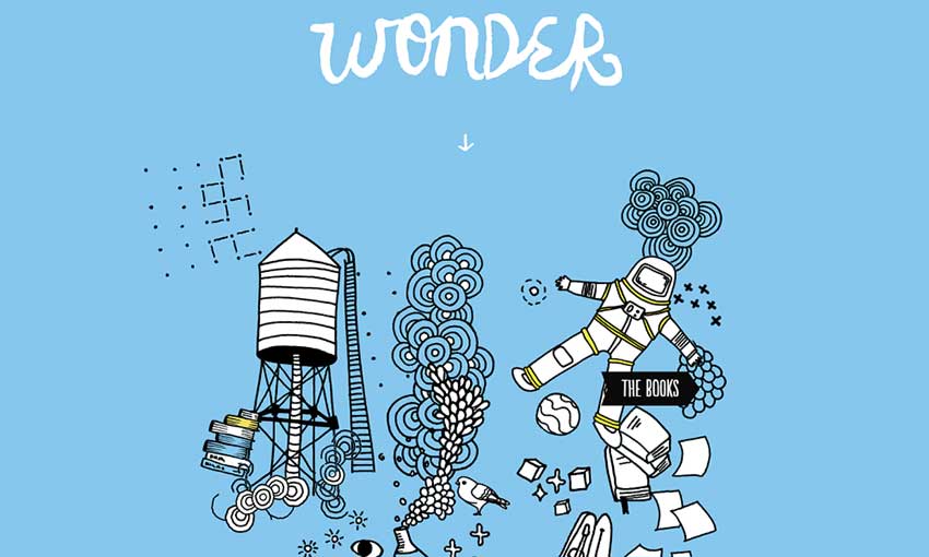
These delightfully cluttered illustrations have a hand-drawn feel, with cute animations to match the style. Wonder’s simplistic style makes it fun to navigate, and even the social media icons have the same pencil-sketch style.
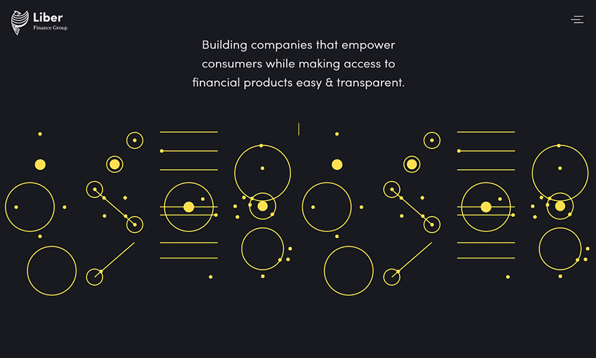
This gorgeous animation gives the idea of a well-oiled machine, each individual piece moving in harmony with the others. It’s made of CSS animations with a seamless rainbow effect added. Anyone with enough CSS knowledge could create artwork on their site just like this!
Enhance Your Site with Art, Drawings and Paintings
Using illustrations is a great way to get your website brand out there. It’s not often you see a site that uses art in its design, so wow new visitors with a gorgeous illustrated header or hand-made graphics packed with personality.
Graphic designers and artists can help you create the site that fits your vision. So, if you’re ready to incorporate illustration in your website, get out there and start looking for a great artist!
This post may contain affiliate links. See our disclosure about affiliate links here.

