Dark websites have long captured designers’ imaginations, standing in stark contrast to the more mainstream light web design. When creating a website that’s unique, sleek, and mysterious, dark colors are often what creators go for first. In a world of white and bright websites, black stands out.
Ready to get inspired for your own creations? These websites make stunning use of a shadowy palette to create artistic, unconventional websites. Each one has something interesting to teach you!
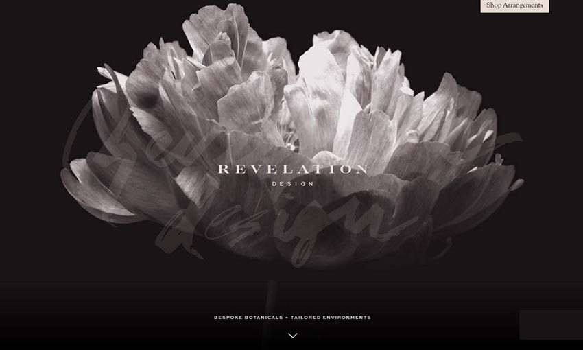
Now this is a good first impression. When you enter this site, you’re greeted with the elegant animation of a flower slowly unfolding before you. Scroll down and text elements smoothly fade in and elements appear.
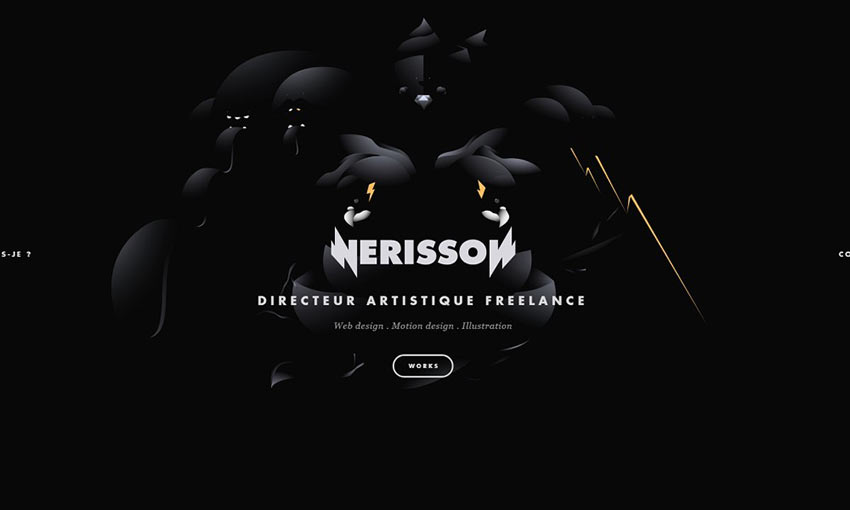
This site instantly shows off the creator’s skill in motion design with a cool animation as its centerpiece. The black background makes the colorful portfolio blocks that much more enticing. Each page sports a different color, but the dark UI remains consistent.
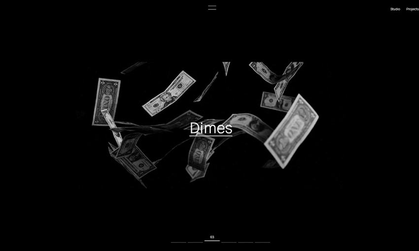
Awesome animations, 3D interactions, and plenty of pages to explore are what make up this website. With all these images and animations, a dimmed background is the perfect choice to frame the abundance of visual content.
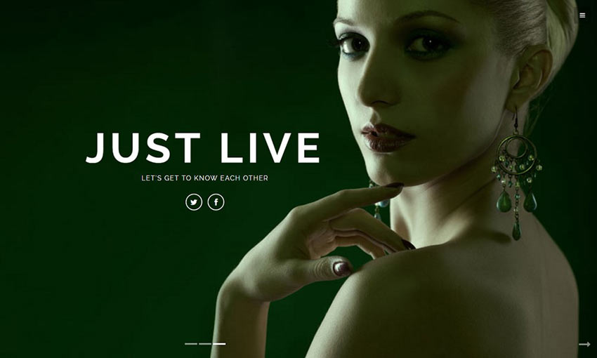
A huge slider of crisp photography with muted colors greets you on the homepage. Click a button to learn more and you’ll be transported to a page that’s easier to read, but with plenty of gray highlights that beautifully contrast against the white.

Here’s a good example of how you can use white as contrast and draw the eye to important areas on a page. A splash of blue every now and then adds variety and lets you know that some elements are interactive.
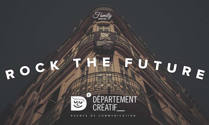
Nothing makes a statement like well-placed photography. The muted images on this site contrast nicely with the white background and text, and the occasional parallax animation looks great in this box-based layout.
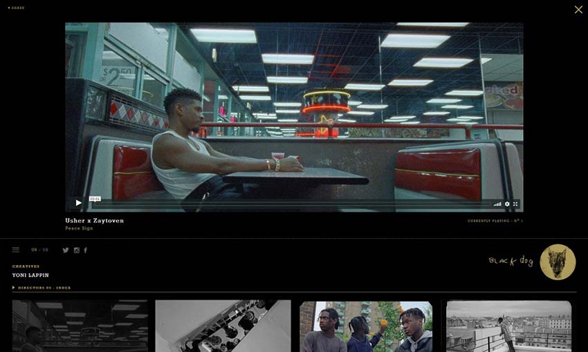
You can use a minimalistic set of colors to attract the eyes to certain content. When you visit a page, the video is framed against darkness with plenty of space. Bright text leads you down to more videos with black and white previews, which light up in color when you hover them. The effect is simple, but looks amazing.
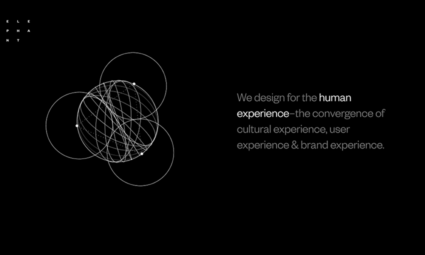
Text on a dark website is difficult to get right, but Elephant is a good place to take inspiration from. The site uses larger text with plenty of contrast, avoiding long-form content on this black background. The smooth animations are a nice touch and a great way to fill leftover space.
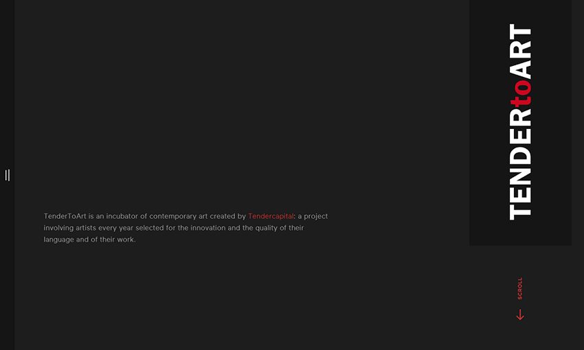
The importance of a good palette can’t be stressed enough, and black, white, and a bright color tend to be popular choices on these sites. Tender to Art chooses red, and uses it well by highlighting important links and areas with it.
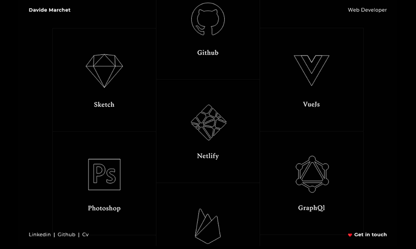
Dark design is a good choice for portfolios – it tells potential employers that you’re different, willing to take risks, and it just looks professional. This is a beautiful one-page portfolio, using just the right mix of text and images to keep you interested as you navigate.
Turn the Lights Out
White websites tend to be preferred by both creators and consumers – they’re simple, conventional, easy to read, and like a blank canvas for designers. But there is a place for dark design online.
It can be used to provide emphasis and contrast, to show off something you want to brand as new and interesting, or to display content like photography and art. And as these examples have shown you, it just looks good!
We hope you found the inspiration you needed from these beautiful websites. Next time you’re planning a website, take a risk and try dark design.
This post may contain affiliate links. See our disclosure about affiliate links here.


