Minimalism is always in. The universally appealing, clean web design trend has dominated the internet for many years, and will certainly continue for many years to come. While there’s plenty of bright, flashy, experimental web design emerging as well, nothing beats simplistic, clean, and beautiful.
Looking for some inspiration for your own designs? We’ve collected these elegant, minimalistic web designs for you today. Take a look at these websites and their own spins on the trend.
UNLIMITED DOWNLOADS: Email, admin, landing page & website templates
Starting at only $16.50 per month!
DOWNLOAD NOW![]()
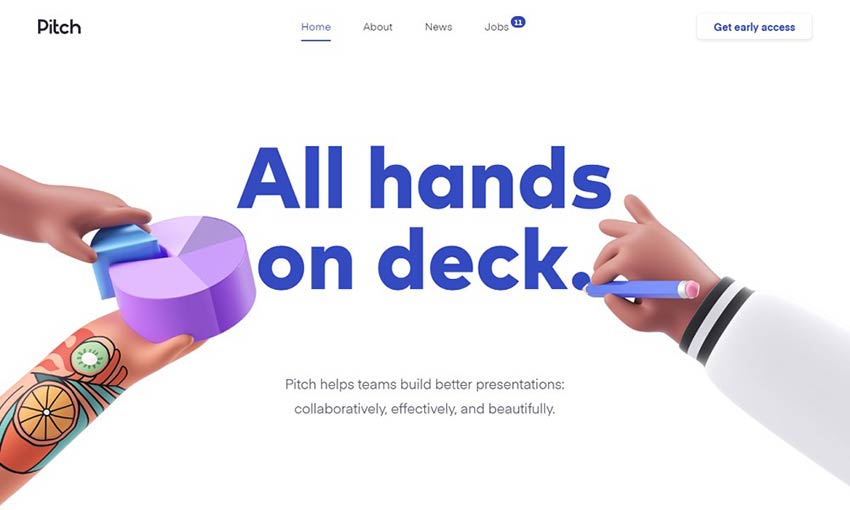
Pitch opens with a unique full screen intro that scrolls out and transitions into the rest of the site content. It uses clean, white design as a base but builds on it with plenty of colorful and lively animations. This is a great example of what you can do with a simple white base and a little creativity.
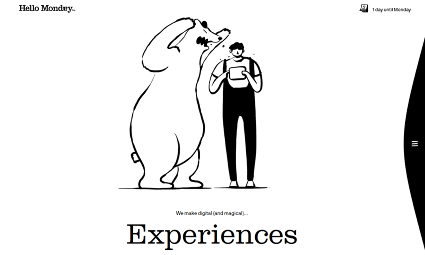
Great animation has the power to make a simple website vivid and memorable. The intro animation alone will capture your eye, and all the beautiful transitions and hover effects round it out perfectly. This is the perfect portfolio for a branding company: one that leaves a lasting impact.
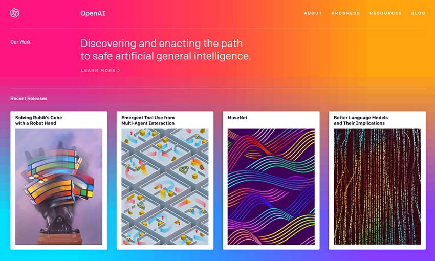
Clean doesn’t have to mean boring. OpenAI uses vivid images and a gorgeous gradient background while still being efficient and elegant. Scrolling transitions to white to give you a break from the rich colors, and blog pages blend a simple background with interactive elements and bright images to keep things fresh.
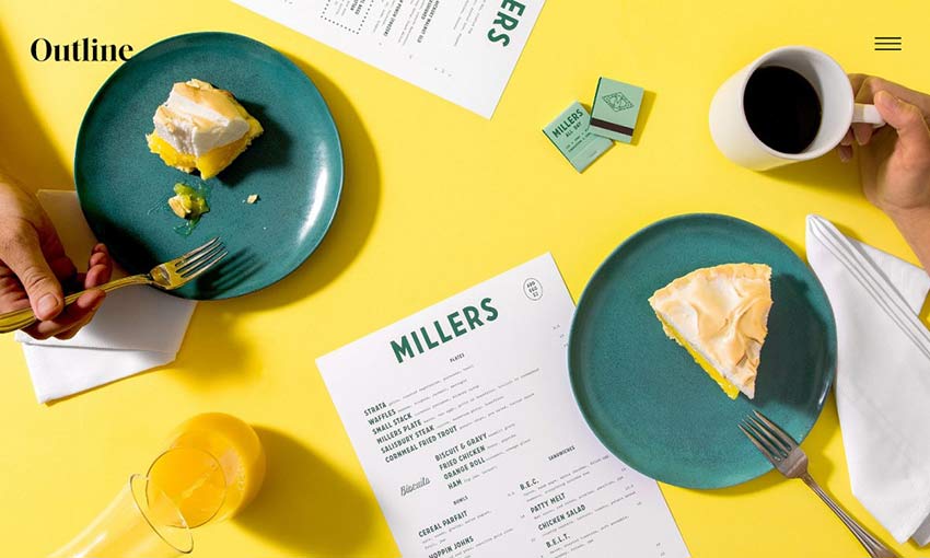
Check out this website if you’re aiming for minimalism and elegance balanced against vivid imagery. It introduces itself with a simple animated header, then drops you into softly scrolling sliders and bold full screen design. Product pages are intensely colorful with crisp HD pictures, and that same elegant aesthetic.
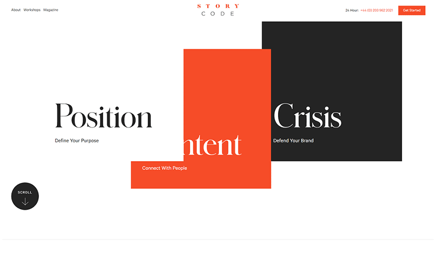
A little innovation is all it takes to make a simple, clean UI interesting. StoryCode opens with a cool scroll animation that pulls away to reveal their branding tagline. The three-color palette of orange, black, and white provides consistency and contrast in this design.
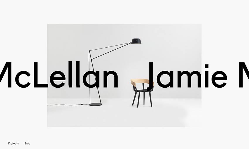
You’ll definitely remember this designer’s name, as it hovers boldly behind his project images. Click a picture to see its project page, and again to zoom in closer. The whole site is in black and white barring images, but the unique UI does more than enough to make it appealing.
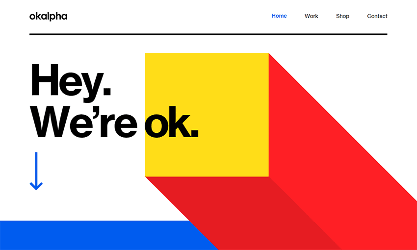
Minimalism doesn’t just mean a white background or a subtle two-toned palette. Okalpha goes all out, starting out with just a pop of color before plunging right into the bright, cartoonish hues. This definitely isn’t an easy aesthetic to pull off, but this site does it by consistently using only three bright colors to balance the intensity.
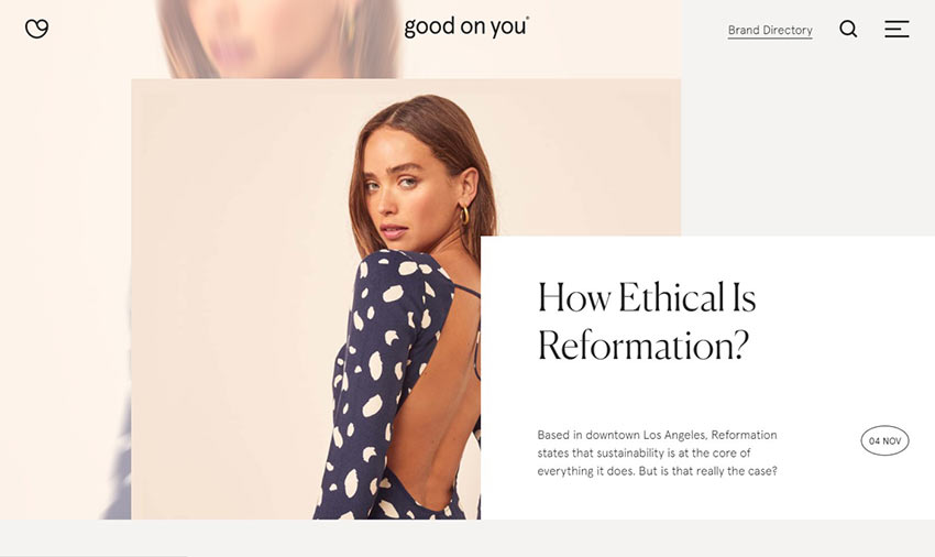
If you’re going for a more sophisticated, muted design, look here for inspiration. This fashion website uses pale browns and blues, with each carefully picked image having just the right intensity of color to accent them.
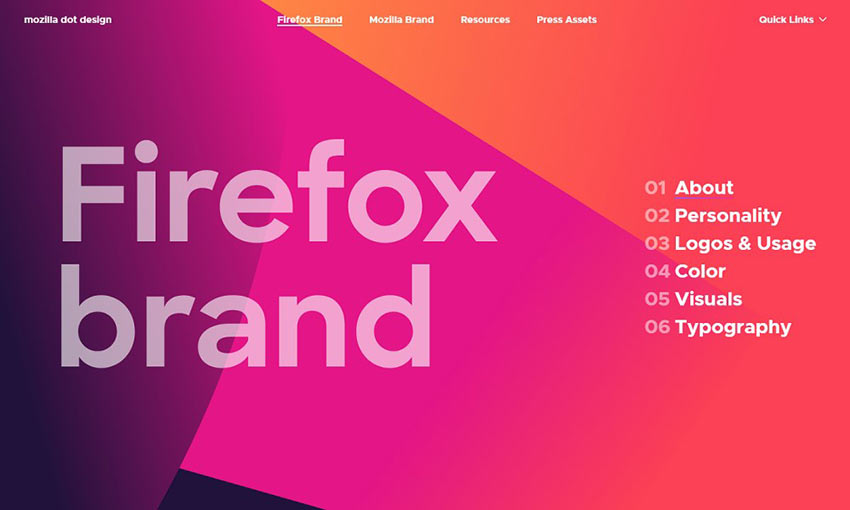
Clean design is all about the UI, and Mozilla Dot Design does it right with a bold and image-focused appearance. Its palette is striking and multi-toned, but it uses it to great effect on every single page.

Bold uses fresh and professional design to create a stunning aesthetic. The site opens to black and white tones, with a crisp video that also begins in a monochromatic palette. The middle of the page is filled with bright and beautiful colors, before transitioning back into black and white as it reaches the footer. It’s an awesome effect and great for branding.
A Fresh Take on Minimalism
Minimalism is definitely a style can be overdone, but with a unique little twist, you can breathe life into this popular trend. Take note of how each of these websites include a fresh new spin on things. A pop of color, an intriguing intro, a beautiful scrolling animation – add your own touch to it, and your site will stand out.
This post may contain affiliate links. See our disclosure about affiliate links here.


