The following article is co-authored by Uri Shaked and Michal Porag.
Let’s explore the complexities of how CSS computes the width and height dimensions of elements. This is based on countless late-night hours debugging and fiddling with lots of combinations of CSS properties, reading though the specs, and trying to figure out why some things seem to behave one way or another.
But before jumping in, let’s cover some basics so we’re all on the same page.
The basics
Table of Contents
You have an element, and you want it to be 640px wide and 360px tall. These are just arbitrary numbers that conform to 16:9 pixel ratio. You can set them explicitly like this:
.element { width: 640px; height: 360px;
}
Now, the design calls for some padding inside that element. So you modify the CSS:
.element { width: 640px; height: 360px; padding: 10px;
}
What is the rendered width and height of the element now? I bet you can guess… it’s not 640×360px anymore! It’s actually 660×380px, because the padding adds 10px to each side (i.e. top, right, bottom and left), for an additional 20px on both the height and width.
This has to do with the box-sizing property: if it’s set to content-box (the default value), the rendered size of the element is the width and height plus the padding and border. That might mean that the rendered size is bigger than we intend which is funny because it might wind up that an element’s declared width and height values are completely different than what’s rendered.
That’s the power of The CSS Box Model. It calculates width and height like so:
/* Width */
width + padding-left + padding-right + border-left + border-right /* Height */
height + padding-top + padding-bottom + border-top + border-bottom
What we just saw is how the dimensions for a block element are computed. Block elements include any element that naturally takes up the full width that’s available. So, by nature, it doesn’t matter how much content the element contains because its width is always 100%, that is, until we alter it. Think of elements like <p>, <article>, <main>, <div>, and so many more.
But now we ought to look at inline elements because they behave differently when it comes to The Box Model and how their dimensions are computed. After that, we’ll look at the relationship between parent and child elements, and how they affect the width and height computations of each other.
The curious case of inline elements
As we just saw, the padding and border of any element are both included in the element’s computed width and height dimensions. Funny enough, there are cases where the width and height properties have no effect whatsoever. Such is the case when working with inline elements.
An inline element is an element that’s width and height are determined by the content it contains. Inline elements, such as a <span>, will completely ignore the width and height as well the the left and right margin properties because, well, the content is what determines the dimensions. Here, sometimes a visual can help.
Just look at how nesting a block element inside of an inline element breaks the inline element’s shape simply because the block element is not defined by the amount of content it contains, but rather the amount of available space. You can really see that in action when we add a border to the inline element. Look how the inline element abruptly stops where the paragraph comes in, then continues after the paragraph.
The span sees the paragraph, which interrupts the inline flow of the span and essentially breaks out of it. Fascinating stuff!
But there’s more! Look how the inline element completely overlooks width and margin, even when those are declared right on it.
Crazy!
Parent and child elements
The parent-child relationship is a common pattern. A parent element is one that contains other elements nested inside it. And those nested elements are the parent element’s children.
<!-- The parent element -->
<div class="parent"> <!-- The children --> <div class="child"></div> <div class="another-child"></div> <div class="twins">Whoa!</div>
</div>
The width and height of an element gets super interesting with parent and child elements. Let’s look at all the interesting quirks we get with this.
Relative units
Let’s start with relative units. A relative unit is computed by its context, or relation to other elements. Yeah, that’s sort of a convoluted definition. There are several different types of relative units, but let’s take percentages as an example. We can say that an element is 100% wide.
<div class="child"> <!-- nothing yet -->
</div>
.parent { width: 100%;
}Cool. If we plop that element onto an empty page, it will take up 100% of the available horizontal space. And what that 100% computes to depends on the width of the browser, right? 100% of a browser that’s 1,500 pixels is 1,500 pixels wide. 100% of a browser that’s 500 pixels is 500 pixels wide. That’s what we mean by a relative unit. The actual computed value is determined by the context in which it’s used.
So, the astute reader may already be thinking: Hey, so that’s sort of like a child element that’s set to a parent element’s width.
And that would be correct. The width of the child at 100% will compute based on the actual width of the parent element that contains it.
Height works much the same way: it’s relative to the parent’s height. For example, two parent elements with different height dimensions but identical children result in children with different heights.
Padding and margin
The width and height of parent-child combinations get even more interesting when we look at other properties, such as padding and margin. Apparently, when we specify a percentage value for padding or margin, it is always relative to the width of the parent, even when dealing with vertical edges.
Some clever designers have taken advantage of it to create boxes of equal width and height, or boxes that keep a certain aspect ratio when the page resizes. This is particularly useful for video or image content, but can also be (ab)used in creative ways. Go ahead, type whatever you want into the editable element in this demo. The box maintains a proportional height and width, no matter how much (or little) content is added.
This technique for creating aspect ratio boxes is lovingly referred to as the “padding hack.” Chris has covered it extensively. But now that we have the aspect-ratio property gaining wide browser support, there’s less reason to reach for it.
display: inline and inline-block
Now that we’ve taken looks at how parent and child element dimensions are computed, we should check out two other interesting property values that affect an element’s width: min-content and max-content.
These properties tell the browser to look at the content of the element in order to determine its width. For instance, if we have the text: “hello CSS encyclopedia, nice to meet you!”, the browser would calculate the space that text would take up on the screen, and use it as the width.
The difference between min-content and max-content lies in how the browser does this calculation. For max-content, the browser pretends it has infinite space, and lays all the text in a single line while measuring its width.
For min-content, the browser pretends it has zero space, so it puts every word / child inline element in a different line. Let’s see this in action:
We actually saw max-content in action when we looked at the difference between block and inline elements. Inline elements, remember, are only as wide and tall as the content they contain. We can make most elements inline elements just by declaring display: inline; on it.
Cool. Another weapon we have is display: inline-block;. That creates an inline element, but enhanced with block-level computations in The Box Model. In other words, it’s an inline element that respects margin, width and height. The best of both worlds!
Cyclic percentage size
Did that last point make sense? Well, hopefully I won’t confuse you with this:
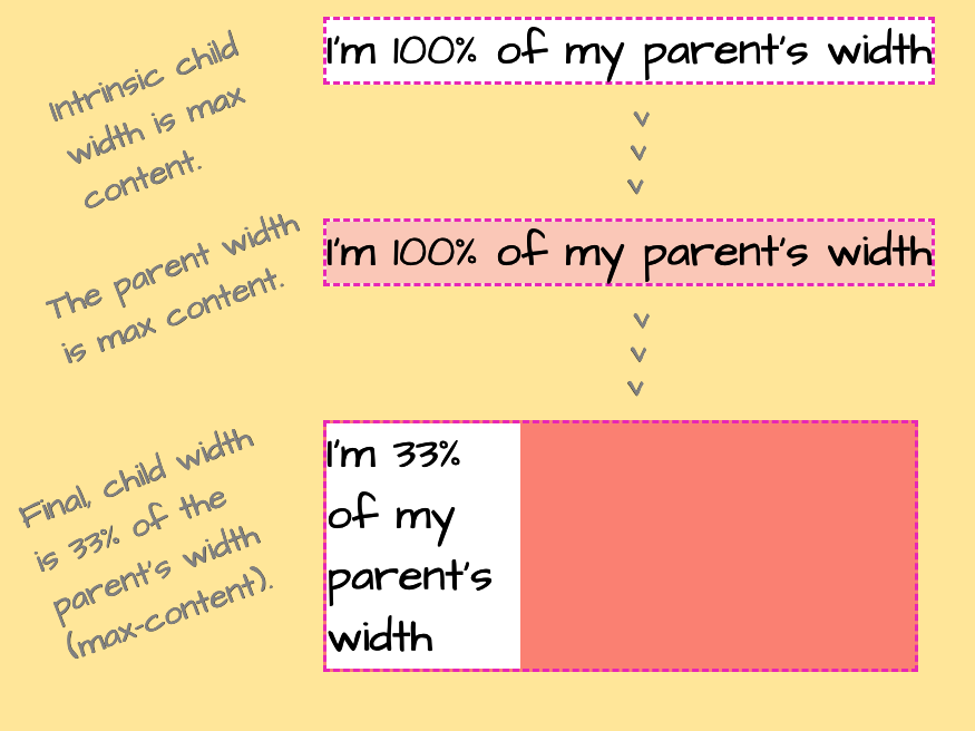
The child element in this example has a relative width of 33%. The parent element does not have a width declared on it. How the heck is the child’s computed width get calculated when there’s nothing relative to it?
To answer that, we have to look at how the browser calculates the size of the elements in this example. We haven’t defined a specific width for the parent element, so the browser uses the initial value for width , which is auto. And since the parent element’s display is set to inline-block, auto behaves like max-content. And max-content, as we saw, should mean the parent element is as wide as the content in it, which is everything inside the child element.
So, the browser looks at the element’s content (children) to determine its width. However, the width of the child also depends on the parent’s width! Gah, this is weird!
The CSS Box Sizing Module specification calls this cyclic percentage sizing. I’m not sure why it’s called that exactly, but it details the complex math the browser has to do to (1) determine the parent element’s width, and (2) reconcile that width to the relative width of the child.
The process is actually pretty cool once you get over the math stuff. The browser starts by calculating a temporary width for the child before its declared value is applied. The temporary width the browser uses for the child is auto which we saw behaves like max-content which, in turn, tells the browser that the child needs to be as wide as the content it contains. And right now, that’s not the declared 33% value.
That max-content value is what the browser uses to calculate the parent’s width. The parent, you see, needs to be at least as wide as the content that it contains, which is everything in the child at max-content. Once that resolves, the browser goes back to the child element and applies the 33% value that’s declared in the CSS.
This is how it looks:

There! Now we know how a child element can contribute to the computed value of its parent.
M&Ms: the min- and max- properties
Hey, so you’re probably aware that the following properties exist:
min-widthmin-heightmax-widthmax-height
Well, those have a lot to do with an element’s width and height as well. They specify the limits an element’s size. It’s like saying, Hey, browser, make sure this element is never under this width/height or above this width/height.
So, even if we have declared an explicit width on an element, say 100%, we can still cap that value by giving it a max-width:
element { width: 100%; max-width: 800px;
}
This allows the browser to let the element take up as much space as it wants, up to 800 pixels. Let’s look what happens if we flip those values around and set the max-width to 100% and width to 800px:
element { width: 800px; max-width: 100%;
}
Hey look, it seems to result in the exact same behavior! The element takes up all the space it needs until it gets to 800 pixels.
Apparently, things start to get more complex as soon as we add a parent element into the mix. This is the same example as above, with one notable change: now each element is a child of an inline-block element. Suddenly, we see a striking difference between the two examples:
Why the difference? To understand, let’s consider how the browser calculates the width of the elements in this example.
We start with the parent element (.parent). It has a display property set to inline-block, and we didn’t specify a width value for it. Just like before, the browser looks at the size of its children to determine its width. Each box in this example is wrapped in the .parent element.
The first box (#container1) has a percentage width value of 100%. The width of the parent resolves to the width of the text within (the child’s max-content), limited by the value we specified by max-width, and that is used to calculate the width of the child as well.
The second box (#container2) has a set width of 800px, so its parent width is also 800px — just wide enough to fit its child. Then, the child’s max-width is resolved relative to the parent’s final width, that is 800px. So both the parent and the child are 800px wide in this case.
So, even though we initially saw the two boxes behave the same when we swapped width and max-width values, we now know that isn’t always true. In this case, introducing a parent element set to display: inline-block; threw it all off!
Adding min(), max() and clamp() into the mix
The min(), max() and clamp() are three useful CSS functions that let us define the size of elements responsively… without media queries!
min(): Returns the minimum value of its arguments. The arguments can be given in different units, and we can even mix and match absolute and relative units, likemin(800px, 100%).max(): Returns the maximum value of its arguments. Just likemin(), you can mix and match different units.clamp(): A shorthand function for doingminandmaxat once:clamp(MIN, VAL, MAX)is resolved asmax(MIN, min(VAL, MAX)). In other words, it will returnVAL, unless it exceeds the boundaries defined byMINandMAX, in which case it’ll return the corresponding boundary value.
Like this. Check out how we can effectively “re-write” the max-width example from above using a single CSS property:
.element { width: min(800px, 100%);
} /* ...is equivalent to: */
.element { width: 800px; max-width: 100%;
}
That would set the width of the element to 800px, but make sure we don’t exceed the width of the parent (100%). Just like before, if we wrap the element with an inline-block parent, we can observe it behaving differently than the max-width variation:
The width of the children (800px) is the same. However, if you enlarge the screen (or use CodePen’s 0.5x button to zoom out), you will notice that the second parent is actually larger.
It boils down to how the browser calculates the parent’s width: we didn’t specify a width for the parent, and as child’s width value is using relative units, the browser ignores it while calculating the parent’s width and uses the max-content child of the child, dictated by the “very long … long” text.
Wrapping up
Phew! It’s crazy that something as seemingly simple as width and height actually have a lot going on. Sure, we can set explicit width and height values on an element, but the actual values that render often end up being something completely different.
That’s the beauty (and, frankly, the frustration) with CSS. It’s so carefully considered and accounts for so many edge cases. I mean, the concept of The Box Model itself is wonderfully complex and elegant at the same time. Where else can we explicitly declare something in code and have it interpreted in different ways? The width isn’t always the width.
And we haven’t even touched on some other contributing factors to an element’s dimensions. Modern layout techniques, like CSS Flexbox and Grid introduce axes and track lines that also determine the rendered size of an element.
Authors: Uri Shaked and Michal Porag


