In this week’s roundup, WebKit’s prefixed autofill becomes a standard, the pointer cursor is for more than just links, and browsers are jumping on board to delay videos set to autoplay until they’re in view… plus more! Let’s jump right into it.
CSS ::-webkit-autofill has become a standard feature
Table of Contents
Chrome, Safari, and pretty much every other modern web browser except Firefox (more on that later) have supported the CSS :-webkit-autofill pseudo-class for many years. This selector matches form fields that have been autofilled by the browser. Websites can use this feature to style autofilled fields in CSS (with some limitations) and detect such fields in JavaScript.
let autofilled = document.querySelectorAll(":-webkit-autofill");There currently does not exist a standard autocomplete or autofill event that would fire when the browser autofills a form field, but you can listen to the input event on the web form and then check if any of its fields match the :-webkit-autofill selector.
The HTML Standard has now standardized this feature by adding :autofill (and :-webkit-autofill as an alias) to the list of pseudo-classes that match HTML elements. This pseudo-class will also be added to the CSS Selectors module.
The
:autofilland:-webkit-autofillpseudo-classes must match<input>elements that have been autofilled by the user agent. These pseudo-classes must stop matching if the user edits the autofilled field.
Following standardization, both pseudo-classes have been implemented in Firefox and are expected to ship in Firefox 86 later this month.
In the article “Let’s Bring Spacer GIFs Back!” Josh W. Comeau argues for using a “spacer” <span> element instead of a simple CSS margin to define the spacing between the icon and text of a button component.
In our home-button example, should the margin go on the back-arrow, or the text? It doesn’t feel to me like either element should “own” the space. It’s a distinct layout concern.
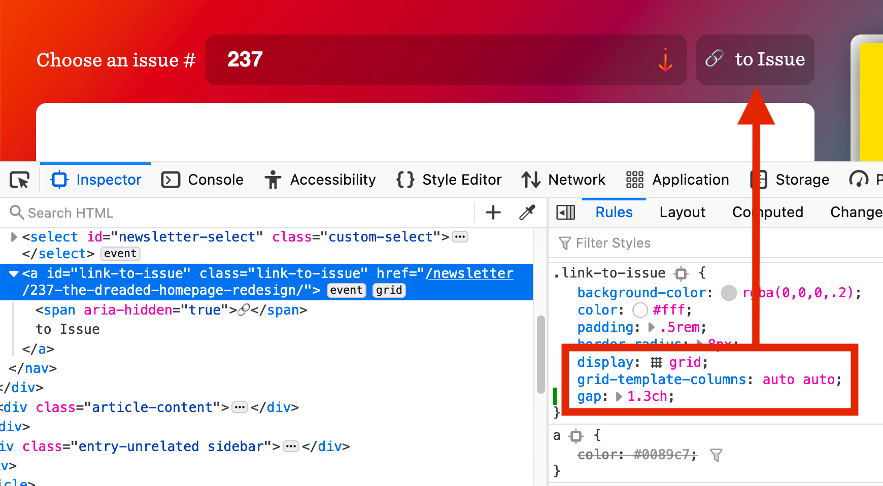
CSS Grid is an alternative to such spacer elements. For example, the “Link to issue” link in CSS-Tricks’s newsletter section contains two non-breaking spaces ( ) to increase the spacing between the emoji character and text, but the link could instead be turned into a simple grid layout to gain finer control over the spacing via the gap property.

Websites agree that the pointer cursor is not just for links
The CSS Basic User Interface module defines the CSS cursor property, which allows websites to change the type of cursor that is displayed when the user hovers specific elements. The specification has the following to say about the property’s pointer value:
The cursor is a pointer that indicates a link. … User agents must apply
cursor: pointerto hyperlinks. … Authors should usepointeron links and may use on other interactive elements.
Accordingly, browsers display the pointer cursor (rendered as a hand) on links and the default cursor (rendered as an arrow) on buttons. However, most websites (including Wikipedia) don’t agree with this default style and apply cursor: pointer to other interactive elements, such as buttons and checkboxes, as well.
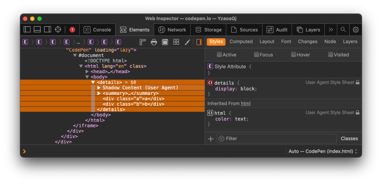
Another interactive element for which it makes sense to use the pointer cursor is the <summary> element (the “toggle button” for opening and closing the parent <details> element).
Browsers delay autoplay until the video comes into view
Compared to modern video formats, animated GIF images are up to “twice as expensive in energy use.” For that reason, browsers have relaxed their video autoplay policies (some time ago) to encourage websites to switch from GIFs to silent or muted videos.
<!-- a basic re-implementation of a GIF using <video> -->
<video autoplay loop muted playsinline src="meme.mp4"></video>
If you’re using <video muted autoplay>, don’t worry about pausing such videos when they’re no longer visible in the viewport (e.g., using an Intersection Observer). All major browsers (except Firefox) already perform this optimization by default:
<video autoplay>elements will only begin playing when visible on-screen such as when they are scrolled into the viewport, made visible through CSS, and inserted into the DOM.
(via Zach Leatherman)
Chrome introduces three new @font-face descriptors
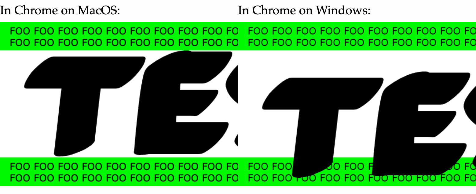
Different browsers and operating systems sometimes use different font metrics even when rendering the same font. These differences affect the vertical position of text, which is especially noticeable on large headings.

Similarly, the different font metrics of a web font and its fallback font can cause a layout shift when the fonts are swapped during page load.
To help websites avoid layout shift and create interoperable text layouts, Chrome recently added the following three new CSS @font-face descriptors for overriding the font’s default metrics:
ascent-override(ascent is the height above the baseline)descent-override(descent is the depth below the baseline)line-gap-override
@font-face { font-family: Roboto; /* Merriweather Sans has 125.875px ascent * and 35px descent at 128px font size. */ ascent-override: calc(125.875 / 128 * 100%); descent-override: calc(35 / 128 * 100%); src: local(Roboto-Regular);
}
The following video shows how overriding the ascent and descent metrics of the fallback font (Roboto) to match the same metrics of the web font (Merriweather Sans) can avoid layout shift when swapping between these two fonts.
[embedded content]


