Blobs are the smooth, random, jelly-like shapes that have a whimsical quality and are just plain fun. They can be used as illustration elements and background effects on the web.
So, how are they made? Just crack open an illustration app and go for it, right? Sure, that’s cool. But we’re in a post here on CSS-Tricks, and it would be much more fun to look at the possibilities we have to do this with CSS and SVG — two of our favorite ingredients!
We actually have a few ways to go about blobs. Let’s check them out.
Drawing circles in SVG
Table of Contents
Let’s start easy. We can draw SVG in something like Illustrator, Sketch, Figma or whatever, but we’re going to draw in SVG code instead.
SVG makes it pretty trivial to draw a circle, thanks to the appropriately named <circle> element:
<circle cx="100" cy="100" r="40" fill="red" />Those funky attributes? They make sense once you break them down:
cxdefines the x-coordinate of center of circle.cydefines the y-coordinate.ris the radius.fillis used to fill the shape with color.
That snippet creates a circle with a 40px radius with its center at 100px on the x-axis and 100px on the y-axis. The coordinates start from the upper-left corner of the parent container.
Let’s create multiple overlapping circles like this:
<svg height="300" width="300"> <circle cx="80" cy="80" r="40" fill="red" /> <circle cx="120" cy="80" r="40" fill="red" /> <circle cx="150" cy="80" r="40" fill="red" /> <circle cx="150" cy="120" r="40" fill="red" /> <circle cx="100" cy="100" r="40" fill="red" />
</svg>
<svg> acts as the art board where all the different shapes and figures are drawn. So, its height and width indicates the size in which the whole drawing needs to be enclosed. If some part of figure is out of bounds of the SVG’s size, then that part will be truncated.
But blobs aren’t always so perfectly… round. We can mix things up by using <ellipse> instead of <circle>:
<ellipse cx="200" cy="80" rx="100" ry="50" fill="red" />This is nearly identical to the circle except the change in tag name and two radii values to define the horizontal (rx) and vertical (ry) radii separately. The funny thing is that we can still get a perfect circle if we want if the radii values are the same. So, in a sense, <ellipse> is a little more versatile.
And, if all you need is a circle, we could probably lean on CSS without SVG at all. Any box element can become a circle or ellipse with border-radius.
.circle { border-radius: 50%; height: 50px; width: 50px;
}
…but more on that later.
Freestyling with SVG paths
Thanks to SVG’s <path> tag, we can create any kind of shape. It is like drawing with a pencil or pen. You start from a point and draw lines, curves, shapes and close the loop.
There are many data parameters in path for different tasks like:
M– Moving to the pointL– Drawing lineC– Drawing a curveQ– Bézier curveZ– Closing the path
Chris has a super thorough guide that explains these parameters in great detail.
We just need the curve (C) parameter for the actual drawing. But we’ll also be moving the starting point and closing the path, so we’ll reach for the M and Z parameters as well.
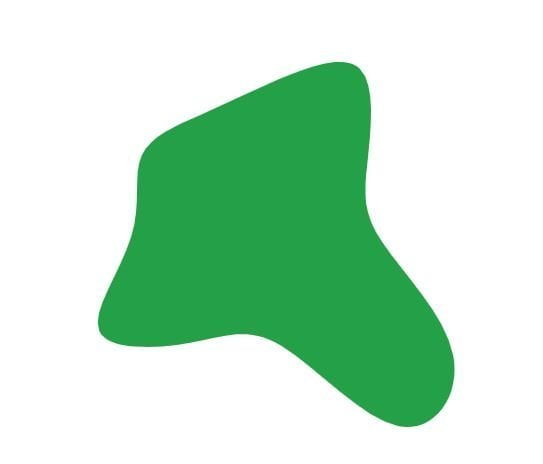
<path> element.Ready to break this down? Coordinates play a big role in <path> so what we’re about to look at will look like Google Maps data barfed inside our code. But it makes a lot more sense when we know what they’re doing.
Take this…
<svg xmlns="http://www.w3.org/2000/svg"> <path fill="#24A148" d="" />
</svg>
Here, the d attribute stores the path data. It holds information containing where the drawing starts, what direction it moves, what shape it follows, and where it ends. For example:
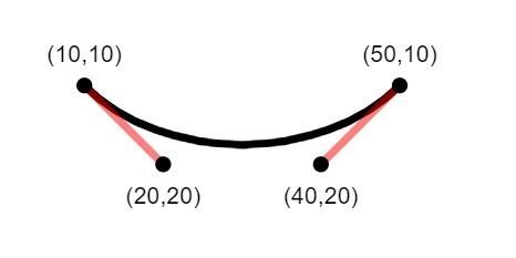
<path d="M 10 10 C 20 20, 40 20, 50 10" stroke="black" fill="transparent"/>It shows that our path starts from coordinates 10 10, indicated by the M that precedes them. Then, it establishes a Cubic Bézier curve (C) with two control points. Bézier curves are like handles on the both ends of a path that control the curviness between them. We have two Bézier “handles”: one for starting position (20 20) of the curve and another for ending position (40 20).
Let’s use this knowledge to design our blob. The blob I drew is actually a bit complex, with a number of curves and control points. It doesn’t help that many of the coordinates aren’t full integers. But, still, now that we know what the <path> ‘s d parameter does and the attributes it uses to draw points along the path, it doesn’t look quite as scary.
But, hey, I get it. That’s a lot of code to not only write by hand, but get exactly right as well. I wouldn’t fault you for using something like this tool to generate the code for you.
Gooey effects with CSS and SVG filters
SVG path is complex. Right? What if I present you a way to convert many custom shapes (which you can create through divs) into gooey blobs? Here’s the idea. We’re going to create two rectangles that intersect. They’re the same color, but have a little transparency to darken where they intersect.
Then we’re going to leverage SVG’s blurring features to smudge the rectangles, creating an extra gooey blob with softer edges. The two intersecting rectangles will turn into this –
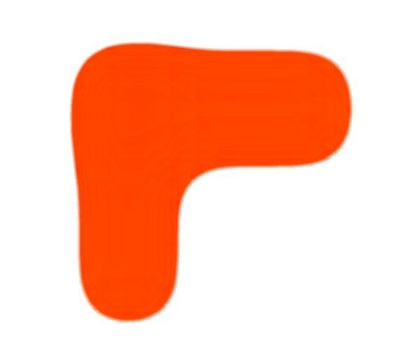
Let’s first understand how filters work in SVG. They are declared using <filter> on HTML elements or other SVG elements, like circle.
circle { filter: url("#id_of_filter");
}
<filter> is basically a wrapper for the actual filter effects, that include:
<feGaussianBlur><feImage><feMerge><feColorMatrix>- Many more… Get the complete list here.
Our blob is blurred and colored, so that’s why we’re going to put <feGaussianBlur> and <feColorMatrix> to use.
<feGaussianBlur> takes multiple attributes, but we are only interested in two of them: how much blur we want and where we want it. The standard deviation (stdDeviation) and in properties align with those needs, respectively.
in accepts one of two values:
SourceGraphic– Blurs the entire shapeSourceAlpha– Blurs the alpha value, and is used to create shadow effects
After playing around a bit, here’s where I landed on the <feGaussianBlur> effect:
<feGaussianBlur in="SourceGraphic" stdDeviation="30" />This goes right in the HTML markup with an ID that we call on the parent element of our blob:
<!-- The SVG filter -->
<svg style="position: absolute; width: 0; height: 0;"> <filter id="goo"> <feGaussianBlur in="SourceGraphic" stdDeviation="30" /> </filter>
</svg> <!-- The blob -->
<div class="hooks-main"> <div></div> <div></div>
</div>
The filter doesn’t actually render, even though it’s in the markup. Instead, we reference it as a CSS filter on the blob’s parent element:
/* Blob parent element */
.hooks-main { position: absolute; width: 100%; height: 100%; filter: url("#goo&"); overflow: hidden;
}This isn’t done just yet. The blur is scattered and the element’s shape lost its boundary and color. We need a bulging effect with blur on the boundaries and a solid color to fill the shape. This is where our next SVG filter, <feColorMatrix>, comes into play.
There are two <feColorMatrix> attributes we want:
in– Indicates where the effect is applied, just like<feGaussianBlur>.values– A matrix of four rows and five columns.
The values attribute bears a little more nuance. It holds a matrix that gets multiplied with the color and alpha values of each pixel and generates a new color value for that pixel. Mathematically speaking:
new pixel color value = ( values matrix ) × ( current pixel color value )Let’s get a little numbers nerdy here. In that equation, values matrix is equal to:
[F-red1 F-green1 F-blue1 F-alpha1 F-constant1 F-red2 F-green2 F-blue2 F-alpha2 F-constant2 F-red3 F-green3 F-blue3 F-alpha3 F-constant3 F-red4 F-green4 F-blue4 F-alpha4 F-constant4]Here, F-red means a fraction of red in pixels, with a value ranging from 0 to 1. F-constant is some constant value to add (or subtract) from color value.
Breaking this down further… We have a color pixel with an RGBA value of rgba(214, 232, 250, 1). To convert it into a new color, we will multiply it with our values matrix.
| Values Matrix | Color Pixel (RGBA) | New Color (RGBA) | ||
|---|---|---|---|---|
[1 0 0 0 0 |
× | [214 |
= [ 214x1 + 232x0 + 250x0 + 1x0 + 1x1 |
= [214 |
The pixel value didn’t change because we multiplied it by the identity matrix, but if you change the values of the matrix, then its pixel value will change too. Learn more about values matrix from MDN documentation.
In our case, these values seem to work pretty well:
<filter id="goo"> <feGaussianBlur in="SourceGraphic" stdDeviation="30" /> <feColorMatrix in="blur" values="1 0 0 0 0 0 1 0 0 0 0 0 1 0 0 0 0 0 30 -7" />
</filter>
I’ve added few more styles in the blob to stretch it from the corner.
Try to use these filter values in other shapes and let me know how they work out for you in the comments.
Using CSS border-radius
We teased this earlier, but now let’s get to the CSS border-radius property. It can also create blob-like shape, thanks to it’s ability to smooth out the corners of an element. This is possible because each corner radius is divided into two radii, one for each edge. That’s why we can have more shapes apart from circle and ellipse.
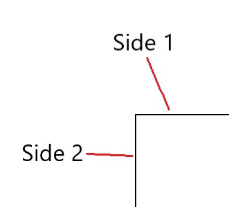
You might be used to using border-radius as a shorthand for all four corners of an element:
.rounded { border-radius: 25%;
}
That’s a nice way to get uniformity for all of the corners. But blobs aren’t so uniform. We want some corners to be rounder than others to get some that looks gooey. That’s why we go for the constituent properties of border-radius, like:
.element { border-top-left-radius: 70% 60%; border-top-right-radius: 30% 40%; border-bottom-right-radius: 30% 60%; border-bottom-left-radius: 70% 40%;
}
And see how each properties takes two values? That’s one for each edge of the corner, giving us a lot of flexibility to curve an element into interesting shapes. Then we can drop in a background color, fill it up with a gradient, or even set a box-shadow on it to get a neat effect.


