In this week’s roundup, we highlight a proposal for a new <popup> element, check the use of prefers-reduced-motion on award-winning sites, learn how to opt into cross-origin isolation, see how WhiteHouse.gov approaches accessibility, and warn the dangers of 100vh.
Let’s get into the news!
On January 21, Melanie Richards from the Microsoft Edge web platform team posted an explainer for a proposed HTML <popup> element (the name is not final). A few hours later, Mason Freed from Google announced an intent to prototype this element in the Blink browser engine. Work on the implementation is taking place in Chromium issue #1168738.
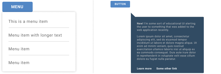
A popup is a temporary (transient) and “light-dismissable” UI element that is displayed on the the “top layer” of all other elements. The goal for the <popup> element is to be fully stylable and accessible by default. A <popup> can be anchored to an activating element, such as a button, but it can also be a standalone element that is displayed on page load (e.g., a teaching UI).

A <popup> is automatically hidden when the user presses the Esc key or moves focus to a different element (this is called a light dismissal). Unlike the <dialog> element, only one <popup> can be shown at a time, and unlike the deprecated <menu> element, a <popup> can contain arbitrary content, including interactive elements:
We imagine
<popup>as being useful for various different types of popover UI. We’ve chosen to use an action menu as a primary example, but folks use popup-esque patterns for many different types of content.
Award-winning websites should honor the “reduce motion” preference
Table of Contents
Earlier this week, AWWWARDS announced the winners of their annual awards for the best websites of 2020. The following websites were awarded:
All these websites are highly dynamic and show full-screen motion on load and during scroll. Unfortunately, such animations can cause dizziness and nausea in people with vestibular disorders. Websites are therefore advised to reduce or turn off non-essential animations via the prefers-reduced-motion media query, which evaluates to true for people who have expressed their preference for reduced motion (e.g., the “Reduce motion” option on Apple’s platforms). None of the winning websites do this.
/* (code from animal-crossing.com) */
@media (prefers-reduced-motion: reduce) { .main-header__scene { animation: none; }
}
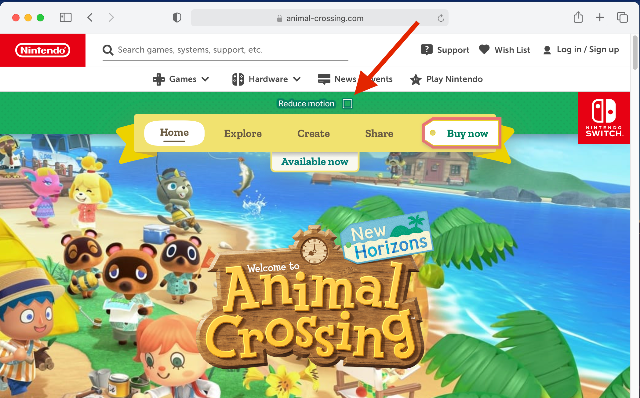
An example of a website that does this correctly is the official site of last year’s Animal Crossing game. Not only does the website honor the user’s preference via prefers-reduced-motion, but it also provides its own “Reduce motion” toggle button at the very top of the page.

(via Eric Bailey)
Websites can now opt into cross-origin isolation
Cross-origin isolation is part of a “long-term security improvement.” Websites can opt into cross-origin isolation by adding the following two HTTP response headers, which are already supported in Chrome and Firefox:
Cross-Origin-Embedder-Policy: require-corp
Cross-Origin-Opener-Policy: same-origin
A cross-origin-isolated page relinquishes its ability to load content from other origins without their explicit opt-in (via CORS headers), and in return, the page gains access to some powerful APIs, such as SharedArrayBuffer.
if (crossOriginIsolated) { // post SharedArrayBuffer
} else { // do something else
}
The White House recommits to accessibility
The new WhiteHouse.gov website of the Biden administration was built from scratch in just six weeks with accessibility as a top priority (“accessibility was top of mind”). Microsoft’s chief accessibility officer reviewed the site and gave it the thumbs up.
The website’s accessibility statement (linked from the site’s footer) declares a “commitment to accessibility” and directly references the latest version of the Web Content Accessibility Guidelines, WCAG 2.1 (2018). This is notable because federal agencies in the USA are only required to comply with WCAG 2.0 (2008).
The Web Content Accessibility Guidelines are the most widely accepted standards for internet accessibility. … By referencing WCAG 2.1 (the latest version of the guidelines), the Biden administration may be indicating a broader acceptance of the WCAG model.
The CSS 100vw value can cause a useless horizontal scrollbar
On Windows, when a web page has a vertical scrollbar, that scrollbar consumes space and reduces the width of the page’s <html> element; this is called a classic scrollbar. The same is not the case on macOS, which uses overlay scrollbars instead of classic scrollbars; a vertical overlay scrollbar does not affect the width of the <html> element.
macOS users can switch from overlay scrollbars to classic scrollbars by setting “Show scroll bars” to ”Always” in System preferences > General.
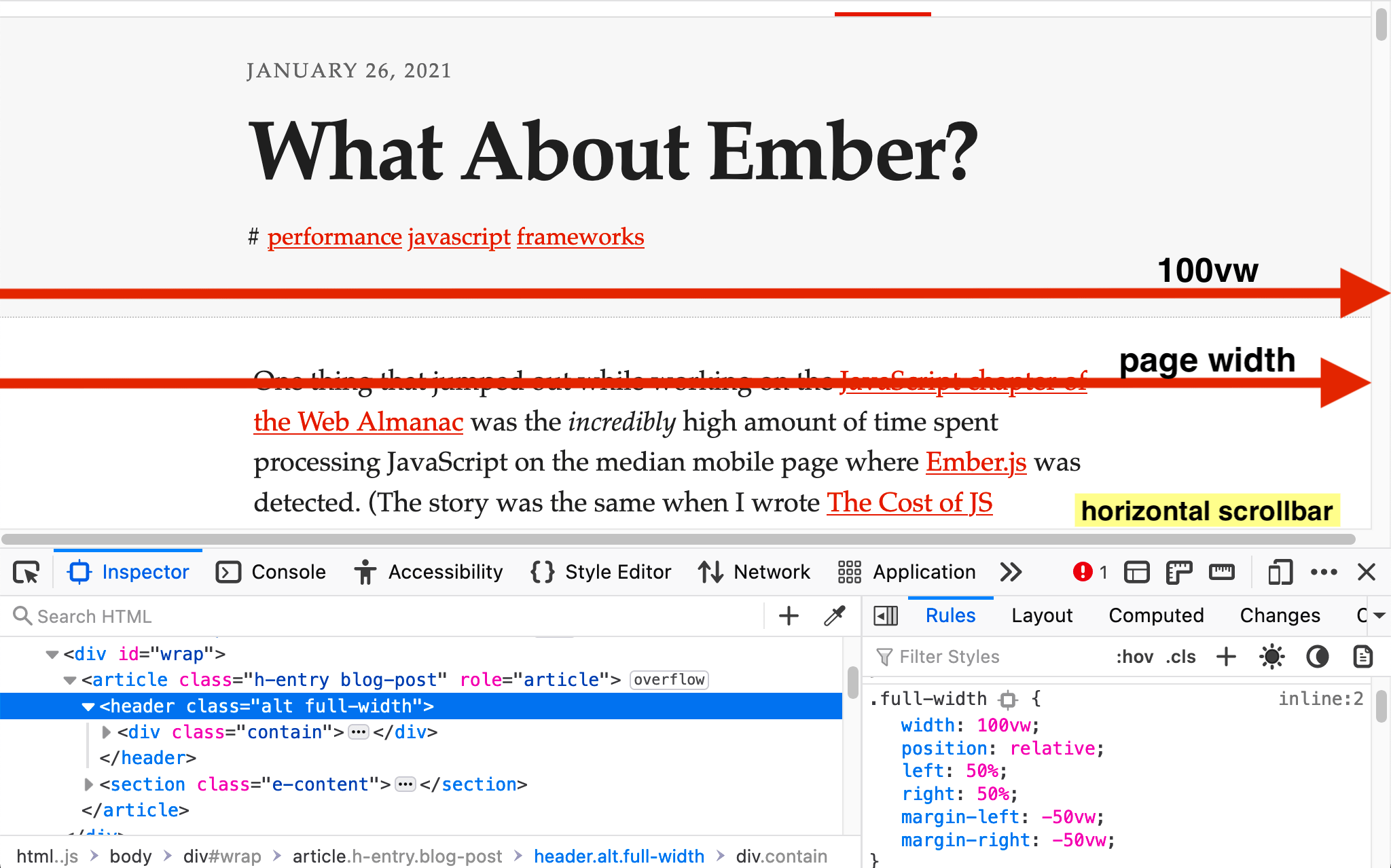
The CSS length value 100vw is equal to the width of the <html> element. However, if a classic vertical scrollbar is added to the page, the <html> element becomes narrower (as explained above), but 100vw stays the same. In other words, 100vw is wider than the page when a classic vertical scrollbar is present.
This can be a problem for web developers on macOS who use 100vw but are unaware of its peculiarity. For example, a website might set width: 100vw on its article header to make it full-width, but this will cause a useless horizontal scrollbar on Windows that some of the site’s visitors may find annoying.

Web developers on macOS can switch to classic scrollbars to make sure that overflow bugs caused by 100vw don’t slip under their radar. In the meantime, I have asked the CSS Working Group for comment.


