The way we style text hasn’t changed much over the years. There have been numerous advancements to help make things more flexible, like layouts, but in terms of styling, most finite aspects of our designs, like text, remain relatively unchanged. This is especially true of text styling. We write code to style text explicitly for every portion of our layouts, and then, to make it responsive, we write more code to make it work at every breakpoint. This means that, as different areas of text compress and expand, the result is tension — palpable, experiential tension — just before the content breaks. At these places, content suffers from not being sized or spaced well, all the while being supported by overly complicated and brittle code.
Intrinsic typography shifts all this, clearing it away by starting at the code itself to affect the styling. Instead of writing explicit text styles, you define how those styles change in proportion to the text’s area. This enables you to use more flexible text components in more layout variations. It simplifies your code, increasing the opportunities for new layout possibilities. Intrinsic typography works so that text self-adjusts to the area in which it’s rendered. Instead of sizing and spacing text for each component at every breakpoint, the text is given instructions to respond to the areas it is placed in. As a result, intrinsic typography enables designs to be far more flexible, adapting to the area in which it is placed, with far less code.
Typographic superpowers beyond clamp()
Table of Contents
The result of using intrinsic typography goes well beyond what is possible with tools like clamp(). Intrinsic typographic styling blends the component portability of element queries with the interpolation control of CSS animations, enabling seamless changes of any value across container widths. This technique enables things that aren’t possible with other CSS techniques, such as fluidly adjusting variable font settings, color, and unitless line-height as an element’s area changes. You also avoid the accessibility pitfalls of clamp() and locks where changing the browser’s default font size shifts your typography out of alignment with your breakpoints when using relative units.
How is this different from responsive typography?
Responsive typography references the viewport to transform text. It does this through media queries, clamp(), or CSS Locks. While these techniques enable granular control of typography across screen sizes, they lack the ability to control typography in different components. This means that, for a page with an array of differently sized content areas, a new headline style would need to be created for each of these areas with a responsive typography approach.
Intrinsic typography doesn’t need all that. With intrinsic typography, a single headline style can be used in all different content areas. Discrete headline styles can be consolidated into one intrinsic headline. This is a distinction similar to that of element queries versus media queries: with element queries it’s possible to bind all of the scaling information to a component, where media queries the styles always reference the viewport.
The anatomy of an intrinsic style
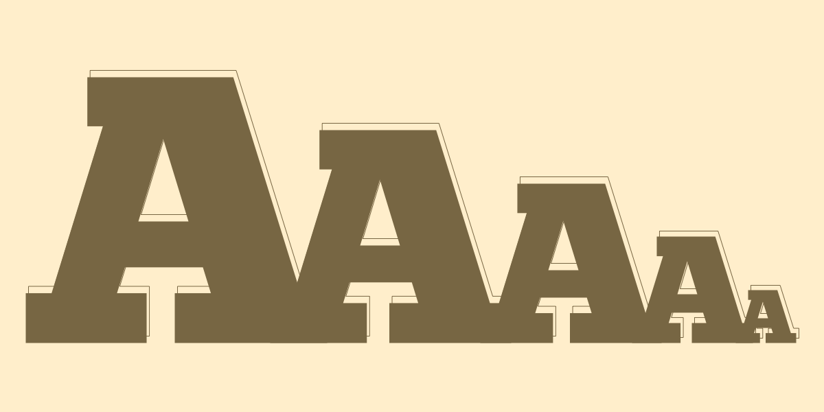
If we were to take the intrinsic headline styles above and extrude out all the variations within them, it would look like the following:
Within larger areas of the page, the text is typeset to be bigger, bolder, and wider. In smaller areas of the page the text is smaller, lighter, and narrower. The area in which a headline is rendered is measured, and then the appropriate slice is taken from this intrinsic headline style to be used for that specific headline.
You may notice a few things about the shape of this extruded headline style. The text goes from being smaller to larger, but the shape itself has curves. This control over how text scales from one point to another is particularly useful as screens get smaller to ensure optimal legibility. Below you can see the same set of styles being applied to two columns of text, one with a curved shape and one with a linear shape. In the curved intrinsic example the text is vastly more legible in more places, in comparison to the example using linear interpolation, where the text becomes too small too quickly.
Through combining the ability to interpolate text styling across sizes and areas of a layout as well as shaping how those settings are interpolated, intrinsic typography gives designers an unprecedented amount of control over how text is rendered at any screen or component size.
Typeset intrinsically
Typetura developed a tool to add intrinsic typesetting functionality to CSS (I’m the creator.) This tool enables the necessary typographic styles to be written, injecting flexibility where previously there was none. Intrinsic styles are stored in CSS keyframes and change based on the width of a parent element. This enables interpolation of any animatable property across element widths. To reference back to our element queries example, think interpolated element queries.
To set up your keyframes, 0% is equal to a container width of 0px, and keyframe 100% is the maximum container width your styles will cover. This value is 1600px by default. Containers can be defined by adding the class typetura to an element, with the root element as the default container. Child elements will be styled based on the parent context’s width, unless a new context is defined.
@keyframes headline { 0% { font-size: 1rem; } 100% { font-size: 4rem; }
}
To attach these styles to your element, use the custom property --tt-key. Now you can see your first intrinsic style.
@keyframes headline { 0% { font-size: 1rem; line-height: 1.1; } 100% { font-size: 4rem; line-height: 1; }
} .headline { --tt-key: headline;
}
To shape how these styles scale, use the custom property --tt-ease. This property accepts CSS easing functions and keywords. This enables you to rapidly bring up your base font size or taper off headline scaling and spacing. Additionally, we can constrain the range these styles cover with --tt-max to better fit the constraints of your layouts and what the text is used for.
@keyframes headline { 0% { font-size: 1rem; line-height: 1.1; } 100% { font-size: 4rem; line-height: 1; }
} .headline { --tt-key: headline; --tt-max: 600; --tt-ease: ease-in-out;
}
The following example shows how flexible your page can be when all the text on it is driven by intrinsic typographic styles; from the root of the document and up. The text can seamlessly transition from a monitor serving a conference room all the way down to the size of a watch — all without media queries. Text styles can also be shared in different modules; for example, the headline at the top of the page and headlines in the next-click area are all driven by the same style. While efficiencies appear immediately at any size of website, they quickly compound: the larger site you have, the more these efficiencies build.
Check out this Pen. In it, I’ve added an intrinsic style inspector so you can click on each headline and see what the rendered size is. Within the inspector you can also manipulate the shape of the intrinsic style, and the upper boundary. This allows you to begin to see the typographic styling possibilities for enabled by Typetura.
Intrinsic Typography is the future of styling on the web
Baking these design rules into your content is the practice of intrinsic design, and baking these rules into your text is the practice of intrinsic typography. Intrinsic web design, coined by Jen Simmons, is a concept where common design mutations are baked into the very fabric of our components. Instead of explicitly stating the style of each individual piece of content, intrinsic layouts are given design constraints and our content responds to its environment, as opposed to explicitly defining styles. This approach both simplifies your codebase and enhances the flexibility of your designs, as components have instructions that help them respond to more than just the viewport.
Typetura brings this philosophy into text styling. With text components being our most foundational design material, a material that is reused in almost every component, intrinsic typography has significant advantages over other methodologies. Advantages of design resilience, scalability, and simplification of code exist deeper in your project and extend its lifespan. Scale down to the size of a watch or up to the size of a TV, and where text once limited how far your layout could reach, it now supports your ambitions.


