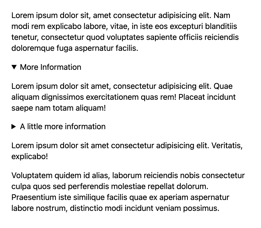
One thing that can be just a smidge funky about the <details> element is that, when open, it’s not always 100% clear what is inside that element and what isn’t. I’m not saying that always matters or that it’s a particularly hard problem to solve, I’m just noting it as it came up recently for me.
Here’s a visual example:

<details> and what isn’t?The solution is… CSS. Style the <details> somewhat uniquely, and that problem goes away. Even if you want the typography to be the same, or you don’t want any exclusive styling until the <details> is opened, it’s still possible. Using an alpha-transparent fill, you can even make sure that deeper-nested <details> remain clear.
Here’s that CSS:
details[open] { --bg: rgb(0 0 0 / 0.2); background: var(--bg); outline: 1rem solid var(--bg); margin: 0 0 2rem 0;
}
And the demo:


