Ever heard of favicons made with SVG? If you are a regular reader of CSS-Tricks, you probably have. But does your website actually use one?
The task is more non-trivial than you might think. As we will see in this article, creating a useful SVG favicon involves editing an SVG file manually, which is something many of us try to avoid or are uncomfortable doing. Plus, we are talking about a favicon. We can spend a few hours playing with a hot new CSS framework. But a favicon? It sometimes feels too small to be worth our time.
This article is about creating an SVG favicon for real. If you’re in front of your laptop, get the vector file of a logo ready. By the end of your (active!) reading, your SVG favicon will be ready to shine.
Why an SVG favicon at all?
Table of Contents
We are here for the “how” but it’s worth reflecting: what is an SVG favicon even good for? We already have other file types that handle this, right?
SVG is a vector format. As such, it has valuable features over raster formats, including those typically used for favicons, like PNG. SVGs scale and are often more compact than its binary cousins because, well, they’re just code! Everything is drawn in numbers and letters!
That’s good news, but how does this help our favicon? Desktop favicons are small, at most 64×64. And you can ship your icons in several resolutions. Scaling is a feature we don’t really need here.
File size is another source of disappointment. While SVG has a clear edge over a high resolution PNG file, the tables turn in low resolution. It is common for a 48×48 PNG favicon to result in a smaller file size than its SVG equivalent.
Yet, we have a good reason to pay attention to SVG favicon: dark mode support.
Dark mode has received a lot of attention recently. You may even have implemented dark mode for your own websites. What does that mean for favicon? It means the ability to show different icons based on the brightness of the browser tab’s background.
We are going to prepare such an icon.
How to create an SVG favicon (in theory)
Getting dark mode support for an SVG favicon relies on a CSS trick (10 points to Gryffindor), namely that we can drop a <style> tag right inside SVG, and use a media query to detect the user’s current theme preference. Something like this:
<svg> <style> @media (prefers-color-scheme: dark) { // Your dark styles here } </style> <!-- more stuff --> </svg>With this pattern, your light/dark favicon is only limited by your imagination. For example, change the color of all lines:
<svg> <style> path { fill: black; } @media (prefers-color-scheme: dark) { path { fill: white; } } </style> <!-- more stuff --> </svg>Now is the time to actually write these styles. This is when the troubles begin.
SVGs are images, and the logo we are using to build our favicon was probably created with a tool like Adobe Illustrator or InkScape. Why not use the same tool again? That’s because apps like these haven’t really integrated CSS and media queries into their products. It’s not that they can’t handle them, but you have to forget the mouse-only experience they promise. You are going to use the keyboard and type code.
Which leads us to a second option: write the CSS by hand. After all, this is the way to go with front-end development. Why should it be different here? Unfortunately, SVG is often hard to read. Sure, this is an XML dialect, which is (almost) like HTML. But SVG images are cluttered with long path declarations and other markup we often don’t see in our day-to-day work. For example, the Raspberry Pi logo is more than 8KB of raw data. This make manual editing more tedious than it sounds.

How to create an SVG favicon (in practice)
To understand how we can deal with an SVG favicon quickly and easily, we first need to define what we want to achieve.
The technique we covered above calls for creativity: replace a color, invert them all (which we’ll get to), change a shape… But the setup for a favicon is not the right time for this. A favicon should almost always be the website’s logo. Its appearance? Aesthetic? The message it conveys? All these questions have been answered already. Preparing the favicon should be fine-tuning the logo so it fits the small space allocated in browser tabs.
Often, the logo is perfect as-is and its favicon counterpart is a scaled down version of it. Sometimes, we need to add margin to make it square. What motivates a dark icon, then?
Contrast.
Many logos are designed for light backgrounds. When they don’t, another version exists solely for the purpose of darker backgrounds.

Therefore, whether we prepare a favicon manually or with a tool, we automatically pick the light-compatible logo and start with that. After all, desktop tabs are traditionally white or light gray. The problem arises when going dark mode.
Now that we have pinpointed the problem, we can formulate a solution: sometimes, we need a brighter icon for dark mode. It’s very simple. For a colorful, yet too dark logo, we can add brightness to a dark mode favicon with a CSS filter:
<svg> <style> @media (prefers-color-scheme: dark) { :root { filter: brightness(2); } } </style> <!-- more stuff -->
</svg>
If the logo is in shades or gray, we can invert its colors using another CSS filter:
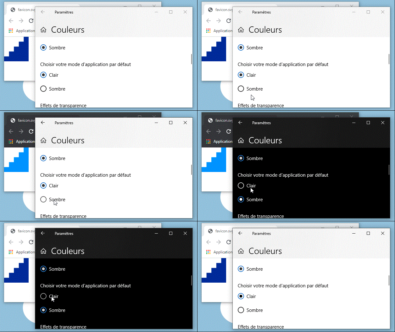
<svg> <style> @media (prefers-color-scheme: dark) { :root { filter: invert(100%); } } </style> <!-- more stuff --> </svg>Your turn! Open your SVG logo in a text editor and drop any of those <style> snippets above just before the closing </svg> tag. Open your logo in a browser, switch from light to dark, then from dark to light (Windows or Mac), and observe the magic. Adjust the brightness or invert filters as needed.

How fast was that?
Even faster: The SVG favicon editor
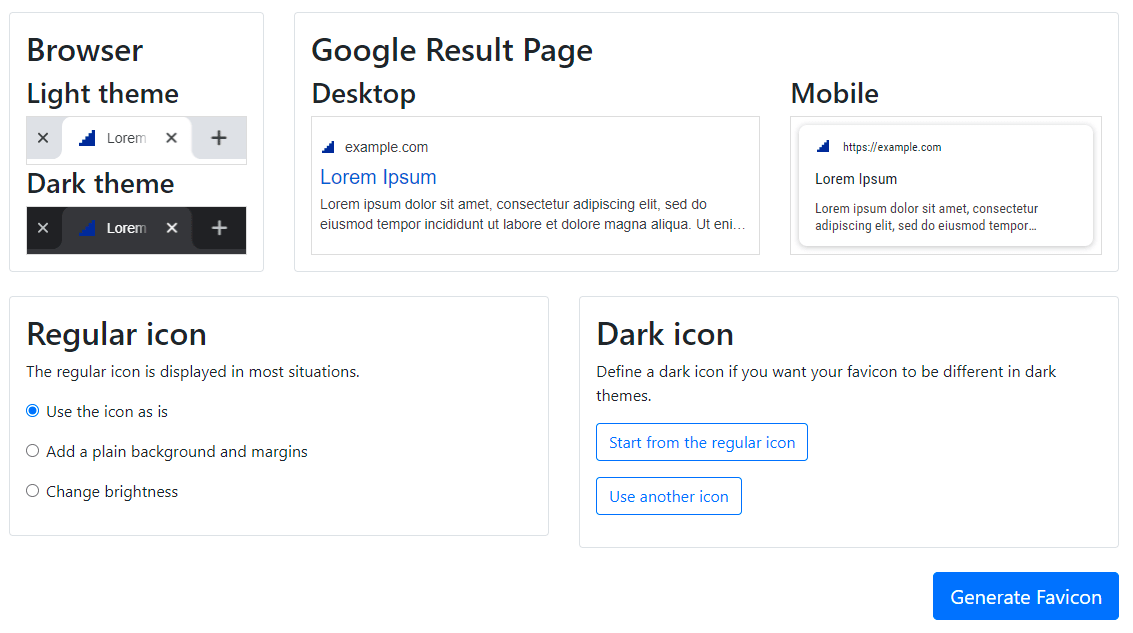
That brightness hack we covered didn’t come out of nowhere. I wrote it while upgrading RealFaviconGenerator with the SVG favicon editor. This online tool includes everything we discussed earlier. Submit your SVG logo to get a preview of your favicon in tabs and Google result pages.

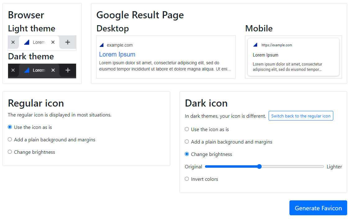
After that, play with the editor to produce the perfect favicon. In this example, we make the dark icon lighter, using the brightness filter hack behind te scene:

Grayscale logos benefit from the invert filter as well:

Click on the “Generate Favicon” button, et voilà! Favicon ready, fine tuned for light and dark modes in under a minute. Mission accomplished.
Conclusion
Beyond coolness, SVG favicons actually solve a problem that its PNG counterpart cannot. It’s only been about a year since we’ve had the ability to use SVG this way at all, but so far, it seems seldom used. With intentional purpose and tooling, maybe SVG favivons will rise and find its place among the favicon classics.


