Following the widespread implementation of CSS Grid Layout, one question became prominent in front-end web development circles: Is there still any use for Flexbox?
Grid is now supported by all major browsers as much as Flexbox is. But the answer to the question is that yes, Flexbox is still an important part of CSS.
In this article, I’m going to suggest a few ways to help you decide when to use Flexbox and when to use Grid as you tackle your web development projects.
What Is Flexbox?
Table of Contents
CSS Flexible Box Layout, or Flexbox for short, started to appear in browsers around 2012. Having binged on floats and third-party layout libraries for years, web designers and developers welcomed this new CSS module with enthusiasm, although it took a little while to get used to its alien syntax and acquire full command of its inner workings.
A flex container can be defined in a CSS document like so: .container { display: flex; }. Then, as the W3C Specification says, its children —
can be laid out in any direction, and can “flex” their sizes, either growing to fill unused space or shrinking to avoid overflowing the parent. Both horizontal and vertical alignment of the children can be easily manipulated. Nesting of these boxes (horizontal inside vertical, or vertical inside horizontal) can be used to build layouts in two dimensions.
Since the introduction of Flexbox, things like creating equal-length columns irrespective of their amount of content, centering elements both horizontally and vertically, lining up and spacing navigation links along a horizontal line and more, has become much easier.
Wrapping columns inside a flex container is enough to achieve equal-length columns. Check it out!
See the Pen Flexbox-Equal-Columns by SitePoint (@SitePoint)
on CodePen.
As for centering content both horizontally and vertically, it’s a matter of adding the following lines of code to a flex container:
.hero { display: flex; flex-direction: column; /* centers vertically */ justify-content: center; /* centers horizontally */ align-items: center; } Here’s a demo:
See the Pen centering-flexbox by SitePoint (@SitePoint)
on CodePen.
Finally, lining up a bunch of links has never been so painless:
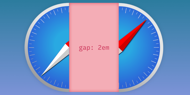
.links-container { display: flex; /* shortcut to specify direction (horizontal) and wrapping behavior */ flex-flow: row wrap; gap: 1rem; } You can see a demo of this on CodePen.
To familiarize yourself with how Flexbox works, and as a quick reference to its properties and values, have a look at the links below:
- A Friendly Introduction to Flexbox for Beginners on SitePoint
- Mozilla’s Flexbox introduction
- The Flexbox cheat sheet by CSS-Tricks
- The What the Flexbox?! video series by Wes Bos
So that’s Flexbox in a nutshell. Let’s now move on and look at Grid.
What Is CSS Grid?
In March 2017, CSS Grid Layout started to receive widespread browser support. According to the Grid specification, Grid layout is —
a new layout model for CSS that has powerful abilities to control the sizing and positioning of boxes and their contents.
With Grid, the power to build all kinds of robust layouts on the Web has grown immensely, so much so that Jen Simmons, CSS expert and renowned Grid advocate, has been encouraging web designers and developers to be adventurous in their layouts and break out of overly used common patterns. (See her YouTube video Modern Layouts: Getting Out of Our Ruts.)
Thanks to Grid, it’s easy to create a complex layout that doesn’t use much code at all, needs no floats or other hacks, and that causes zero headaches.
Here’s a CodePen demo. (Note that Grid only kicks in on wider screen sizes.)
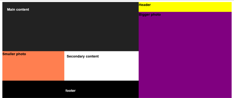
In that demo, to create the basic grid for the entire page at full size, I turned my container div into a grid container and then divided it up into columns and rows:
.container { display: grid; grid-template-columns: 1fr 1.2fr 1.5fr; grid-template-rows: 1fr 4fr 3fr 2fr; } The fr unit is a new flexible unit of measurement introduced with CSS Grid Layout. The fr part is short for fractional, as it represents a fraction of the available space in the grid container. Using fr rather than a fixed unit like px, means letting the browser work out the math needed to create the layout, which I think is preferable in most cases.
Once the grid is ready, it’s time to go ahead and place the child elements inside it. There are a few different ways to do this. In the demo above, I used grid line numbers and the grid-area property, which does the job in one line of code. For example, here’s the code to lay out my main content:
.main { /* row start, row end, col start col end */ grid-area: 1 / 1 / 3 / 3; } Once all the sections are in place within the grid, here’s what it looks like:
For more details and handy cheat sheets, check out the links below:
- SitePoint’s “Introducing the CSS Grid Layout” and “Creating Layouts with CSS Grid” tutorials
- Rachel Andrew’s Grid by Example
- Jen Simmons’ s Experimental Layout Lab
- CSS-Tricks’s “A Complete Guide to Grid”
- the MDN CSS Grid Layout Guide
- Wes Bos’s CSS Grid course
Grid or Flexbox: Which One Should I Go For?
Having had a taste of what both Grid and Flexbox are capable of, it’s time to go back to the original question. When is one preferable to the other?
Here’s a Twitter thread Chris Coyier launched a couple of years ago basically asking this same question:
For y'all that have an understand of both CSS grid and flexbox, what's your favorite way of explaining the difference?
— Chris Coyier (@chriscoyier) January 25, 2019
For y’all that have an understand of both CSS grid and flexbox, what’s your favorite way of explaining the difference?
As you can expect, a number of interesting answers did crop up, most of which I’ve sorted out under the headings below.
Grid for page layout and Flexbox for components
“Grid for page layout and Flexbox for components” is perhaps the most intuitive answer one could give to this question. In fact, I wouldn’t have any doubts as to which technology I’d use when coding up a whole page layout. You can do page layouts with Flexbox — and indeed, that’s what most of us did before Grid entered the scene. But creating a grid with flexbox has never felt really “flexy” and has never come without a few headaches. Grid, on the other hand, was simply born for this. However, the question remains: was it born just for this?
It turns out that Grid is also great when creating components to be placed inside the macro, page-level sections. For example, in the demo below, the form is a grid container and its elements have been laid out using CSS Grid properties.
See the Pen form-with-css-grid by SitePoint (@SitePoint)
on CodePen.
Despite the fact that the Email and the Password labels are of different lengths, the form fields line up perfectly, both horizontally and vertically. And this is the magic of Grid: it lays out web element both horizontally and vertically, by default, be it page-level elements or component-level elements. This specificity that Grid possesses is a powerful factor in deciding when to use Flexbox or Grid.
Continue reading Flexbox or Grid? Key Strategies for Choosing the Best Option on SitePoint.