I love shapes, especially colorful ones! Shapes on websites are in the same category of helpfulness as background colors, images, banners, section separators, artwork, and many more: they can help us understand context and inform our actions through affordances.
A few months back, I built an application to engage my 7-year old daughter with mathematics. Apart from basic addition and subtraction, my aim was to present questions using shapes. That’s when I got familiar with the CSS clip-path property, a reliable way to make shapes on the web. Then, I ended up building another app called, TryShape using the power of clip-path.
I’ll walk you through the story behind TryShape and how it helps create, manage, share, and export shapes. We’ll cover a lot about CSS clip-path along the way and how it helped me quickly build the app.
Here are a few important links:
First, the CSS clip-path property and shapes
Table of Contents
Imagine you have a plain piece of paper and a pencil to draw a shape (say, a square) on it. How will you proceed? Most likely, you will start from a point, then draw a line to reach another point, then repeat it exact three more times to come back to the initial point. You also have to make sure you have opposite lines parallel and of the same length.
So, the essential ingredients for a shape are points, lines, directions, curves, angles, and lengths, among many others. The CSS clip-path helps specify many of these properties to clip a region of an HTML element to show a specific region. The part that is inside the clipped region is shown, and the rest is hidden. It gives an ocean of opportunities to developers to create various shapes using clip-path property.
Learn more about clipping and how it is different from masking.
The clip-path values for shape creation
The clip-path property accepts the following values for creating shapes:
circle()ellipse()inset()polygon()- A clip source using
url()function path()
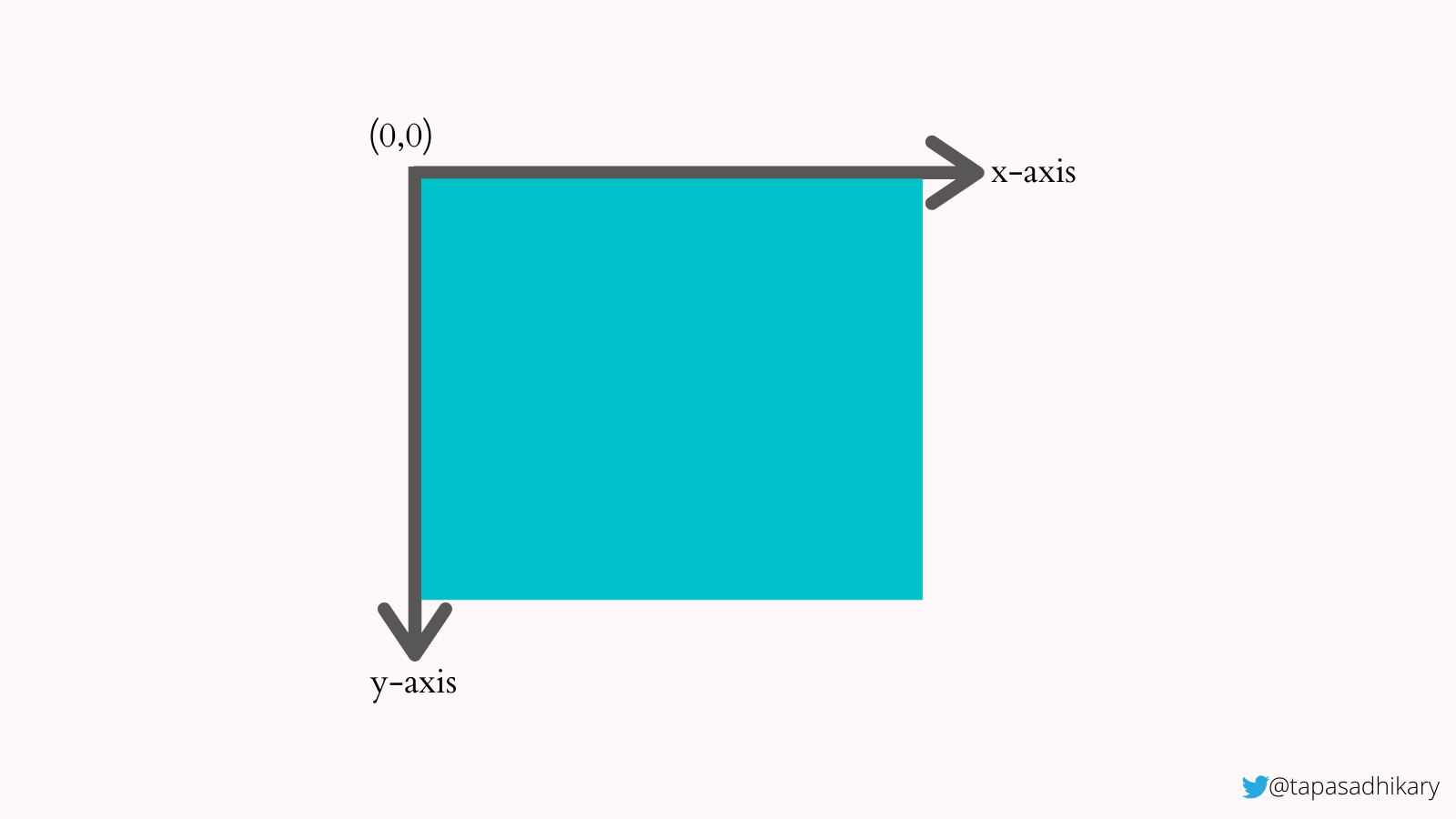
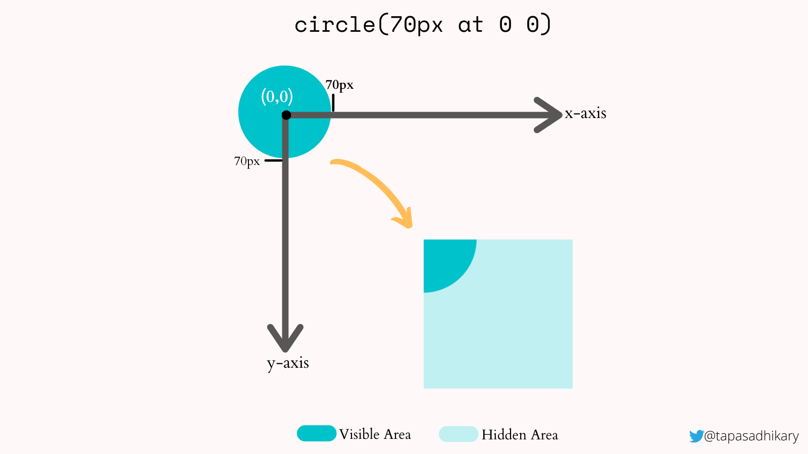
We need to understand the basic coordinate system a bit to use these values. When applying the clip-path property on an element to create shapes, we must consider the x-axis, y-axis, and the initial coordinates (0,0) at the element’s top-left corner.
Here is a div element with its x-axis, y-axis, and initial coordinates (0,0).
Now let’s use the circle() value to create a circular shape. We can specify the position and radius of the circle using this value. For example, to clip a circular shape at the coordinate position (70, 70) with a radius of 70px, we can specify the clip-path property value as:
clip-path: circle(70px at 70px 70px)So, the center of the circle is placed at the coordinate (70, 70) with a 70px radius. Now, only this circular region is clipped and shown on the element. The rest of the portion of the element is hidden to create the impression of a circle shape.
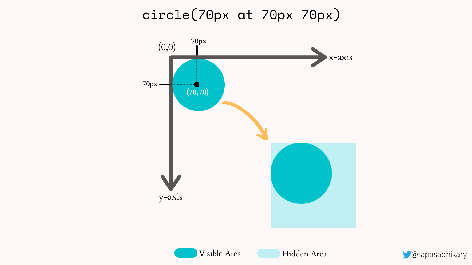
Next, what if we want to specify the position at (0,0)? In this case, the circle’s center is placed at the (0,0) position with a radius of 70px. That makes only a portion of the circle visible inside the element.
Let’s move on to use the other two essential values, inset() and polygon(). We use an inset to define a rectangular shape. We can specify the gap that each of the four edges may have to clip a region from an element. For example:
clip-path: inset(30px)The above clip-path value clips a region by leaving out the 30px values from element’s edges. We can see that in the image below. We can also specify a different inset value for each of the edges.
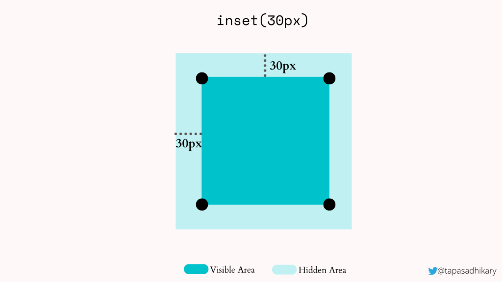
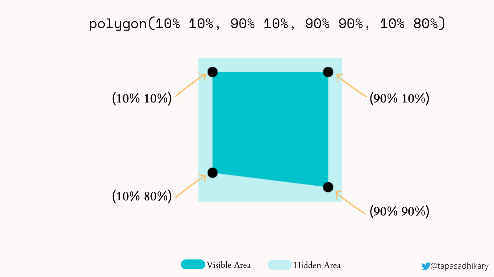
inset() function allows us to clip and area from the outside edge of a shape.Next is the polygon() value. We can create a polygonal shape using a set of vertices. Take this example:
clip-path: polygon(10% 10%, 90% 10%, 90% 90%, 10% 80%)Here we are specifying a set of vertices to create a region for clipping. The image below shows the position of each vertex to create a polygonal shape. We can specify as many vertices as we want.
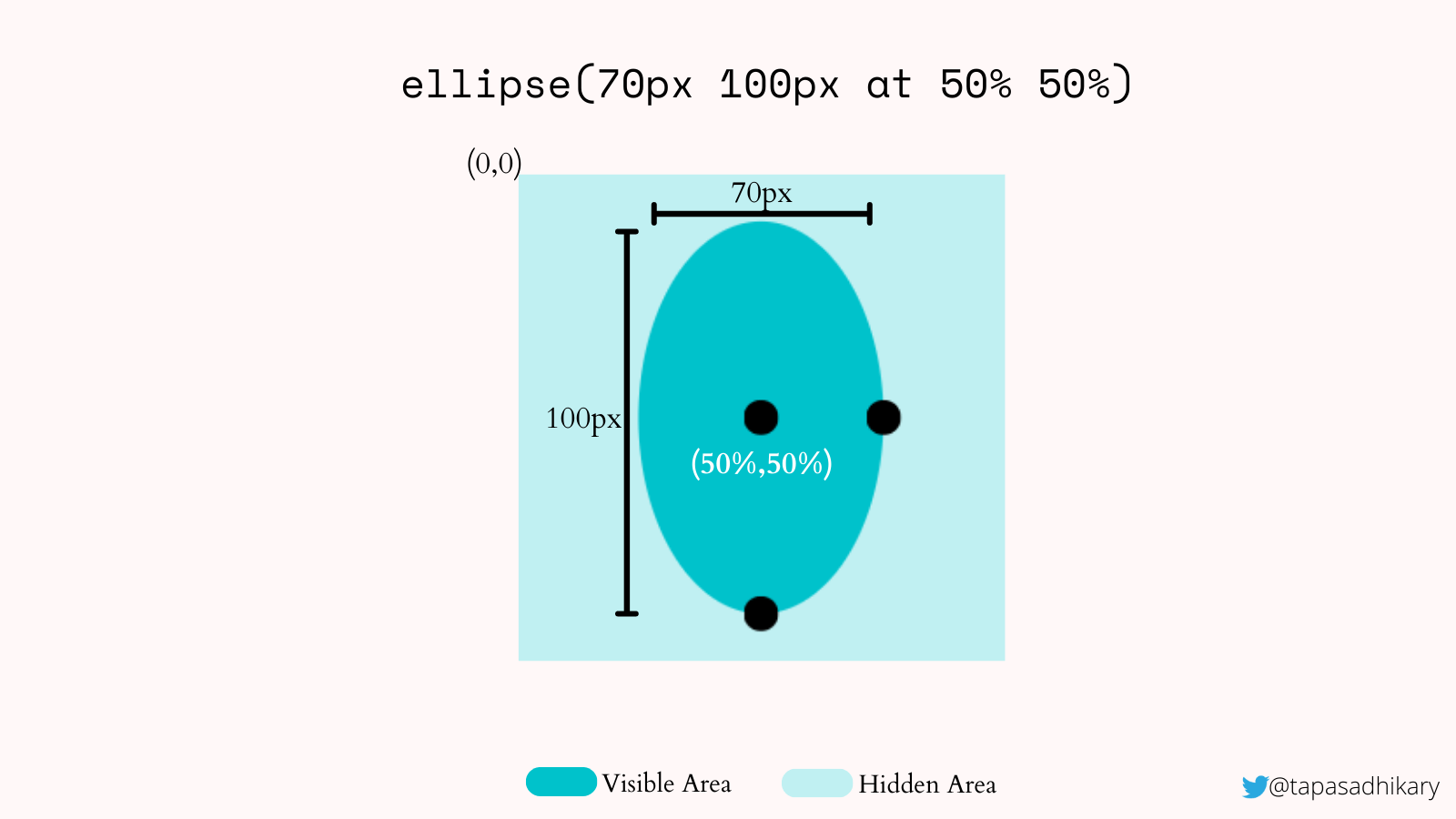
Next, let’s take a look at the ellipse() and the url() values. The ellipse() value helps create shapes by specifying two radii values and a position. In the image below, we see an ellipse at the position where the radii is at (50%,50%) and the shape is 70px wide and 100px tall.
url() is a CSS function to specify the clip-path element’s ID value to render an SVG shape. Please take a look at the image below. We have defined a SVG shape using clipPath and path elements. You can use the ID value of the clipPath element as an argument to the url() function to render this shape.
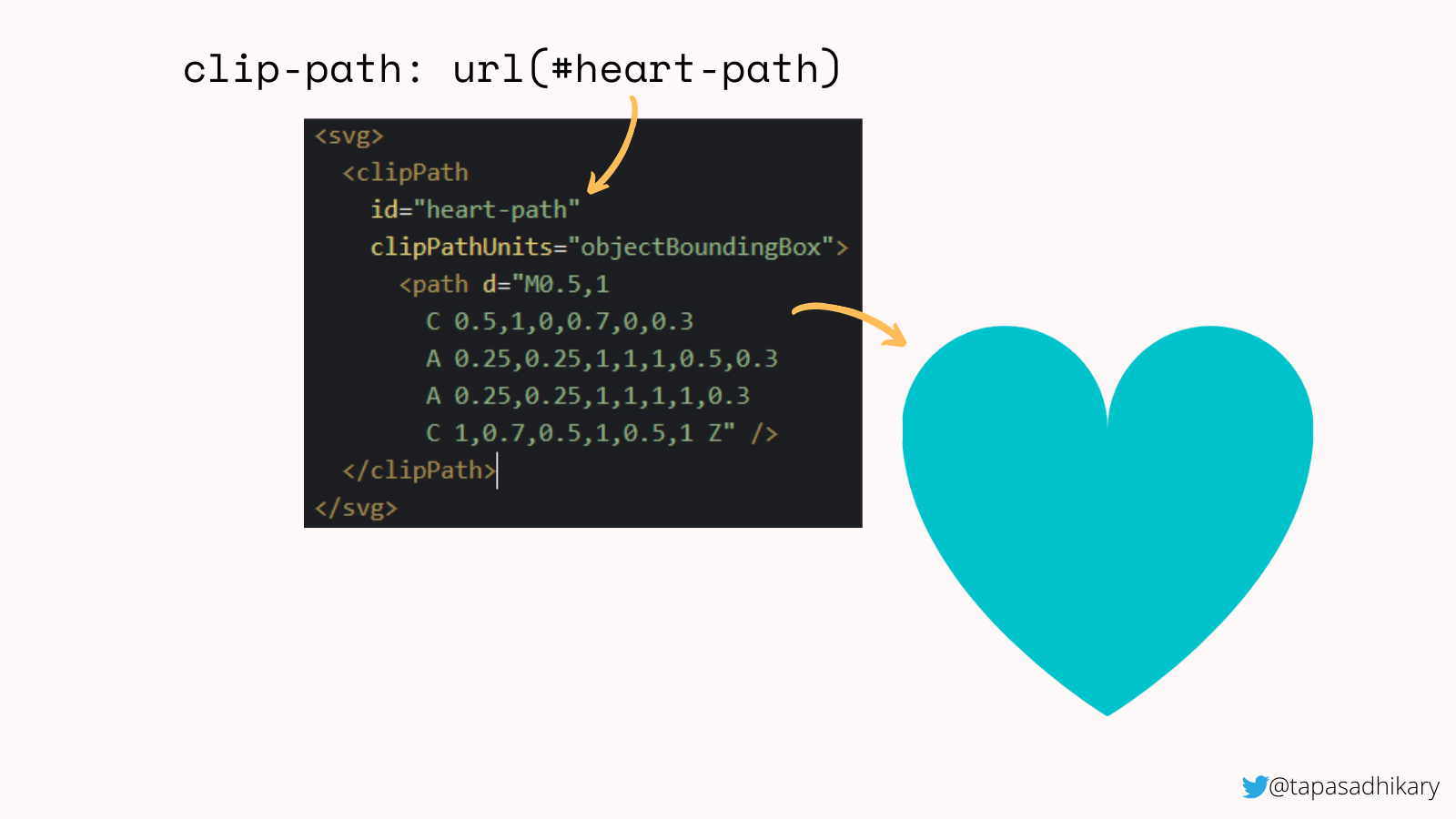
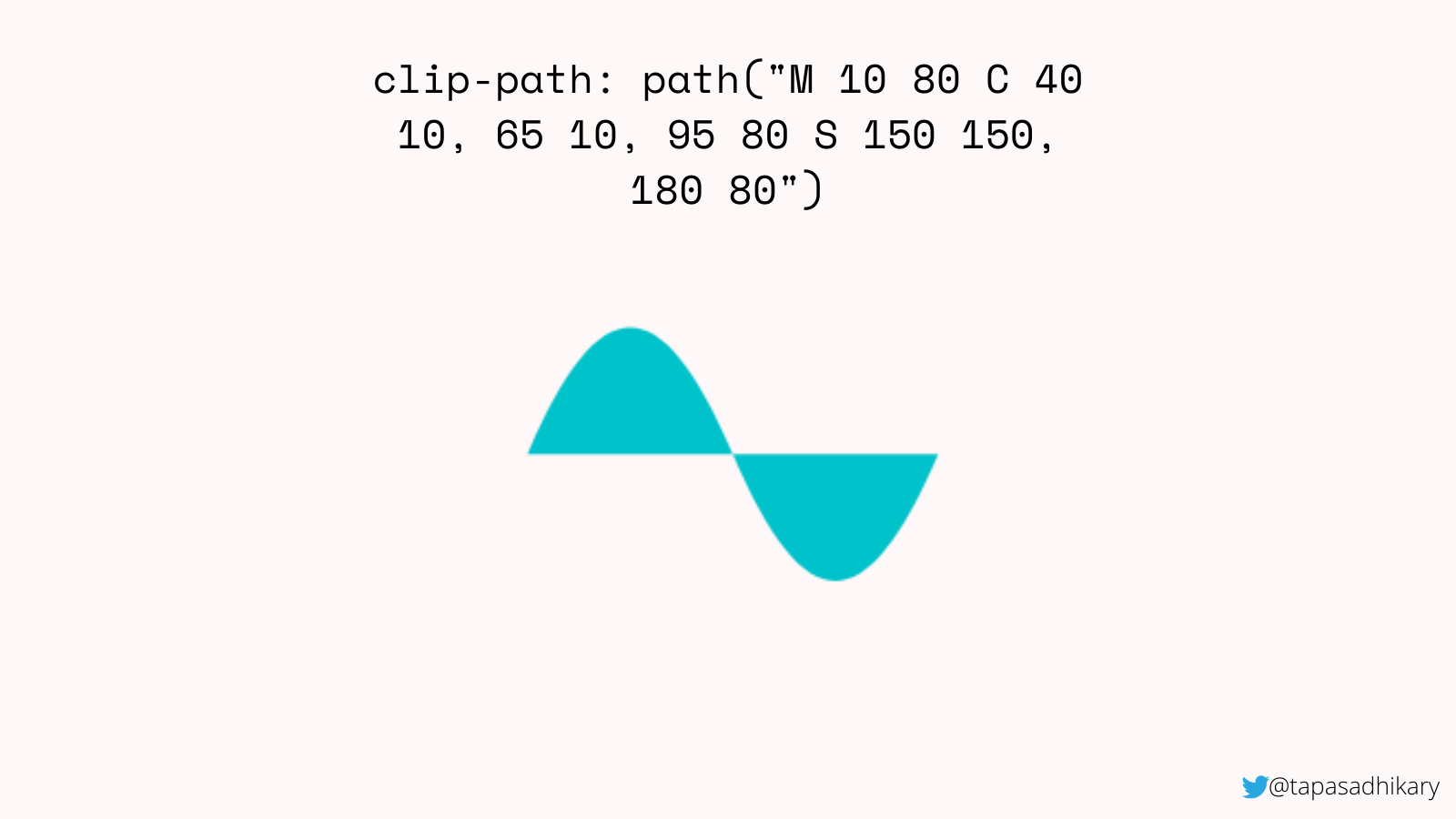
url() functionAdditionally, we can use the path values directly in the path() function to draw the shape.
Alright. I hope you have got an understanding of different clip-path property values. With this understanding, let’s take a loot at some implementations and play around with them. Here is a Pen for you. Please use it to try adding, modifying values to create a new shape.
Let’s talk about TryShape
It’s time to talk about TryShape and its background story. TryShape is an open-source application that helps create, export, share, and use any shapes of your choice. You can create banners, circles, arts, polygons and export them as SVG, PNG, and JPEG files. You can also create a CSS code snippet to copy and use in your application.
TryShape is built using the following framework and libraries (and clip-path, of course):
- CSS clip-path: We’ve already discussed the power of this awesome CSS property.
- Next.js: The coolest React-based framework around. It helped me create pages, components, interactions, and APIs to connect to the back-end database.
- HarperDB: A flexible database to store data and query them using both SQL and No-SQL interactions. TryShape has its schema and tables created in the HarperDB cloud. The Next.js APIs interact with the schema and tables to perform required CRUD operations from the user interface.
- Firebase: Authentication services from Google. TryShape uses it to get the social login working using Google, GitHub, Twitter, and other accounts.
- react-icons: One shop for all the icons for a React-based application
- date-fns: The modern, lightweight library for date formatting
- axios: Making the API calls easy from the React components
- styled-components: A structured way to create CSS rules from react components
- react-clip-path: A homegrown module to handle
clip-pathproperty in a React app - react-draggable: Make an HTML element draggable in a React app. TryShape uses it to adjust the position of shape vertices.
- downloadjs: Trigger a download from JavaScript
- html-to-image: Converts an HTML element to image (including SVG, JPEG, and PNG)
- Vercel: Best for hosting a Next.js app
Creating shapes in TryShape using CSS clip-path
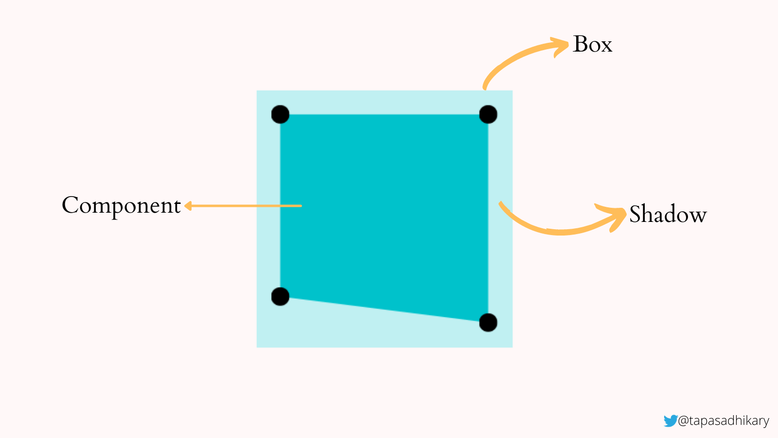
Let me highlight the source code that helps create a shape using the CSS clip-path property. The code snippet below defines the user interface structure for a container element (Box) that’s 300px square. The Box element has two child elements, Shadow and Component.
<Box height="300px" width="300px" onClick={(e) => props.handleChange(e)}> { props.shapeInformation.showShadow && <Shadow backgroundColor={props.shapeInformation.backgroundColor} id="shapeShadow" /> } <Component formula={props.shapeInformation.formula} backgroundColor={props.shapeInformation.backgroundColor} id="clippedShape" />
</Box>
The Shadow component defines the area that is hidden by the clip-path clipping. We create it to show a light color background to make this area partially visible to the end user. The Component is to assign the clip-path value to show the clipped area.
See the styled-component definitions of Box, Shadow, and Component below:
// The styled-components code to create the UI components using CSS properties // The container div
const Box = styled.div` width: ${props => props.width || '100px'}; height: ${props => props.height || '100px'}; margin: 0 auto; position: relative;
`; // Shadow defines the area that is hidden by the `clip-path` clipping
// We show a light color background to make this area partially visible.
const Shadow = styled.div` background-color: ${props => props.backgroundColor || '#00c4ff'}; opacity: 0.25; position: absolute; top: 10px; left: 10px; right: 10px; bottom: 10px;
`; // The actual component that takes the `clip-path` value (formula) and set
// to the `clip-path` property.
const Component = styled.div` clip-path: ${props => props.formula}; // the formula is the clip-path value background-color: ${props => props.backgroundColor || '#00c4ff'}; position: absolute; top: 10px; left: 10px; right: 10px; bottom: 10px;
`;
Please feel free to look into the entire codebase in the GitHub repo.
The future scope of TryShape
TryShape works well with the creation and management of basic shapes using CSS clip-path in the background. It is helpful to export the shapes and the CSS code snippets to use in your web applications. It has the potential to grow with many more valuable features. The primary one will be the ability to create shapes with curvy edges.
To support the curvy shapes, we need the support of the following values in TryShape:
- a clip source using
url()and path().
With the help of these values, we can create shapes using SVG and then use one of the above values. Here is an example of the url() CSS function to create a shape using the SVG support.
<div class="heart">Heart</div>
<svg> <clipPath id="heart-path" clipPathUnits="objectBoundingBox"> <path d="M0.5,1 C 0.5,1,0,0.7,0,0.3 A 0.25,0.25,1,1,1,0.5,0.3 A 0.25,0.25,1,1,1,1,0.3 C 1,0.7,0.5,1,0.5,1 Z" /> </clipPath>
</svg>
Then, the CSS::
.heart { clip-path: url(#heart-path);
}
Now, let’s create a shape using the path() value. The HTML should have an element like a div:
<div class="curve">Curve</div>In CSS:
.curve { clip-path: path("M 10 80 C 40 10, 65 10, 95 80 S 150 150, 180 80");
}
Before we end…
I hope you enjoyed meeting my TryShape app and learning about the idea that leads to it, the strategies I considered, the technology under the hood, and its future potential. Please consider trying it and looking through the source code. And, of course, feel free to contribute to it with issues, feature requests, and code.
Before we end, I want to leave you with this short video prepared for the Hashnode hackathon where TryShape was an entry and finally in the list of winners. I hope you enjoy it.
[embedded content]
Let’s connect. You can @ me on Twitter (@tapasadhikary) with comments, or feel free to follow.


