You might already know about the CSS gap property. It isn’t exactly new, but it did gain an important new ability last year: it now works in Flexbox in addition to CSS Grid. That, and the fact that I believe the property is more complicated than it appears, made me want to go back and explain exactly how it works.
Let’s take a proper look at gap and its associated properties, and understand how and where they work.
All the gap properties
Table of Contents
To start us off, let’s review all of the CSS properties related to gap. There are six in total:
grid-row-gapgrid-column-gapgrid-gaprow-gapcolumn-gapgap
From this list, we can already ignore the first three properties. The grid-* properties were added early when CSS Grid’s specifications were being drafted, and later deprecated when gap became more generalized. Browsers still support these deprecated grid-* properties (as of this writing) and merely treat them as if the grid- prefix is not present. Hence, grid-gap is the same as gap, grid-column-gap is the same as column-gap and grid-row-gap is the same as row-gap.
As for the other three properties, knowing that gap is a shorthand that lets you specify the other two properties, we really only need to know what row-gap and column-gap do.
Our understanding of these properties depends on the type of CSS layout we’re using. Let’s look at those options first.
Where can gaps be used?
If you’re like me, you’ve used gaps in grid layouts, but they can now be used in Flexbox, as well as multi-column layouts. Let’s go over each case.
Grid gaps
All browsers support gaps in grid layouts, and they’re quite simple to understand in this context.
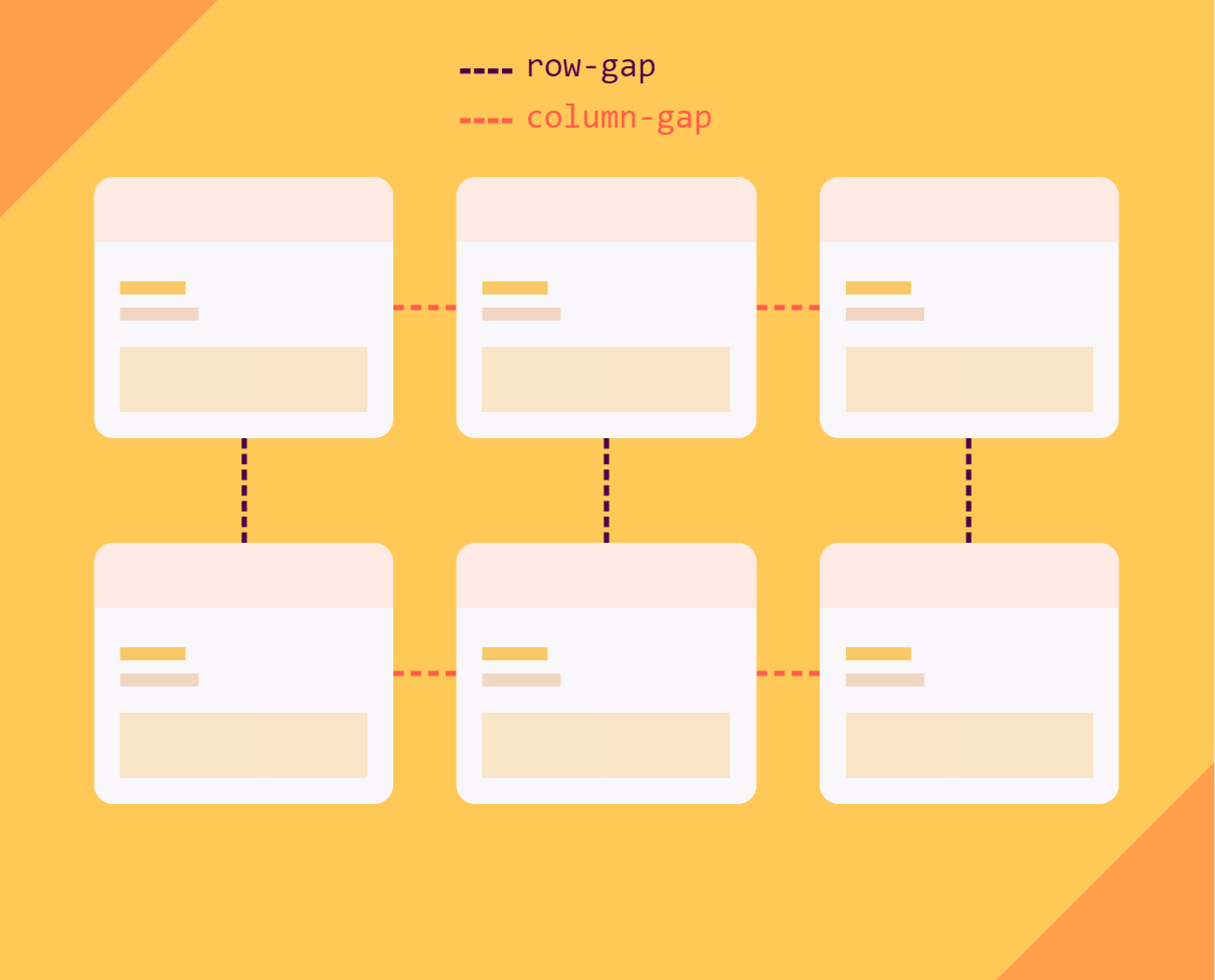
row-gapintroduces space between row trackscolumn-gapintroduces space between column tracks
Let’s create a grid with three columns and two rows:
.container { display: grid; grid-template-columns: 200px 100px 300px; grid-template-rows: 100px 100px;
}
This gives us the following grid:
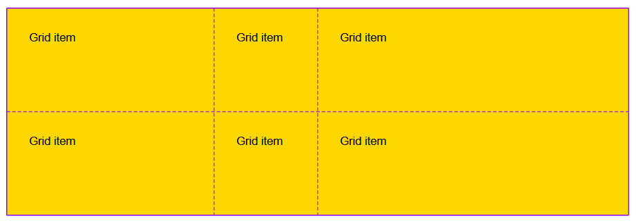
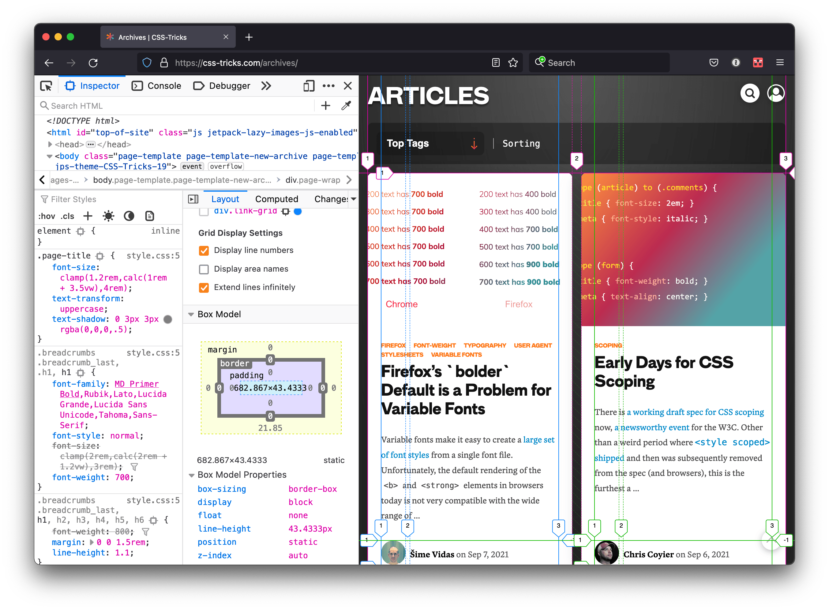
The lines in the picture above are called grid lines, and they separate the tracks (rows and columns) of the grid. These lines don’t really exist in the grid — they’re invisible, have no thickness, and are typically what DevTools displays when we enable the grid inspector (in Safari, Firefox, Edge or Chrome).
If we do, however, start adding gaps to our grid, it will work as though these lines start acquiring thickness.
Let’s add a 20px gap:
.container { display: grid; grid-template-columns: 200px 100px 300px; grid-template-rows: 100px 100px; gap: 20px;
}
The lines between our tracks are now 20px thick and therefore push grid items further apart.
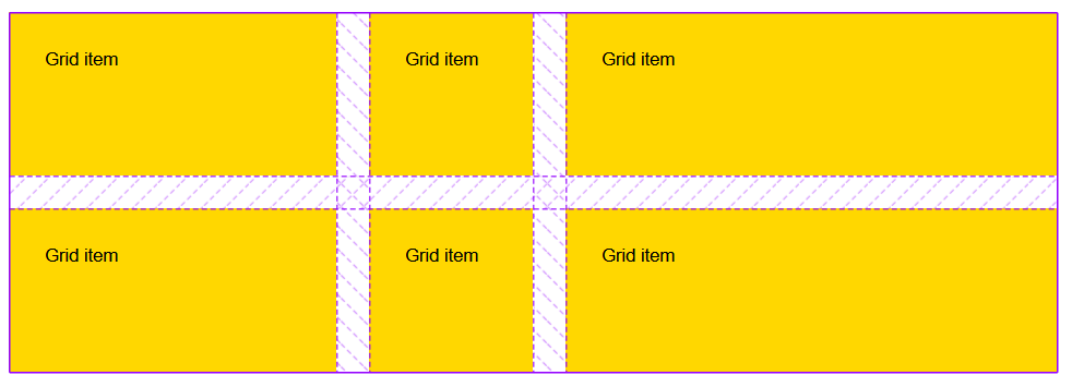
It’s worth noting that the tracks still have the same sizes (defined by the grid-template-* properties); therefore, the grid is wider and taller than it was without gaps.
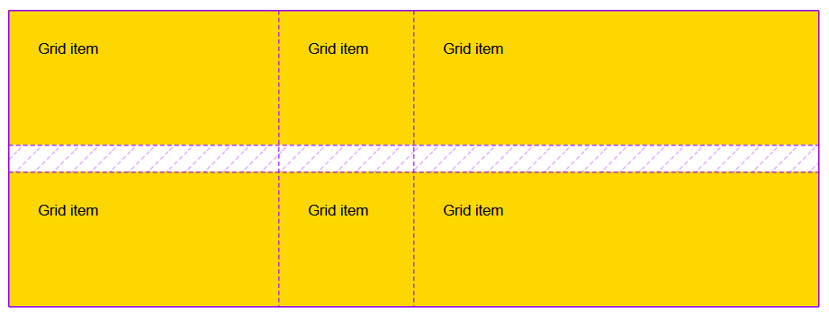
In grid, row-gap always applies between row tracks. So, if we replace gap with row-gap in the above example, we get this:
And column-gap always applies between column tracks, so replacing gap with column-gap produces the following result:

Grid is simple because, by default, columns are vertical, and rows are horizontal, just like in a table. So it’s easy to remember where column-gap and row-gap apply.
Now, things do get a little more complicated when writing-mode is used. The default writing mode on the web is horizontal, from left to right, but there are vertical writing modes as well, and when that happens, columns become horizontal and rows are vertical. Always pay attention to writing-mode as it can make it less intuitive than it usually is.
This is a good transition into the next section as columns and rows get new meanings within Flexbox.
Flexbox gaps
Let’s talk about gaps in Flexbox layouts, where things get a little more complicated. We’ll use the following example:
.container { display: flex;
}
By default, this gives us a row flex container, which means items within the container are stacked from left to right on the same horizontal line.

In this case, column-gap is applied between items and row-gap does nothing. That’s because there is only one line (or row). But now let’s add some gap between items:
.container { display: flex; column-gap: 10px;
}
Now let’s switch the flex-direction of our container to column, which stacks items vertically, from top to bottom, with the following code:
.container { display: flex; flex-direction: column; column-gap: 10px;
}
Here is what happens:
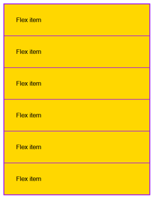
The gap disappeared. Even if column-gap did add space between items when the container was in a row direction, it does not work anymore in the column direction.
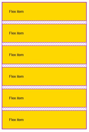
We need to use row-gap to get it back. Alternatively, we could use the gap shorthand with one value, which would apply the same gap in both directions and, therefore, work in both cases.
.container { display: flex; flex-direction: column; gap: 10px;
}
So, to summarize, colum-gap always works vertically (assuming the default writing-mode), and row-gap always works horizontally. This does not depend on the direction of the flex container.
But now take a look at an example where line wrapping is involved:
.container { display: flex; flex-wrap: wrap; column-gap: 40px; row-gap: 10px; justify-content: center;
}
Here, we’re allowing items to wrap on multiple lines with flex-wrap: wrap if there isn’t enough space to fit everything in a single line.
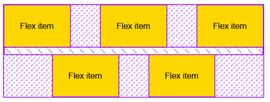
In this case, the column-gap is still applied vertically between items, and row-gap is applied horizontally between the two flex lines.
There’s one interesting difference between this and grid. The column gaps don’t necessarily align across flex lines. That’s because of justify-content: center, which centers items within their flex lines. This way, we can see that each flex line is a separate layout where gaps apply independently of other lines.
Multi-column gaps
Multi-column is a type of layout that makes it very easy to automatically flow content between several columns, like what you might expect in a traditional newspaper article. We set a number of columns and set the size for each column.

Gaps in multi-column layouts don’t quite work the same as grid or Flexbox. There are three notable differences:
row-gaphas no effect,column-gaphas a non-0 default value,- and gaps can be styled.
Let’s break those down. First of all, row-gap has no effect. In multi-column layouts, there aren’t any rows to separate. That means only column-gap is relevant (as is the gap shorthand).
Secondly, unlike in grid and Flexbox, column-gap has a default value of 1em in multi-column layouts (as opposed to 0). So, even when no gap is specified at all, the columns of content are still visually separated. The default gap can, of course, be overridden but it’s a good default to have.
Here is the code that the example is based on:
.container { column-count: 3; padding: 1em;
}
Finally, we can style the empty gap between columns in a multi-column layout. We use the column-rule property which works like border:
.container { column-count: 3; column-gap: 12px; column-rule: 4px solid red; padding: 12px;
}
column-rule property gives us some styling affordance in a multi-column layout.Browser support
gap is really well-supported across the board. There’s more information over at caniuse, but to summarize:
- Flexbox:
gapis supported everywhere except for Internet Explorer (which is on its way out), Opera Mini and UC Browser for Android. caniuse has global support at 87.31%. - Grid: Same thing, but we’re looking at 93.79% global support.
- Multi-column: Same thing, too, but it’s unsupported in Safari and has 75.59% global support.
So, overall, the gap property is well supported and, in most cases, workarounds are unnecessary.
Styling the gap in flex and grid
Styling gap in Flexbox and CSS Grid would be really useful. The sad news is that it isn’t supported anywhere today. But the good news is that it could be in the near future. This has been discussed over at the CSS working group and is in the works in Firefox. Once we have a working implementation in Firefox along with the spec proposal, perhaps it will drive implementation in other browsers.
In the meantime, there are ways around this.
One is to give the grid container a background color, then a different color for the items, and finally a gap to make the container color show through.
While this works, it means we’re unable to use gaps to introduce space between items. The gap here acts as a border width instead. So, to visually separate the items out a bit more, we need to use padding or margin on the items, which isn’t as great… as we’ll see in the next section.
Can’t I just use margin or padding?
Yes, in most cases we can also use margin (and/or padding) to add visual space between elements of a layout. But gap comes with multiple advantages.
First, gaps are defined at the container level. This means we define them once for the entire layout and they are applied consistently within it. Using margins would require a declaration on each and every item. This can get complicated when items are different in nature, or come from different reusable components.
On top of this, gaps do the right thing by default with just one line of code. For example, if we’re trying to introduce some space in between flex items, not around them, margin would require special cases to remove extra margins before the first item and after the last one. With gaps, we don’t need to do this.
With a margin: 0 20px on each flex item, we’d end up with:

However with a gap: 40px on the container, we’d get this:

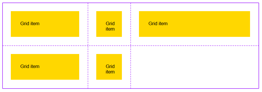
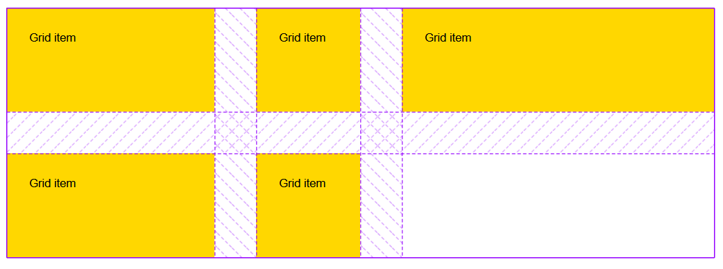
Similarly in grid layout, defining gap at the container level is much simpler and provides better results than having to define a margin on each item and accounting for the margin that applies on the edge of the grid.
With margin: 20px on each grid item:
And with gap: 40px on the grid container instead:
Empty space adds up
With everything said up to this point, margin and gap don’t have to be exclusive. In fact, there are many ways to spread items of a layout further apart, and they all can work together very well.
The gap property is just one part of the empty space created between boxes in a layout container. margin, padding, and alignment all may increase the empty space on top of what gap already defines.
Let’s consider an example where we build a simple flex layout with a given width, some gap, some distribution of content (using justify-content), and some margin and padding:
.container { display: flex; gap: 40px; width: 900px; justify-content: space-around;
}
.item { padding: 20px; margin: 0 20px;
}
Let’s assume this code produces the following result:

Now, let’s see exactly how the empty space between items got created:

As we see, there are four different types of empty space between two consecutive flex items:
- Between two consecutive items, the gap defines the minimum space between these items. There can be more, like in this case, but there can never be less space.
- Margin pushes items even further apart, but unlike
gap, it adds space both sides of all items. - Padding provides some space inside each item.
- Finally, and only because there is enough remaining space, content distribution kicks in and distributes the items evenly within the flex line, according to the
space-aroundvalue.
Debugging gaps
Let’s conclude with a topic that’s very near and dear to my heart: DevTools support for debugging gaps. There can always be cases where things go wrong, and knowing that DevTools has got our backs is very comforting, but we do need to know which tools can help us in this case.
For gap, I can think of two very specific features that might become useful.
Is my gap active?
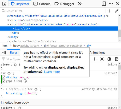
Unless we misspelled gap or provided an invalid value, the property is always going to apply to the page. For example, this is correct:
.some-class { display: block; gap: 3em;
}
It won’t do anything, but it is valid CSS and the browser doesn’t mind that gap doesn’t apply to block layouts. However, Firefox has a feature called Inactive CSS that does just this: it cares about valid CSS that’s applied to things that make sense. In this case, Firefox DevTools displays a warning in the Inspector.
Where is my gap?
Chrome and Microsoft Edge also have a very useful feature for debugging gaps. It was added through a collaboration between Microsoft and Google that was aimed at building layout debugging tools in Chromium (the open source project that powers both of the browsers, as well as others). In these browsers, you can hover over individual properties in the Styles panel, and see their effect on the page.
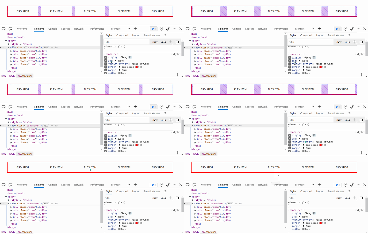
gap and the justify-content properties in the Styles panel, and the corresponding areas of the page light up to indicate where these properties have effect.
margin and padding properties, which highlights the corresponding box model areas of the page.And that’s it. I hope this article was useful in helping understand some of the details of how gaps work in CSS.


