Container queries are going to solve this long-standing issue in web design where we want to make design choices based on the size of an element (the container) rather than the size of the entire page. So, if a container is 600px wide, perhaps it has a row-like design, but any narrower than that it has a column-like design, and we’ll have that kind of control. That’s much different than transitioning between layouts based on screen size.
We can already size some things based on the size of an element, thanks to the % unit. For example, all these containers are 50% as wide as their parent container.

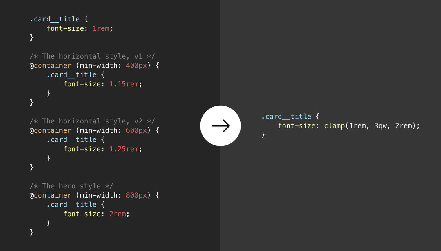
The % here is 1-to-1 with the property in use, so width is a % of width. Likewise, I could use % for font-size, but it will be a % of the parent container’s font-size. There is nothing that lets me cross properties and set the font-size as a % of a container’s width.
That is, unless we get container units! Here’s the table of units per the draft spec:
| unit | relative to |
|---|---|
qw |
1% of a query container’s width |
qh |
1% of a query container’s height |
qi |
1% of a query container’s inline size |
qb |
1% of a query container’s block size |
qmin |
The smaller value of qi or qb |
qmax |
The larger value of qi or qb |
With these, I could easily set the font-size to a percentage of the parent container’s width. Or line-height! Or gap! Or margin! Or whatever!
Miriam notes that we can actually play with these units right now in Chrome Canary, as long as the container queries flag is on.
I had a quick play too. I’ll just put a video here as that’ll be easier to see in these super early days.
And some great exploratory work from Scott here as well:
Ahmad Shadeed is also all over this!
Query units can save us effort and time when dealing with things like
font-size,padding, andmarginwithin a component. Instead of manually increasing the font size, we can use query units instead.Ahmad Shadeed, “CSS Container Query Units”
Maybe container queries and container units will drop for real at the same time. ????