In this tutorial, we’ll be building a React Calculator app. You’ll learn how to make a wireframe, design a layout, create components, update states, and format the output.
To get you inspired, here’s a link to the deployed project we’ll be building.
Also, here’s the source code, just for reference if you need help in any stage of the project.
Planning
Table of Contents
Since we’ll be building a Calculator app, let’s pick a scope that’s not too complicated for learning but also not too basic for covering different aspects of creating an app.
The features we’ll implement include:
- add, subtract, multiply, divide
- support decimal values
- calculate percentages
- invert values
- reset functionality
- format larger numbers
- output resize based on length
To start off, we’ll draw a basic wireframe to display our ideas. For this, you can use free tools like Figma or Diagrams.net.
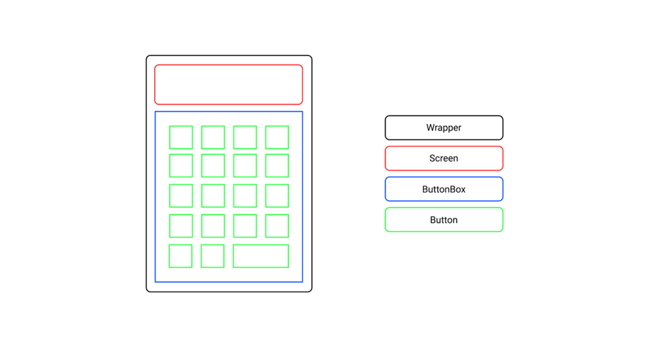
Note that, in this phase, it’s not that important to think about colors and styling. What matter most is that you can structure the layout and identify the components involved.
Design Colors
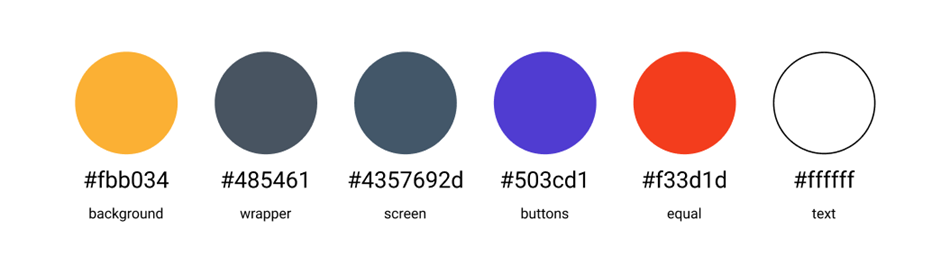
Once we’ve dealt with the layout and the components, all that will be left to do to complete the design is to pick a nice color scheme.
Below are some guidelines for making the app look great:
- the wrapper should contrast with the background
- the screen and button values should be easy to read
- the equals button should in a different color, to give some accent
Based on the criteria above, we’ll use the color scheme shown below.
Setting Up the Project
To start, open the terminal in your projects folder and create a boilerplate template using the create-react-app. To do that, run the command:
npx create-react-app calculator That’s the fastest and easiest way to set up a fully working React app with zero config. All you need to do after that is run cd calculator to switch to the newly created project folder and npm start to start your app in the browser.
As you can see, it comes with some default boilerplate, so next we’ll do some cleaning up in the project folder tree.
Find the src folder, where the logic of your app will live, and remove everything except App.js to create your app, index.css to style your app, and index.js to render your app in the DOM.
Create Components
Since we’ve already done some wireframing, we already know the main building blocks of the application. Those are Wrapper, Screen, ButtonBox, and Button.
First create a components folder inside the src folder. We’ll then create a separate .js file and .css file for each component.
If you don’t want to create those folders and files manually, you can use the following one-liner to get things set up quickly:
cd src && mkdir components && cd components && touch Wrapper.js Wrapper.css Screen.js Screen.css ButtonBox.js ButtonBox.css Button.js Button.css Wrapper
The Wrapper component will be the frame, holding all the children components in place. It will also allow us to center the whole app afterward.
Wrapper.js
import "./Wrapper.css"; const Wrapper = ({ children }) => { return <div className="wrapper">{children}</div>; }; export default Wrapper; Wrapper.css
.wrapper { width: 340px; height: 540px; padding: 10px; border-radius: 10px; background-color: #485461; background-image: linear-gradient(315deg, #485461 0%, #28313b 74%); } Screen
The Screen component will be the top section child of the Wrapper component, and its purpose will be to display the calculated values.
In the features list, we included display output resize on length, meaning longer values must shrink in size. We’ll use a small (3.4kb gzip) library called react-textfit for that.
To install it, run npm i react-textfit and then import and use it like shown below.
Screen.js
import { Textfit } from "react-textfit"; import "./Screen.css"; const Screen = ({ value }) => { return ( <Textfit className="screen" mode="single" max={70}> {value} </Textfit> ); }; export default Screen; Screen.css
.screen { height: 100px; width: 100%; margin-bottom: 10px; padding: 0 10px; background-color: #4357692d; border-radius: 10px; display: flex; align-items: center; justify-content: flex-end; color: white; font-weight: bold; box-sizing: border-box; } ButtonBox
The ButtonBox component, similarly to the Wrapper component, will be the frame for the children — only this time for the Button components.
ButtonBox.js
import "./ButtonBox.css"; const ButtonBox = ({ children }) => { return <div className="buttonBox">{children}</div>; }; export default ButtonBox; ButtonBox.css
.buttonBox { width: 100%; height: calc(100% - 110px); display: grid; grid-template-columns: repeat(4, 1fr); grid-template-rows: repeat(5, 1fr); grid-gap: 10px; } Button
The Button component will provide the interactivity for the app. Each component will have the value and onClick props.
In the stylesheet, we’ll also include the styles for the equal button. We’ll use Button props to access the class later on.
Button.js
import "./Button.css"; const Button = ({ className, value, onClick }) => { return ( <button className={className} onClick={onClick}> {value} </button> ); }; export default Button; Button.css
button { border: none; background-color: rgb(80, 60, 209); font-size: 24px; color: rgb(255, 255, 255); font-weight: bold; cursor: pointer; border-radius: 10px; outline: none; } button:hover { background-color: rgb(61, 43, 184); } .equals { grid-column: 3 / 5; background-color: rgb(243, 61, 29); } .equals:hover { background-color: rgb(228, 39, 15); } Render elements
The base file for rendering in React apps is index.js. Before we go further, make sure your index.js looks as follows:
import React from "react"; import ReactDOM from "react-dom"; import App from "./App"; import "./index.css"; ReactDOM.render( <React.StrictMode> <App /> </React.StrictMode>, document.getElementById("root") ); Also, let’s check index.css and make sure we reset the default values for padding and margin, pick some great font (like Montserrat in this case) and set the proper rules to center the app in the viewport:
@import url("https://fonts.googleapis.com/css2?family=Montserrat&display=swap"); * { margin: 0; padding: 0; font-family: "Montserrat", sans-serif; } body { height: 100vh; display: flex; align-items: center; justify-content: center; background-color: #fbb034; background-image: linear-gradient(315deg, #fbb034 0%, #ffdd00 74%); } Finally, let’s open the main file App.js, and import all the components we created previously:
import Wrapper from "./components/Wrapper"; import Screen from "./components/Screen"; import ButtonBox from "./components/ButtonBox"; import Button from "./components/Button"; const App = () => { return ( <Wrapper> <Screen value="0" /> <ButtonBox> <Button className="" value="0" onClick={() => { console.log("Button clicked!"); }} /> </ButtonBox> </Wrapper> ); }; export default App; In the example above we have rendered just a single Button component.
Let’s create an array representation of the data in the wireframe, so we can map through and render all the buttons in the ButtonBox:
import Wrapper from "./components/Wrapper"; import Screen from "./components/Screen"; import ButtonBox from "./components/ButtonBox"; import Button from "./components/Button"; const btnValues = [ ["C", "+-", "%", "/"], [7, 8, 9, "X"], [4, 5, 6, "-"], [1, 2, 3, "+"], [0, ".", "="], ]; const App = () => { return ( <Wrapper> <Screen value=0 /> <ButtonBox> { btnValues.flat().map((btn, i) => { return ( <Button key={i} className={btn === "=" ? "equals" : ""} value={btn} onClick={() => { console.log(`${btn} clicked!`); }} /> ); }) } </ButtonBox> </Wrapper> ); }; Check your terminal and make sure your React app is still running. If not, run npm start to start it again.
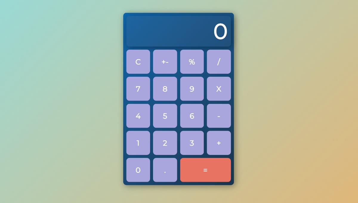
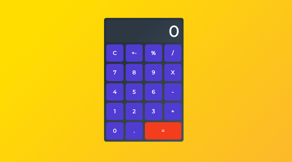
Open your browser. If you followed along, your current result should look like this:
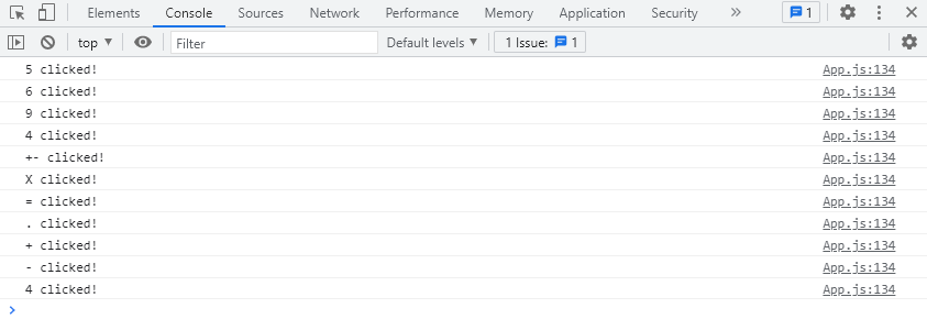
If you want, you can also open the browser’s devtools and test out the log values for each button pressed.
Define states
Next, we’ll declare the state variables using React useState hook.
Specifically, there’ll be three states: num, the entered value; sign, the selected sign: and res, the calculated value.
In order to use the useState hook, we must first import it in App.js:
import React, { useState } from "react"; In the App function, we’ll use an object to set all states at once:
import React, { useState } from "react"; // ... const App = () => { let [calc, setCalc] = useState({ sign: "", num: 0, res: 0, }); return ( // ... ); }; Continue reading React Tutorial: Build a Calculator App from Scratch on SitePoint.