In 2008, Pepsi hired the now-defunct Arnell Group to redesign its iconic red, white, and blue logo. The agency flattened and tilted Pepsi’s 3D globe to rest on its side, and replaced the bold font with lowercase, sans-serif text. The total price tag? Over a million dollars.
Seven figures may sound steep, but Pepsi is in good company. The BBC paid $1.8 million for a logo redesign back in 1997. And following a 2009 merger, the Australia and New Zealand Banking Group (ANZ) paid $15 million for a new logo and marketing campaign.
When I started Jotform in 2006, I didn’t know how to create a logo, so I bought one for $10 from an online design hub. It seemed like a great deal?—?and a good match for the product?—?until a customer alerted me that it was pulled directly from a Mac app.
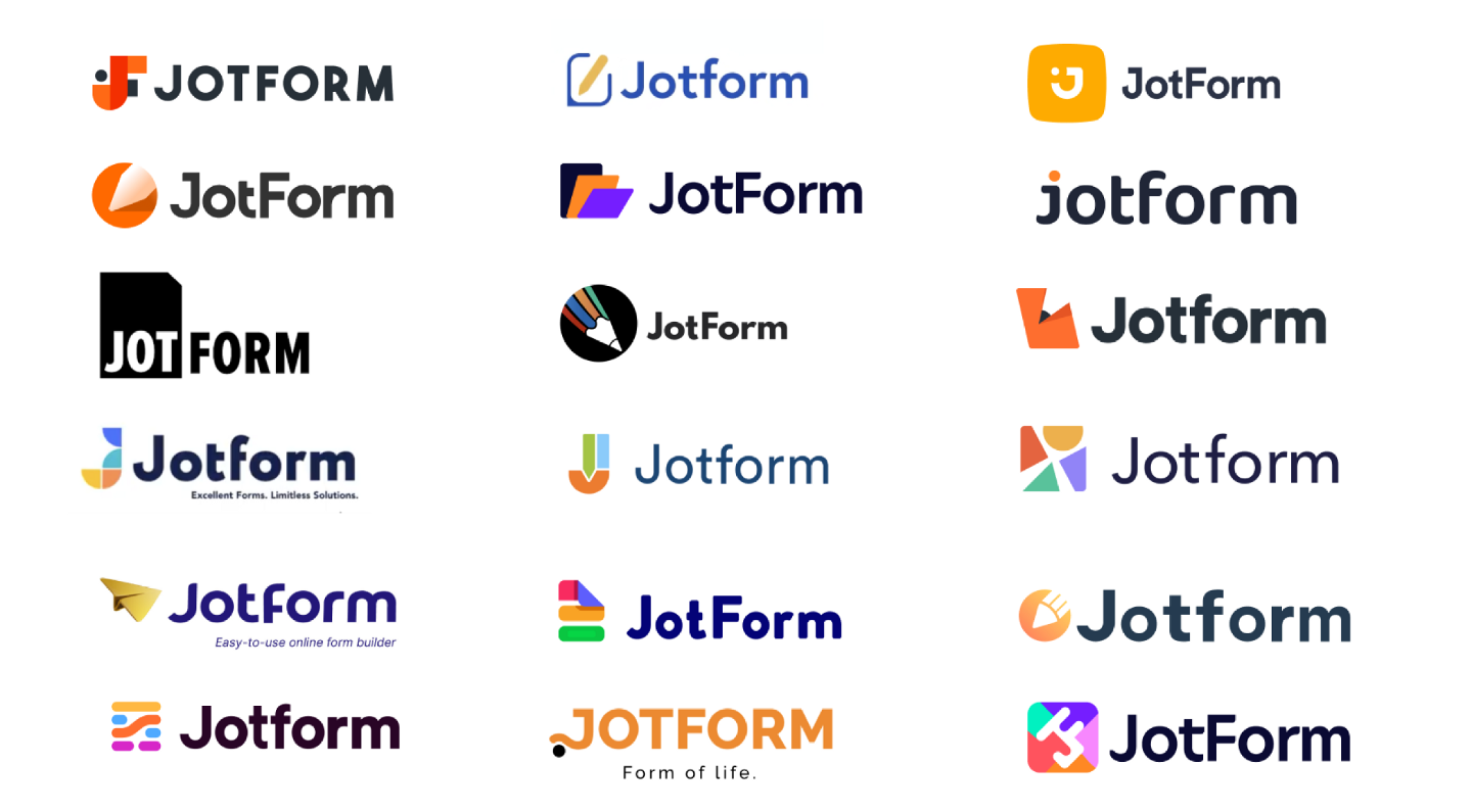
We soon commissioned a second logo, which our own designers have gently nipped and tucked over the last 15 years. After that rocky start, I learned that good branding isn’t cheap. A sharp logo and tagline can elevate your business and your reputation. But, you don’t have to engage a pricey agency to have a memorable brand. In fact, dropping major cash doesn’t guarantee you’ll create the next swoosh, bitten apple, or golden arches.
Today, we’re revealing our first rebrand in over a decade?—?and I’m proud to say it was an inside job. Our team developed a fresh identity that not only looks fantastic (in my very biased opinion), but reinforces the essence of Jotform. It also strengthened my belief that the best ideas usually come from your own smart people.
Whether you’re just starting out with a tight grip on the budget, or you simply don’t want to engage a flashy agency, I’d like to take you inside our rebranding process and share the lessons we learned along the way.
Timing is everything
Before you dive in, re-evaluate whether you actually need to polish your branding, and whether the timing is right. How do you know? Every business is different, but I advise founders to wait until the market or your customers demand it. To be clear, terrible design won’t fly. You can’t compete with a sloppy or amateurish visual identity. But if everything is fine, don’t rush into a big rebranding project.
If, however, your business has shifted or your product is starting to show its age, it might be due for a makeover. At Jotform, we’ve always been hyper-focused on continuous improvement. Clean, engaging product design has always been our top priority, but the homepage, logo, and other marketing materials had some inconsistencies. We needed to bring everything up to the same standard.
Most importantly, the company has evolved. Our previous tagline was the “easy-to-use online form builder for every business.” Today, we provide much more than just forms. We have a powerful, multi-dimensional product that’s still easy to use, but that’s not the heart of our story. The rebrand needed to fix this narrative disconnect. And after many iterations, we landed on our new tagline: “powerful forms get it done.” It perfectly encapsulates who we are and what Jotform equips people to accomplish.

Know thyself
A successful rebrand requires an intimate understanding of who you are and where you want to go. Before you move a single pixel, ensure you can clearly articulate your mission and business value. Cut the jargony, corporate-speak and keep distilling until you could share it with a stranger on the bus. This excavation process takes time, and if you’re tackling the work internally, you might be tempted to skip it?—?don’t. You’ll save time, money, and avoid spinning your wheels by completing this crucial step.
Once you’ve clarified the vision, branding can be a way to literally design your future: What do you want to highlight? How do you want people to see you? Who are your peers? We’ve always aimed to make our product clean, colorful, powerful, and bold, so those traits led the way. We also wanted to show that we’re an innovative tech company alongside boundary-pushers like Google, Airtable, and monday.com. That inspired us to ensure our logo was similarly fresh and bright.
Nurture internal talent
If your company doesn’t have strong designers and writers, you might need to seek outside help. Earmark this as a goal and develop your capacity over time. Assuming you do have the talent, make the most of this incredible asset. After all, no one knows your culture, style, and preferences like your own team.
You might also think a rebrand is too big for employees with full-time responsibilities. In my experience, they’ll be excited to tackle such a creative and potentially meaningful project?—?as long as you give them enough time and space. Don’t just tack it on top of their day-to-day work. Free them up to do the necessary research, exploration, development, and refinement.
Our lead designer has been with us since 2015. We’ve collaborated closely ever since and she knows our product inside out. That created a shorthand that was invaluable as we spent the last year (yes, a full year) developing the new brand. We also held a series of design weeks, like hack weeks, where all of our product designers created new visual options. Eventually, we realized that we couldn’t cut the pencil from our logo. It symbolizes creativity and feels like an integral part of our identity.
Our team kept refining and we finally landed where we are today: a playful, stylized pencil built from the same colorful components that represent our forms. The logo has a sense of motion and power. It’s bold and confident, yet utterly simple. It also feels alive. We’re always moving forward, and so is our brand.

Take your time
The new brand might not be perfect, but it’s right for us. We know for sure, because it took hundreds of versions and 12 months to get here. And that’s one of the best reasons to tackle your own rebrand; you can set the pace. Don’t rush it, and don’t jump to finalize the first strong option. I’ve learned that creativity needs time to breathe. Today’s winning version might look all wrong in a few weeks or months.
I also recommend that you designate the final decision-maker(s). Who has the last word? Whether it’s the founder, CEO, lead designer, or a team vote, set your parameters upfront. Full transparency can prevent confusion, frustration, or hurt feelings. As always, I leaned on our team throughout this process. We thoroughly discussed and debated each choice, but when it came down to the wire, I made the final call. Thankfully, our staff have been nothing but supportive and excited. This is their company, too.
Getting here wasn’t always easy, but cultivating our own innovation was definitely the right call. It’s a healthy way to ensure the inside of your company matches the outside. I truly love Jotform’s new brand. I hope you do, too.


