Here’s a beautiful website: it’s a type specimen for Mass-Driver’s ever-so-lovely type family MD Nichrome. There’s a ton of nifty animations and graphics explaining all the features inside…
If you’re wondering how those animations work, they’re actually styled <video> elements.
There’s lots of great graphic design touches as well, such as how the letters below trail off and fade away…
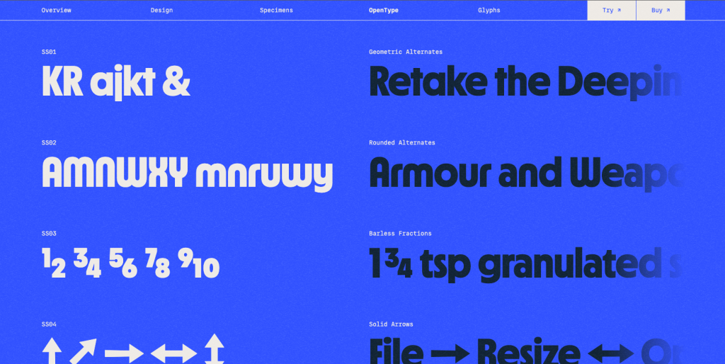
That little bit of CSS is neat. It makes sure that each <h1> stays on a single line with white-space, then sets hidden overflow on them so the heading trails off. The fading is courtesy of a linear gradient that incorporates transparency. The gradient is actually a mask-image in this case. That’s a good reminder that CSS gradients are images generated by the browser.
h1 { white-space: nowrap; overflow: hidden; -webkit-mask-image: linear-gradient(to right, black 75%, transparent);
}
In the image above you can also see how Mass-Driver is advertising the OpenType features of the font. That’s stuff like fractions or alternate letters that gives your text superpowers. By default, these sections show what the feature is, but when you hover over them they do the following:
.element { font-feature-setting: unset;
}
I don’t think I’ve ever used unset before but this is a great place to use it—show what the feature looks like up front and then when you hover show what the default is. Smart stuff.
But the part that caught my eye—besides the kick ass typography—is the background. It’s made up of two parts: a shimmery animation that makes the page look like paper, and the gradient that’s stacked on top of it. And after digging around in DevTools I realized that shimmering effect is a PNG image where the background-position property moves the picture around slightly to animate it like a GIF. It’s hard to see in pictures, so here’s a copycat demo I made with the opacity turned off to make it easier to see:
See that lovely fuzziness? It gives the background a kind of… texture… that I haven’t seen for a long time, perhaps since around 2008 when everyone was trying to make buttons look like real, analog buttons on the web. Geoff covered the same sort of technique a while back where you can get a deep dive into how it works.
The other part of the design of this website is the gradient in the background. How are those so smooth? Well, Rutherford Craze, the designer behind this ingenious bit of web design, made a thread explaining how he got this effect to work in the browser. He created a gradients tool that lets you create a similar effect:
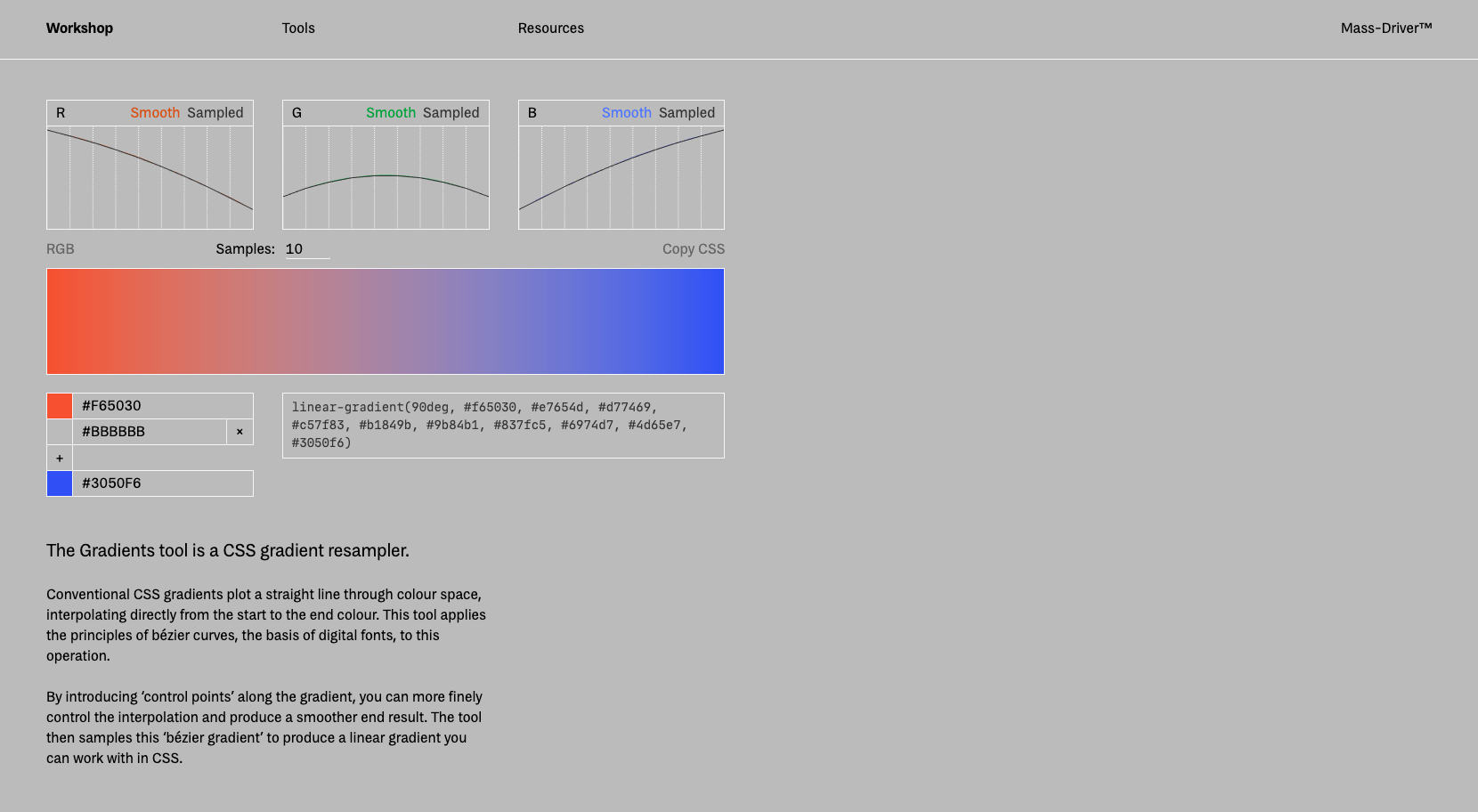
Rutherford writes:
Conventional CSS gradients plot a straight line through colour space, interpolating directly from the start to the end colour. This tool applies the principles of bézier curves, the basis of digital fonts, to this operation.
By introducing ‘control points’ along the gradient, you can more finely control the interpolation and produce a smoother end result. The tool then samples this ‘bézier gradient’ to produce a linear gradient you can work with in CSS.
What Rutherford is describing above is what’s known as the “Gray Dead Zone” of gradients, where often in a linear gradient there’s this gray color that forms in the middle.
Another small detail that I almost didn’t catch was the sticky navigation: when you first load the website you just see the logo with nothing else, but then as you scroll you’ll see the nav and it locks into place:
Notice how sticky positioning is also used later on to demonstrate the font’s glyphs.
CSS makes this sort of thing so easy. Declare sticky positioning on the element, then offset the stickiness if the element should start sticking at a certain spot.
.sticky-thing { position: sticky; top: 75px;
}
Since they want you to focus on the letters first and not all the rest of the UI, it makes a ton of sense to put the navigation off to one side, only when you need it. And this makes the overall design feel incredibly focused and straightforward, barely worth commenting on at all perhaps, but when most websites are so full of distractions then I think it’s worth celebrating quiet websites like these.

