In this article, you’ll learn how to make your website’s text dynamic and more engaging using typewriter effects in pure CSS.
The typewriter effect involves text being revealed gradually, as if it’s being typed before your eyes.
Adding typewriter effects to chunks of your text can help engage your website’s visitors and keep them interested in reading further. The typewriter effect can be used for many purposes, such as making engaging landing pages, call-to-action elements, personal websites, and code demonstrations
The Typewriter Effect Is Easy to Create
Table of Contents
The typewriter effect is easy to make, and all you’ll need in order to make sense of this tutorial is a basic knowledge of CSS and CSS animations.
Here’s the way the typewriter effect is going to work:
- The typewriter animation is going to reveal our text element by changing its width from 0 to 100%, step by step, using the CSS
steps()function. - A blink animation is going to animate the cursor that “types out” the text.
Creating the Web Page for Our Typing Effect
Let’s first create the web page for our typewriter demo. It will include a <div> container for our typewriter text with a class of typed-out:
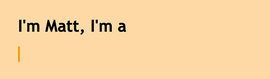
<!doctype html> <html> <head> <title>Typewriter effect</title> <style> body{ background: navajowhite; background-size: cover; font-family: 'Trebuchet MS', sans-serif; } </style> </head> <body> <div class="container"> <div class="typed-out">Web Developer</div> </div> </body> </html> Styling the Container for the Typewriter Text
Now that we have the layout of the web page, let’s style the <div> with the “typed-out” class:
.typed-out { overflow: hidden; border-right: .15em solid orange; font-size: 1.6rem; width: 0; } Note that, in order for the typewriter effect to work, we’ve added the following:
"overflow: hidden;"and a"width: 0;", to make sure the text content isn’t revealed until the typing effect has started."border-right: .15em solid orange;", to create the typewriter cursor.
Before making the typing effect, in order to stop the cursor at the last letter of the typed-out element once it has been fully typed out, the way a typewriter (or really a word processor) would, we’ll create a container for the typed-out element and add display: inline-block;:
.container { display: inline-block; } Making the Reveal-text Animation
The typewriter animation is going to create the effect of the text inside the typed-out element being typed out, letter by letter. We’ll use the @keyframes CSS animation rule:
@keyframes typing { from { width: 0 } to { width: 100% } } As you can see, all this animation does is change an element’s width from 0 to 100%.
Now, we’ll include this animation in our typed-out class and set its animation direction to forwards to make sure the text element won’t go back to width: 0 after the animation has finished:
.typed-out{ overflow: hidden; border-right: .15em solid orange; white-space: nowrap; font-size: 1.6rem; width: 0; animation: typing 1s forwards; } Our text element will simply be revealed in one smooth step, from left to right:
See the Pen Smooth step by SitePoint (@SitePoint)
on CodePen.
Adding Steps to Achieve a Typewriter Effect
So far, our text is revealed, but in a smooth way that doesn’t reveal the text letter by letter. This is a start, but obviously it’s not what a typewriter effect looks like.
To make this animation reveal our text element letter by letter, or in steps, the way a typewriter would, we need to split the typing animation included by the typed-out class into steps in order for it to look like it’s being typed out. This is where the steps() CSS function comes in:
.typed-out{ overflow: hidden; border-right: .15em solid orange; white-space: nowrap; font-size: 1.6rem; width: 0; animation: typing 1s steps(20, end) forwards; } As you can see, we’ve split the typing animation into 20 steps using the CSS steps() function. This is what we see now:
See the Pen Multiple steps by SitePoint (@SitePoint)
on CodePen.
Here’s our full code so far:
<html> <head> <title>Typewriter effect</title> </head> <style> body{ background: navajowhite; background-size: cover; font-family: 'Trebuchet MS', sans-serif; } .container{ display: inline-block; } .typed-out{ overflow: hidden; border-right: .15em solid orange; white-space: nowrap; animation: typing 1s steps(20, end) forwards; font-size: 1.6rem; width: 0; } @keyframes typing { from { width: 0 } to { width: 100% } } </style> <body> <h1>I'm Matt, I'm a</h1> <div class="container"> <div class="typed-out">Web Developer</div> </div> </body> </html> Continue reading How to Create a CSS Typewriter Effect for your Website on SitePoint.