One way to work with Custom Properties is to think of them as design tokens. Colors, spacings, fonts, and whatnot. You set them at the root of the page and use them throughout your CSS. Very useful, and the classic use case for not only Custom Properties but for preprocessor variables for the last one million years.
Another way to work with Custom Properties, which can be done in addition to the design tokens approach, is to go a lot harder and use them for every major unique styling choice on any given element.
Imagine you have a Card like this (simplified for demonstration sake, of course):
.card { background: hsl(200deg 15% 73%); border: 4px solid rgb(255 255 255 / 0.5); padding: 2rem; border-radius: 8px;
}
.card > h2 { margin: 0 0 1rem 0; border-bottom: 3px solid rgba(0 0 0 / 0.2);
}
Fine.
But then when you inevitably make variations of the card, you’re on your own to override these rulesets. A CSS Custom Property approach can be like:
.card { --card-background: hsl(200deg 15% 73%); --card-border: 4px solid rgb(255 255 255 / 0.5); --card-padding: 2rem; --card-border-radius: 8px; --card-title-margin: 0 0 1rem 0; --card-title-border: 3px solid rgba(0 0 0 / 0.2); background: var(--card-background); border: var(--card-border); padding: var(--card-padding); border-radius: var(--card-border-radius);
}
.card > h2 { margin: var(--card-title-margin); border-bottom: var(--card-title-border);
}
A little more verbose, for now, but look what happens when we want to do a variation:
.card-variation { --card-background: purple; --card-padding-block: 2.5rem; --card-title-margin: 0 0 2rem 0;
}
Here are three clear advantages right off the bat:
- I’m only changing values that I’ve clearly set up to be changed. My main Card prototype maintains the integrity I want it to keep.
- I can style children of the variation without having to re-write those selectors correctly.
- I can now pass in styling overrides from the
styleattribute in the HTML for quick, one-off variations.
Less verbose with fallbacks
Table of Contents
Rather than declaring the Custom Properties at the top and then using them right below, I can do both at the same time like this:
.card { background: var(--card-background, hsl(200deg 15% 73%)); border: var(--card-border, 4px solid rgb(255 255 255 / 0.5)); padding: var(--card-padding, 2rem); border-radius: var(--card-border-radius, 8px);
}
.card > h2 { margin: var(--card-title-margin, 0 0 1rem 0); border-bottom: var(--card-title-border, 3px solid rgba(0 0 0 / 0.2));
}
Now if something like --card-background does happen to get set, it will override the fallback value here. I don’t completely love this, because it means elements above .card can override it. That might be what you want, but it’s not exactly the same as declaring the values at the .card level to begin with. No strong opinions here.
Breaking it up even more
An example here is that you might want to individually control padding.
.card { --card-padding-block: 2rem; --card-padding-inline: 2rem; --card-padding: var(--card-padding-block) var(--card-padding-inline); padding: var(--card-padding);
}
Now a variation can control just a part of the padding if I want:
.card-variation { --card-padding-inline: 3rem;
}
You gotta be careful of the big gotcha though. Meaning if you declare all these at the root, this isn’t going to work, because those nested properties have already been resolved. But so long as it’s first declared on .card, you’ll be fine here.
Too far?
Say you wanted super ultimate control over every part of a value. For example:
html { --color-1-h: 200deg; --color-1-s: 15%; --color-1-l: 73%; --color-1-hsl: var(--color-1-h) var(--color-1-s) var(--color-1-l); --color-1: hsl(var(--color-1-hsl));
}
That’s kinda neat, but it’s likely too far. Colors are almost certainly going to be declared at the root and left alone, so the great gotcha is going to make overriding the low-level child properties impossible. Besides, if you have a --color-1, you probably have a 2-9 (or more) as well, which is all well and good because there is far more delicate design magic to a color system than simple mathematical manipulations of color parts.
Deliverable design systems?
There is no doubt that Tailwind has enjoyed a lot of popularity. It uses an atomic approach where a slew of HTML classes control one property each. I’d argue some of that popularity is driven by the fact that if you choose from these pre-configured classes, that the design ends up fairly nice. You can’t go off the rails. You’re choosing from a limited selection of values that have been designed to look good.
I wouldn’t go as far as to say that a Custom Properties heavy-based approach to styling is exactly the same. For example, you’ll still need to think of a class name abstraction rather than apply styling directly to the HTML element. But, it might enjoy some of the same constraints/limitations that make Tailwind and other atomic class approaches desirable. If you can only pick from a pre-defined set of --spacing-x values, --color-x values, and --font-x values, you might achieve a more cohesive design than you would have otherwise.
Personally, I’ve found inching toward a design system that is more heavily based on Custom Properties feels good — if nothing else to make variations and overrides more sensible to manage.
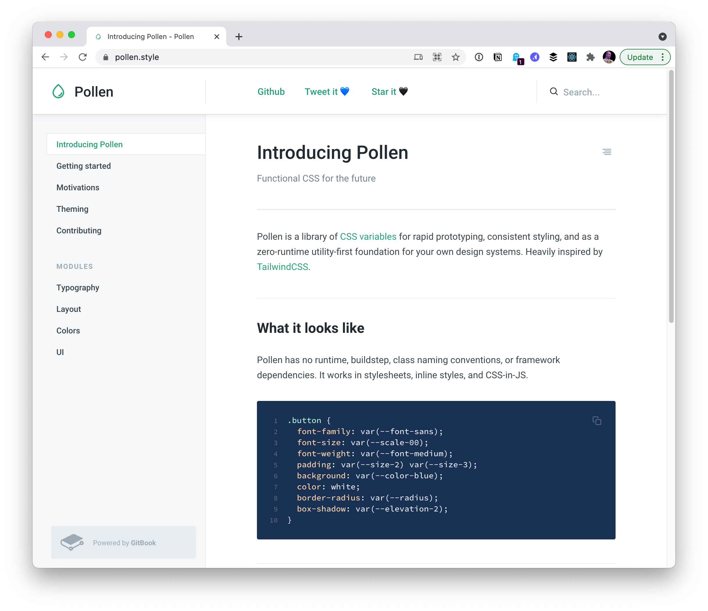
What about third-party design systems delivering what they deliver as… nothing but a big ol’ set of Custom Properties to use at your leisure?

Third-party deliverables don’t even have to be the entire kitchen sink like this. For example, Adam Argyle’s transition.style provides a “Hackpack” that is nothing but Custom Properties of transition animation helpers.
Understandabilty cost
One pushback I’ve heard against this more all-in approach on Custom Properties is newcomer understandability. If you wrote the system, it probably makes perfect sense to you. But it’s an additional abstraction on top of CSS. CSS knowledge is shared by all, bespoke systems knowledge is only shared by the people actively working on it.
Rolling in fresh to a system heavily using Custom Properties is going to have a heck of a learning curve.
Videos
[embedded content]
[embedded content]


