Let me spoil this for you: we’re not as rational as we think.
Every day, every hour and minute, we have to make a decision. The more decisions you have to make, the more stress you’re facing. To avoid stress, our brain will use shortcuts when it can. This is also because it wants to preserve energy. By the way, did you know that our brain accounts for ~2% of our body weight, but in order to function properly it requires ~20% of the body’s energy?
Now, here’s a shortcut example. You wanna begin a new book, and you ask a friend for recommendations because you have similar tastes. You trust his advice then go ahead and rent or buy the book. Without this shortcut, you would’ve done hours of research to find a book to match your interests.
Apps such as Netflix or Audible are sparing you the trouble of doing hours of research, and make personalized recommendations based on your history of movies watched or books listened to. Less stress, happier brain. And this is a safe example, that does not yet prove my point that we’re irrational.
Now, consumers believe that they act rationally when making purchasing decisions (aka they always focus on maximizing their best interests). On the other hand, marketers also assume that consumer shopping decisions are rational. Potential buyers do rational evaluations of product features and attributes before buying. But is that really so?
If we were rational consumers, we would probably never buy luxury goods. Also, we would all save money. But that’s not the case, because saving money does not produce instant gratification, even if it would be a rational choice. And we choose to spend money to achieve that tiny moment of pleasure in the present, instead of choosing a higher amount of pleasure, but in the future.
Also, did you ever wonder why the sweets are placed close to the cashier in a supermarket? By the time you get there, you’re already so tired from wandering around the supermarket and filling up your basket, that it’s hard to resist the temptation of buying some sweets. Pretty irrational, don’t you think?
To understand what’s going on in our brain circuits we’ll dig a bit into consumer psychology. Next, we’ll try to translate its teachings to e-commerce web design.
Ready?
The Truth behind Color Psychology
Table of Contents
I must admit I was wrong…
All that I knew about yellow, being the color that raises attention, of red, signifying danger, is all wrong.
Brian Cugelman, a behavioral scientist, opened my eyes with his work entitled “Color Psychology for UX, Design and Marketing”.
Now, I do not want to guide you through optics jargon and wavelength stories, but just to sum up Brian’s method for building a color system.
Together with the UX designer, they start with a white background, add grayscale structures, and then add accent colors on top. Next, they’ll try to figure out accent colors that have distinct contrasts, appropriate emotional associations, and symbolic meanings.
Now, here’s a chart that can show you the dominance of colors:
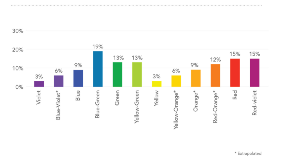

Source
Brian is using this UI Color Psychology Map to think through some of the competing design goals and challenges.
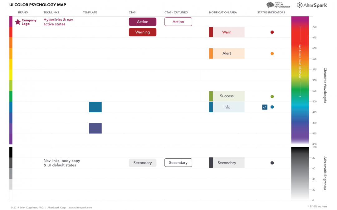

Source
Now, it’s time to polish this rough version with proper contrast ratios.
For more about the process, here’s an easier to grasp article.
The idea is that you need a scientific approach to color scheme design. And, in the back of your head, you need to understand the emotions you can raise in the mind of your website visitors.
Patterns and the Need for Order
We feel safe when we recognize patterns and we tend to be uneasy with chaos and disorder.
And this is valid when it comes to website or app design as well. For example, we are used to seeing menus at the top of a web page, and the logo in the upper left. Research from Nielsen has shown that logo placement helps with brand recall.
Patterns also induce a sense of familiarity. For example, when you look at photos on Facebook, you feel like turning the pages in a photo album. The same goes for Netflix or Audible, where movies and audiobooks seem to be arranged on shelves in a video store or library.
The moment patterns get broken, you might invite friction in. This is why try to stick to the patterns you see in web design and do not reinvent the wheel.
The Isolation Effect (the von Restorff effect)
This effect predicts that when multiple similar objects are present, the one that differs from the rest is most likely to be remembered. This is why we have different font sizes for headings or backgrounds for calls to action.
This is also connected to the earlier topic we discussed, on patterns. Whenever a pattern is broken, our eyes will notice it. In order to help something stand out on a web page you can make use of colors, different font sizes or font families, white space, highlighting, etc.
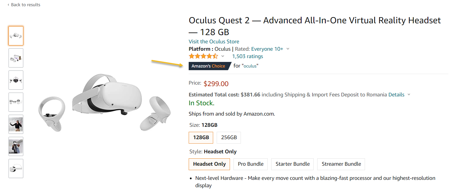
Now, because our attention span is limited, be careful where and how you direct the focus of the website’s visitor. What do you care more about your product page: the pricing, the reviews, the product’s features?
Sometimes this is hard to do when you’re Amazon or Booking.com. In the example below, the “Amazon’s choice” badge seems to stand out.

How to Build upon Anticipation of Reward
Dopamine is a neurotransmitter that gets triggered by the anticipation of reward. Dopamine gets people curious and ready to take action. In the long term, dopamine is really important in shaping habits, both good or bad.
But, be careful, there’s a trap. There are a lot of conspiracy theories out there about how social media and certain marketing strategies out there can get people so hooked and addicted that you can’t escape them. Not true. If those were true, we would all be zombies…Luckily, our brain is wiser than that. Dopamine exists in an environment that has a “braking system”, called serotonin. Serotonin helps us identify risky choices, avoid loss, etc.
Also, some strategies can work, can make us act (buy something, click on a button, etc) but, on the other hand, they won’t work for long. Why? Because the reward we anticipate will eventually lose its grip on us. Many of us are now blind to a lot of banner ads in online newspapers and Facebook, right?
Still, how can we trigger our audience’s dopamine?
Take a look at the example below: it’s a pop-up from Dedoles, an online store that sells funky socks, slippers, and more. It triggers anticipation of reward by offering a gift. That gift can vary, depending on how lucky you are with the wheel below.
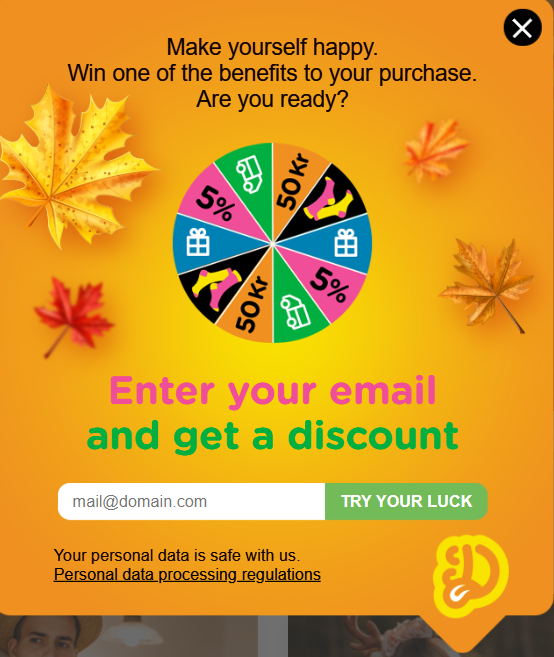

Source: dedoles.se
This strategy is more powerful than: “Here’s 10% off for your next purchase”. We got used to getting 10% off, almost everyone is doing it now. Also, because everyone is doing it, you kinda expect it as a potential customer, so this might put some pressure on the online store, to fulfill this wish.
Now, here are some other examples for triggering dopamine from Brian Cugelman (the behavioral scientist mentioned before):
- Make use of questions. You can do this in a website’s header, in the first paragraph of an article, in the title of an article, in the subject line of an email.
Here’s an example of such a question in a pop-up on the Decision Lab website.
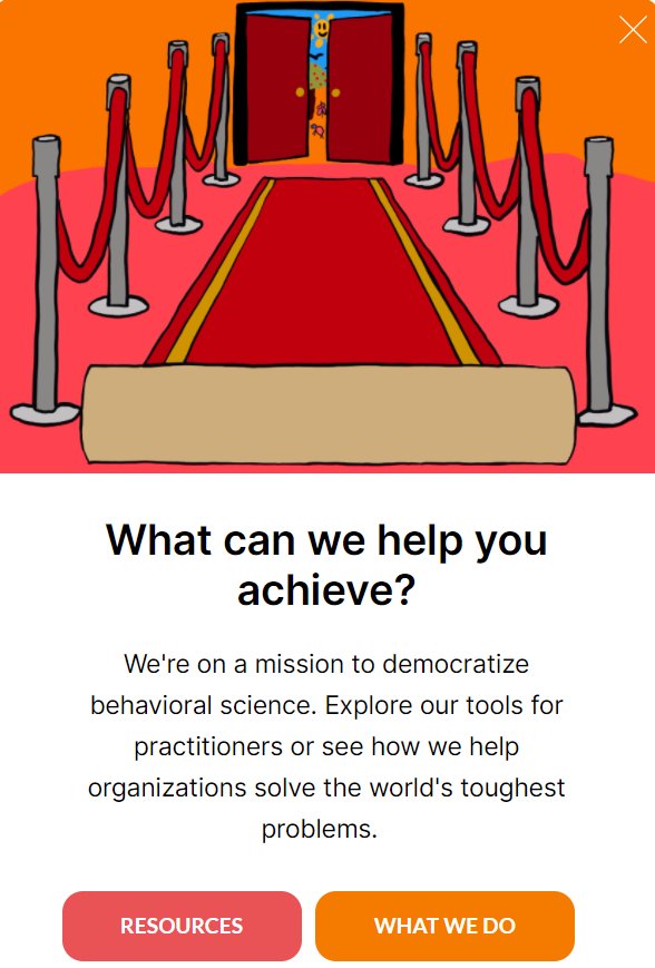

Source: thedecisionlab.com
- Use the foreshadowing technique in copywriting. This means that you can use teasers and hints in your copy in order to create suspense and curiosity.
- When doing videos use the first 5 seconds to intrigue the viewer, and to keep him interested in seeing more. Introduce more triggers along the way, to maximize the viewing time.
- Make use of testimonials that speak of results in landing pages, product pages, etc.
Now, one thing you should pay attention to: make sure to set up the right expectations and to fulfill them afterward. Else, this strategy will just backfire.
How to Make Use of Loss Aversion
Loss aversion is a cognitive bias that works like this: individuals feel (psychologically) the pain of losing, twice as powerful as the pleasure of gaining. This means, that we, as individuals will have the tendency to prefer avoiding losses to acquiring equivalent gains. This means it’s better not to lose $10 than to find $10.
Three specific regions of the human brain get activated when loss aversion is triggered:
- The amygdala. This part of the brain is responsible for fear and anxiety, which are closely related to loss.
- The striatum. The striatum region handles prediction errors in our minds. Neuroscientists could notice under fMRI that the striatum activates when we experience both loss and their equivalent gains. There’s more activation in conditions of loss.
- The insula. This region of the brain reacts to disgust. Together with the amygdala, they make us avoid certain types of behavior. When confronted with potential loss, this region gets activated more, than with the perspective of an equivalent gain.
Other aspects of the brain also contribute to this process of analyzing loss and gain, but these three seem more significant.
Now, when someone feels the pain of not taking action, he’ll be more inclined to take action, and make a decision. For you, such a decision can translate into more conversions or sales.
Here is another example from Everlane. They are offering price adjustments if the price goes down a week after the purchase:
“If you bought something at full price and the price is lowered within seven days of your purchase, we’d be happy to honor a price adjustment.”
Here are some other techniques that you could use to leverage loss aversion:
- Limited time offers: “2 hours left”
- Limited stocks: “only 2 items left”.
- Countdown timers in emails or landing pages.
- “Free returns”, or “satisfaction or your money back” are offered by merchants to promote the idea that they can be trusted, and that the risk of an unsatisfactory trade is low.
- When you establish your pricing plans, and offer discounts, for pricing larger than $100, test between absolute and relative discounts. People can see a difference between 25% OFF and $30 OFF.
Booking.com really knows how to play the loss aversion card.


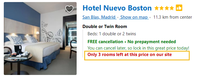

Source: booking.com
Another thing that you should remember: don’t confuse loss aversion with negative messaging, it might backfire.
Also, don’t exaggerate. For example. On July 7th, 2020, I was getting an email from Wix telling me that I can get 50% off, an offer valid until July 9th. 

And then, on Jul 22nd, I get another 50% off…
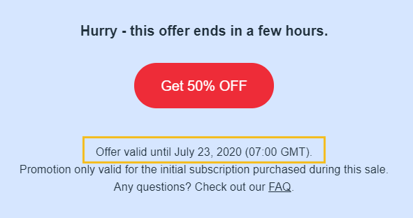

So, try not to abuse strategies that make use of loss aversion, else, you might end up losing the trust of both potential customers and customers.
Also, studies have shown that loss aversion can vary across participants, context, and magnitude of payoffs. This means that loss aversion can get stronger when a larger loss is expected.
This doesn’t mean that we should all offer 50% discounts…In the end, make sure that your promotions have a sense, financially speaking. And also, always test your hypothesis.
Leveraging Hyperbolic Discounting
I mentioned earlier that we are more likely to choose a smaller reward in the present, than a bigger reward, but in the future. There are plenty of experiments that prove this. One research showed that many people who are offered the choice of $10 today or $11 tomorrow choose to receive the lesser amount immediately.
This is known as hyperbolic discounting, and it’s one very famous cognitive bias.
Let me give you another example. It seems that waiting for an hour now feels less painful than waiting for an hour in the future. This explains why same-day shipping is a very fruitful strategy, in e-commerce.
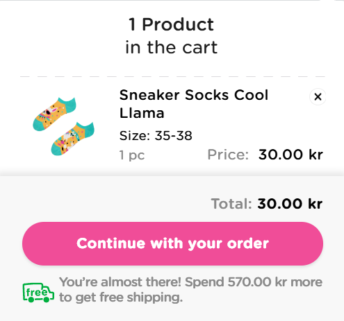
Another technique that takes advantage of this bias is to condition free shipping with a minimum order amount. Here’s such an example from Dedoles:

Source: dedoles.se
What else can you do to leverage this cognitive bias?
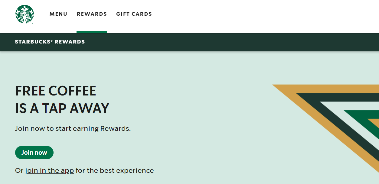
You could run a loyalty program. Loyalty programs often give customers free products, coupons, points, etc. They give short-term rewards that provide the customer the instant gratification they’re looking for.
One of the most famous loyalty programs is the one from Starbucks, where the customer receives between 1 and three stars, for every dollar spent, depending on the type of payment they use. Depending on the number of stars accumulated you will get free coffee refills or other perks.

Source: starbucks.com
How Social Proof Influences Decisions
We are all familiar with the “Follow the crowd” and “Word of mouth” terms. From the marketing perspective, they get to be known as “Social proof”.
Because we’re social creatures. It’s very for us to follow the crowd, rather than engaging in research, evaluation, and so on, when making a decision. We often allow our family, friends, tribe, decide for ourselves.
Sometimes, this can work against us. And there’s a fascinating example that the economist Daniel McFadden presents in a study. In a Korean village, peasant women within the same village tend to use the same contraception – even though there are other options in the surrounding villages. This pattern could not be explained by income, education, or price, but by word of mouth.
Now, how can you leverage word of mouth in e-commerce web design?
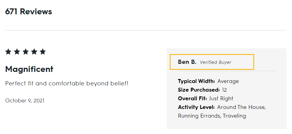
- Use product reviews aka short-form recommendations from happy customers. Instead of you saying how great your product is, let your customers say it for you.
The folks at AllBirds are even marking their reviews with “Verified Buyer” to enforce credibility.

- Use star ratings for your products. For example, Booking.com is assigned stars not only for hotels but also for their location.


The folks at Lush are asking their customers to review both the quality of the product and the value for the money.


Source: lush.com
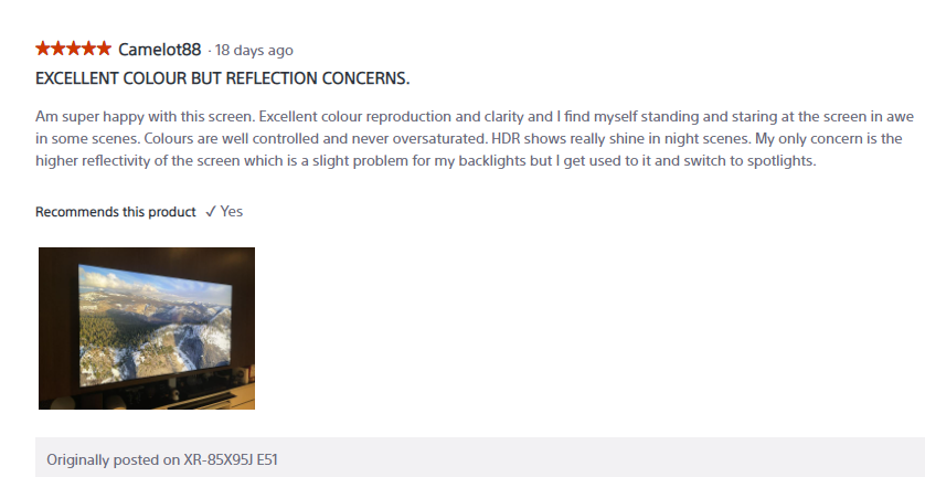
- Leverage user-generated content (UGC). Certain products or services can end up being mentioned on Instagram, TikTok, and more. Make sure to listen to what your users are saying about you. Also, you can encourage your customers to send you pictures of them using/wearing your products, as Sony does.

Source: electronics.sony.com/
- On the product page make use of sections similar to “Others have bought”. This strategy might help you cross-sell and increase the average order value for your customers.
Here’s an example from Amazon.
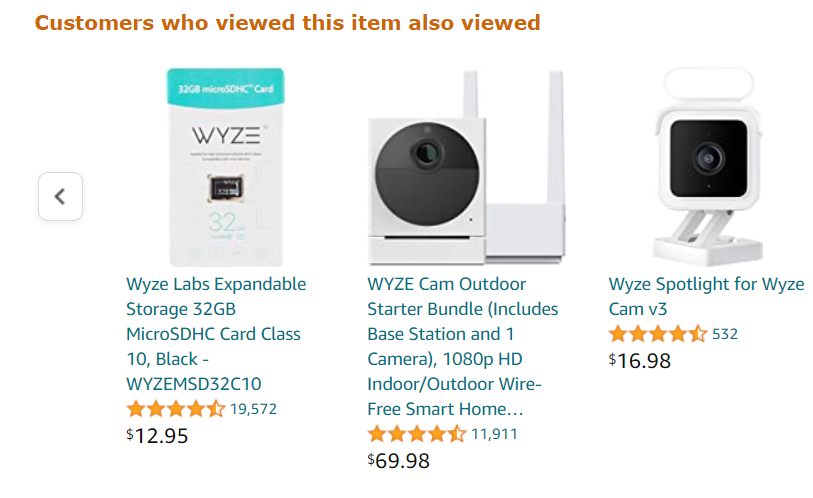

Source: amazon.com
- Show how many people liked or bought a product. Here’s an example from Dedoles.


Another way of using this strategy can be: “5 other people are looking at this product”, “Someone in the UK just bought this”.
Wrapping it all up
Some of us are afraid that if we apply neuroscience in design and advertising we will be subverting free will and promoting compulsive buying behavior. We’re far from that because we have a brain system that is responsible for fear and anxiety that works like a braking system.
But, there are ways to trigger specific actions using certain psychology concepts, when employed correctly. What’s important is that we’re honest at the end of the day, and meet the expectations we’re setting.
Also, the way we design an e-commerce website should fulfill two main objectives: the potential customers’ goals, and your business goal. These goals need to coexist.
Also, any time you apply an idea, don’t start from the assumption that it will also work for you. Test everything.
Over and out!
Author: Alina Belascu
Alina is a digital marketer with a passion for web design. When she’s not strategizing for Colibri and ConvertSquad, she’s doing photography, listening to podcasts on history and psychology, and playing with her 2 dogs and cat.


