Adding borders to complex shapes is a pain, but rounding the corner of complex shapes is a nightmare! Luckily, the CSS Paint API is here to the rescue! That’s what we’re going to look at as part of this “Exploring the CSS Paint API” series.
Here’s what we’re aiming for. Like everything else we’ve looked at in this series, note that only Chrome and Edge support this for now.
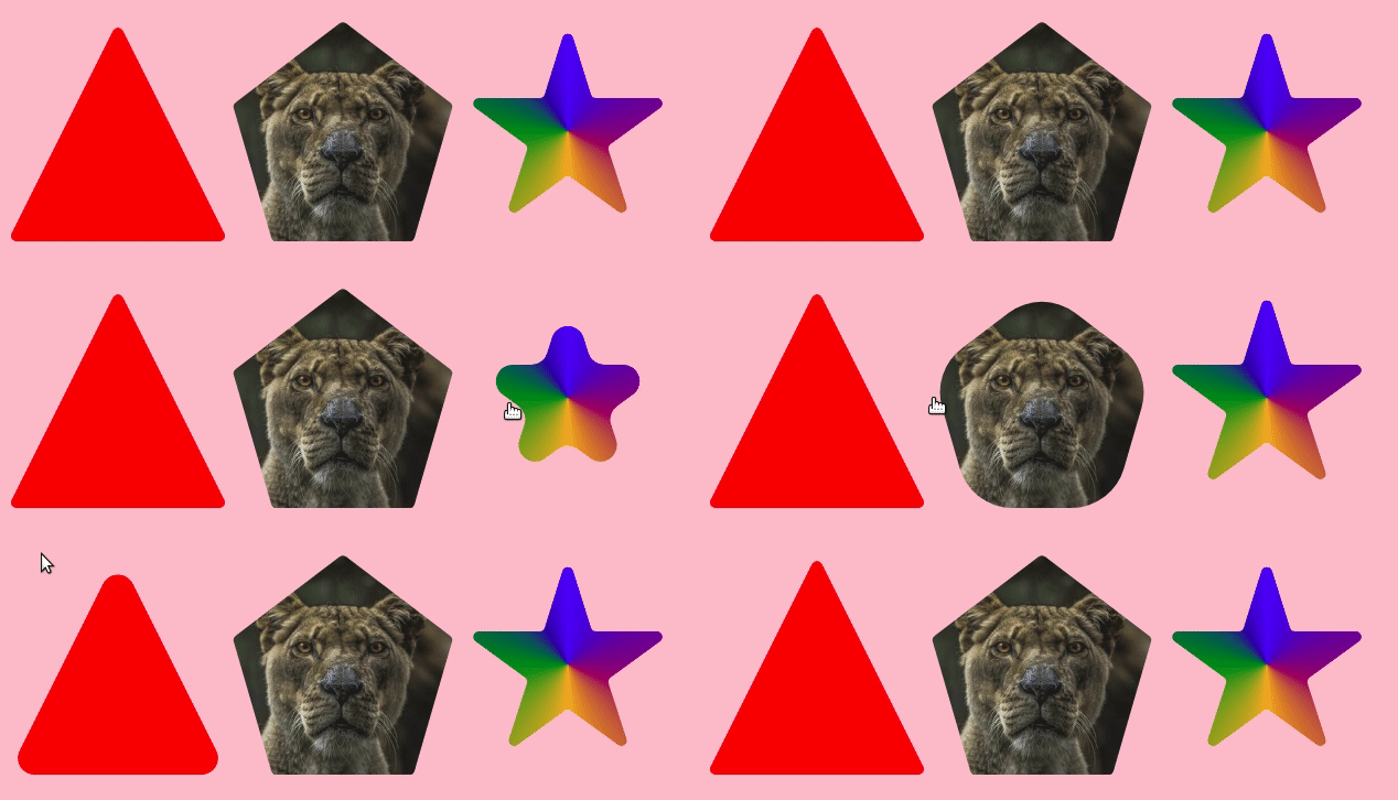
You may have noticed a pattern forming if you’ve followed along with the rest of the articles. In general, when we work with the CSS Paint API:
- We write some basic CSS that we can easily adjust.
- All the complex logic is done behind the scene inside the
paint()function.
We can actually do this without the Paint API
There are probably a lot of ways to put rounded corners on complex shapes, but I will share with you three methods I’ve used in my own work.
I already hear you saying: If you already know three methods, then why are you using the Paint API?
Good question. I’m using it because the three methods I’m aware of are difficult, and two of them are specifically related to SVG. I have nothing against SVG, but a CSS-only solution makes thing easier to maintain, plus it’s easier for someone to walk into and understand when grokking the code.
Onto those three methods…
Using clip-path: path()
If you are an SVG guru, this method is for you. the clip-path property accepts SVG paths. That means we can easily pass in the path for a complex rounded shape and be done. This approach is super easy if you already have the shape you want, but it’s unsuitable if you want an adjustable shape where, for example, you want to adjust the radius.
Below an example of a rounded hexagon shape. Good luck trying to adjust the curvature and the shape size! You’re gonna have to edit that crazy-looking path to do it.
I suppose you could refer to this illustrated guide to SVG paths that Chris put together. But it’s still going to be a lot of work to plot the points and curves just how you want it, even referencing that guide.
Using an SVG filter
I discovered this technique from Lucas Bebber’s post about creating a gooey effect. You can find all the technical details there, but the idea is to apply an SVG filter to any element to round its corners.
We simply use clip-path to create the shape we want then apply the SVG filter on a parent element. To control the radius, we adjust the stdDeviation variable.
This is a good technique, but again, it requires a deep level of SVG know-how to make adjustments on the spot.
Using Ana Tudor’s CSS-only approach
Yes, Ana Tudor found a CSS-only technique for a gooey effect that we can use to round the corner of complex shapes. She’s probably writing an article about it right now. Until then, you can refer to the slides she made where she explain how it works.
Below a demo where I am replacing the SVG filter with her technique:
Again, another neat trick! But as far as being easy to work with? Not so much here, either, especially if we’re considering more complex situations where we need transparency, images, etc. It’s work finding the correct combination of filter, mix-blend-mode and other properties to get things just right.
Using the CSS Paint API instead
Unless you have a killer CSS-only way to put rounded borders on complex shapes that you’re keeping from me (share it already!), you can probably see why I decided to reach for the CSS Paint API.
The logic behind this relies on the same code structure I used in the article covering the polygon border. I’m using the --path variable that defines our shape, the cc() function to convert our points, and a few other tricks we’ll cover along the way. I highly recommend reading that article to better understand what we’re doing here.
First, the CSS setup
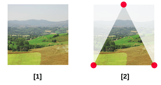
We first start with a classic rectangular element and define our shape inside the --path variable (shape 2 above). The --path variable behaves the same way as the path we define inside clip-path: polygon(). Use Clippy to generate it.
.box { display: inline-block; height: 200px; width: 200px; --path: 50% 0,100% 100%,0 100%; --radius: 20px; -webkit-mask: paint(rounded-shape);
}
Nothing complex so far. We apply the custom mask and we define both the --path and a --radius variable. The latter will be used to control the curvature.
Next, the JavaScript setup
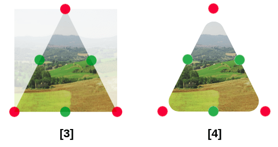
In addition to the points defined by the path variable (pictured as red points above), we’re adding even more points (pictured as green points above) that are simply the midpoints of each segment of the shape. Then we use the arcTo() function to build the final shape (shape 4 above).
Adding the midpoints is pretty easy, but using arcTo() is a bit tricky because we have to understand how it works. According to MDN:
[It] adds a circular arc to the current sub-path, using the given control points and radius. The arc is automatically connected to the path’s latest point with a straight line, if necessary for the specified parameters.
This method is commonly used for making rounded corners.
The fact that this method requires control points is the main reason for the extra midpoints points. It also require a radius (which we are defining as a variable called --radius).
If we continue reading MDN’s documentation:
One way to think about
arcTo()is to imagine two straight segments: one from the starting point to a first control point, and another from there to a second control point. WithoutarcTo(), these two segments would form a sharp corner:arcTo()creates a circular arc that fits this corner and smooths is out. In other words, the arc is tangential to both segments.
Each arc/corner is built using three points. If you check the figure above, notice that for each corner we have one red point and two green points on each side. Each red-green combination creates one segment to get the two segments detailed above.
Let’s zoom into one corner to better understand what is happening:
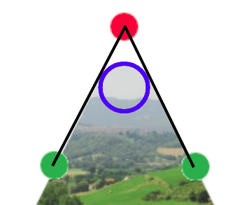
The circle in blue illustrates the radius.
Now imagine that we have a path that goes from the first green point to the next green point, moving around that circle. We do this for each corner and we have our rounded shape.
Here’s how that looks in code:
// We first read the variables for the path and the radius.
const points = properties.get('--path').toString().split(',');
const r = parseFloat(properties.get('--radius').value); var Ppoints = [];
var Cpoints = [];
const w = size.width;
const h = size.height;
var N = points.length;
var i;
// Then we loop through the points to create two arrays.
for (i = 0; i < N; i++) { var j = i-1; if(j<0) j=N-1; var p = points[i].trim().split(/(?!(.*)s(?![^(]*?))/g); // One defines the red points (Ppoints) p = cc(p[0],p[1]); Ppoints.push([p[0],p[1]]); var pj = points[j].trim().split(/(?!(.*)s(?![^(]*?))/g); pj = cc(pj[0],pj[1]); // The other defines the green points (Cpoints) Cpoints.push([p[0]-((p[0]-pj[0])/2),p[1]-((p[1]-pj[1])/2)]);
} /* ... */ // Using the arcTo() function to create the shape
ctx.beginPath();
ctx.moveTo(Cpoints[0][0],Cpoints[0][1]);
for (i = 0; i < (Cpoints.length - 1); i++) { ctx.arcTo(Ppoints[i][0], Ppoints[i][1], Cpoints[i+1][0],Cpoints[i+1][1], r);
}
ctx.arcTo(Ppoints[i][0], Ppoints[i][1], Cpoints[0][0],Cpoints[0][1], r);
ctx.closePath(); /* ... */ ctx.fillStyle = '#000';
ctx.fill();
The last step is to fill our shape with a solid color. Now we have our rounded shape and we can use it as a mask on any element.
That’s it! Now all we have to do is to build our shape and control the radius like we want — a radius that we can animate, thanks to @property which will make things more interesting!
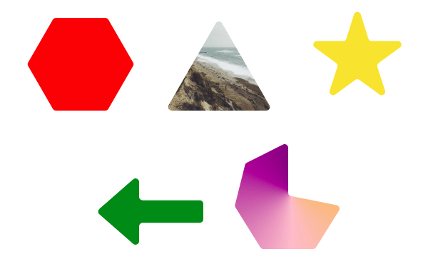
Are there any drawbacks with this method?
Yes, there are drawbacks, and you probably noticed them in the last example. The first drawback is related to the hover-able area. Since we are using mask, we can still interact with the initial rectangular shape. Remember, we faced the same issue with the polygon border and we used clip-path to fix it. Unfortunately, clip-path does not help here because it also affects the rounded corner.
Let’s take the last example and add clip-path. Notice how we are losing the “inward” curvature.
There’s no issue with the hexagon and triangle shapes, but the others are missing some curves. It could be an interesting feature to keep only the outward curvature — thanks to clip-path— and at the same time we fix the hover-able area. But we cannot keep all the curvatures and reduce the hover-able area at the same time.
The second issue? It’s related to the use of a big radius value. Hover over the shapes below and see the crazy results we get:
It’s actually not a “major” drawback since we have control over the radius, but it sure would be good to avoid such a situation in case we wrongly use an overly large radius value. We could fix this by limiting the value of the radius to within a range that caps it at a maximum value. For each corner, we calculate the radius that allows us to have the biggest arc without any overflow. I won’t dig into the math logic behind this (????), but here is the final code to cap the radius value:
var angle = Math.atan2(Cpoints[i+1][1] - Ppoints[i][1], Cpoints[i+1][0] - Ppoints[i][0]) -
Math.atan2(Cpoints[i][1] - Ppoints[i][1], Cpoints[i][0] - Ppoints[i][0]);
if (angle < 0) { angle += (2*Math.PI)
}
if (angle > Math.PI) { angle = 2*Math.PI - angle
}
var distance = Math.min( Math.sqrt( (Cpoints[i+1][1] - Ppoints[i][1]) ** 2 + (Cpoints[i+1][0] - Ppoints[i][0]) ** 2), Math.sqrt( (Cpoints[i][1] - Ppoints[i][1]) ** 2 + (Cpoints[i][0] - Ppoints[i][0]) ** 2) );
var rr = Math.min(distance * Math.tan(angle/2),r);
r is the radius we are defining and rr is the radius we’re actually using. It equal either to r or the maximum value allowed without overflow.
If you hover the shapes in that demo, we no longer get strange shapes but the “maximum rounded shape” (I just coined this) instead. Notice that the regular polygons (like the triangle and hexagon) logically have a circle as their “maximum rounded shape” so we can have cool transitions or animations between different shapes.
Can we have borders?
Yes! All we have to do is to use stroke() instead of fill() inside our paint() function. So, instead of using:
ctx.fillStyle = '#000';
ctx.fill();
…we use this:
ctx.lineWidth = b;
ctx.strokeStyle = '#000';
ctx.stroke();
This introduces another variable, b, that controls the border’s thickness.
Did you notice that we have some strange overflow? We faced the same issue in the previous article, and that due to how stroke() works. I quoted MDN in that article and will do it again here as well:
Strokes are aligned to the center of a path; in other words, half of the stroke is drawn on the inner side, and half on the outer side.
Again, it’s that “half inner side, half outer side” that’s getting us! In order to fix it, we need to hide the outer side using another mask, the first one where we use the fill(). First, we need to introduce a conditional variable to the paint() function in order to choose if we want to draw the shape or only its border.
Here’s what we have:
if(t==0) { ctx.fillStyle = '#000'; ctx.fill();
} else { ctx.lineWidth = 2*b; ctx.strokeStyle = '#000'; ctx.stroke();
}
Next, we apply the first type of mask (t=0) on the main element, and the second type (t=1) on a pseudo-element. The mask applied on the pseudo-element produces the border (the one with the overflow issue). The mask applied on the main element addresses the overflow issue by hiding the outer part of the border. And if you’re wondering, that’s why we are adding twice the border thickness to lineWidth.
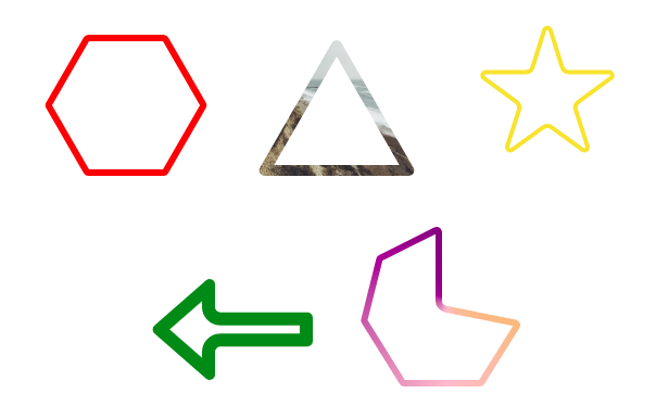
See that? We have perfect rounded shapes as outlines and we can adjust the radius on hover. And can use any kind of background on the shape.
And we did it all with a bit of CSS:
div { --radius: 5px; /* Defines the radius */ --border: 6px; /* Defines the border thickness */ --path: /* Define your shape here */; --t: 0; /* The first mask on the main element */ -webkit-mask: paint(rounded-shape); transition: --radius 1s;
}
div::before { content: ""; background: ..; /* Use any background you want */ --t: 1; /* The second mask on the pseudo-element */ -webkit-mask: paint(rounded-shape); /* Remove this if you want the full shape */
}
div[class]:hover { --radius: 80px; /* Transition on hover */
}
Let’s not forget that we can easily introduce dashes using setLineDash() the same way we did in the previous article.
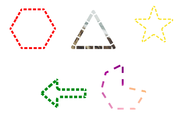
Controlling the radius
In all the examples we’ve looked at, we always consider one radius applied to all the corners of each shape. It would be interesting if we could control the radius of each corner individually, the same way the border-radius property takes up to four values. So let’s extend the --path variable to consider more parameters.
Actually, our path can be expressed as a list of [x y] values. We’ll make a list of [x y r] values where we introduce a third value for the radius. This value isn’t mandatory; if omitted, it falls back to the main radius.
.box { display: inline-block; height: 200px; width: 200px; --path: 50% 0 10px,100% 100% 5px,0 100%; --radius: 20px; -webkit-mask: paint(rounded-shape);
}
Above, we have a 10px radius for the first corner, 5px for the second, and since we didn’t specify a value for the third corner, it inherits the 20px defined by the --radius variable.
Here’s our JavaScript for the values:
var Radius = [];
// ...
var p = points[i].trim().split(/(?!(.*)s(?![^(]*?))/g);
if(p[2]) Radius.push(parseInt(p[2]));
else Radius.push(r);
This defines an array that stores the radius of each corner. Then, after splitting the value of each point, we test whether we have a third value (p[2]). If it’s defined, we use it; if not, we use the default radius. Later on, we’re using Radius[i] instead of r.
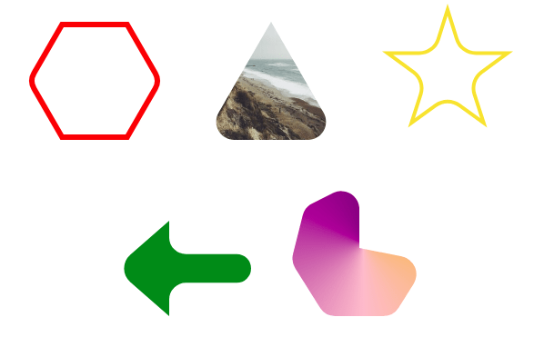
This minor addition is a nice feature for when we want to disable the radius for a specific corner of the shape. In fact, let’s look at a few different examples next.
More examples!
I made a series of demos using this trick. I recommend setting the radius to 0 to better see the shape and understand how the path is created. Remember that the --path variable behaves the same way as the path we define inside clip-path: polygon(). If you’re looking for a path to play with, try using Clippy to generate one for you.
Example 1: CSS shapes
A lot of fancy shapes can be created using this technique. Here are a few of them done without any extra elements, pseudo-elements, or hack-y code.
Example 2: Speech bubble
In the previous article, we added border to a speech bubble element. Now we can improve it and round the corners using this new method.
If you compare with this example with the original implementation, you may notice the exact same code. I simply made two or three changes to the CSS to use the new Worklet.
Example 3: Frames
Find below some cool frames for your content. No more headaches when we need gradient borders!
Simply play with the --path variable to create your own responsive frame with any coloration your want.
Example 4: Section divider
SVG is no longer needed to create those wavy section dividers that are popular these days.
Notice that the CSS is light and relatively simple. I only updated the path to generate new instances of the divider.
Here’s a classic design pattern that I’m sure many of us have bumped into at some time: How the heck do we invert the radius? You’ve likely seen it in navigation designs.
A slightly different take on it:
Example 6: Gooey effect
If we play with the path values we can reach for some fancy animation.
Below an idea where I am applying a transition to only one value of the path and yet we get a pretty cool effect
This one’s inspired by Ana Tudor’s demo.
Another idea with a different animation
Another example with a more complex animation:
What about a bouncing ball
Example 7: Shape morphing
Playing with big radius values allows us to create cool transitions between different shapes, especially between a circle and a regular polygon.
If we add some border animation, we get “breathing” shapes!
Let’s round this thing up
I hope you’ve enjoyed getting nerdy with the CSS Paint API. Throughout this series, we’ve applied paint() to a bunch of real-life examples where having the API allows us to manipulate elements in a way we’ve never been able to do with CSS — or without resorting to hacks or crazy magic numbers and whatnot. I truly believe the CSS Paint API makes seemingly complicated problems a lot easier to solve in a straightforward way and will be a feature we reach for time and again. That is, when browser support catches up to it.
If you’ve followed along with this series, or even just stumbled into this one article, I’d love to know what you think of the CSS Paint API and how you imagine using it in your work. Are there any current design trends that would benefit from it, like the wavy section dividers? Or blobby designs? Experiment and have fun!
This one’s taken from my previous article


