Ensuring accessibility is a clear path to making your website better. When you make your site accessible, you grow your audience, improve the experience for all people using it (not just those with accessibility needs), and you get SEO benefits as well.
Along the same lines, preference-query customization is another great opportunity to give your users a personalized experience that speaks to them and is more enjoyable to use.
One preference query you can take advantage of is prefers-reduced-motion. This preference means that your users would prefer a web experience without flashy, quick animations. You can write your styles in a way that supports this preference, and then write a media query for those who don’t have this preference set to get your “louder” interactive experience:
Another preference to consider is a user’s preferred color scheme. While most sites today use a light theme by default, dark themes have been a top request over the past few years, especially for browsing the web at night. Providing a customized theming that aligns with your user’s preferences is another way to improve your user’s experience.
You can do this efficiently by using CSS custom properties, and adjusting those custom property values with the prefers-color-scheme media feature. If you use general values like background, text, and highlight, you can update your values all in one place.
Don’t forget to use the color-scheme property as well to automatically get some theme conversion from the browser. Setting this property tells the browser what color themes (light, dark, or both) the page supports. In turn, the browser will automatically convert form controls and browser UI like scrollbars to the correct theme as well:
In this demo, even though I’m not setting the text color for my color themes, since I told the browser the site supports both light and dark themes with color-scheme: light dark in the :root, it automatically switches the typeface from black to white.
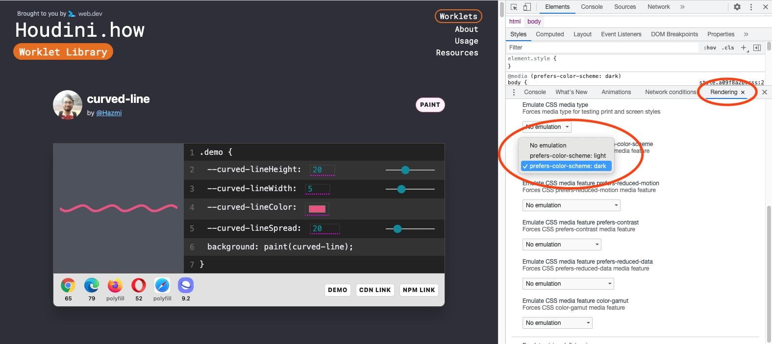
You can test your dark theme without changing your system settings in Chrome DevTools under the “Rendering” panel. This illustration shows the site houdini.how in its dark mode:

Another bonus to creating a dark theme is the battery life savings you’re providing your users. In a Pixel 6 Lab study, it was found that for an OLED screen, a dark theme saves 11% in power consumption.
So now you’re respecting your user’s accessibility needs, preferences, and battery life, which is a pretty great way to make your website better for your users.


