How much time do you spend designing the content presentation for your websites? When you write a new blog post or create a new page, are you thinking about just the words, or how your readers will engage with those words? With these few tips in mind, you can make your site’s content easier to digest and more visually interesting for your visitors.
Use good basics
Table of Contents
Think about your content’s structure. How can you break down a wall of information into easily digestible chunks? There are some basic formatting rules you can follow to take lots of information and make it easier to read and understand.
Break it up
Use headings and subheadings to group together related content.
Readers on the web scan for information, rather than reading everything line-by-line. Chunking your content into smaller sections, called out by larger headings, helps them find the information they’re searching for.
When I’m trying to find something quickly, there’s nothing more intimidating than jumping onto a site with a giant wall of unbroken content. At best, I’ll cmd+f and search for specific keywords, but usually I’ll just say “lol no” and look for the information elsewhere.
Just see for yourself — which of these examples seems more approachable?
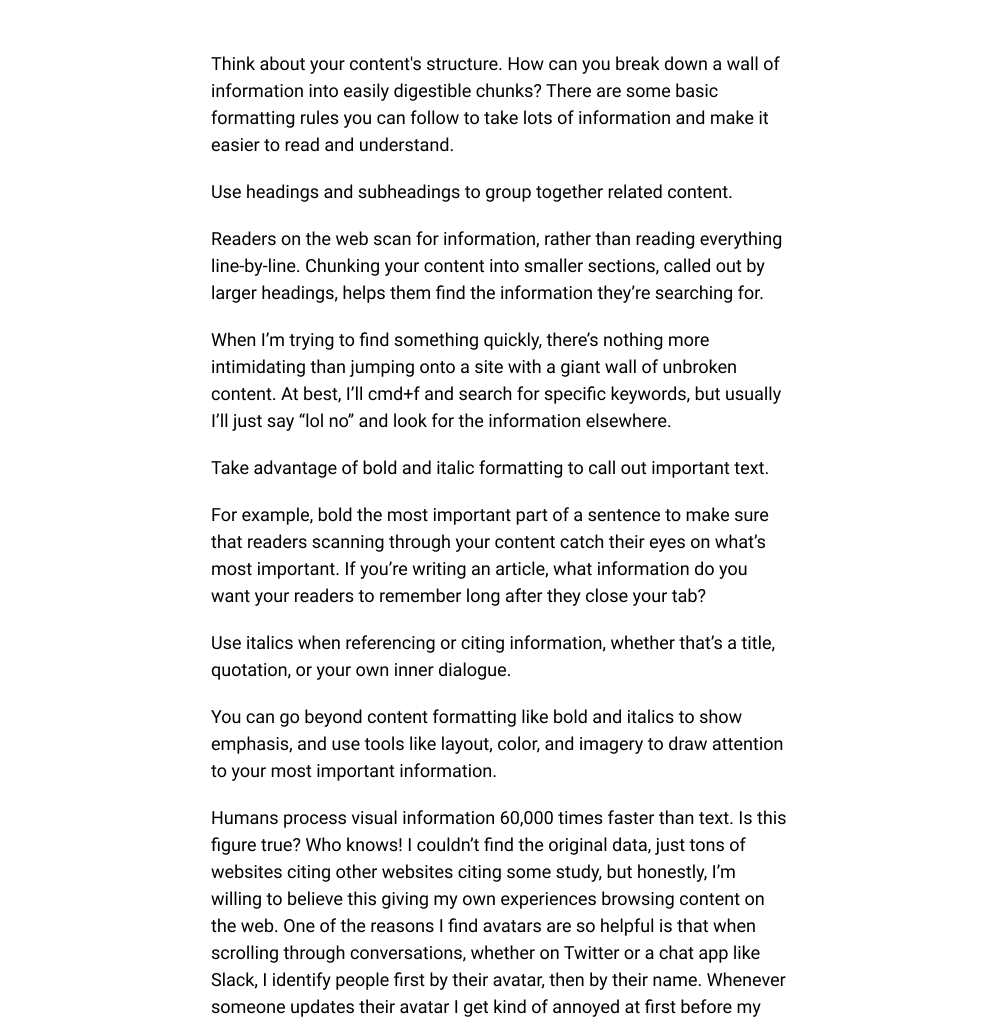
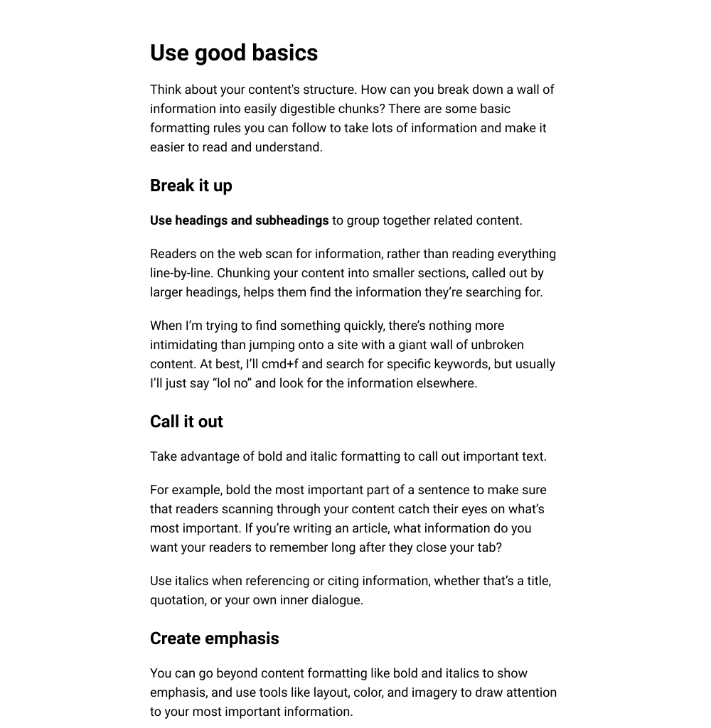
Where possible, break down paragraphs into lists. Lists make scanning easier!


If I’m reading through content that has multiple steps, for example, I need lists in order to follow along. Whenever I encounter any sort of instructions that don’t break down individual tasks into lists, my brain just can’t pull out the requires steps. I lose my place, or miss something, and get confused. This is true whether you’re listing ingredients, steps in a tutorial, or the different services your company offers. Please, help my brain and make lists.
Call it out
Take advantage of bold and italic formatting to call out important text.
For example, bold the most important part of a sentence to make sure that readers scanning through your content catch their eyes on what’s most important. If you’re writing an article, what information do you want your readers to remember long after they close your tab?
Use italics when referencing or citing information, whether that’s a title, quotation, or your own inner dialogue.
Using good formatting isn’t just helpful for people physically reading your site — it’s also useful for the robots we use to speak your content out loud, whether that’s screen reading software or your virtual assistant. As more of our digital content becomes accessed in physical space, the need for proper semantics becomes even more important.
Create emphasis
You can go beyond content formatting like bold and italics to show emphasis, and use tools like layout, color, and imagery to draw attention to your most important information.
Humans process visual information 60,000 times faster than text. Is this figure true? Who knows! I couldn’t find the original data, just tons of websites citing other websites citing some study, but honestly, I’m willing to believe this giving my own experiences browsing content on the web. One of the reasons I find avatars are so helpful is that when scrolling through conversations, whether on Twitter or a chat app like Slack, I identify people first by their avatar, then by their name. Whenever someone updates their avatar I get kind of annoyed at first before my brain catches up and gets used to the new image.
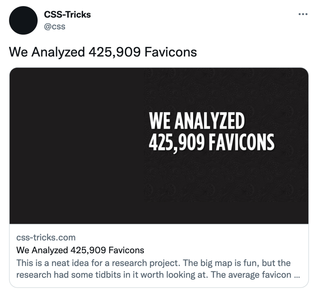
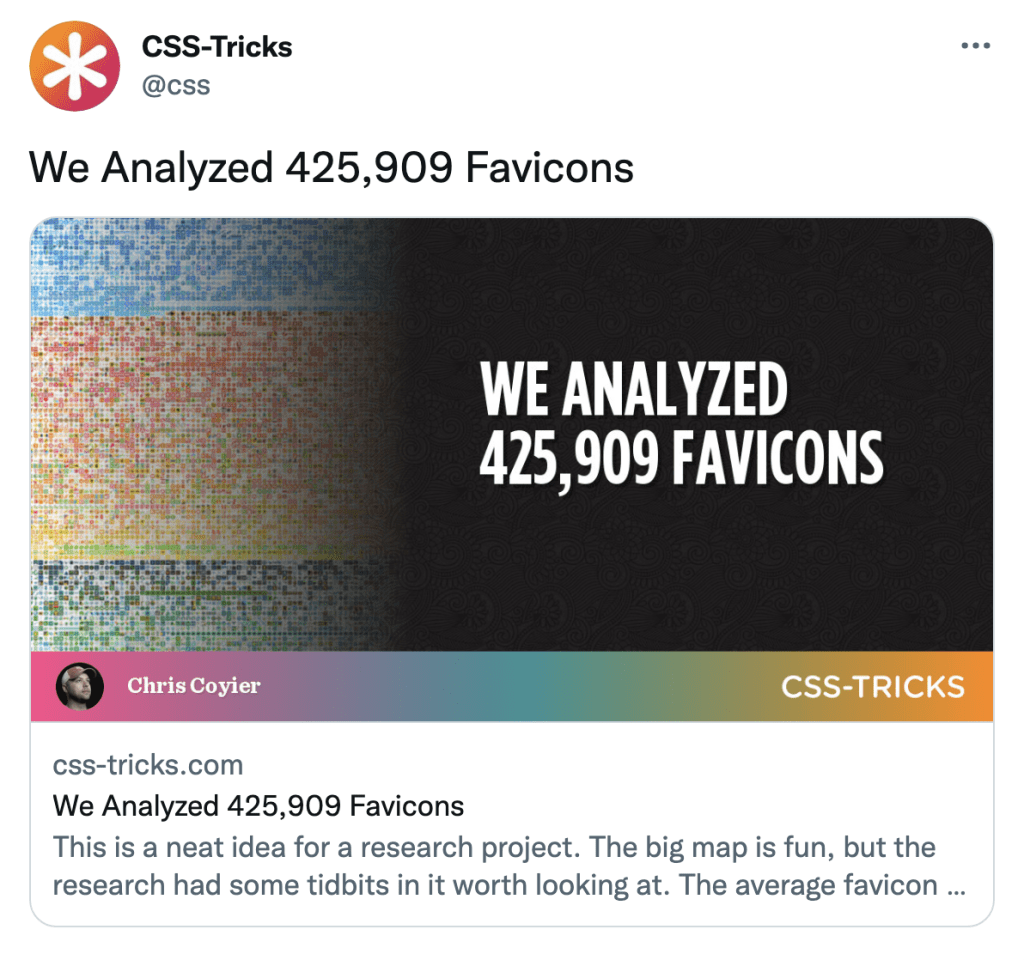
Use imagery to both complement and emphasize your content, whether that’s adding an icon, illustration, or photo your text. Aim for imagery that helps people understand what your content is saying.
For example, take IKEA instructions. Assembling furniture is hard, and IKEA’s visually-driven directions make building your own furniture a little bit easier.
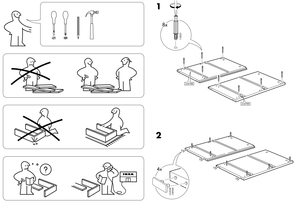
(Just don’t go overboard — a confusing icon or busy image could distract, not help.)
Beyond images, you can also use layout or color to help call out information. Have a bunch of numbers? Organize them into a table, or call out numbers with larger text in their own columns, rather than writing everything out into a paragraph.
| Product | Width | Height |
|---|---|---|
| Green Entrance Rug | 3′ | 2′ |
| Purple Area Rug | 4′ | 4′ |
| Multicolor Area Rug | 4′ | 6′ |
Using a table to display lists of numerical information
205
Websites Built
164
Happy Clients
Using columns to call out important text
Use blockquotes or pullquotes to highlight specific quotations or important parts of your articles.
Need to direct someone to specific or timely information? Wrap that content in a callout box.
Think outside of just paragraphs! When browsing a website or reading through a book or magazine, what kind of content catches your eye the most? What information do you remember later? Take inspiration from around you.
Tell a story
People are emotional. We remember stories, especially stories we can relate to. Can you frame your content as a story? Can you present it with a curious beginning and strong resolution? Is there conflict?
During the US 2020 presidential election, Elizabeth Warren’s tech team put together a number of interactive digital experiences for voters to engage with, such as Warren’s Tax the Ultra-Rich plan and accompanying Billionaire Calculator. They wrote up a case study that goes into more depth, but I want to highlight how the informational scrolling pages they built (nicknamed “scrollytelling”) quite literally highlights the important information, providing relevant linked content to learn more, add citations, or inject some additional personality. The pages blend embedded interactive content to engage you as a reader, video, images, and text. It’s a compelling way to present Warren’s story.
Try new ways ways of presenting information
Remember, the web is an interactive platform — take advantage of that, where appropriate (less is more, accessibility is integral, and you need to know your audience). Whether that’s scrollytelling, captioned video, and heck, maybe for your audience, now’s the time to start looking into AR/VR! Who knows. Sometimes you just need to try stuff out and see what sticks. Just be careful. Experimentation is great, but we need to make sure we’re bringing everyone along for the ride.
Of course, more complex interactions require more work and/or budget, so what you can create with your content depends on your resources. The kind of storytelling you create will different whether you’re a DIY blogger or have access to an agency or internal creative team. And that’s fine — not every article needs to be as media-rich an experience as Snowfall. Even the addition of some simple illustrations, like in Samir Nosrat’s SALT FAT ACID HEAT, can create a great vibe for your readers and help enrich understanding.
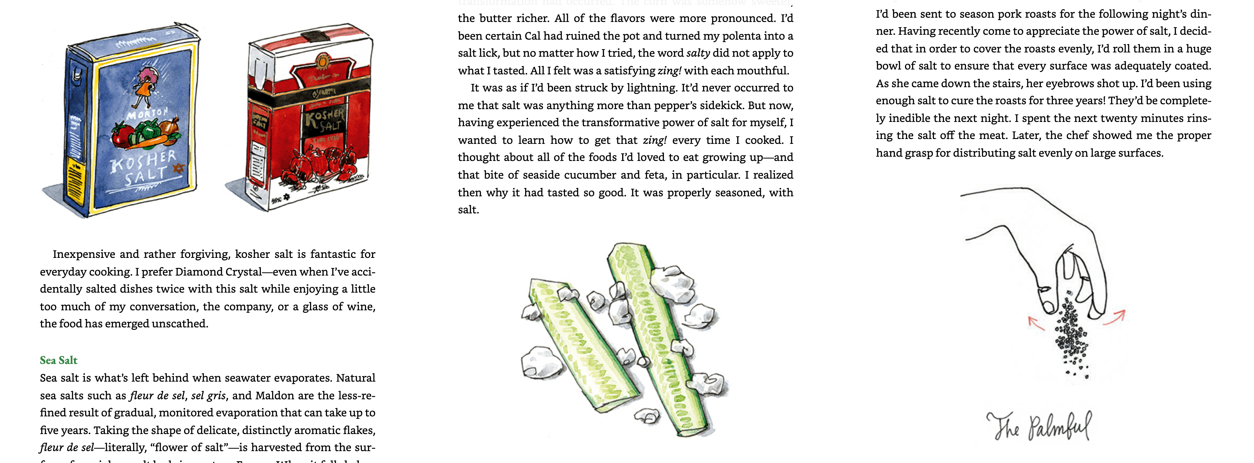
Whether you’re crafting your first website or you’re a seasoned writer, there’s probably more you can do to present your content in interesting and engaging ways. Next time you make something new, think about the different ways you can show, not tell, information to your audience.


