I was updating my portfolio and wanted to use the forward slash (/) as a visual element for the site’s main layout. I hadn’t attempted to create a slanted container in CSS before, but it seemed like it would be easy at first glance. As I began digging into it more, however, there were actually a few very interesting challenges to get a working CSS slanted container that supports text and media.
Here’s what was going for and where I finally landed:
I started by looking around for examples of non-rectangular containers that allowed text to flow naturally inside of them. I assumed it’d be possible with CSS since programs like Adobe Illustrator and Microsoft Word have been doing it for years.
Step 1: Make a CSS slanted container with transforms
Table of Contents
I found the CSS Shapes Module and that works very well for simple text content if we put the shape-outside property to use. It can even fully justify the text. But what it doesn’t do is allow content to scroll within the container. So, as the user scrolls down, the entire slanted container appears to move left, which isn’t the effect I wanted. Instead, I took a simpler approach by adding transform: skew() to the container.
.slant-container { transform: skew(14deg);
}
That was a good start! The container was definitely slanted and scrolling worked as expected while pure CSS handled the resizing for images. The obvious problem, however, is that the text and images became slanted as well, making the content more difficult to read and the images distorted.
Step 2: Reverse the font
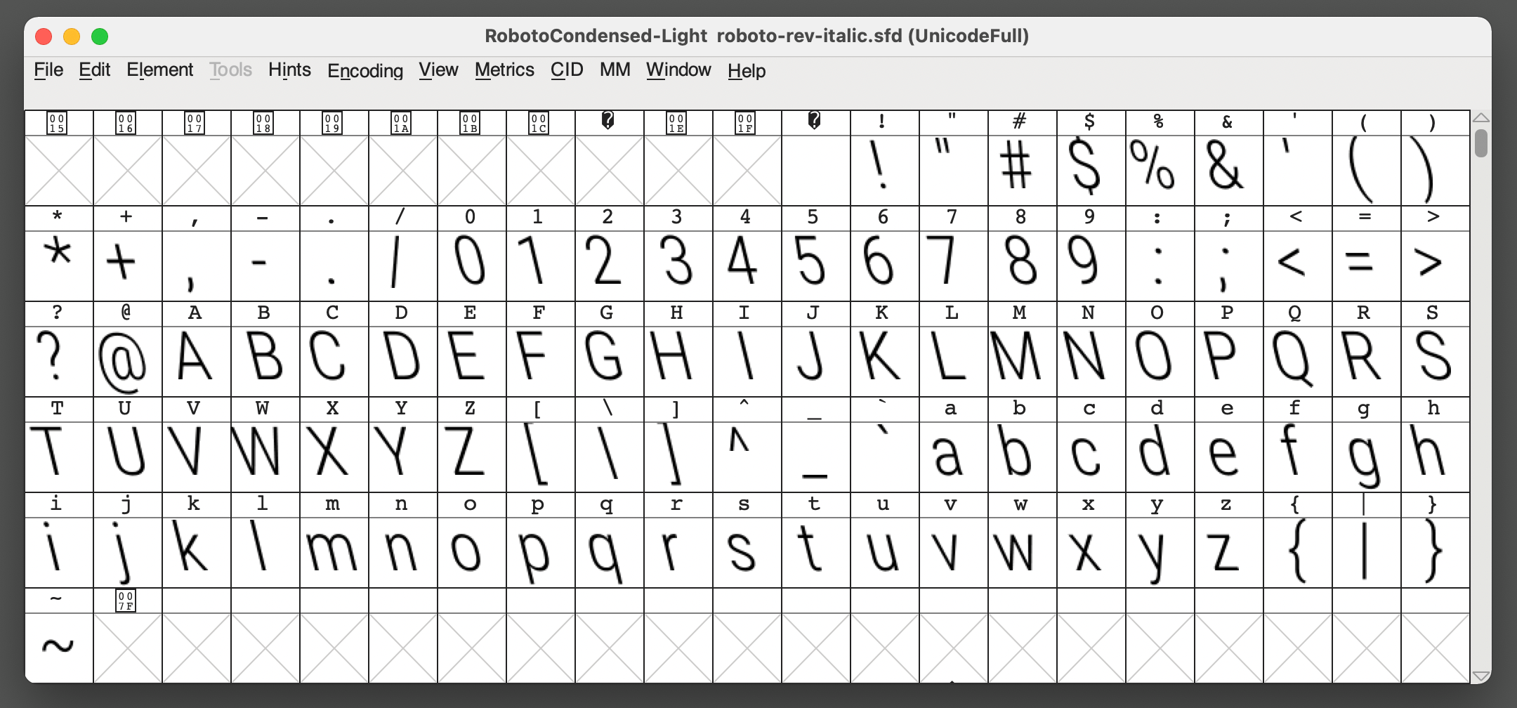
I made a few attempts to solve the issues with slanted text and images with CSS but eventually came up with an even simpler solution: create a new font using FontForge to reverse the text’s slant.
FontForge is an open-source font editor. I’d chosen Roboto Condensed Light for the site’s main content, so I downloaded the .ttf file and opened it up in FontForge. From there, I selected all the glyphs and applied a skew of 14deg to compensate for the slanting caused by the CSS transform on the container. I saved the new font file as Roboto-Rev-Italic.ttf and called it from my stylesheet.

There we go. Now the font is slanted in the opposite direction by the same amount of the container’s slant, offsetting things so that the content appears like the normal Roboto font I was originally using.
Step 3: Refine images and videos
That worked great for the text! Selecting the text even functioned normally. From there, all I needed to do was reverse the slant for block-level image and video elements using a negative skew() value that offsets the value applied to the container:
img,
video { transform: skew(-14deg);
}
I did wind up wrapping images and videos in extra divs, though. That way, I could give them nice backgrounds that appear to square nicely with the container. What I did was hook into the ::after pseudo-element and position it with a background that extends beyond the slanted container’s left and right edges.
img::after,
video::after { content: ''; display: block; background: rgba(0, 0, 0, 0.5); position: absolute; top: 0; left: 0; width: 200%; height: 100%;
}Final demo
Here’s that final demo again:
I’m using this effect right now on my personal website and love it so far. But have you done something similar with a different approach? Definitely let me know in the comments so we can compare notes!


