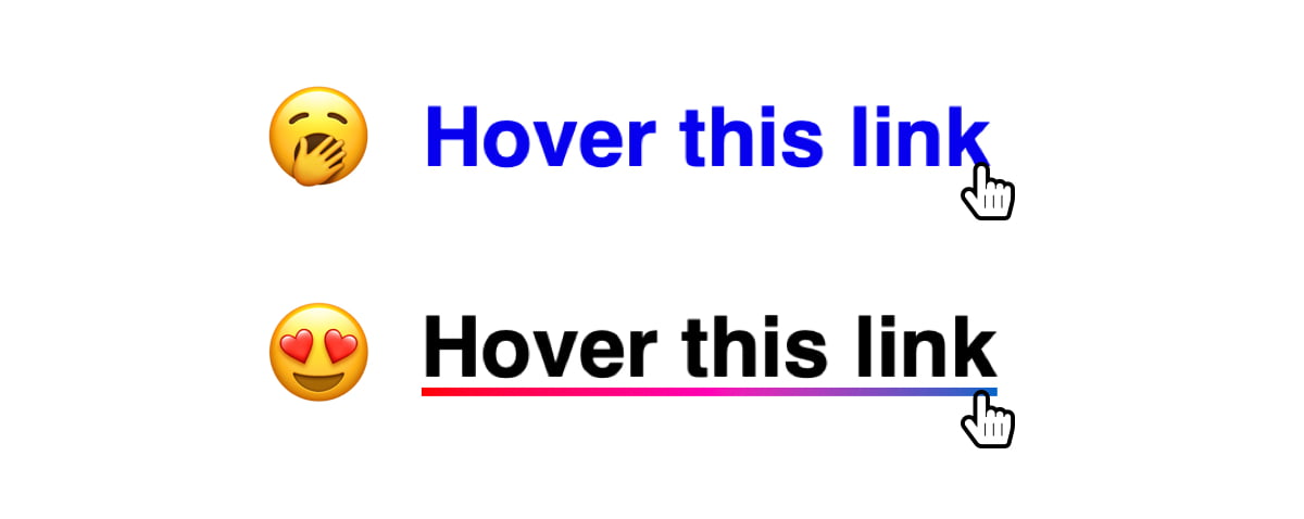
Creating CSS link hover effects can add a bit of flair to an otherwise bland webpage. If you’ve ever found yourself stumped trying to make a slick hover effect, then I have six CSS effects for you to take and use for your next project.

Let’s get right to it!
I know we’re talking about :hover and all, but it can sometimes (but maybe not always) be a good idea lump :focus in as well, as not all interactions are directly from a mouse, but perhaps a tap or keystroke.
The Sliding Highlight Link Hover Effect
Table of Contents
This effect applies a box shadow to the inline link, altering the color of the link text in the process. We start with padding all around the link, then add a negative margin of the same value to prevent the padding from disrupting the text flow.
We will use box-shadow instead of the background property since it allows us to transition.
a { box-shadow: inset 0 0 0 0 #54b3d6; color: #54b3d6; margin: 0 -.25rem; padding: 0 .25rem; transition: color .3s ease-in-out, box-shadow .3s ease-in-out;
}
a:hover { box-shadow: inset 100px 0 0 0 #54b3d6; color: white;
}
The Text Swappin’ Link Hover Effect
Here’s a fun one where we swap the text of the link with some other text on hover. Hover over the text and the linked text slides out as new text slides in.
Easier to show than tell.
There’s quite a bit of trickery happening in this link hover effect. But the magic sauce is using a data-attribute to define the text that slides in and call it with the content property of the link’s ::after pseudo-element.
First off, the HTML markup:
<p>Hover <a href="#" data-replace="get a link"><span>get a link</span></a></p>That’s a lot of inline markup, but you’re looking at a paragraph tag that contains a link and a span.
Let’s give link some base styles. We need to give it relative positioning to hold the pseudo-elements — which will be absolutely positioned — in place, make sure it’s displayed as inline-block to get box element styling affordances, and hide any overflow the pseudo-elements might cause.
a { overflow: hidden; position: relative; display: inline-block;
}
The ::before and ::after pseudo-elements should have some absolute positioning so they stack with the actual link. We’ll make sure they are set to the link’s full width with a zero offset in the left position, setting them up for some sliding action.
a::before,
a::after { content: ''; position: absolute; width: 100%; left: 0;
}
The ::after pseudo-element gets the content from the link’s data-attribute that’s in the HTML markup:
a::after { content: attr(data-replace);
}
Now we can transform: translate3d() the ::after pseudo-element element to the right by 200%. We move it back into position on :hover. While we’re at it, we can give this a zero offset n the top direction. This’ll be important later when we use the ::before pseudo-element like an underline below the text.
a::after { content: attr(data-replace); top: 0; transform-origin: 100% 50%; transform: translate3d(200%, 0, 0);
} a:hover::after,
a:focus::after { transform: translate3d(0, 0, 0);
}
We’re also going to transform: scale() the ::before pseudo-element so it’s hidden by default, then scale it back up on :hover. We’ll make it small, like 2px in height, and pin it to the bottom so it looks like an underline on the text that swaps in with ::after.
a::before { background-color: #54b3d6; height: 2px; bottom: 0; transform-origin: 100% 50%; transform: scaleX(0);
} a:hover::before,
a:focus::before { transform-origin: 0% 50%; transform: scaleX(1);
}
The rest is all preference! We drop in a transition on the transform effects, some colors, and whatnot to get the full effect. Those values are totally up to you.
View full CSS
a { overflow: hidden; position: relative; display: inline-block;
} a::before,
a::after { content: ''; position: absolute; width: 100%; left: 0;
}
a::before { background-color: #54b3d6; height: 2px; bottom: 0; transform-origin: 100% 50%; transform: scaleX(0); transition: transform .3s cubic-bezier(0.76, 0, 0.24, 1);
}
a::after { content: attr(data-replace); height: 100%; top: 0; transform-origin: 100% 50%; transform: translate3d(200%, 0, 0); transition: transform .3s cubic-bezier(0.76, 0, 0.24, 1); color: #54b3d6;
} a:hover::before { transform-origin: 0% 50%; transform: scaleX(1);
}
a:hover::after { transform: translate3d(0, 0, 0);
} a span { display: inline-block; transition: transform .3s cubic-bezier(0.76, 0, 0.24, 1);
} a:hover span { transform: translate3d(-200%, 0, 0);
}
The Growing Background Link Hover Effect
This is a pretty popular effect I’ve seen used in quite a few places. The idea is that you use the link’s ::before pseudo-element as a thick underline that sits slightly behind the actual text of the link. Then, on hover, the pseudo-element expands to cover the whole thing.
OK, some base styles for the link. We want no text-decoration since ::before will act like one, then some relative positioning to hold ::before in place when we give that absolute positioning.
a { text-decoration: none; position: relative;
}
Now let’s set up ::before by making it something like 8px tall so it looks like a thick underline. We’ll also give it absolute positioning so we have control to make it the full width of the actual link while offsetting it so it’s at the left and is just a smidge off the bottom so it looks like it’s subtly highlighting the link. May as well give it z-index: -1 so we’re assured it sits behind the link.
a::before { content: ''; background-color: hsla(196, 61%, 58%, .75); position: absolute; left: 0; bottom: 3px; width: 100%; height: 8px; z-index: -1;
}
Nice, nice. Let’s make it appear as though ::before is growing when the link is hovered. All we need is to change the height from 3px to 100%. Notice that I’m also dropping the bottom offset back to zero so the background covers more space when it grows.
a:hover::before { bottom: 0; height: 100%;
}
Now for slight transition on those changes:
a::before { content: ''; background-color: hsla(196, 61%, 58%, .75); position: absolute; left: 0; bottom: 3px; width: 100%; height: 8px; z-index: -1; transition: all .3s ease-in-out;
}
View full CSS
a { text-decoration: none; color: #18272F; font-weight: 700; position: relative;
} a::before { content: ''; background-color: hsla(196, 61%, 58%, .75); position: absolute; left: 0; bottom: 3px; width: 100%; height: 8px; z-index: -1; transition: all .3s ease-in-out;
} a:hover::before { bottom: 0; height: 100%;
}
The Right-to-Left Color Swap Link Hover Effect
I personally like using this effect for links in a navigation. The link starts in one color without an underline. Then, on hover, a new color slides in from the right while an underline slides in from the left.
Neat, right? There’s a lot of motion happening in there, so you might consider the accessibility implications and wrap it all in a prefers-reduced-motion query to replace it with something more subtle for those with motion sensitivities.
Here’s how it works. We give the link a linear background gradient with a hard stop between two colors at the halfway mark.
a { background-image: linear-gradient( to right, #54b3d6, #54b3d6 50%, #000 50% );
}
We make the background double the link’s width, or 200%, and position it all the way over to the left. That way, it’s like only one of the gradients two colors is showing.
a { background-image: linear-gradient( to right, #54b3d6, #54b3d6 50%, #000 50% ); background-size: 200% 100%; background-position: -100%;
}
The magic happens when we reach for a couple of non-standard -webkit-prefixed properties. One strips the color out of the text to make it transparent. The other clips the background gradient to the text so it appears the text is actually the color of the background.
a { background-image: linear-gradient( to right, #54b3d6, #54b3d6 50%, #000 50% ); background-size: 200% 100%; background-position: -100%; -webkit-background-clip: text; -webkit-text-fill-color: transparent;
}
Still with me? Now let’s make the link’s faux underline by putting ::before to use. We’ll give it the same color we gave the on the hidden portion of the link’s background gradient and position it under the actual link so it looks like a proper text-decoration: underline.
a:before { content: ''; background: #54b3d6; display: block; position: absolute; bottom: -3px; left: 0; width: 0; height: 3px;
}
On hover, we slide ::before into place, coming in from the left:
a:hover { background-position: 0;
}
Now, this is a little tricky. On hover, we make the link’s ::before pseudo-element 100% of the link’s width. If we were to apply this directly to the link’s hover, we’d make the link itself full-width, which moves it around the screen. Yikes!
a:hover::before { width: 100%;
}
Add a little transition to smooth things out:
a { background-image: linear-gradient( to right, #54b3d6, #54b3d6 50%, #000 50% ); background-size: 200% 100%; background-position: -100%; -webkit-background-clip: text; -webkit-text-fill-color: transparent; transition: all 0.3s ease-in-out;
}
View full CSS
a { background-image: linear-gradient( to right, #54b3d6, #54b3d6 50%, #000 50% ); background-size: 200% 100%; background-position: -100%; display: inline-block; padding: 5px 0; position: relative; -webkit-background-clip: text; -webkit-text-fill-color: transparent; transition: all 0.3s ease-in-out;
} a:before { content: ''; background: #54b3d6; display: block; position: absolute; bottom: -3px; left: 0; width: 0; height: 3px; transition: all 0.3s ease-in-out;
} a:hover { background-position: 0;
} a:hover::before { width:100%;
}
The Rainbow Underline Link Hover Effect
We can’t do text-decoration-color: rainbow, but we can fake it with a little background magic mixed with linear gradients.
First, we remove the link’s text-decoration:
a { text-decoration: none;
}
Now for those gradients. We chain two linear gradients together on the same background property. One gradient is the initial color before hover. The second is the rainbow on hover.
a { background: linear-gradient( to right, rgba(100, 200, 200, 1), rgba(100, 200, 200, 1) ), linear-gradient( to right, rgba(255, 0, 0, 1), rgba(255, 0, 180, 1), rgba(0, 100, 200, 1) );
}
Let’s make the background size a mere 3px tall so it looks like, you know, an underline. We can size both gradients together on the background-size property so that the initial gradient is full width and 3px tall, and the rainbow is zero width.
a { background: linear-gradient( to right, rgba(100, 200, 200, 1), rgba(100, 200, 200, 1) ), linear-gradient( to right, rgba(255, 0, 0, 1), rgba(255, 0, 180, 1), rgba(0, 100, 200, 1) ); background-size: 100% 3px, 0 3px;
}
Now we can position the background gradients — at the same time on the background-position property — so that the first gradient is fully in view and the rainbow is pushed out of view. Oh, and let’s make sure the background isn’t repeating while we’re at it.
a { background: linear-gradient( to right, rgba(100, 200, 200, 1), rgba(100, 200, 200, 1) ), linear-gradient( to right, rgba(255, 0, 0, 1), rgba(255, 0, 180, 1), rgba(0, 100, 200, 1) ); background-size: 100% 3px, 0 3px; background-position: 100% 100%, 0 100%; background-repeat: no-repeat;
}
Let’s update the background-size on hover so that the gradients swap values:
a:hover { background-size: 0 3px, 100% 3px;
}
And, finally, a little transition when the hover takes place:
a { background: linear-gradient( to right, rgba(100, 200, 200, 1), rgba(100, 200, 200, 1) ), linear-gradient( to right, rgba(255, 0, 0, 1), rgba(255, 0, 180, 1), rgba(0, 100, 200, 1) ); background-size: 100% 3px, 0 3px; background-position: 100% 100%, 0 100%; background-repeat: no-repeat; transition: background-size 400ms;
}
Voilà!
The Passing Underline Link Hover Effect
Geoff Graham actually covered this same one recently when he dissected Adam Argyle’s slick hover effect. In his demo, a background color enters from the left behind the link, then exits to the right on mouse out.
My version pares down the background so it’s more of an underline.
a { position: relative;
} a::before { content: ''; position: absolute; width: 100%; height: 4px; border-radius: 4px; background-color: #18272F; bottom: 0; left: 0; transform-origin: right; transform: scaleX(0); transition: transform .3s ease-in-out; } a:hover::before { transform-origin: left; transform: scaleX(1);
}
That’s not the only way to accomplish this! Here’s another one by Justin Wong using background instead:
Geoff also has a roundup of CSS link hover effects, ranging from neat to downright absurd. Worth checking out!
Have a blast linking!
There are a lot of options when it comes to creating your own hover effect for in-line links with CSS. You can even play with these effects and create something new. I hope you liked the article. Keep experimenting!


