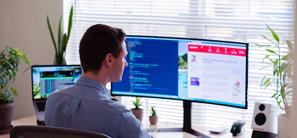
Looking for some inspiration for your next web design project? These are the web design trends that are attracting eyes and clicks in 2022.
1. One-page websites
Table of Contents
Websites with multiple pages and menus were necessary when loading times were an issue. Now that 5G is taking over, single-page websites are becoming popular. Navigating a single page is much easier than having to click around—especially on mobile. It may not work for companies with diverse product lines, but for most others, one page simplifies the customer journey.
2. More video content
5G allows for high-quality videos and fast streaming on mobile devices. As a result, text-based content is being transformed into video. Landing page copy, product descriptions, and even customer reviews are all being replaced with video content.
And it makes sense why.
Consumers prefer video to text when learning about products. Video is accessible to a wider audience, and it can easily be repurposed for social media, ads, and more. Web designers can take advantage of free video download from stock video and CC sources to create affordable and video-rich pages.
3. Web vintage
The internet is old enough to officially have a “vintage” era. Designs from the early days of the internet (from the late 90s to the early 2000s, like this) spark nostalgia in millennials. This trend is also a response to the spike in video and motion effects, which some find overstimulating.
Vintage designs feature lots of bright colors, collage-like image placement, and plenty of pixels.
4. Linework
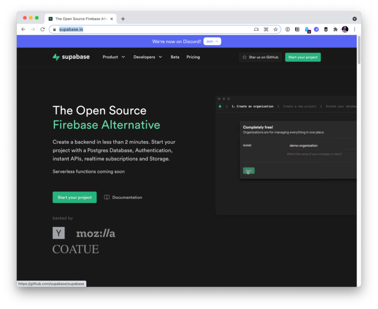
Linework is a minimalist and versatile design style that’s taking over the internet. It can be used to create complex illustrations or to cleanly format a website, like this. The symmetry of linework is comforting and lends to a brand’s authority.
One of the biggest perks of linework is that it can be done quickly and simply. However, this doesn’t mean it’s easy to do well.
5. Motion effects
Motion effects on mobile and desktop sites are becoming more common now that 5G devices are able to handle the bandwidth. Animations, trigger effects, scaling, and other effects are effective ways to keep visitors on-page and engaged.
But be warned that motion effects can go wrong if done incorrectly. Too much motion can cause anxiety. Incorporating subtle motion can accentuate a message without becoming overstimulating, like this.
6. VR and AR
Some brands are going beyond motion effects and adopting virtual reality (VR) and augmented reality (AR) features directly into their sites. Thanks to 5G, app-less AR integrations are possible, allowing consumers to visualize the benefits of products and services in their own homes or on their bodies, such as AR clothes fittings.
Immersive VR experiences are being used to let customers test products and take tours of far-away places from their sofas. Check out how Lowe’s is using VR to teach its customers DIY home improvement projects.
7. Gender-neutral design
Marketers are avoiding overtly masculine and feminine tropes as the public embraces gender fluidity, and web design is following suit. Gender-neutral visuals include neutral colors like grey, green, and yellow. Images and backgrounds should not promote stereotypes, such as flowers for girls and camouflage for boys.
New design features can also make sites more inclusive, such as allowing users to select their pronouns when providing personal info.
8. Personalized content
Advanced tracking and analytics are making personalized features smarter. Now, when customers go to websites they are greeted with personalized content greeting them by name. Landing pages may even be curated with articles or products based on a user’s past search history.
Personalized design means web pages look different to each visitor, posing creative challenges and opportunities for designers.
9. Dark mode
A simple yet popular trend is “dark mode,” which inverts the white and dark colors on a site or social media app. Facebook, Twitter, Reddit, and many others have a dark mode option, and a striking 95% of users prefer it.
Darker backgrounds and lighter text may be easier on the eyes after hours of screen exposure. Designers can use this information to darken their backgrounds and avoid flashy colors.
10. Color psychology
Color psychology is the use of color tones to influence behavior. It’s been used in advertising for years, and more designers are incorporating it into their websites.
Orange and yellow induce hunger, blue creates a sense of calm, red triggers passion, etc. Using the right color can avoid dissonance on your website (think, advertising steaks against a neon-green background). Starting from a base of color psychology is also helpful in defining your palette.
Web design trends in 2022 are embracing the dawn of 5G while adapting to a changing cultural landscape. New trends are cropping up daily, but the ones on this list enjoy broad appeal and are likely to stick around.


