A while ago, Geoff wrote an article about a cool hover effect. The effect relies on a combination of CSS pseudo-elements, transforms, and transitions. A lot of comments have shown that the same effect can be done using background properties. Geoff mentioned that was his initial thought and that’s what I was thinking as well. I am not saying the pseudo-element he landed on is bad, but knowing different methods to achieve the same effect can only be a good thing.
In this post, we will re-work that hover effect, but also expand it into other types of hover effects that only use CSS background properties.
You can see the background properties at work in that demo, as well as how we can use custom properties and the calc() function to do even more. We are going to learn how to combine all of these so we are left with nicely optimized code!
Hover effect #1
Let’s start with the first effect which is the reproduction of the one detailed by Geoff in his article. The code used to achieve that effect is the following:
.hover-1 { background: linear-gradient(#1095c1 0 0) var(--p, 0) / var(--p, 0) no-repeat; transition: .4s, background-position 0s;
}
.hover-1:hover { --p: 100%; color: #fff;
}
If we omit the color transition (which is optional), we only need three CSS declarations to achieve the effect. You are probably surprised how small the code is, but you will see how we got there.
First, let’s start with a simple background-size transition:
We are animating the size of a linear gradient from 0 100% to 100% 100%. That means the width is going from 0 to 100% while the background itself remains at full height. Nothing complex so far.
Let’s start our optimizations. We first transform our gradient to use the color only once:
background-image: linear-gradient(#1095c1 0 0);The syntax might look a bit strange, but we are telling the browser that one color is applied to two color stops, and that’s enough to define a gradient in CSS. Both color stops are 0, so the browser automatically makes the last one 100% and fills our gradient with the same color. Shortcuts, FTW!
With background-size, we can omit the height because gradients are full height by default. We can do a transition from background-size: 0 to background-size: 100%.
.hover-1 { background-image: linear-gradient(#1095c1 0 0); background-size: 0; background-repeat: no-repeat; transition: .4s;
}
.hover-1:hover { background-size: 100%;
}
Let’s introduce a custom property to avoid the repetition of background-size:
.hover-1 { background-image: linear-gradient(#1095c1 0 0); background-size: var(--p, 0%); background-repeat: no-repeat; transition: .4s;
}
.hover-1:hover { --p: 100%;
}
We are not defining --p initially, so the fallback value (0% in our case) will be used. On hover, we define a value that replaces the fallback one ( 100%).
Now, let’s combine all the background properties using the shorthand version to get:
.hover-1 { background: linear-gradient(#1095c1 0 0) left / var(--p, 0%) no-repeat; transition: .4s;
}
.hover-1:hover { --p: 100%;
}
We are getting closer! Note that I have introduced a left value (for the background-position) which is mandatory when defining the size in the background shorthand. Plus, we need it anyway to achieve our hover effect.
We need to also update the position on hover. We can do that in two steps:
- Increase the size from the right on mouse hover.
- Decrease the size from the left on mouse out.
To do this, we need to update the background-position on hover as well:
We added two things to our code:
- A
background-positionvalue ofrighton hover - A
transition-durationof0son thebackground-position
This means that, on hover, we instantly change the background-position from left (see, we needed that value!) to right so the background’s size will increase from the right side. Then, when the mouse cursor leaves the link, the transition plays in reverse, from right to left, making it appear that we are decreasing the background’s size from the left side. Our hover effect is done!
But you said we only needed three declarations and there are four.
That’s true, nice catch. The left and right values can be changed to 0 0 and 100% 0, respectively; and since our gradient is already full height by default, we can get by using 0 and 100%.
.hover-1 { background: linear-gradient(#1095c1 0 0) 0 / var(--p, 0%) no-repeat; transition: .4s, background-position 0s;
}
.hover-1:hover { --p: 100%; background-position: 100%;
}
See how background-position and --p are using the same values? Now we can reduce the code down to three declarations:
.hover-1 { background: linear-gradient(#1095c1 0 0) var(--p, 0%) / var(--p,0%) no-repeat; transition: .4s, background-position 0s;
}
.hover-1:hover { --p: 100%;
}
The custom property --p is defining both the background position and size. On hover, It will update both of them as well. This is a perfect use case showing how custom properties can help us reduce redundant code and avoid writing properties more than once. We define our setting using custom properties and we only update the latter on hover.
But the effect Geoff described is doing the opposite, starting from left and ending at right. How do we do that when it seems we cannot rely on the same variable?
We can still use one variable and update our code slightly to achieve the opposite effect. What we want is to go from 100% to 0% instead of 0% to 100%. We have a difference of 100% that we can express using calc(), like this:
.hover-1 { background: linear-gradient(#1095c1 0 0) calc(100% - var(--p,0%)) / var(--p,0%) no-repeat; transition: .4s, background-position 0s;
}
.hover-1:hover { --p: 100%;
}
--p will change from 0% to 100%, but the background’s position will change from 100% to 0%, thanks to calc().
We still have three declarations and one custom property, but a different effect.
Before we move to the next hover effect, I want to highlight something important that you have probably noticed. When dealing with custom properties, I am using 0% (with a unit) instead of a unit-less 0. The unit-less zero may work when the custom property is alone, but will fail inside calc() where we need to explicitly define the unit. I may need another article to explain this quirk but always remember to add the unit when dealing with custom properties. I have two answers on StackOverflow (here and here) that go into more detail.
Hover effect #2
We need a more complex transition for this effect. Let’s take a look at a step-by-step illustration to understand what is happening.
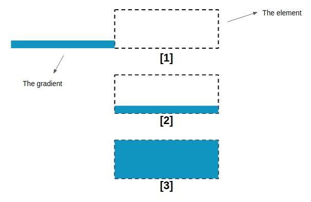
100% to cover the whole element.We first have a background-position transition followed by a background-size one. Let’s translate this into code:
.hover-2 { background-image: linear-gradient(#1095c1 0 0); background-size: 100% .08em; /* .08em is our fixed height; modify as needed. */ background-position: /* ??? */; background-repeat: no-repeat; transition: background-size .3s, background-position .3s .3s;
}
.hover-2:hover { transition: background-size .3s .3s, background-position .3s; background-size: 100% 100%; background-position: /* ??? */;
}
Note the use of two transition values. On hover, we need to first change the position and later the size, which is why we are adding a delay to the size. On mouse out, we do the opposite.
The question now is: what values do we use for background-position? We left those blank above. The background-size values are trivial, but the ones for background-position are not. And if we keep the actual configuration we’re unable to move our gradient.
Our gradient has a width equal to 100%, so we cannot use percentage values on background-position to move it.
Percentage values used with background-position are always a pain especially when you use them for the first time. Their behavior is non-intuitive but well defined and easy to understand if we get the logic behind it. I think it would take another article for a full explanation why it works this way, but here’s another “long” explanation I posted over at Stack Overflow. I recommend taking a few minutes to read that answer and you will thank me later!
The trick is to change the width to something different than 100%. Let’s use 200%. We’re not worried about the background exceeding the element because the overflow is hidden anyway.
.hover-2 { background-image: linear-gradient(#1095c1 0 0); background-size: 200% .08em; background-position: 200% 100%; background-repeat: no-repeat; transition: background-size .3s, background-position .3s .3s;
}
.hover-2:hover { transition: background-size .3s .3s, background-position .3s; background-size: 200% 100%; background-position: 100% 100%;
}
And here’s what we get:
It’s time to optimize our code. If we take the ideas we learned from the first hover effect, we can use shorthand properties and write fewer declarations to make this work:
.hover-2 { background: linear-gradient(#1095c1 0 0) no-repeat var(--p, 200%) 100% / 200% var(--p, .08em); transition: .3s var(--t, 0s), background-position .3s calc(.3s - var(--t, 0s));
}
.hover-2:hover { --p: 100%; --t: .3s;
}
We add all the background properties together using the shorthand version then we use --p to express our values. The sizes change from .08em to 100% and the position from 200% to 100%
I am also using another variable --t , to optimize the transition property. On mouse hover we have it set to a .3s value, which gives us this:
transition: .3s .3s, background-position .3s 0s;On mouse out, --t is undefined, so the fallback value will be used:
transition: .3s 0s, background-position .3s .3s;Shouldn’t we have
background-sizein thetransition?
That is indeed another optimization we can make. If we don’t specify any property it means “all” the properties, so the transition is defined for “all” the properties (including background-size and background-position). Then it’s defined again for background-position which is similar to defining it for background-size, then background-position.
“Similar” is different than saying something is the “same.” You will see a difference if you change more properties on hover, so the last optimization might be unsuitable in some cases.
Can we still optimize the code and use only one custom property?
Yes, we can! Ana Tudor shared a great article explaining how to create DRY switching where one custom property can update multiple properties. I won’t go into the details here, but our code can be revised like this:
.hover-2 { background: linear-gradient(#1095c1 0 0) no-repeat calc(200% - var(--i, 0) * 100%) 100% / 200% calc(100% * var(--i, 0) + .08em); transition: .3s calc(var(--i, 0) * .3s), background-position .3s calc(.3s - calc(var(--i, 0) * .3s));
}
.hover-2:hover { --i: 1;
}
The --i custom property is initially undefined, so the fallback value, 0, is used. On hover though, we replace 0 with 1. You can do the math for both cases and get the values for each one. You can see that variable as a “switch” that update all our values at once on hover.
Again, we’re back to only three declarations for a pretty cool hover effect!
Hover effect #3
We are going to use two gradients instead of one for this effect. We will see that combining multiple gradients is another way to create fancy hover effects.
Here’s a diagram of what we’re doing:
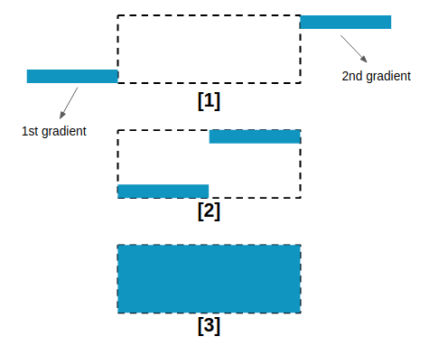
Here’s how that looks in CSS:
.hover-3 { background-image: linear-gradient(#1095c1 0 0), linear-gradient(#1095c1 0 0); background-repeat: no-repeat; background-size: 50% .08em; background-position: -100% 100%, 200% 0; transition: background-size .3s, background-position .3s .3s;
}
.hover-3:hover { background-size: 50% 100%; background-position: 0 100%, 100% 0; transition: background-size .3s .3s, background-position .3s;
}
The code is almost the same as the other hover effects we’ve covered. The only difference is that we have two gradients with two different positions. The position values may look strange but, again, that’s related to how percentages work with the background-position property in CSS, so I highly recommend reading my Stack Overflow answer if you want to get into the gritty details.
Now let’s optimize! You get the idea by now — we’re using shorthand properties, custom properties, and calc() to tidy things up.
.hover-3 { --c: no-repeat linear-gradient(#1095c1 0 0); background: var(--c) calc(-100% + var(--p, 0%)) 100% / 50% var(--p, .08em), var(--c) calc( 200% - var(--p, 0%)) 0 / 50% var(--p, .08em); transition: .3s var(--t, 0s), background-position .3s calc(.3s - var(--t, 0s));
}
.hover-3:hover { --p: 100%; --t: 0.3s;
}
I have added an extra custom property, --c, that defines the gradient since the same gradient is used in both places.
I am using 50.1% in that demo instead of 50% for the background size because it prevents a gap from showing between the gradients. I also added 1% to the positions for similar reasons.
Let’s do the second optimization by using the switch variable:
.hover-3 { --c: no-repeat linear-gradient(#1095c1 0 0); background: var(--c) calc(-100% + var(--i, 0) * 100%) 100% / 50% calc(100% * var(--i, 0) + .08em), var(--c) calc( 200% - var(--i, 0) * 100%) 0 / 50% calc(100% * var(--i, 0) + .08em); transition: .3s calc(var(--i, 0) * .3s), background-position .3s calc(.3s - var(--i, 0) * .3s);
}
.hover-3:hover { --i: 1;
}
Are you started to see the patterns here? It’s not so much that the effects we’re making are difficult. It’s more the “final step” of code optimization. We start by writing verbose code with a lot of properties, then reduce it following simple rules (e.g. using shorthand, removing default values, avoiding redundant values, etc) to simplify things down as much as possible.
Hover effect #4
I will raise the difficulty level for this last effect, but you know enough from the other examples that I doubt you’ll have any issues with this one.
This hover effect relies on two conic gradients and more calculations.
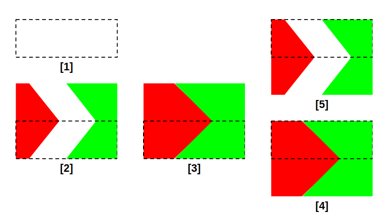
Initially, we have both gradients with zero dimensions in Step 1. We increase the size of each one in Step 2. We keep increasing their widths until they fully cover the element, as shown in Step 3. After that, we slide them to the bottom to update their position. This is the “magic” part of the hover effect. Since both gradients will use the same coloration, changing their position in Step 4 will make no visual difference — but we will see a difference once we reduce the size on mouse out during Step 5.
If you compare Step 2 and Step 5, you can see that we have a different inclination. Let’s translate that into code:
.hover-4 { background-image: conic-gradient(/* ??? */), conic-gradient(/* ??? */); background-position: 0 0, 100% 0; background-size: 0% 200%; background-repeat: no-repeat; transition: background-size .4s, background-position 0s;
}
.hover-4:hover { background-size: /* ??? */ 200%; background-position: 0 100%, 100% 100%;
}
The positions are pretty clear. One gradient starts at top left (0 0) and ends at bottom left (0 100%) while the other starts at top right (100% 0) and ends at bottom right (100% 100%).
We’re using a transition on the background positions and sizes to reveal them. We only need a transition value for the background-size. And like before, background-position needs to change instantly, so we’re assigning a 0s value for the transition’s duration.
For the sizes, both gradient need to have 0 width and twice the element height (0% 200%). We will see later how their sizes change on hover. Let’s first define the gradient configuration.
The diagram below illustrates the configuration of each gradient:
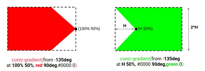
Note that for the second gradient (indicated in green), we need to know the height to use it inside the conic-gradient we’re creating. For this reason, I am going to add a line-height that sets the element’s height and then try that same value for the conic gradient values we left out.
.hover-4 { --c: #1095c1; line-height: 1.2em; background-image: conic-gradient(from -135deg at 100% 50%, var(--c) 90deg, #0000 0), conic-gradient(from -135deg at 1.2em 50%, #0000 90deg, var(--c) 0); background-position: 0 0, 100% 0; background-size: 0% 200%; background-repeat: no-repeat; transition: background-size .4s, background-position 0s;
}
.hover-4:hover { background-size: /* ??? */ 200%; background-position: 0 100%, 100% 100%;
}
The last thing we have left is to figure out the background’s size. Intuitively, we may think that each gradient needs to take up half of the element’s width but that’s actually not enough.
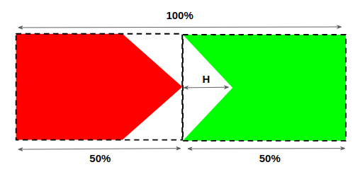
50% as the background-size value for both gradients.We get a gap equal to the height, so we actually need to do is increase the size of each gradient by half the height on hover for them to cover the whole element.
.hover-4:hover { background-size: calc(50% + .6em) 200%; background-position: 0 100%, 100% 100%;
}
Here’s what we get after optimizing them like the previous examples:
.hover-4 { --c: #1095c1; line-height: 1.2em; background: conic-gradient(from -135deg at 100% 50%, var(--c) 90deg, #0000 0) 0 var(--p, 0%) / var(--s, 0%) 200% no-repeat, conic-gradient(from -135deg at 1.2em 50%, #0000 90deg, var(--c) 0) 100% var(--p, 0%) / var(--s, 0%) 200% no-repeat; transition: .4s, background-position 0s;
}
.hover-4:hover { --p: 100%; --s: calc(50% + .6em);
}
What about the version with only one custom property?
I will leave that for you! After looking at four similar hover effects, you should be able to get the final optimization down to a single custom property. Share your work in the comment section! There’s no prize, but we may end up with different implementations and ideas that benefit everyone!
Before we end, let me share a version of that last hover effect that Ana Tudor cooked up. It’s an improvement! But note that it lacks Firefox supports due to a known bug. Still, it’s a great idea that shows how to combine gradients with blend modes to create even cooler hover effects.
Wrapping up
We made four super cool hover effects! And even though they are different effects, they all take the same approach of using CSS background properties, custom properties, and calc(). Different combinations allowed us to make different versions, all using the same techniques that leave us with clean, maintainable code.
If you want to get some ideas, I made a collection of 500 (yes, 500!) hover effects, 400 of which are done without pseudo-elements. The four we covered in this article are just the tip of the iceberg!


