A service page is one of the most important parts of your website. This is where your prospective customers will learn more about what your business offers and determine whether or not you can help them.
In this article, we’re going to outline how you can optimize your website’s service pages in order to get more sales. Let’s get started.
Move customers in the right direction with strong calls to action
Table of Contents
A call to action, or CTA, is a word or phrase — often on a clickable button — that tells the reader what to do next. Sometimes, people just need an extra push in order to get them to do what you want. A strong CTA can direct someone to contact you for a quote or request more information and boost your overall conversion rate.
Whether you want to increase your Shopify sales or sell a product in a B2B situation, here are a few tips for adding effective CTAs to your service pages:
- Place your phrase on a button to help it stand out
- Use bold colors that stand out against the background
- Tap into your brand voice
- Lead with a strong verb
Let’s take a look at an example of a service page with an effective CTA as inspiration.
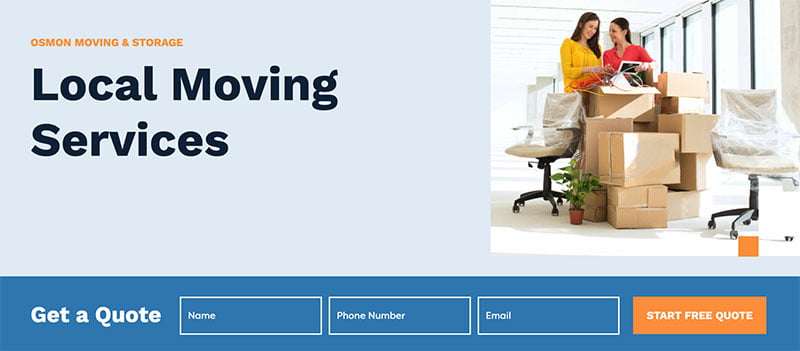

Osmon Moving and Storage, a California-based moving company, has a great CTA on its homepage. As you can see in the image above, they have a CTA that says “START FREE QUOTE” on a bright orange button that stands out against the blue background.
It’s very clear to the website visitor where they need to go to get a cost estimate — this is a particularly effective approach for a moving company that likely has to consider a lot of different factors before offering a bespoke price for their services.
If you run a service-based business, it might not always be that easy to outline your costs to a website visitor. But, if you mimic the strategy seen above and create a simple contact form attached to a bold CTA, you can streamline the process for your website visitors and help increase your conversion rate.
Limit friction by making it incredibly easy to convert
When people land on your service page, you need to make it as easy as possible for them to take the next step with your business. No one wants to spend a ton of time clicking around a website trying to figure out how to buy. If you make the conversion process easy, you’ll be more likely to increase your sales.
Here are a few suggestions for making it easy to convert on your service pages:
- Offer multiple CTAs for different types of customers
- Design a sophisticated search feature that takes users to the exact services they’re looking for
- Make it easy for people to get in touch with your customer service team by placing your contact information where it’s easy to find
Let’s take a look at a few examples of businesses that make it easy to convert on their service pages as inspiration.
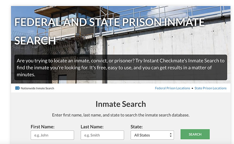

Instant Checkmate, a public records search engine, makes it very easy to convert on their inmate search page. As you can see in the image above, Instant Checkmate just asks for the name and state of the person the user is searching for. By only requiring a small amount of information to start, the company is likely to convince more people to use its tool, ultimately increasing its conversion rate.
If you provide a tool that takes your website visitors to the information they’re looking for, be sure that you don’t ask for too much information from them upfront. You don’t want your tool to be too intimidating or time-consuming, or you’ll risk people leaving your website without converting. Instead, make the process simple and straightforward to encourage people to use it.


Syniverse, a US-based telecommunications company, also makes it very easy to convert on their website. For instance, on their Rich Communication Services page, they have multiple CTAs: one to get started with the business, and another to contact their customer service team.
These appeal to two different groups of people at different stages of their buying journeys. “Contact Us” attracts people who aren’t quite ready to make a purchase or need more information, while “Get Started” attracts people who want to convert. By offering multiple CTAs, Syniverse is able to make it easier for people to get started, helping increase their sales.
Consider offering multiple CTAs on your service pages. Different CTAs can attract different people — some people might want to request information, others might want to ask questions, and there will be visitors who are ready to make a purchase. In doing this, you can increase your conversion rate.
Focus on ensuring your service page copy sells
The copy on your service page can ultimately make or break a sale. This means you need to ensure your copy is descriptive, optimized, and works hard to sell your website visitors on your services.
When constructing your service page copy, it can be tough to determine what to include. Start by thinking about how your services work to solve the problems that your ideal customers have. Why should your customers care about what you have to offer? How will your products improve their lives or businesses?
Furthermore, you should work to address the benefits of your services, rather than the features. In your copy, focus on how you can improve their sales or save them time, for instance, rather than just adding a bulleted list of features.
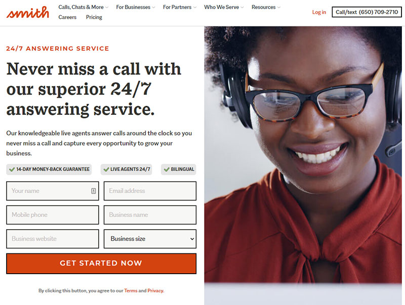

Smith.ai makes it clear how their live agents will answer calls around the clock so that your business never misses a call. This is a great way to see how the benefits, and not the features, of your service, can be used to write copy that sells.
At the same time, on the same page, there’s also various testimonials that further reiterate Smith.ai’s effectiveness in relation to the user’s needs.
When writing your service page copy, it is also helpful to incorporate relevant keywords. These are the words and phrases that people plug into search engines to find services like yours. When you incorporate them into your service page copy, you can increase your chances of ranking on search engine results pages (SERPs) for relevant queries and reaching the most appropriate people.
To identify relevant keywords, you’ll want to conduct some keyword research. Head to a tool like Google Keyword Planner and plug in words and phrases related to your business. Google will then offer you a list of keywords based on their competitiveness, or how hard they are to rank for, and their average monthly search volumes.
You can then weave the most suitable keywords into your service page copy in order to rank on the SERPs for relevant searches. Be sure to only choose keywords that are very closely related to what you actually sell — if you target keywords that are too broad, you’ll risk attracting people to your website who aren’t actually looking for services like yours. But, if done correctly, incorporating keywords into your service page copy can make sure you’re driving qualified traffic to your website, which will then translate into sales.
Use imagery to communicate the value of your services
Strong visuals can help grab people’s attention and show them what your business is all about. Imagery can also help you engage your website visitors and communicate the value of your services, ultimately helping you increase your sales!
Here are a few different ways you can incorporate imagery into the design of your service pages for the best results:
- Use images of your past clients, happy that they have used your services
- Showcase photos of your employees hard at work
- Display images of people actually using your services
Let’s take a look at an example of a business with imagery that does an excellent job of communicating its value.
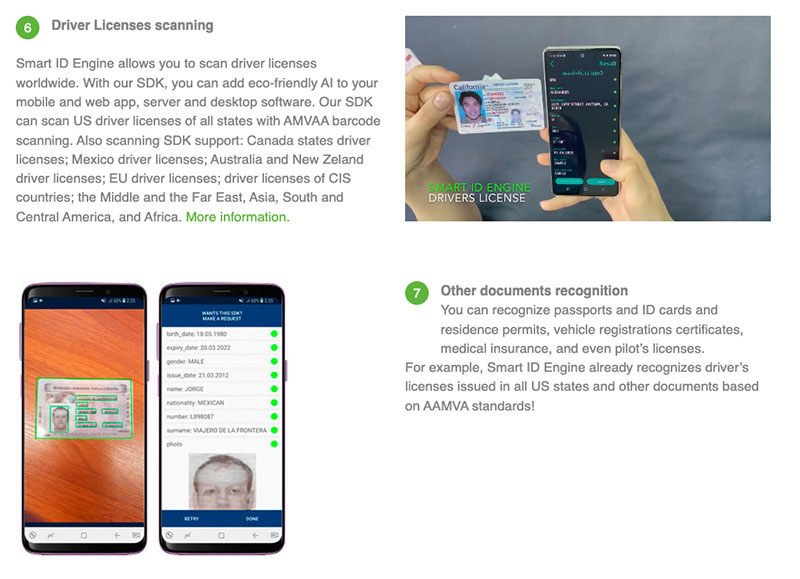

Smart Engines, a company specializing in document scanning, has great imagery on its ID scanner page. As you can see in the screenshot above, its website offers imagery that shows exactly how the company’s software works — it’s as simple as scanning an ID with your smartphone.
This makes it very clear to the website visitor how the software works and what it’s capable of — it’s great for businesses needing assistance scanning IDs, monitoring for fraud, or authenticating documents. Instead of needing to purchase fancy products or sending scans to a third party, Smart Engine’s customers just need a smartphone. Because the imagery makes this clear, it’s more likely to encourage website visitors to want to make a purchase.
Showcase images of your services in action or show how they work! This can go a long way in helping website visitors understand your products or services. And, the better your website visitors understand what your business provides, the more likely you’ll be to find the right people who will convert on your website.
People won’t just take your word for it when you say you’re great at what you do — rather, you need to design your service pages to provide proof that you’re a well-trusted expert in your field.
Client reviews and testimonials can go a long way in providing social proof. To collect reviews from your past clients, you simply need to ask. You could send out a post-purchase email to your customers asking for a review — perhaps in exchange for a small discount as incentivization. You can also ask them to attend an interview with you where they can speak candidly about your services. Posting these on your relevant service pages will help ensure that the right people see them and boost your conversion rate.
Let’s take a look at an example of a business that does an excellent job of incorporating testimonials into their service pages as inspiration.
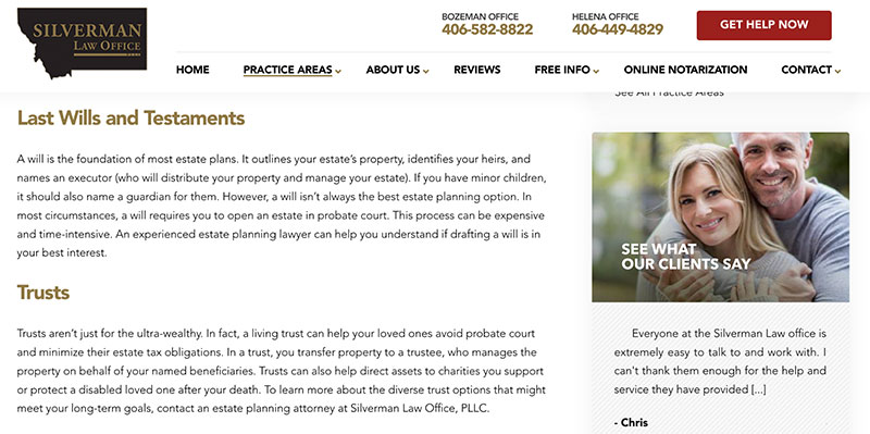

Silverman Law Office, a Montana law firm, has testimonials on all of its service pages. For instance, on the company’s estate planning service page, if you scroll down just a bit, there is a carousel of reviews outlining how helpful Silverman Law Office has been when handling different cases.
The fact that these testimonials have been included in a sidebar means people can scroll through the page without being inundated with reviews, but they can also see what others have to say. Reviews and testimonials like this are particularly important for a law firm. Legal services can seem intimidating, but reviews can do a lot to help build trust with customers and encourage them to make a purchase.
Be sure that you include reviews and testimonials on your service pages. Consider including them alongside your service explanations where they can be seen without distracting from your content. This will help you build trust with website visitors and show that you have achieved great results for others, encouraging more people to hire you!
Along with social proof, statistics are another factor that can be used to help build trust with potential customers. After all, if you can provide hard data that supports your claims, people will be more likely to believe you!
If your service page deals with productivity at the workplace, providing employee productivity statistics on your page can help solidify your case and further enhance the points you’re making.
Summary
Your service pages will make up a critical part of your selling process. In this article, we outlined how you can create high-converting service pages for your business’s website, including by incorporating reviews, using strong imagery, and offering solid CTAs.
Take a look at your service pages and see what work needs to be done!
–
Author bio


Adam Steele has been writing about digital marketing for 11 years. He has also consulted for businesses small and large, including several of the largest companies in the world. If you liked this post, follow him on Twitter and LinkedIn for more.

