As the author of a library called AgnosticUI, I’m always on the lookout for new components. And recently, I decided to dig in and start work on a new dialog (aka modal) component. That’s something many devs like to have in their toolset and my goal was to make the best one possible, with an extra special focus on making it inclusive and accessible.
My first thought was that I would avoid any dependencies and bite the bullet to build my own dialog component. As you may know, there’s a new <dialog> element making the rounds and I figured using it as a starting point would be the right thing, especially in the inclusiveness and accessibilities departments.
But, after doing some research, I instead elected to leverage a11y-dialog by Kitty Giraudel. I even wrote adapters so it integrates smoothly with Vue 3, Svelte, and Angular. Kitty has long offered a React adapter as well.
Why did I go that route? Let me take you through my thought process.
First question: Should I even use the native <dialog> element?
Table of Contents
The native <dialog> element is being actively improved and will likely be the way forward. But, it still has some issues at the moment that Kitty pointed out quite well:
- Clicking the backdrop overlay does not close the dialog by default
- The
alertdialogARIA role used for alerts simply does not work with the native<dialog>element. We’re supposed to use that role when a dialog requires a user’s response and shouldn’t be closed by clicking the backdrop, or by pressingESC. - The
<dialog>element comes with a ::backdrop pseudo-element but it is only available when a dialog is programmatically opened with dialog.showModal().
And as Kitty also points out, there are general issues with the element’s default styles, like the fact they are left to the browser and will require JavaScript. So, it’s sort of not 100% HTML anyway.
Here’s a pen demonstrating these points:
Now, some of these issues may not affect you or whatever project you’re working on specifically, and you may even be able to work around things. If you still would like to utilize the native dialog you should see Adam Argyle’s wonderful post on building a dialog component with native dialog.
OK, let’s discuss what actually are the requirements for an accessible dialog component…
What I’m looking for
I know there are lots of ideas about what a dialog component should or should not do. But as far as what I was personally going after for AgnosticUI hinged on what I believe make for an accessible dialog experience:
- The dialog should close when clicking outside the dialog (on the backdrop) or when pressing the
ESCkey. - It should trap focus to prevent tabbing out of the component with a keyboard.
- It should allow forwarding tabbing with
TABand backward tabbing withSHIFT+TAB. - It should return focus back to the previously focused element when closed.
- It should correctly apply
aria-*attributes and toggles. - It should provide Portals (only if we’re using it within a JavaScript framework).
- It should support the alertdialog ARIA role for alert situations.
- It should prevent the underlying body from scrolling, if needed.
- It would be great if our implementation could avoid the common pitfalls that come with the native
<dialog>element. - It would ideally provide a way to apply custom styling while also taking the prefers-reduced-motion user preference query as a further accessibility measure.
I’m not the only one with a wish list. You might want to see Scott O’Hara’s article on the topic as well as Kitty’s full write-up on creating an accessible dialog from scratch for more in-depth coverage.
It should be clear right about now why I nixed the native <dialog> element from my component library. I believe in the work going into it, of course, but my current needs simply outweigh the costs of it. That’s why I went with Kitty’s a11y-dialog as my starting point.
Auditing <dialog> accessibility
Before trusting any particular dialog implementation, it’s worth making sure it fits the bill as far as your requirements go. With my requirements so heavily leaning on accessibility, that meant auditing a11y-dialog.
Accessibility audits are a profession of their own. And even if it’s not my everyday primary focus, I know there are some things that are worth doing, like:
- manually verifying the functionality listed above, of course in different browsers,
- using accessibility tooling like Lighthouse, IBM Equal Access Accessibility Checker, Deque’s AXE, and WAVE to help find insights and uncover issues,
- testing with real screen readers, like JAWS, NVDA, and VoiceOver, and
- testing the component on real people.
This is quite a lot of work, as you might imagine (or know from experience). It’s tempting to take a path of less resistance and try automating things but, in a study conducted by Deque Systems, automated tooling can only catch about 57% of accessibility issues. There’s no substitute for good ol’ fashioned hard work.
The auditing environment
The dialog component can be tested in lots of places, including Storybook, CodePen, CodeSandbox, or whatever. For this particular test, though, I prefer instead to make a skeleton page and test locally. This way I’m preventing myself from having to validate the validators, so to speak. Having to use, say, a Storybook-specific add-on for a11y verification is fine if you’re already using Storybook on your own components, but it adds another layer of complexity when testing the accessibility of an external component.
A skeleton page can verify the dialog with manual checks, existing a11y tooling, and screen readers. If you’re following along, you’ll want to run this page via a local server. There are many ways to do that; one is to use a tool called serve, and npm even provides a nice one-liner npx serve <DIRECTORY> command to fire things up.
Let’s do an example audit together!
I’m obviously bullish on a11y-dialog here, so let’s put it to the test and verify it using some of the the recommended approaches we’ve covered.
Again, all I’m doing here is starting with an HTML. You can use the same one I am (complete with styles and scripts baked right in).
View full code
<!DOCTYPE html>
<html lang="en"> <head> <meta charset="UTF-8"> <meta name="viewport" content="width=device-width, initial-scale=1.0"> <meta http-equiv="X-UA-Compatible" content="ie=edge"> <title>A11y Dialog Test</title> <style> .dialog-container { display: flex; position: fixed; top: 0; left: 0; bottom: 0; right: 0; z-index: 2; } .dialog-container[aria-hidden='true'] { display: none; } .dialog-overlay { position: fixed; top: 0; left: 0; bottom: 0; right: 0; background-color: rgb(43 46 56 / 0.9); animation: fade-in 200ms both; } .dialog-content { background-color: rgb(255, 255, 255); margin: auto; z-index: 2; position: relative; animation: fade-in 400ms 200ms both, slide-up 400ms 200ms both; padding: 1em; max-width: 90%; width: 600px; border-radius: 2px; } @media screen and (min-width: 700px) { .dialog-content { padding: 2em; } } @keyframes fade-in { from { opacity: 0; } } @keyframes slide-up { from { transform: translateY(10%); } } /* Note, for brevity we haven't implemented prefers-reduced-motion */ .dialog h1 { margin: 0; font-size: 1.25em; } .dialog-close { position: absolute; top: 0.5em; right: 0.5em; border: 0; padding: 0; background-color: transparent; font-weight: bold; font-size: 1.25em; width: 1.2em; height: 1.2em; text-align: center; cursor: pointer; transition: 0.15s; } @media screen and (min-width: 700px) { .dialog-close { top: 1em; right: 1em; } } * { box-sizing: border-box; } body { font: 125% / 1.5 -apple-system, BlinkMacSystemFont, Segoe UI, Helvetica, Arial, sans-serif; padding: 2em 0; } h1 { font-size: 1.6em; line-height: 1.1; font-family: 'ESPI Slab', sans-serif; margin-bottom: 0; } main { max-width: 700px; margin: 0 auto; padding: 0 1em; } </style> <script defer src="https://cdn.jsdelivr.net/npm/[email protected]/dist/a11y-dialog.min.js"></script> </head> <body> <main> <div class="dialog-container" id="my-dialog" aria-hidden="true" aria-labelledby="my-dialog-title" role="dialog"> <div class="dialog-overlay" data-a11y-dialog-hide></div> <div class="dialog-content" role="document"> <button data-a11y-dialog-hide class="dialog-close" aria-label="Close this dialog window"> × </button> <a href="https://www.yahoo.com/" target="_blank">Rando Yahoo Link</a> <h1 id="my-dialog-title">My Title</h1> <p id="my-dialog-description"> Some description of what's inside this dialog… </p> </div> </div> <button type="button" data-a11y-dialog-show="my-dialog"> Open the dialog </button> </main> <script> // We need to ensure our deferred A11yDialog has // had a chance to do its thing ;-) window.addEventListener('DOMContentLoaded', (event) => { const dialogEl = document.getElementById('my-dialog') const dialog = new A11yDialog(dialogEl) }); </script> </body> </html>
I know, we’re ignoring a bunch of best practices (what, styles in the <head>?!) and combined all of the HTML, CSS, and JavaScript in one file. I won’t go into the details of the code as the focus here is testing for accessibility, but know that this test requires an internet connection as we are importing a11y-dialog from a CDN.
First, the manual checks
I served this one-pager locally and here are my manual check results:
| Feature | Result |
|---|---|
It should close when clicking outside the dialog (on the backdrop) or when pressing the ESC key. |
✅ |
| It ought to trap focus to prevent tabbing out of the component with a keyboard. | ✅ |
It should allow forwarding tabbing with TAB and backward tabbing with SHIFT+TAB. |
✅ |
| It should return focus back to the previously focused element when closed. | ✅ |
It should correctly apply aria-* attributes and toggles. |
✅ I verified this one “by eye” after inspecting the elements in the DevTools Elements panel. |
| It should provide Portals. | Not applicable. This is only useful when implementing the element with React, Svelte, Vue, etc. We’ve statically placed it on the page with aria-hidden for this test. |
It should support for the alertdialog ARIA role for alert situations. |
✅ You’ll need to do two things: First, remove
Now, clicking on the overlay outside of the dialog box does not close the dialog, as expected. |
| It should prevent the underlying body from scrolling, if needed. | ✅ I didn’t manually test but this, but it is clearly available per the documentation. |
It should avoid the common pitfalls that come with the native <dialog> element. |
✅ This component does not rely on the native <dialog> which means we’re good here. |
Next, let’s use some a11y tooling
I used Lighthouse to test the component both on a desktop computer and a mobile device, in two different scenarios where the dialog is open by default, and closed by default.
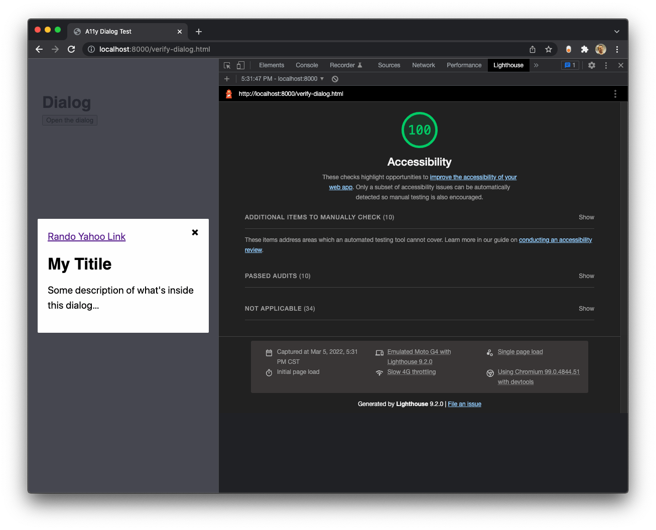
I’ve found that sometimes the tooling doesn’t account for DOM elements that are dynamically shown or hidden DOM elements, so this test ensures I’m getting full coverage of both scenarios.
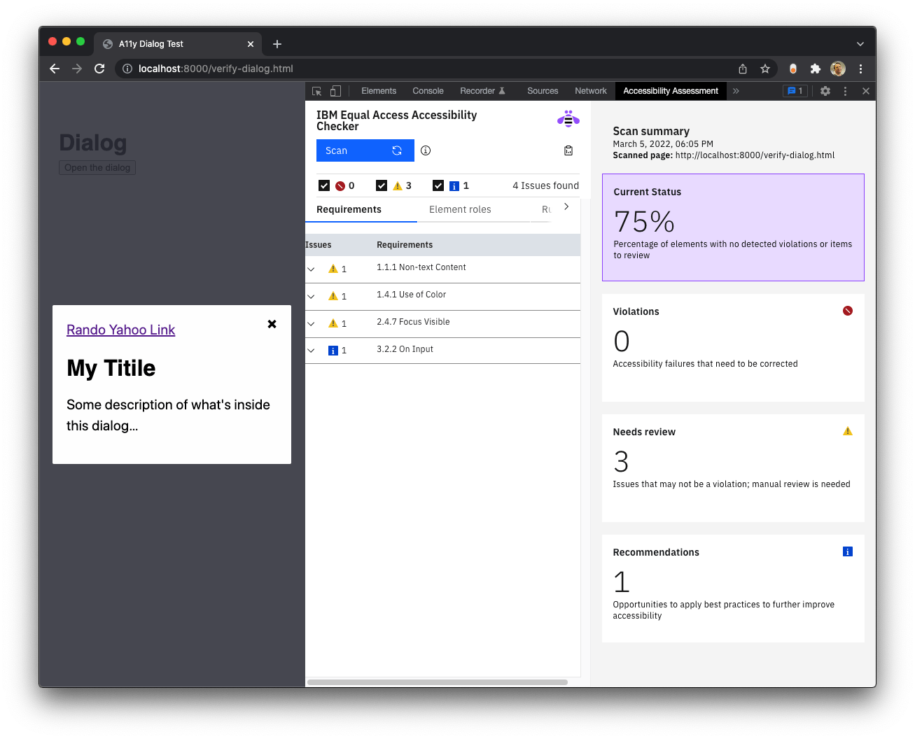
I also tested with IBM Equal Access Accessibility Checker. Generally, this tool will give you a red violation error if there’s anything egregious wrong. It will also ask you to manually review certain items. As seen here, there a couple of items for manual review, but no red violations.
Moving on to screen readers
Between my manual and tooling checks, I’m already feeling relatively confident that a11y-dialog is an accessible option for my dialog of choice. However, we ought to do our due diligence and consult a screen reader.
VoiceOver is the most convenient screen reader for me since I work on a Mac at the moment, but JAWS and NVDA are big names to look at as well. Like checking for UI consistency across browsers, it’s probably a good idea to test on more than one screen reader if you can.
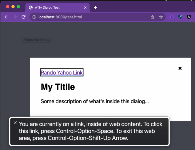
Here’s how I conducted the screen reader part of the audit with VoiceOver. Basically, I mapped out what actions needed testing and confirmed each one, like a script:
| Step | Result |
|---|---|
| The dialog component’s trigger button is announced. | “Entering A11y Dialog Test, web content.” |
The dialog should open when pressing CTRL+ALT +Space should show the dialog. |
“Dialog. Some description of what’s inside this dialog. You are currently on a dialog, inside of web content.” |
The dialog should TAB to and put focus on the component’s Close button. |
“Close this dialog button. You are currently on a button, inside of web content.” |
| Tab to the link element and confirm it is announced. | “Link, Rando Yahoo Link” |
Pressing the SPACE key while focused on the Close button should close the dialog component and return to the last item in focus. |
✅ |
Testing with people
If you’re thinking we’re about to move on to testing with real people, I was unfortunately unable to find someone. If I had done this, though, I would have used a similar set of steps for them to run through while I observe, take notes, and ask a few questions about the general experience.
As you can see, a satisfactory audit involves a good deal of time and thought.
Fine, but I want to use a framework’s dialog component
That’s cool! Many frameworks have their own dialog component solution, so there’s lots to choose from. I don’t have some amazing spreadsheet audit of all the frameworks and libraries in the wild, and will spare you the work of evaluating them all.
Instead, here are some resources that might be good starting points and considerations for using a dialog component in some of the most widely used frameworks.
Disclaimer: I have not tested these personally. This is all stuff I found while researching.
Angular dialog options
In 2020, Deque published an article that audits Angular component libraries and the TL;DR was that Material (and its Angular/CDK library) and ngx-bootstrap both appear to provide decent dialog accessibility.
React dialog options
Reakit offers a dialog component that they claim is compliant with WAI-ARIA dialog guidelines, and chakra-ui appears to pay attention to its accessibility. Of course, Material is also available for React, so that’s worth a look as well. I’ve also heard good things about reach/dialog and Adobe’s @react-aria/dialog.
Vue dialog options
I’m a fan of Vuetensils, which is Austin Gil’s naked (aka headless) components library, which just so happens to have a dialog component. There’s also Vuetify, which is a popular Material implementation with a dialog of its own. I’ve also crossed paths with PrimeVue, but was surprised that its dialog component failed to return focus to the original element.
Svelte dialog options
You might want to look at svelte-headlessui. Material has a port in svelterial that is also worth a look. It seems that many current SvelteKit users prefer to build their own component sets as SvelteKit’s packaging idiom makes it super simple to do. If this is you, I would definitely recommend considering svelte-a11y-dialog as a convenient means to build custom dialogs, drawers, bottom sheets, etc.
I’ll also point out that my AgnosticUI library wraps the React, Vue, Svelte and Angular a11y-dialog adapter implementations we’ve been talking about earlier.
Bootstrap, of course
Bootstrap is still something many folks reach for, and unsurprisingly, it offers a dialog component. It requires you to follow some steps in order to make the modal accessible.
If you have other inclusive and accessible library-based dialog components that merit consideration, I’d love to know about them in the comments!
But I’m creating a custom design system
If you’re creating a design system or considering some other roll-your-own dialog approach, you can see just how many things need to be tested and taken into consideration… all for one component! It’s certainly doable to roll your own, of course, but I’d say it’s also extremely prone to error. You might ask yourself whether the effort is worthwhile when there are already battle-tested options to choose from.
I’ll simply leave you with something Scott O’Hara — co-editor of ARIA in HTML and HTML AAM specifications in addition to just being super helpful with all things accessibility — points out:
You could put in the effort to add in those extensions, or you could use a robust plugin like a11y-dialog and ensure that your dialogs will have a pretty consistent experience across all browsers.
Back to my objective…
I need that dialog to support React, Vue, Svelte, and Angular implementations.
I mentioned earlier that a11y-dialog already has ports for Vue and React. But the Vue port hasn’t yet been updated for Vue 3. Well, I was quite happy to spend the time I would have spent creating what likely would have been a buggy hand-rolled dialog component toward helping update the Vue port. I also added a Svelte port and one for Angular too. These are both very new and I would consider them experimental beta software at time of writing. Feedback welcome, of course!
It can support other components, too!
I think it’s worth pointing out that a dialog uses the same underlying concept for hiding and showing that can be used for a drawer (aka off-canvas) component. For example, if we borrow the CSS we used in our dialog accessibility audit and add a few additional classes, then a11y-dialog can be transformed into a working and effective drawer component:
.drawer-start { right: initial; }
.drawer-end { left: initial; }
.drawer-top { bottom: initial; }
.drawer-bottom { top: initial; } .drawer-content { margin: initial; max-width: initial; width: 25rem; border-radius: initial;
} .drawer-top .drawer-content,
.drawer-bottom .drawer-content { width: 100%;
}
These classes are used in an additive manner, essentially extending the base dialog component. This is exactly what I have started to do as I add my own drawer component to AgnosticUI. Saving time and reusing code FTW!
Wrapping up
Hopefully I’ve given you a good idea of the thinking process that goes into the making and maintenance of a component library. Could I have hand-rolled my own dialog component for the library? Absolutely! But I doubt it would have yielded better results than what a resource like Kitty’s a11y-dialog does, and the effort is daunting. There’s something cool about coming up with your own solution — and there may be good situations where you want to do that — but probably not at the cost of sacrificing something like accessibility.
Anyway, that’s how I arrived at my decision. I learned a lot about the native HTML <dialog> and its accessibility along the way, and I hope my journey gave you some of those nuggets too.


