Creating a grid of images is easy, thanks to CSS Grid. But making the grid do fancy things after the images have been placed can be tricky to pull off.
Say you want to add some fancy hover effect to the images where they grow and zoom beyond the rows and columns where they sit? We can do that!
Cool, right? If you check the code, you won’t find any JavaScript, complex selectors, or even magic numbers. And this is only one example among many we will explore!
Building the grid
Table of Contents
The HTML code to create the grid is as simple as a list of images within a container. We don’t need more than that.
<div class="gallery"> <img> <img> <img> <!-- etc. -->
</div>
For the CSS, we first start by setting the grid using the following:
.gallery { --s: 150px; /* controls the size */ --g: 10px; /* controls the gap */ display: grid; gap: var(--g); width: calc(3*var(--s) + 2*var(--g)); /* 3 times the size plus 2 times the gap */ aspect-ratio: 1; grid-template-columns: repeat(3, auto);
}
In short, we have two variables, one that controls the size of the images and one that sets the size of the gap between images. aspect-ratio helps keep things in proportion.
You might be wondering why we are only defining three columns but no rows. No, I didn’t forget the rows — we just don’t need to explicitly set them. CSS Grid is capable of automatically placing items on implicit rows and columns, meaning we get as many rows as needed to any number of images we throw at it. We can explicitly define the rows instead but we need to add grid-auto-flow: column to make sure the browser will create the needed columns for us.
Here is an example to illustrate both cases. The difference is that one flows in a row direction an the other in a column direction.
Check out this other article I wrote for more about the implicit grids and the auto-placement algorithm.
Now that we have our grid, it’s time to style the images:
.gallery > img { width: 0; height: 0; min-height: 100%; min-width: 100%; object-fit: cover;
}
The hover effect we’re making relies on this CSS. It probably looks weird to you that we’re making images that have both no width or height but have a minimum width and height of 100%. But you will see that it’s a pretty neat trick for what we are trying to achieve.
What I’m doing here is telling the browser that the images need to have 0 width and height but also need to have a minimum height equal to 100%… but 100% of what? When using percentages, the value is relative to something else. In this case, our image is placed inside a grid cell and we need to know that size to know what’s 100% is relative to.
The browser will first ignore min-height: 100% to calculate the size of the grid cells, but it will use the height: 0 in its calculation. That means our images will not contribute to the size of the grid cells… because they technically have no physical size. This will result in three equal columns and rows that are based on the size of the grid (which we defined on the .gallery’s width and aspect-ratio). The height of each grid cell is nothing but the variable --s we defined (same for the width).
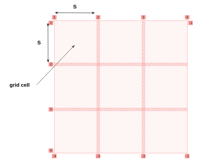
Now that we have the dimensions of our grid’s cells, the browser will use it with min-height: 100% (and min-width: 100%) which will force the images to completely fill the space of each grid cell. The whole thing may look a bit confusing but the main idea is to make sure that the grid defines the size of the images rather than the other way around. I don’t want the image to define the size of the grid and you will understand why after adding the hover effect.
Creating the hover effect
What we need to do is increase the scale of the images when they’re hovered. We can do that by adjusting an image’s width and height on :hover:
.gallery { --f: 1.5; /* controls the scale factor */
} .gallery img:hover{ width: calc(var(--s) * var(--f)); height: calc(var(--s) * var(--f));
}
I added a new custom variable, --f, to the mix as a scale factor to control the size on hover. Notice how I’m multiplying the size variable, --s, by it to calculate the new image size.
But you said that the image size needs to be 0. What is going on? I am lost…
What I said is still true but I am making an exception for the hovered image. I am telling the browser that only one image will have a size that’s not equal to zero — so it will contribute to the dimension of the grid — while all the others remain equal to 0.
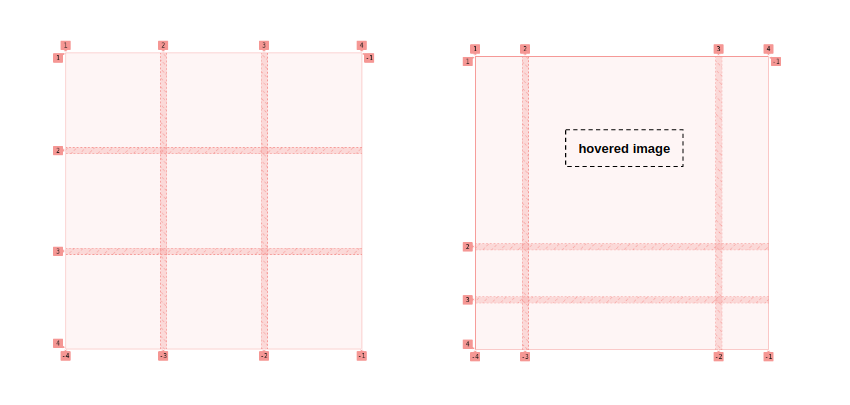
The left side shows the grid in its natural state without any hovered images, which is what the right side is showing. All the grid cells on the left side are equal in size since all the images have no physical dimensions.
On the right side, the second image in the first row is hovered, which gives it dimensions that affect the grid cell’s size. The browser will make that specific grid cell bigger on hover, which contributes to the overall size. And since the size of the whole grid is set (because we set a fixed width on the .gallery), the other grid cells will logically respond by becoming smaller in order to keep the .gallery‘s overall size in tact.
That’s our zoom effect in action! By increasing the size of only one image we affect the whole grid configuration, and we said before that the grid defines the size of the images so that each image stretches inside its grid cell to fill all the space.
To this, we add a touch of transition and use object-fit to avoid image distortion and the illusion is perfect!
I know that the logic behind the trick is not easy to grasp. Don’t worry if you don’t fully understand it. The most important is to understand the structure of the code used and how to modify it to get more variations. That’s what we will do next!
Adding more images
We created a 3×3 grid to explain the main trick, but you have probably guessed that we there’d no need to stop there. We can make the number of columns and rows variables and add as many images as we want.
.gallery { --n: 3; /* number of rows*/ --m: 4; /* number of columns */ --s: 150px; /* control the size */ --g: 10px; /* control the gap */ --f: 1.5; /* control the scale factor */ display: grid; gap: var(--g); width: calc(var(--m)*var(--s) + (var(--m) - 1)*var(--g)); height: calc(var(--n)*var(--s) + (var(--n) - 1)*var(--g)); grid-template-columns: repeat(var(--m),auto);
}
We have two new variables for the number of rows and columns. Then we simply define the width and height of our grid using them. Same for grid-template-columns which uses the --m variable. And just like before, we don’t need to explicitly define the rows since the CSS Grid’s auto-placement feature will do the job for us no matter how many image elements we’re using.
Why not different values for the width and height? We can do that:
.gallery { --n: 3; /* number of rows*/ --m: 4; /* number of columns */ --h: 120px; /* control the height */ --w: 150px; /* control the width */ --g: 10px; /* control the gap */ --f: 1.5; /* control the scale factor */ display: grid; gap: var(--g); width: calc(var(--m)*var(--w) + (var(--m) - 1)*var(--g)); height: calc(var(--n)*var(--h) + (var(--n) - 1)*var(--g)); grid-template-columns: repeat(var(--m),auto);
} .gallery img:hover{ width: calc(var(--w)*var(--f)); height: calc(var(--h)*var(--f));
}
We replace --s with two variables, one for the width, --w, and another one for the height, --h. Then we adjust everything else accordingly.
So, we started with a grid with a fixed size and number of elements, but then we made a new set of variables to get any configuration we want. All we have to do is to add as many images as we want and adjust the CSS variables accordingly. The combinations are limitless!
A full-screen gallery of images
What about a full-screen version? Yes, that’s also possible. All we need is to know what values we need to assign to our variables. If we want N rows of images and we want our grid to be full screen, we first need to solve for a height of 100vh:
var(--n) * var(--h) + (var(--n) - 1) * var(--g) = 100vhSame logic for the width, but using vw instead of vh:
var(--m) * var(--w) + (var(--m) - 1) * var(--g) = 100vwWe do the math to get:
--w: (100vw - (var(--m) - 1) * var(--g)) / var(--m)
--h: (100vh - (var(--n) - 1) * var(--g)) / var(--n)
Done!
It’s the same exact HTML but with some updated variables that change the grid’s sizing and behavior.
Note that I have omitted the formula we previously set on the .gallery‘s width and height and replaced them with 100vw and 100vh, respectively. The formula will give us the same result but since we know what value we want, we can ditch all that added complexity.
We can also simplify the --h and --w by removing the gap from the equation in favor of this:
--h: calc(100vh / var(--n)); /* Viewport height divided by number of rows */
--w: calc(100vw / var(--m)); /* Viewport width divided by number of columns */
This will make the hovered image grow a bit more than the previous example, but it is no big deal since we can control the scale with the --f variable we’re using as a multiplier.
And since the variables are used in one place we can still simplify the code by removing them altogether:
It’s important to note this optimization applies only to the full-screen example and not to the examples we’ve covered. This example is a particular case where we can make the code lighter by removing some of the complex calculation work we needed in the other examples.
We actually have everything we need to create the popular pattern of expanding panels:
Let’s dig even deeper
Did you notice that our scale factor can be less than 1? We can define the size of the hovered image to be smaller than --h or --w but the image gets bigger on hover.
The initial grid cell size is equal to --w and --h, so why do a smaller values make the grid cell bigger? Shouldn’t the cell get smaller, or at least maintain its initial size? And what is the final size of the grid cell?
We need to dig deeper into how the CSS Grid algorithm calculates the size of the grid cells. And this is involves understanding CSS Grid’s default stretch alignment.
Here’s an example to understand the logic.
On the left side of the demo, I defined a two-column with auto width. We get the intuitive result: two equal columns (and two equal grid cells). But the grid I set up on the right side of the demo, where I am updating the alignment using place-content: start, appears to have nothing.
DevTools helps show us what’s really happening in both cases:
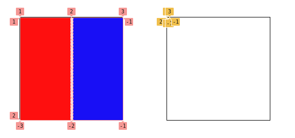
In the second grid, we have two columns, but their widths equal zero, so we get two grid cells that are collapsed at the top-left corner of the grid container. This is not a bug but the logical result of the grid’s alignment. When we size a column (or row) with auto, it means that its content dictates its size — but we have an empty div with no content to make room for.
But since stretch is the default alignment and we have enough space inside our grid, the browser will stretch both grid cells equally to cover all that area. That’s how the grid on the left winds up with two equal columns.
From the specification:
Note that certain values of justify-content and align-content can cause the tracks to be spaced apart (space-around, space-between, space-evenly) or to be resized (stretch).
Note the “to be resized” which is the key here. In the last example, I used place-content which is the shorthand for justify-content and align-content
And this is buried somewhere in the Grid Sizing algorithm specs:
This step expands tracks that have an auto max track sizing function by dividing any remaining positive, definite free space equally amongst them. If the free space is indefinite, but the grid container has a definite min-width/height, use that size to calculate the free space for this step instead.
“Equally” explains why we wind up with equal grid cells, but it applies to “the free space” which is very important.
Let’s take the previous example and add content to one of the divs:
We added a square 50px image. Here’s an illustration of how each grid in our example responds to that image:
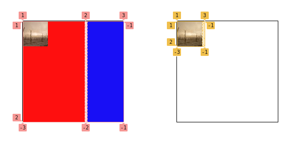
In the first case, we can see that the first cell (in red) is bigger than the second one (in blue). In the second case, the size of the first cell changes to fit the physical size of the image while the second cell remains with no dimensions. The free space is divided equally, but the first cell has more content inside which makes it bigger.
This is the math to figure out our free space:
(grid width) - (gap) - (image width) = (free space)
200px - 5px - 50px = 145px
Divided by two — the number of columns — we get a width of 72.5px for each column. But we add the size of the image, 50px, to the first column which leaves us with one column at 122.5px and the second one equal to 72.5px.
The same logic applies to our grid of images. All the images have a size equal to 0 (no content) while the hovered image contributes to size — even if it’s just 1px — making its grid cell bigger than the others. For this reason, the scale factor can be any value bigger than 0 even decimals between 0 and 1.
To get the final width of the grid cells, we do the same calculation to get the following:
(container width) - (sum of all gaps) - (hovered image width) = (free space)The width of container is defined by:
var(--m)*var(--w) + (var(--m) - 1)*var(--g)…and all the gaps are equal to:
(var(--m) - 1)*var(--g)…and for the hovered image we have:
var(--w)*var(--f)We can calculate all of that with our variables:
var(--m)*var(--w) - var(--w)*var(--f) = var(--w)*(var(--m) - var(--f))The number of columns is defined by --m ,so we divide that free space equally to get:
var(--w)*(var(--m) - var(--f))/var(--m)…which gives us the size of the non-hovered images. For hovered images, we have this:
var(--w)*(var(--m) - var(--f))/var(--m) + var(--w)*var(--f)
var(--w)*((var(--m) - var(--f))/var(--m) + var(--f))
If we want to control the final size of the hovered image, we consider the above formula to get the exact size we want. If, for example, we want the image to be twice as big:
(var(--m) - var(--f))/var(--m) + var(--f) = 2So, the value of our scale multiplier, --f, needs to be equal to:
var(--m)/(var(--m) - 1)For three columns we will have 3/2 = 1.5 and that’s the scale factor I used in the first demo of this article because I wanted to make the image twice as big on hover!
The same logic applies to the height calculation and in case we want to control both of them independently we will need to consider two scale factors to make sure we have a specific width and height on hover.
.gallery { /* same as before */ --fw: 1.5; /* controls the scale factor for the width */ --fh: 1.2; /* controls the scale factor for the height */ /* same as before */
} .gallery img:hover{ width: calc(var(--w)*var(--fw)); height: calc(var(--h)*var(--fh));
}
Now, you know all the secrets to create any kind of image grid with a cool hover effect while also having control of the sizing you want using the math we just covered.
Wrapping up
In my last article, we created a complex-looking grid with a few lines of CSS that put CSS Grid’s implicit grid and auto-placement features to use. In this article, we relied on some CSS Grid sizing trickery to create a fancy grid of images that zoom on hover and cause the grid to adjust accordingly. All of this with a simplified code that is easy to adjust using CSS variables!
In the next article, we will play with shapes! We will combine CSS grid with mask and clip-path to get fancy grid of images.

