In a previous article, I looked at CSS Grid’s ability to create complex layouts using its auto-placement powers. I took that one step further in another article that added a zooming hover effect to images in a grid layout. This time, I want to dive into another type of grid, one that works with shapes.
Like, what if the images aren’t perfectly square but instead are shaped like hexagons or rhombuses? Spoiler alert: we can do it. In fact, we’re going to combine CSS Grid techniques we’ve looked at and drop in some CSS clip-path and mask magic to create fancy grids of images for just about any shape you can imagine!
Let’s start with some markup
Table of Contents
Most of the layouts we are going to look at may look easy to achieve at first glance, but the challenging part is to achieve them with the same HTML markup. We can use a lot of wrappers, divs, and whatnot, but the goal of this post is to use the same and smallest amount of HTML code and still get all the different grids we want. After all, what’s CSS but a way to separate styling and markup? Our styling should not depend on the markup, and vice versa.
This said, let’s start with this:
<div class="gallery"> <img src="..." alt="..."> <img src="..." alt="..."> <img src="..." alt="..."> <img src="..." alt="..."> <!-- as many times as we want -->
</div>
A container with images is all that we need here. Nothing more!
CSS Grid of Hexagons
This is also sometimes referred to as a “honeycomb” grid.
There are already plenty of other blog posts out there that show how to make this. Heck, I wrote one here on CSS-Tricks! That article is still good and goes way deep on making a responsive layout. But for this specific case, we are going to rely on a much simpler CSS approach.
First, let’s use clip-path on the images to create the hexagon shape and we place all of them in the same grid area so they overlap.
.gallery { --s: 150px; /* controls the size */ display: grid;
} .gallery > img { grid-area: 1/1; width: var(--s); aspect-ratio: 1.15; object-fit: cover; clip-path: polygon(25% 0%, 75% 0%, 100% 50%, 75% 100%, 25% 100%, 0 50%);
}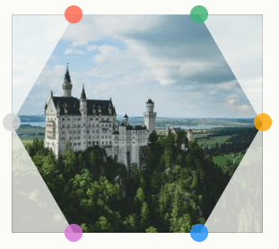
clip-path: polygon(25% 0%, 75% 0%, 100% 50%, 75% 100%, 25% 100%, 0 50%)Nothing fancy yet. All the images are hexagons and above each other. So it looks like all we have is a single hexagon-shaped image element, but there are really seven.
The next step is to apply a translation to the images to correctly place them on the grid.
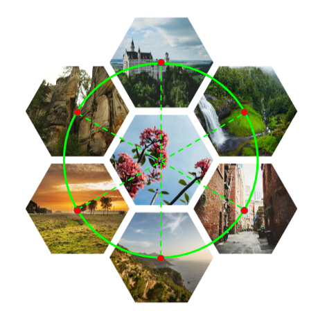
Notice that we still want one of the images to remain in the center. The rest are placed around it using CSS translate and good ol’ fashioned geometry. Here’s are the mock formulas I came up with for each image in the grid:
translate((height + gap)*sin(0deg), (height + gap)*cos(0))
translate((height + gap)*sin(60deg), (height + gap)*cos(60deg))
translate((height + gap)*sin(120deg), (height + gap)*cos(120deg))
translate((height + gap)*sin(180deg), (height + gap)*cos(180deg))
translate((height + gap)*sin(240deg), (height + gap)*cos(240deg))
translate((height + gap)*sin(300deg), (height + gap)*cos(300deg))
A few calculations and optimization later (let’s skip that boring part, right?) we get the following CSS:
.gallery { --s: 150px; /* control the size */ --g: 10px; /* control the gap */ display: grid;
}
.gallery > img { grid-area: 1/1; width: var(--s); aspect-ratio: 1.15; object-fit: cover; clip-path: polygon(25% 0%, 75% 0%, 100% 50% ,75% 100%, 25% 100%, 0 50%); transform: translate(var(--_x,0), var(--_y,0));
}
.gallery > img:nth-child(1) { --_y: calc(-100% - var(--g)); }
.gallery > img:nth-child(7) { --_y: calc( 100% + var(--g)); }
.gallery > img:nth-child(3),
.gallery > img:nth-child(5) { --_x: calc(-75% - .87*var(--g)); }
.gallery > img:nth-child(4),
.gallery > img:nth-child(6) { --_x: calc( 75% + .87*var(--g)); }
.gallery > img:nth-child(3),
.gallery > img:nth-child(4) { --_y: calc(-50% - .5*var(--g)); }
.gallery > img:nth-child(5), .gallery > img:nth-child(6) { --_y: calc( 50% + .5*var(--g)); }
Maybe that’ll be easier when we get real trigonometry functions in CSS!
Each image is translated by the --_x and --_y variables that are based on those formulas. Only the second image (nth-child(2)) is undefined in any selector because it’s the one in the center. It can be any image if you decide to use a different order. Here’s the order I’m using:
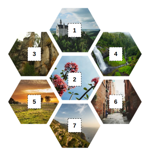
With only a few lines of code, we get a cool grid of images. To this, I added a little hover effect to the images to make things fancier.
Guess what? We can get another hexagon grid by simply updating a few values.
If you check the code and compare it with the previous one you will notice that I have simply swapped the values inside clip-path and I switched between --x and --y. That’s all!
CSS Grid of Rhombuses
Rhombus is such a fancy word for a square that’s rotated 45 degrees.
Same HTML, remember? We first start by defining a 2×2 grid of images in CSS:
.gallery { --s: 150px; /* controls the size */ display: grid; gap: 10px; grid: auto-flow var(--s) / repeat(2, var(--s)); place-items: center;
}
.gallery > img { width: 100%; aspect-ratio: 1; object-fit: cover;
}
The first thing that might catch your eye is the grid property. It’s pretty uncommonly used but is super helpful in that it’s a shorthand that lets you define a complete grid in one declaration. It’s not the most intuitive — and not to mention readable — property, but we are here to learn and discover new things, so let’s use it rather than writing out all of the individual grid properties.
grid: auto-flow var(--s) / repeat(2,var(--s)); /* is equivalent to this: */
grid-template-columns: repeat(2, var(--s));
grid-auto-rows: var(--s);
This defines two columns equal to the --s variable and sets the height of all the rows to --s as well. Since we have four images, we will automatically get a 2×2 grid.
Here’s another way we could have written it:
grid-template-columns: repeat(2, var(--s));
grid-template-rows: repeat(2, var(--s));
…which can be reduced with the grid shorthand:
grid: repeat(2,var(--s)) / repeat(2,var(--s));After setting the grid, we rotate it and the images with CSS transforms and we get this:
Note how I rotate them both by 45deg, but in the opposite direction.
.gallery { /* etc. */ transform: rotate(45deg);
}
.gallery > img { /* etc. */ transform: rotate(-45deg);
}
Rotating the images in the negative direction prevents them from getting rotated with the grid so they stay straight. Now, we apply a clip-path to clip a rhombus shape out of them.
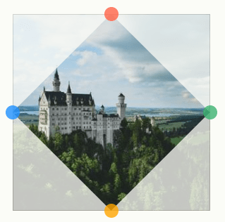
clip-path: polygon(50% 0, 100% 50%, 50% 100%, 0 50%)We are almost done! We need to rectify the size of the image to make them fit together. Otherwise, they’re spaced far apart to the point where it doesn’t look like a grid of images.
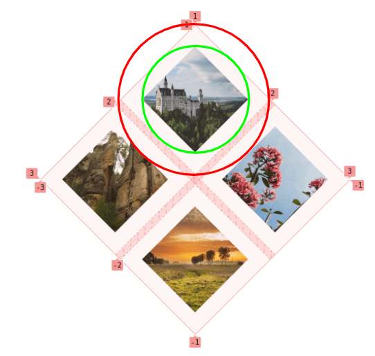
The image is within the boundary of the green circle, which is the inscribed circle of the grid area where the image is placed. What we want is to make the image bigger to fit inside the red circle, which is the circumscribed circle of the grid area.
Don’t worry, I won’t introduce any more boring geometry. All you need to know is that the relationship between the radius of each circle is the square root of 2 (sqrt(2)). This is the value we need to increase the size of our images to fill the area. We will use 100%*sqrt(2) = 141% and be done!
.gallery { --s: 150px; /* control the size */ display: grid; grid: auto-flow var(--s) / repeat(2,var(--s)); gap: 10px; place-items: center; transform: rotate(45deg);
}
.gallery > img { width: 141%; /* 100%*sqrt(2) = 141% */ aspect-ratio: 1; object-fit: cover; transform: rotate(-45deg); clip-path: polygon(50% 0, 100% 50%, 50% 100%, 0 50%);
}
Like the hexagon grid, we can make things fancier with that nice zooming hover effect:
CSS Grid of Triangular Shapes
You probably know by now that the big trick is figuring out the clip-path to get the shapes we want. For this grid, each element has its own clip-path value whereas the last two grids worked with a consistent shape. So, this time around, it’s like we’re working with a few different triangular shapes that come together to form a rectangular grid of images.


We place them inside a 3×2 grid with the following CSS:
.gallery { display: grid; gap: 10px; grid-template-columns: auto auto auto; /* 3 columns */ place-items: center;
}
.gallery > img { width: 200px; /* controls the size */ aspect-ratio: 1; object-fit: cover;
}
/* the clip-path values */
.gallery > img:nth-child(1) { clip-path: polygon(0 0, 50% 0, 100% 100% ,0 100%); }
.gallery > img:nth-child(2) { clip-path: polygon(0 0, 100% 0, 50% 100%); }
.gallery > img:nth-child(3) { clip-path: polygon(50% 0, 100% 0, 100% 100%, 0 100%); }
.gallery > img:nth-child(4) { clip-path: polygon(0 0, 100% 0, 50% 100%, 0 100%); }
.gallery > img:nth-child(5) { clip-path: polygon(50% 0, 100% 100%, 0% 100%); }
.gallery > img:nth-child(6) { clip-path: polygon(0 0, 100% 0 ,100% 100%, 50% 100%); } }
Here’s what we get:
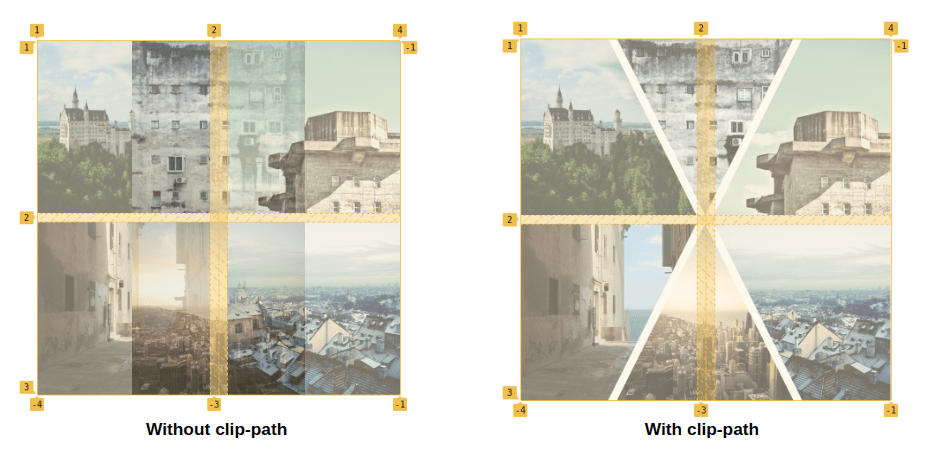
The final touch is to make the width of the middle column equal 0 to get rid of the spaces between the images. The same sort of spacing problem we had with the rhombus grid, but with a different approach for the shapes we’re using:
grid-template-columns: auto 0 auto;I had to fiddle with the clip-path values to make sure they would all appear to fit together nicely like a puzzle. The original images overlap when the middle column has zero width, but after slicing the images, the illusion is perfect:
CSS Pizza Pie Grid
Guess what? We can get another cool grid by simply adding border-radius and overflow to our grid or triangular shapes. ????
CSS Grid of Puzzle Pieces
This time we are going to play with the CSS mask property to make the images look like pieces of a puzzle.
If you haven’t used mask with CSS gradients, I highly recommend this other article I wrote on the topic because it’ll help with what comes next. Why gradients? Because that’s what we’re using to get the round notches in the puzzle piece shapes.
Setting up the grid should be a cinch by now, so let’s focus instead on the mask part.
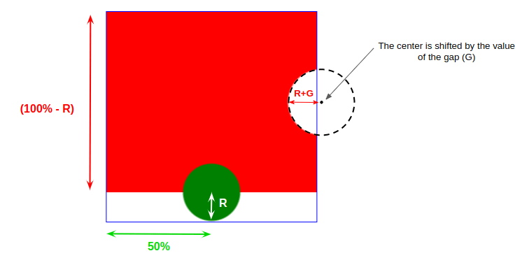
As illustrated in the above demo, we need two gradients to create the final shape. One gradient creates a circle (the green part) and the other creates the right curve while filling in the top part.
--g: 6px; /* controls the gap */
--r: 42px; /* control the circular shapes */ background: radial-gradient(var(--r) at left 50% bottom var(--r), green 95%, #0000), radial-gradient(calc(var(--r) + var(--g)) at calc(100% + var(--g)) 50%, #0000 95%, red) top/100% calc(100% - var(--r)) no-repeat;
Two variables control the shape. The --g variable is nothing but the grid gap. We need to account for the gap to correctly place our circles so they overlap perfectly when the whole puzzle is assembled. The --r variable controls the size of circular parts of the puzzle shape.
Now we take the same CSS and update a few values in it to create the three other shapes:
We have the shapes, but not the overlapping edges we need to make them fit together. Each image is limited to the grid cell it’s in, so it makes sense why the shapes are sort of jumbled at the moment:
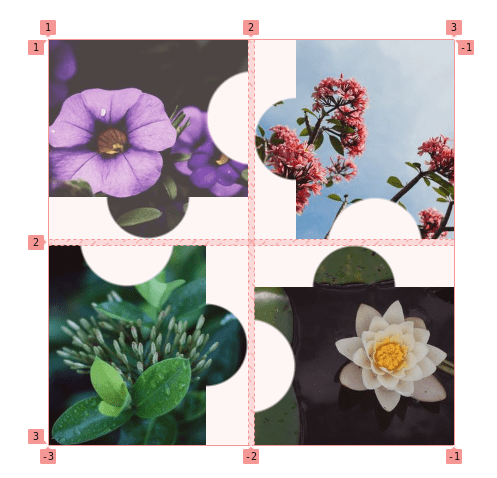
We need to create an overflow by increasing the height/width of the images. From the above figure, we have to increase the height of the first and fourth images while we increase the width of the second and third ones. You have probably already guessed that we need to increase them using the --r variable.
.gallery > img:is(:nth-child(1),:nth-child(4)) { width: 100%; height: calc(100% + var(--r));
}
.gallery > img:is(:nth-child(2),:nth-child(3)) { height: 100%; width: calc(100% + var(--r));
}
We are getting closer!
We created the overlap but, by default, our images either overlap on the right (if we increase the width) or the bottom (if we increase the height). But that’s not what we want for the second and fourth images. The fix is to use place-self: end on those two images and our full code becomes this:
Here is another example where I am using a conic gradient instead of a radial gradient. This gives us triangular puzzle pieces while keeping the same underlying HTML and CSS.
A last one! This time I am using clip-path and since it’s a property we can animate, we get a cool hover by simply updating the custom property that controls the shape.
Wrapping up
That’s all for this first part! By combining the things we’ve already learned about CSS Grid with some added clip-path and mask magic, we were able to make grid layouts featuring different kinds of shapes. And we used the same HTML markup each time! And the markup itself is nothing more than a container with a handful of image elements!
In the second part, we are going to explore more complex-looking grids with more fancy shapes and hover effects.
I’m planning to take the demo of expanding image panels we made together in this other article:
…and transform it into a zig-zag image panels! And this is only one example among the many we will discover in the next article.


