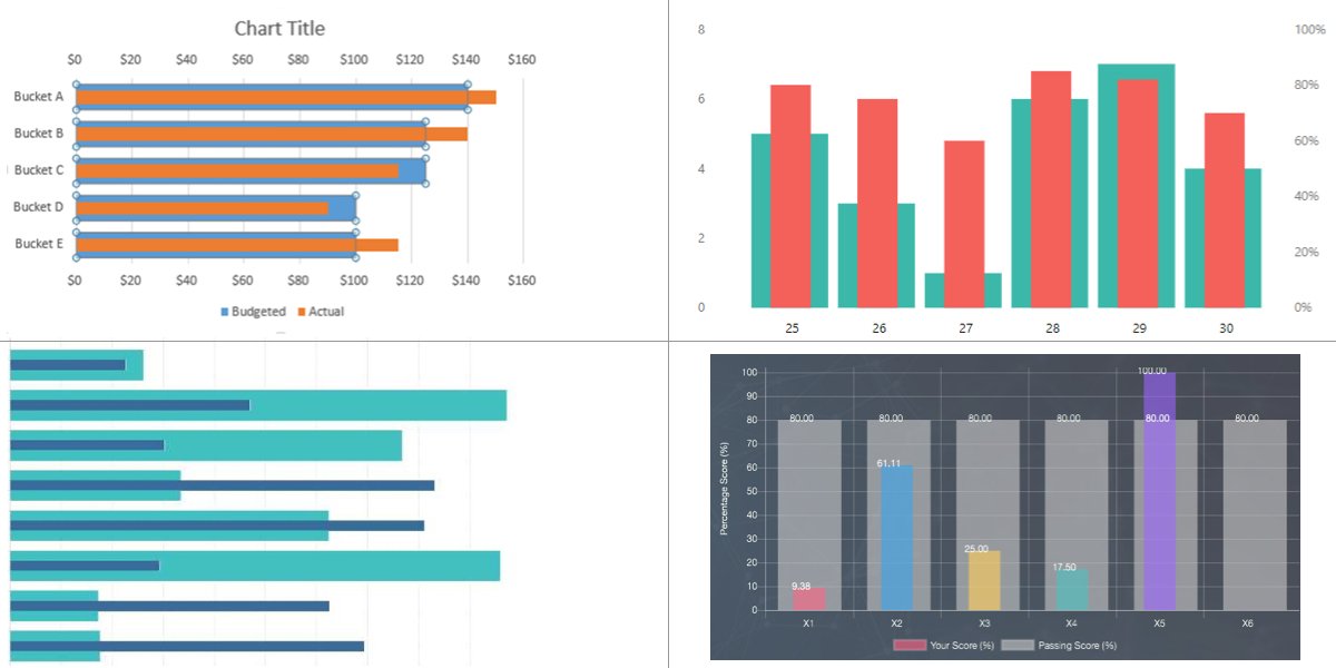
As the name suggests, overlapping charts visualize two different sets of data in a single diagram. The idea is that the overlapping bars allow us to compare data, say, year-over-year. They are also useful for things like tracking progress for a goal where one bar represents the goal and the other shows the current amount.
But they’re beautiful too!

Your mind is probably like mine and is already starting to figure out how you’d go off and code that. Here’s how I tackled it.
The HTML
Table of Contents
We’re going to start with markup because, well, that’s how we know what needs styling.
<div class="container"> <div class="chart"> <dl class="numbers"> <dd><span>100%</span></dd> <!-- all the way to 0% --> </dl> <dl class="bars"> <div> <dt>2018</dt> <dd> <div class="bar" data-percentage="50"></div> <div class="bar overlap" data-percentage="53"></div> </dd> </div> <div> <!-- more bars --> </dl> </div>
</div>
We will be using description lists (<dl>) as it is a much more semantic approach as compared to standard ordered and unordered lists. Another reason is that we are including a label within each bar. Normal lists do not have a tag within them to add a title or description unlike definition lists. In simple terms, it just makes more sense and is more readable too.
The first description list, .numbers, is the y-axis. The .bars is where the data is visualized and I’ve made a definition list to build the x-axis as well. Each list item contains a .bar and the label as a description term (dt).
And what’s up with the data attribute? The data-percentage is being used to specify the height of the bar, which ultimately represents its value on the y-axis. We could manually set it in CSS for each bar, but that is repetitive and a lot of extra code that can be replaced with a few lines of CSS.
The basic chart styles
We’re working with a lot of two-dimensional directions, so flexbox is going to be our friend for getting everything lined up. We can make the .chart element a flexible container that positions the y-axis labels and the chart beside one another in the row direction.
.chart { display: flex;
}
We don’t even need to specify the direction since flexbox defaults to row. Let’s do that and then add flexbox to the list of labels along the y-axis while we’re at it since we know those will run in the column direction.
.numbers { display: flex; flex-direction: column; list-style: none; margin: 0 15px 0 0; padding: 0;
}
Believe it or not, we can use flexbox again for the bars since, they too, are running in a row direction.
.bars { display: flex; flex: auto; /* fill up the rest of the `.chart` space */ gap: 60px;
}
I’ve set this up so that the .bars automatically take up whatever space is leftover by the y-axis .numbers.
You probably noticed it in the HTML, but “bar” is actually two bars where one overlaps the other. I wrapped those in a generic <div> that we can use as yet another flexible container that holds the definition term (<dt>) we’re using as a label and the description details (<dd>) that holds both bar values:
.bars > div { align-items: center; display: flex; flex-direction: column; flex: 1; position: relative;
}
Each bar is going to be the same width, hence flex: 1. We’re relatively positioning the element while we’re at it because we’re about to absolutely position each bar and we want to make sure they stay in their containers.
Each bar has a percentage height that corresponds to the values along the vertical y-axis. You may also remember that we gave each bar a data-percentage attribute — we’re going to sprinkle in a little JavaScript that sets the height of each bar using those values.
var bars = document.querySelectorAll("dd .bar");
bars.forEach((bar) => { var height = bar.getAttribute("data-percentage"); bar.style.height = height + "%";
});
That’s our basic chart!
We want to get this to where we can see the bars overlapping one another. That’s next!
Overlapping bars
The trick to get one bar to overlap another is funny because we’re often trying to prevent things from overlapping visually in CSS. But in this case, we actually want that to happen.
The bars are already overlapping; it’s just tough to tell. Notice in the HTML that the second .bar in each set has an additional .overlap class. Let’s use that to differentiate the bars. You’re totally free to choose your own styling for this. I’m adding a little padding to the .overlap bars so that they are wider than the other bars. Then I’m tweaking the stacking order using z-index so that the .overlap bars sit below the other bars.
Let’s add a legend
Legend. Such a great word, isn’t it? Packed with all kinds of meaning. In this case, it’s a more than a nice touch because, visually, we’re jamming two bars in spaces that are typically reserved for one bar. A legend provides context that explains what each bar represents.
<figure class="legend"> <div class="type1">Estimate</div> <div class="type2">Actual</div>
</figure>
Using a <figure> feels correct to me. They’re often used to wrap images, but the spec says they’re used “to annotate illustrations, diagrams, photos, code listings, etc.” and we’re working with a diagram. We could probably use an unordered list to hold the items, but I went with an unsemantic <div>. If anyone has an opinion on the best way to mark this up, I’m all ears in the comments!
Once again, styling is totally up to you:
Accessibility considerations
We’ve spent a bunch of our effort on making decisions for the markup and styling of our overlapping bar chart. It’s great so far, but we’re definitely not done because there’s more we can do to make this a more accessible experience. Not everyone is a sighted web surfer, so there’s some additional work to do to convey the content in those contexts.
Specifically, we need to:
- check that our colors have plenty of contrast between them,
- allow keyboard users to tab to each overlapping bar, and
- make sure screen readers announce the content.
Color contrasts
We need enough contrast between:
- the overlapping bars
- the bars and the chart background
- the label text and background
I did a little homework in advance on the colors I used in the examples we’ve look at so far, making sure that there is enough contrast between the foregrounds and backgrounds to achieve WCAG AA compliance.
Here’s what I’m using:
- Overlapping bars: (
#25DEAAand#696969: 3.16:1 ratio) - Bars and chart background (
#696969and#111: 3.43:1 ratio) - Y-axis label text and background (
#fffand#333: 12.63: 1 ratio)
Tabbing between bars
To get this where keyboard users can select each individual bar with the Tab key, we can reach for the HTML tabindex attribute. We can use the following JavaScript inside the for-each function to add this property to each bar (both of them). We will set the tab index to 0:
bar.setAttribute("tabindex", 0);We can also add some CSS to improve the outline when the bar is selected while we’re at it:
.bar:focus { outline: 1.5px solid #f1f1f1;
}
Announcing content on screen readers
Another important aspect of accessibility is making sure screen readers can announce the bars and their percentages.
We’re working with two different charts in one: a chart that shows “Estimated” values and another that shows “Actual” values. It’d be great if the user knew which bar was being announced, so let’s label them with the aria-label attribute:
<div class="bar" data-percentage="50" aria-label="Estimate">50%</div>Notice that we have the bar’s value directly in the HTML as well. That will get announced, but we still want to visually hide it. We could use transparent text for that, but another way is to use the classic .visually-hidden trick by wrapping the value in span:
<div class="bar" data-percentage="50" aria-label="Estimate"> <span class="visually-hidden">50%</span>
</div>
.visually-hidden { clip: rect(0 0 0 0); clip-path: inset(50%); height: 1px; overflow: hidden; position: absolute; white-space: nowrap; width: 1px;
}While we’re talking about announcing content, we can probably prevent the y-axis labels from being read. It’s not like the user is missing information, as the actual percentages for each bar are already available and announced. We can use the aria-hidden attribute for that:
<dl class="numbers" aria-hidden="true"> <dd><span>100%</span></dd> <dd><span>80%</span></dd> <dd><span>60%</span></dd> <dd><span>40%</span></dd> <dd><span>20%</span></dd> <dd><span>0%</span></dd>
</dl>
I also think it’s OK for screen readers to ignore the legend since it’s a visual aid:
<figure class="legend" aria-hidden="true"> <div class="type1">Estimate</div> <div class="type2">Actual</div>
</figure>
The final demo
That’s a wrap!
There we go, a chart with overlapping bars! It’s a nice way to compare data and I hope you can find a use for it on some project.
Are there other ways we could have approached this? Of course! Everything we covered here is merely walking you through my thought process. I imagine some of you would have taken a different approach — if that’s you, please share! It’d be great to see other CSS layout techniques and perspectives on nailing the accessibility.


