I recently discovered the joy of creating CSS-only games. It’s always fascinating how HTML and CSS are capable of handling the logic of an entire online game, so I had to try it! Such games usually rely on the ol’ Checkbox Hack where we combine the checked/unchecked state of a HTML input with the :checked pseudo-class in CSS. We can do a lot of magic with that one combination!
In fact, I challenged myself to build an entire game without Checkbox. I wasn’t sure if it would be possible, but it definitely is, and I’m going to show you how.
In addition to the puzzle game we will study in this article, I have made a collection of pure CSS games, most of them without the Checkbox Hack. (They are also available on CodePen.)
Want to play before we start?
Table of Contents
I personally prefer playing the game in full screen mode, but you can play it below or open it up over here.
Cool right? I know, it’s not the Best Puzzle Game You Ever Saw™ but it’s also not bad at all for something that only uses CSS and a few lines of HTML. You can easily adjust the size of the grid, change the number of cells to control the difficulty level, and use whatever image you want!
We’re going to remake that demo together, then put a little extra sparkle in it at the end for some kicks.
The drag and drop functionality
While the structure of the puzzle is fairly straightforward with CSS Grid, the ability to drag and drop puzzle pieces is a bit trickier. I had to relying on a combination of transitions, hover effects, and sibling selectors to get it done.
If you hover over the empty box in that demo, the image moves inside of it and stays there even if you move the cursor out of the box. The trick is to add a big transition duration and delay — so big that the image takes lots of time to return to its initial position.
img { transform: translate(200%); transition: 999s 999s; /* very slow move on mouseout */
}
.box:hover img { transform: translate(0); transition: 0s; /* instant move on hover */
}
Specifying only the transition-delay is enough, but using big values on both the delay and the duration decreases the chance that a player ever sees the image move back. If you wait for 999s + 999s — which is approximately 30 minutes — then you will see the image move. But you won’t, right? I mean, no one’s going to take that long between turns unless they walk away from the game. So, I consider this a good trick for switching between two states.
Did you notice that hovering the image also triggers the changes? That’s because the image is part of the box element, which is not good for us. We can fix this by adding pointer-events: none to the image but we won’t be able to drag it later.
That means we have to introduce another element inside the .box:
That extra div (we’re using a class of .a) will take the same area as the image (thanks to CSS Grid and grid-area: 1 / 1) and will be the element that triggers the hover effect. And that is where the sibling selector comes into play:
.a { grid-area: 1 / 1;
}
img { grid-area: 1 / 1; transform: translate(200%); transition: 999s 999s;
}
.a:hover + img { transform: translate(0); transition: 0s;
}
Hovering on the .a element moves the image, and since it is taking up all space inside the box, it’s like we are hovering over the box instead! Hovering the image is no longer a problem!
Let’s drag and drop our image inside the box and see the result:
Did you see that? You first grab the image and move it to the box, nothing fancy. But once you release the image you trigger the hover effect that moves the image, and then we simulate a drag and drop feature. If you release the mouse outside the box, nothing happens.
Hmm, your simulation isn’t perfect because we can also hover the box and get the same effect.
True and we will rectify this. We need to disable the hover effect and allow it only if we release the image inside the box. We will play with the dimension of our .a element to make that happen.
Now, hovering the box does nothing. But if you start dragging the image, the .a element appears, and once released inside the box, we can trigger the hover effect and move the image.
Let’s dissect the code:
.a { width: 0%; transition: 0s .2s; /* add a small delay to make sure we catch the hover effect */
}
.box:active .a { /* on :active increase the width */ width: 100%; transition: 0s; /* instant change */
}
img { transform: translate(200%); transition: 999s 999s;
}
.a:hover + img { transform: translate(0); transition: 0s;
}
Clicking on the image fires the :active pseudo-class that makes the .a element full-width (it is initially equal to 0). The active state will remain active until we release the image. If we release the image inside the box, the .a element goes back to width: 0, but we will trigger the hover effect before it happens and the image will fall inside the box! If you release it outside the box, nothing happens.
There is a little quirk: clicking the empty box also moves the image and breaks our feature. Currently, :active is linked to the .box element, so clicking on it or any of its children will activate it; and by doing this, we end up showing the .a element and triggering the hover effect.
We can fix that by playing with pointer-events. It allows us to disable any interaction with the .box while maintaining the interactions with the child elements.
.box { pointer-events: none;
}
.box * { pointer-events: initial;
}
Now our drag and drop feature is perfect. Unless you can find how to hack it, the only way to move the image is to drag it and drop it inside the box.
Building the puzzle grid
Putting the puzzle together is going to feel easy peasy compared to what we just did for the drag and drop feature. We are going to rely on CSS grid and background tricks to create the puzzle.
Here’s our grid, written in Pug for convenience:
- let n = 4; /* number of columns/rows */
- let image = "https://picsum.photos/id/1015/800/800"; g(style=`--i:url(${image})`) - for(let i = 0; i < n*n; i++) z a b(draggable="true")
The code may look strange but it compiles into plain HTML:
<g style="--i: url(https://picsum.photos/id/1015/800/800)"> <z> <a></a> <b draggable="true"></b> </z> <z> <a></a> <b draggable="true"></b> </z> <z> <a></a> <b draggable="true"></b> </z> <!-- etc. -->
</g>
I bet you’re wondering what’s up with those tags. None of these elements have any special meaning — I just find that the code is much easier to write using <z> than a bunch of <div class="z"> or whatever.
This is how I’ve mapped them out:
<g>is our grid container that containsN*N<z>elements.<z>represents our grid items. It plays the role of the.boxelement we saw in the previous section.<a>triggers the hover effect.<b>represents a portion of our image. We apply thedraggableattribute on it because it cannot be dragged by default.
Alright, let’s register our grid container on <g>. This is in Sass instead of CSS:
$n : 4; /* number of columns/rows */ g { --s: 300px; /* size of the puzzle */ display: grid; max-width: var(--s); border: 1px solid; margin: auto; grid-template-columns: repeat($n, 1fr);
}
We’re actually going to make our grid children — the <z> elements — grids as well and have both <a> and <b> within the same grid area:
z { aspect-ratio: 1; display: grid; outline: 1px dashed;
}
a { grid-area: 1/1;
}
b { grid-area: 1/1;
}
As you can see, nothing fancy — we created a grid with a specific size. The rest of the CSS we need is for the drag and drop feature, which requires us to randomly place the pieces around the board. I’m going to turn to Sass for this, again for the convenience of being able to loop through and style all the puzzle pieces with a function:
b { background: var(--i) 0/var(--s) var(--s);
} @for $i from 1 to ($n * $n + 1) { $r: (random(180)); $x: (($i - 1)%$n); $y: floor(($i - 0.001) / $n); z:nth-of-type(#{$i}) b{ background-position: ($x / ($n - 1)) * 100% ($y / ($n - 1)) * 100%; transform: translate((($n - 1) / 2 - $x) * 100%, (($n - 1)/2 - $y) * 100%) rotate($r * 1deg) translate((random(100)*1% + ($n - 1) * 100%)) rotate((random(20) - 10 - $r) * 1deg) }
}
You may have noticed that I’m using the Sass random() function. That’s how we get the randomized positions for the puzzle pieces. Remember that we will disable that position when hovering over the <a> element after dragging and dropping its corresponding <b> element inside the grid cell.
z a:hover ~ b { transform: translate(0); transition: 0s;
}
In that same loop, I am also defining the background configuration for each piece of the puzzle. All of them will logically share the same image as the background, and its size should be equal to the size of the whole grid (defined with the --s variable). Using the same background-image and some math, we update the background-position to show only a piece of the image.
That’s it! Our CSS-only puzzle game is technically done!
But we can always do better, right? I showed you how to make a grid of puzzle piece shapes in another article. Let’s take that same idea and apply it here, shall we?
Puzzle piece shapes
Here’s our new puzzle game. Same functionality but with more realistic shapes!
This is an illustration of the shapes on the grid:
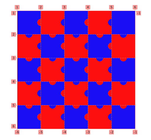
If you look closely you’ll notice that we have nine different puzzle-piece shapes: the four corners, the four edges, and one for everything else.
The grid of puzzle pieces I made in the other article I referred to is a little more straightforward:
We can use the same technique that combines CSS masks and gradients to create the different shapes. In case you are unfamiliar with mask and gradients, I highly recommend checking that simplified case to better understand the technique before moving to the next part.
First, we need to use specific selectors to target each group of elements that shares the same shape. We have nine groups, so we will use eight selectors, plus a default selector that selects all of them.
z /* 0 */ z:first-child /* 1 */ z:nth-child(-n + 4):not(:first-child) /* 2 */ z:nth-child(5) /* 3 */ z:nth-child(5n + 1):not(:first-child):not(:nth-last-child(5)) /* 4 */ z:nth-last-child(5) /* 5 */ z:nth-child(5n):not(:nth-child(5)):not(:last-child) /* 6 */ z:last-child /* 7 */ z:nth-last-child(-n + 4):not(:last-child) /* 8 */Here is a figure that shows how that maps to our grid:
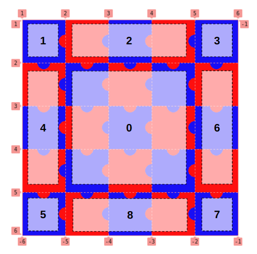
Now let’s tackle the shapes. Let’s focus on learning just one or two of the shapes because they all use the same technique — and that way, you have some homework to keep learning!
For the puzzle pieces in the center of the grid, 0:
mask: radial-gradient(var(--r) at calc(50% - var(--r) / 2) 0, #0000 98%, #000) var(--r) 0 / 100% var(--r) no-repeat, radial-gradient(var(--r) at calc(100% - var(--r)) calc(50% - var(--r) / 2), #0000 98%, #000) var(--r) 50% / 100% calc(100% - 2 * var(--r)) no-repeat, radial-gradient(var(--r) at var(--r) calc(50% - var(--r) / 2), #000 98%, #0000), radial-gradient(var(--r) at calc(50% + var(--r) / 2) calc(100% - var(--r)), #000 98%, #0000);The code may look complex, but let’s focus on one gradient at a time to see what’s happening:
Two gradients create two circles (marked green and purple in the demo), and two other gradients create the slots that other pieces connect to (the one marked blue fills up most of the shape while the one marked red fills the top portion). A CSS variable, --r, sets the radius of the circular shapes.
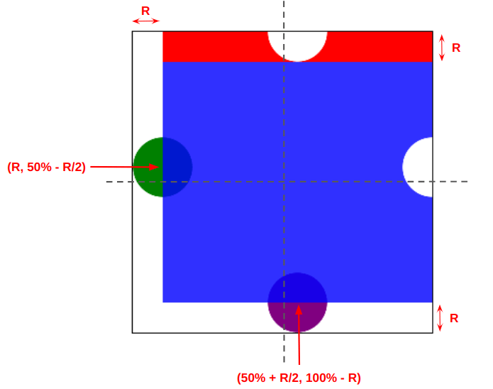
The shape of the puzzle pieces in the center (marked 0 in the illustration) is the hardest to make as it uses four gradients and has four curvatures. All the others pieces juggle fewer gradients.
For example, the puzzle pieces along the top edge of the puzzle (marked 2 in the illustration) uses three gradients instead of four:
mask: radial-gradient(var(--r) at calc(100% - var(--r)) calc(50% + var(--r) / 2), #0000 98%, #000) var(--r) calc(-1 * var(--r)) no-repeat, radial-gradient(var(--r) at var(--r) calc(50% - var(--r) / 2), #000 98%, #0000), radial-gradient(var(--r) at calc(50% + var(--r) / 2) calc(100% - var(--r)), #000 98%, #0000);We removed the first (top) gradient and adjusted the values of the second gradient so that it covers the space left behind. You won’t notice a big difference in the code if you compare the two examples. It should be noted that we can find different background configurations to create the same shape. If you start playing with gradients you will for sure come up with something different than what I did. You may even write something that’s more concise — if so, share it in the comments!
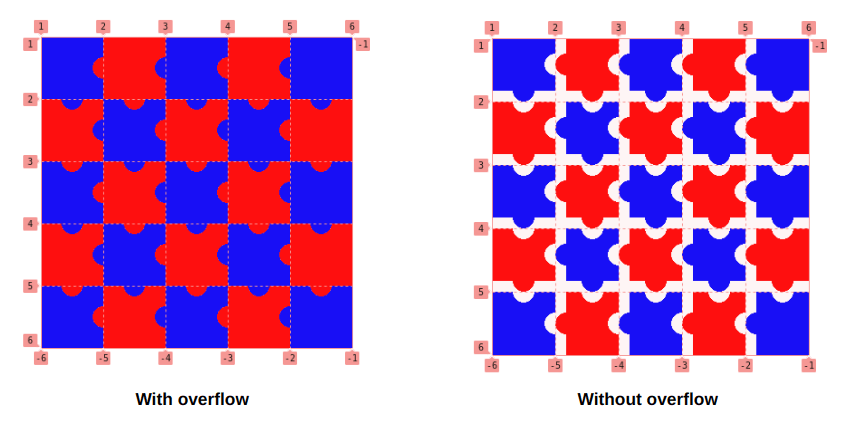
In addition to creating the shapes, you will also find that I am increasing the width and/or the height of the elements like below:
height: calc(100% + var(--r));
width: calc(100% + var(--r));
The pieces of the puzzle need to overflow their grid cell to connect.
Final demo
Here is the full demo again. If you compare it with the first version you will see the same code structure to create the grid and the drag-and-drop feature, plus the code to create the shapes.
Possible enhancements
The article ends here but we could keep enhancing our puzzle with even more features! How about a a timer? Or maybe some sort of congratulations when the player finishes the puzzle?
I may consider all these features in a future version, so keep an eye on my GitHub repo.
Wrapping up
And CSS isn’t a programming language, they say. Ha!
I’m not trying to spark some #HotDrama by that. I say it because we did some really tricky logic stuff and covered a lot of CSS properties and techniques along the way. We played with CSS Grid, transitions, masking, gradients, selectors, and background properties. Not to mention the few Sass tricks we used to make our code easy to adjust.
The goal was not to build the game, but to explore CSS and discover new properties and tricks that you can use in other projects. Creating an online game in CSS is a challenge that pushes you to explore CSS features in great detail and learn how to use them. Plus, it’s just a lot of fun that we get something to play with when all is said and done.
Whether CSS is a programming language or not, doesn’t change the fact that we always learn by building and creating innovative stuff.


