If we browse the WordPress theme directory, a majority of themes showcase cover images. It is a feature in popular demand. The cover page trend is true even in the block theme directory screenshots as well.
Let’s consider the following example from Twenty Twenty (a classic theme) which includes a cover template that can be used to display both in single post and page, where the post’s featured image displays at the top that stretches across the browser screen, with post title and other desired meta data below. Cover templates allow creating content that stands out from the traditional constraints of displaying content.

Creating cover templates currently requires writing PHP code as captured here in the Twenty Twenty default theme’s cover template. If we look at the template-parts/content-cover.php file, it contains the code for displaying content when the cover-template is used.
Thus, it is not possible to create a customized cover page if you do not possess a deep knowledge of PHP. For many ordinary WordPress users, the only option is to use plugin like Custom Post Type UI as described in this short video.
Cover sections in block themes
Table of Contents
Since WordPress 5.8, theme authors could create custom templates (like single post, author, category, and others) with a top hero section using block editor cover block and bundled into their themes with minimal or no code.
Before diving into how top large cover sections are created in block themes templates, let’s briefly look at the two block themes Twenty Twenty-Two and Wabi by Rich Tabor (full review here).

Behind-the-scenes, Twenty Twenty-Two implements a large header by adding a hidden image stored as a pattern in the header-dark-large parts. Whereas, in the Wabi theme, the large header background color in a single post is implemented with accent background colors and a 50px height spacer block (lines: 5-9). The accent colors are managed by the assets/js/accent-colors.js file.
Many others chose to create a top cover section by using cover block, which allowed users to change the background color and add a static image from Media Library or upload from media devices – without writing any code. With this approach, images from the post featured image block had to be added manually to each single post if you wanted to have the post featured image as the background image in single posts.
Cover Blocks with dynamic post featured image
WordPress 6.0 made available another cool featured image cover blocks feature, which allows use of the featured image of any post or page as the background image in the cover block.
In the following short video, Automattic engineers discuss adding featured images to cover blocks with an example from Archeo theme:
[embedded content]
The image block including post featured image block can be further customized using duotone color in theme.json as discussed in this short Connecting The Dots YouTube video (Automattic’s Anne McCarthy).
Use case examples (Wei, Bright Mode)
If we browse the thumbnail images in the block theme directory, we see a majority of them include large cover header sections. If we dig into their template files, they make use of cover blocks with static image background.
Some recently developed themes are using cover blocks with the dynamic post featured image background (e.g., Archeo, Wei, Frost, Bright Mode, etc.). A brief overview of the new feature is available in this short GitHub video.

Combining dynamic accent colors features of Wabi theme with cover and post featured image blocks, Rich Tabor further expands his creativity in his new Wei theme (full review available here) to display dynamic cover images from a single post.
In his Wei announcement post, Rich Tabor writes: “Behind-the-scenes, the single.html template is using a Cover block that leverages the post’s featured image. Then the duotone is applied by the color scheme assigned to the post. This way, just about any image will look fine”.
If you would like to dig deeper into the Wei theme’s header cover block and learn how to create your own, here is a short video from Fränk Klein (WP Development Courses) who explains step-by-step how it was created.
Similar to the Wei theme, Brian Gardner also makes use of cover block with post featured image block in his recent Bright Mode theme to display standout contents with vibrant colors.
Brian told WPTavern: “he loves most about the theme is the way the Cover Block is used on single pages. It pulls the featured image into the Cover block and also offers custom block styles for shadows and full-height options. […] I feel as though this really presents what’s possible with modern WordPress.”
For more detail, here is its demo site and full review of Brian’s Bright Mode theme.
Designing complex layouts with block editor
Recently, WordPress launched a new block editor designed landing homepage and a download page. The announcement attracted mixed reactions from its readers, including from Matt Mullenweg (Automattic) who commented on the 33-days taken to design and launch such a “simple page”. You can find additional behind the scene discussions here.
In response, Jamie Marsland of Pootlepress created this YouTube video where he reproduces a nearly identical homepage in nearly 20 minutes.
Commenting on Marsland video, Sarah Gooding of WP Travern writes: “He is what one might describe as a power user with the block editor. He can quickly shuffle rows, columns, and groups around, adjusting padding and margins as necessary, and assign each section the corresponding color for the design. At this point, this is not something most average WordPress users could do.”
Though the block editor has come a long way, there are still growing pain points to most theme developers and ordinary users to create and design complex layouts with it.
Adding enhancement to TT2 Gopher blocks
In this section, I will walk you through how I added enhancements to the TT2 Gopher Blocks theme that I referenced in my previous article. Inspired by cover blocks from themes that I described earlier, I wanted to add three cover templates (author, category, and single-cover) to the theme.
While browsing websites, we notice two types of cover headers. The mostly observed header is cover section blended with the site header (site title and top navigation) into the cover block (e.g., Twenty Twenty, Twenty Twenty-Two, Wei, Wabi, Frost, Bright Mode, etc.). We also find header cover section which is not blended with site header and positioned just underneath, such as this BBC Future website. For TT2 Gopher blocks theme, I opted for the latter.
First, let’s create cover header patterns for author, single, and others (categories, tags) templates using cover blocks. Then we will convert them into patterns (as described here previously) and call the respective header cover patterns into the templates.
If you are familiar to working with the block editor, design your header section using cover blocks in the site editor and then convert the cover header code into patterns. However, if you are not familiar with FSE editor, then the easiest way is to copy patterns from the patterns directory in a post, make necessary modification and convert it into a pattern.
In my previous CSS-Tricks article, I discussed in detail on creating and using block patterns. Here is a brief overview of the workflow that I am using to create the single post cover header pattern:
Single post cover header pattern
Step 1: Using FSE interface, let’s create a new blank file and start building block structure as shown on the left panel.
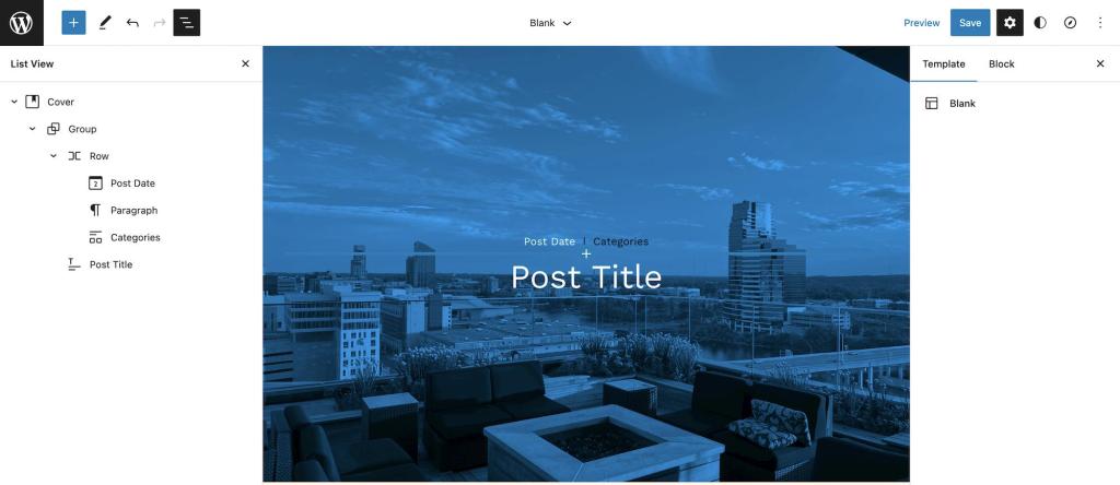
Alternatively, this could be done in a post or page first, and then copy and paste the markup into a pattern file, later.
Step 2: Next, to covert the above markup into a pattern, first we should copy its code markup and paste into a new /patterns/header-single-cover.php in our code editor. We should also add required pattern file header markup (e.g., title, slug, categories, inserter, etc.).
Here is the entire code of the /patterns/header-single-cover.php file:
<?php /** * Title: Header cover single * Slug: tt2gopher/header-cover-single * Categories: tt2gopher-header * Block Types: core/template-part/header * inserter: yes */
?> <!-- wp:cover {"url":"https://pd.w.org/2022/08/15062ed5f5707b5c5.85694718-2048x1536.jpg","id":100,"dimRatio":0,"overlayColor":"foreground","focalPoint":{"x":"0.40","y":"0.37"},"minHeight":50,"minHeightUnit":"vh","isDark":false,"align":"full","style":{"color":{"duotone":["#000000","#00a5ff"]},"spacing":{"margin":{"top":"0px","bottom":"0px"}}}} --> <div class="wp-block-cover alignfull is-light" style="margin-top:0px;margin-bottom:0px;min-height:50vh"><span aria-hidden="true" class="wp-block-cover__background has-foreground-background-color has-background-dim-0 has-background-dim"></span><img class="wp-block-cover__image-background wp-image-100" alt="" src="https://pd.w.org/2022/08/15062ed5f5707b5c5.85694718-2048x1536.jpg" style="object-position:40% 37%" data-object-fit="cover" data-object-position="40% 37%"/><div class="wp-block-cover__inner-container"><!-- wp:group {"style":{"elements":{"link":{"color":{"text":"var:preset|color|base"}}},"spacing":{"blockGap":"10px"}},"textColor":"base","layout":{"wideSize":"800px"}} --> <div class="wp-block-group has-base-color has-text-color has-link-color"><!-- wp:group {"style":{"spacing":{"blockGap":"10px"}},"textColor":"primary","layout":{"type":"flex","flexWrap":"nowrap","justifyContent":"center"},"fontSize":"small"} --> <div class="wp-block-group has-primary-color has-text-color has-small-font-size"><!-- wp:post-date {"textColor":"foreground"} /--> <!-- wp:paragraph --> <p>|</p> <!-- /wp:paragraph --> <!-- wp:post-terms {"term":"category","style":{"elements":{"link":{"color":{"text":"var:preset|color|foreground"}}}}} /--></div> <!-- /wp:group --> <!-- wp:post-title {"textAlign":"center","level":1,"style":{"typography":{"fontStyle":"normal","fontWeight":"400"}},"textColor":"foreground","fontSize":"max-60"} /--></div> <!-- /wp:group --></div></div> <!-- /wp:cover -->
Step 3: For this demo, I have used this image from photos directory as a filler background image, and applied the Midnight duotone color. To use post featured image dynamically, we should add "useFeaturedImage":true in the cover block by replacing the above filler image link just before the "dimRatio":50 such that the line 10 should look like the following:
<!-- wp:cover {"useFeaturedImage":true,"dimRatio":0,"overlayColor":"foreground","focalPoint":{"x":"0.40","y":"0.37"},"minHeight":50,"minHeightUnit":"vh","isDark":false,"align":"full","style":{"color":{"duotone":["#000000","#00a5ff"]},"spacing":{"margin":{"top":"0px","bottom":"0px"}}}} -->Alternatively, the filler image could also be changed by clicking Replace and selecting Use featured image option:

Now, the header cover patterns should be visible in the patterns inserter panel for use anywhere in the templates, posts, and pages.
Archive cover headers
Inspired by this WP Tavern post and a step-by-step walkthrough to create an author template header, I wanted to create a similar cover header and add to TT2 Gopher theme, too.
First, let’s create the archive cover header pattern for author.html the template as well, following the above workflow. In this case, I am creating this in a new blank page, by adding blocks (as shown below in list view):
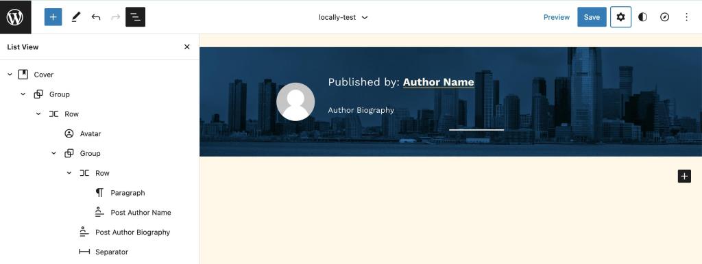
In the background for the cover, I used the same image used in the single post header cover.
Because we would like to display a short author biography on the author block, a biographical statement should also be added to the user profile page, or else a blank space will be displayed in the front-end.
The following is the markup code of the header-author-cover, that we will use pattern, in the next step:
<!-- wp:cover {"url":"https://pd.w.org/2022/03/8256241eff74ef542.61868565.jpeg","id":226,"dimRatio":10,"focalPoint":{"x":"0.50","y":"0.75"},"minHeight":200,"minHeightUnit":"px","isDark":false,"align":"full","style":{"color":{"duotone":["#000000","#00a5ff"]}}} --> <div class="wp-block-cover alignfull is-light" style="min-height:200px"><span aria-hidden="true" class="wp-block-cover__background has-background-dim-10 has-background-dim"></span><img class="wp-block-cover__image-background wp-image-226" alt="" src="https://pd.w.org/2022/03/8256241eff74ef542.61868565.jpeg" style="object-position:50% 75%" data-object-fit="cover" data-object-position="50% 75%"/><div class="wp-block-cover__inner-container"><!-- wp:group {"layout":{"inherit":true}} --> <div class="wp-block-group"><!-- wp:group {"style":{"spacing":{"padding":{"top":"1rem","right":"2rem","bottom":"1rem","left":"2rem"}}},"layout":{"type":"flex","flexWrap":"nowrap"}} --> <div class="wp-block-group" style="padding-top:1rem;padding-right:2rem;padding-bottom:1rem;padding-left:2rem"><!-- wp:avatar {"size":70,"isLink":true,"align":"right","style":{"border":{"radius":"9999px"}}} /--> <!-- wp:group --> <div class="wp-block-group"><!-- wp:group {"style":{"spacing":{"blockGap":"6px"}},"layout":{"type":"flex"},"fontSize":"large"} --> <div class="wp-block-group has-large-font-size"><!-- wp:paragraph {"textColor":"foreground","fontSize":"large"} --> <p class="has-foreground-color has-text-color has-large-font-size">Published by:</p> <!-- /wp:paragraph --> <!-- wp:post-author-name {"isLink":true,"style":{"typography":{"fontStyle":"large","fontWeight":"600"},"elements":{"link":{"color":{"text":"var:preset|color|background"}}}},"textColor":"foreground"} /--></div> <!-- /wp:group --> <!-- wp:post-author-biography {"textColor":"foreground","fontSize":"small"} /--> <!-- wp:separator {"backgroundColor":"foreground"} --> <hr class="wp-block-separator has-text-color has-foreground-color has-alpha-channel-opacity has-foreground-background-color has-background"/> <!-- /wp:separator --></div> <!-- /wp:group --></div> <!-- /wp:group --></div> <!-- /wp:group --></div></div> <!-- /wp:cover -->To covert the markup into a header-author-cover pattern, we should add the required pattern file header markup as described earlier. By editing the header-author-cover.php pattern, we can create similar header covers for tags, taxonomy, and other custom templates.
The header-category-cover.php pattern for my category.html template is available on GitHub.
WordPress 6.0 and the recent Gutenberg 13.7 extended template creating features into the block editor, thus making it possible for many WordPress users, without deep knowledge of coding, to create their customized templates.
For more detailed information and use cases, here is a thorough customization note by Justin Tadlock.
Block editor allows creating various types of templates, including cover templates. Let’s briefly overview how combining cover block and post featured image block with new template UI makes easy to create various types of cover custom templates even with no or low coding skills.
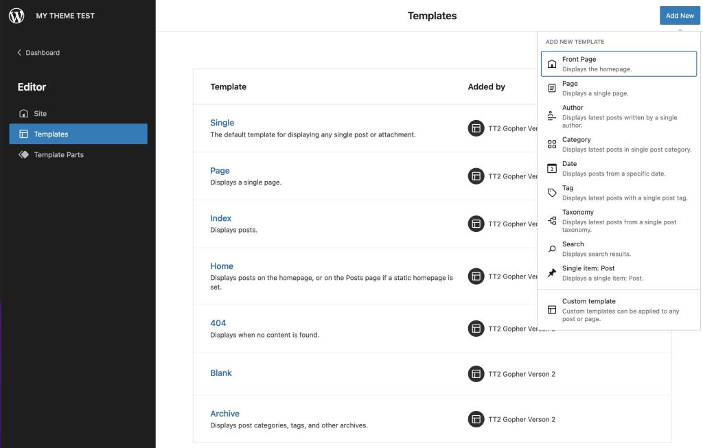
Creating templates has been made much easier with Gutenberg 13.7. How to create block templates with codes and in site editor is described in the Theme handbook and in my previous article.
Author template with cover block
Top (header section) markup of the author.html template is shown below (line 6):
<!-- wp:template-part {"slug":"header-small-dark","theme":"TT2-GOPHER-V2","tagName":"header"} /--> <!-- wp:group {"tagName":"main","style":{"spacing":{"margin":{"top":"0","bottom":"0px"},"padding":{"bottom":"80px"},"blockGap":"0px"}},"className":"site-content"} --> <main class="wp-block-group site-content" style="margin-top:0;margin-bottom:0px;padding-bottom:80px"> <!-- wp:pattern {"slug":"tt2gopher/header-author-cover"} /--> ... ... ... <!-- /wp:group --> ...Here are screenshots of cover headers for the author.html and category.html templates:

The entire code for both templates is available on GitHub.
Single post with cover block
To display cover block in our single post, we have to call the header-cover-single pattern below the header section (line 3):
<!-- wp:template-part {"slug":"header-small-dark","tagName":"header"} /--> <!-- wp:pattern {"slug":"tt2gopher/header-cover-single"} /--> <!-- wp:spacer {"height":32} --> <div style="height:32px" aria-hidden="true" class="wp-block-spacer"></div> <!-- /wp:spacer --> .... .... ....Here is a screen capture showing the front-end view of the single post with the header cover section:

The entire single-cover.html template is available on GitHub.
You can find additional step-by-step walkthrough tutorials on creating a hero header post section and using post featured image background cover blocks on WP Tavern and Full Site Editing website.
There you have it!
Helpful Resources
Featured image cover block
Blog posts
Even though the block themes, in general, are getting lots of pushback from WordPress community members, in my opinion, they are the future of WordPress, too. With block themes, amateur theme authors, without the deep coding skills and mastery of PHP and JavaScript languages, can now create themes with complex layouts with a hero cover section as described in this article combined with patterns and style variations.
As an early Gutenberg user, I couldn’t be more excited with the new theming tools like create block theme plugin and others which allow theme authors to achieve the following directly from block editor UI without writing any code:
- (i) create
- (ii) overwrite theme files and export
- (iii) generate blank or a child theme, and
- (iv) modify and save style variation of the current theme
Additionally, the recent iterations of the Gutenberg plugin allow enabling fluid typography and layout alignments and other stylistic controls using only theme.json file without JavaScript and a line of CSS rules.
Thank you for reading and share your comments and thoughts below!

