Welcome to Part 2 of this three-part series! We are still decorating images without any extra elements and pseudo-elements. I hope you already took the time to digest Part 1 because we will continue working with a lot of gradients to create awesome visual effects. We are also going to introduce the CSS mask property for more complex decorations and hover effects.
Fancy Image Decorations series
Table of Contents
- Single Element Magic
- Masks and Advanced Hover Effects (you are here!)
- Outlines and Complex Animations (coming October 28 )
Let’s turn to the first example we’re working on together…
The Postage Stamp
Believe or not, all it takes to make postage stamp CSS effect is two gradients and a filter:
img { --r: 10px; /* control the radius of the circles */ padding: calc(2 * var(--r)); filter: grayscale(.4); background: radial-gradient(var(--r),#0000 98%,#fff) round calc(-1.5 * var(--r)) calc(-1.5 * var(--r)) / calc(3 * var(--r)) calc(3 * var(--r)), linear-gradient(#fff 0 0) no-repeat 50% / calc(100% - 3 * var(--r)) calc(100% - 3 * var(--r));
}
As we saw in the previous article, the first step is to make space around the image with padding so we can draw a background gradient and see it there. Then we use a combination of radial-gradient() and linear-gradient() to cut those circles around the image.
Here is a step-by-step illustration that shows how the gradients are configured:
Note the use of the round value in the second step. It’s very important for the trick as it ensures the size of the gradient is adjusted to be perfectly aligned on all the sides, no matter what the image width or height is.
From the specification: The image is repeated as often as will fit within the background positioning area. If it doesn’t fit a whole number of times, it is rescaled so that it does.
The Rounded Frame
Let’s look at another image decoration that uses circles…
This example also uses a radial-gradient(), but this time I have created circles around the image instead of the cut-out effect. Notice that I am also using the round value again. The trickiest part here is the transparent gap between the frame and the image, which is where I reach for the CSS mask property:
img { --s: 20px; /* size of the frame */ --g: 10px; /* the gap */ --c: #FA6900; padding: calc(var(--g) + var(--s)); background: radial-gradient(farthest-side, var(--c) 97%, #0000) 0 0 / calc(2 * var(--s)) calc(2 * var(--s)) round; mask: conic-gradient(from 90deg at calc(2 * var(--s)) calc(2 * var(--s)), #0000 25%, #000 0) calc(-1 * var(--s)) calc(-1 * var(--s)), linear-gradient(#000 0 0) content-box;
}
Masking allows us to show the area of the image — thanks to the linear-gradient() in there — as well as 20px around each side of it — thanks to the conic-gradient(). The 20px is nothing but the variable --s that defines the size of the frame. In other words, we need to hide the gap.
Here’s what I mean:
The linear gradient is the blue part of the background while the conic gradient is the red part of the background. That transparent part between both gradients is what we cut from our element to create the illusion of an inner transparent border.
The Inner Transparent Border
For this one, we are not going to create a frame but rather try something different. We are going to create a transparent inner border inside our image. Probably not that useful in a real-world scenario, but it’s good practice with CSS masks.
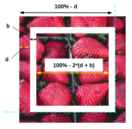
Similar to the previous example, we are going to rely on two gradients: a linear-gradient() for the inner part, and a conic-gradient() for the outer part. We’ll leave a space between them to create the transparent border effect.
img { --b: 5px; /* the border thickness */ --d: 20px; /* the distance from the edge */ --_g: calc(100% - 2 * (var(--d) + var(--b))); mask: conic-gradient(from 90deg at var(--d) var(--d), #0000 25%, #000 0) 0 0 / calc(100% - var(--d)) calc(100% - var(--d)), linear-gradient(#000 0 0) 50% / var(--_g) var(--_g) no-repeat;
}
You may have noticed that the conic gradient of this example has a different syntax from the previous example. Both are supposed to create the same shape, so why are they different? It’s because we can reach the same result using different syntaxes. This may look confusing at first, but it’s a good feature. You are not obliged to find the solution to achieve a particular shape. You only need to find one solution that works for you out of the many possibilities out there.
Here are four ways to create the outer square using gradients:
There are even more ways to pull this off, but you get the point.
There is no Best™ approach. Personally, I try to find the one with the smallest and most optimized code. For me, any solution that requires fewer gradients, fewer calculations, and fewer repeated values is the most suitable. Sometimes I choose a more verbose syntax because it gives me more flexibility to change variables and modify things. It comes with experience and practice. The more you play with gradients, the more you know what syntax to use and when.
Let’s get back to our inner transparent border and dig into the hover effect. In case you didn’t notice, there is a cool hover effect that moves that transparent border using a font-size trick. The idea is to define the --d variable with a value of 1em. This variables controls the distance of the border from the edge. We can transform like this:
--_d: calc(var(--d) + var(--s) * 1em)…giving us the following updated CSS:
img { --b: 5px; /* the border thickness */ --d: 20px; /* the distance from the edge */ --o: 15px; /* the offset on hover */ --s: 1; /* the direction of the hover effect (+1 or -1)*/ --_d: calc(var(--d) + var(--s) * 1em); --_g: calc(100% - 2 * (var(--_d) + var(--b))); mask: conic-gradient(from 90deg at var(--_d) var(--_d), #0000 25%, #000 0) 0 0 / calc(100% - var(--_d)) calc(100% - var(--_d)), linear-gradient(#000 0 0) 50% / var(--_g) var(--_g) no-repeat; font-size: 0; transition: .35s;
}
img:hover { font-size: var(--o);
}
The font-size is initially equal to 0 ,so 1em is also equal to 0 and --_d is be equal to --d. On hover, though, the font-size is equal to a value defined by an --o variable that sets the border’s offset. This, in turn, updates the --_d variable, moving the border by the offset. Then I add another variable, --s, to control the sign that decides whether the border moves to the inside or the outside.
The font-size trick is really useful if we want to animate properties that are otherwise unanimatable. Custom properties defined with @property can solve this but support for it is still lacking at the time I’m writing this.
The Frame Reveal
We made the following reveal animation in the first part of this series:
We can take the same idea, but instead of a border with a solid color we will use a gradient like this:
If you compare both codes you will notice the following changes:
- I used the same gradient configuration from the first example inside the
maskproperty. I simply moved the gradients from thebackgroundproperty to themaskproperty. - I added a
repeating-linear-gradient()to create the gradient border.
That’s it! I re-used most of the same code we already saw — with super small tweaks — and got another cool image decoration with a hover effect.
/* Solid color border */ img { --c: #8A9B0F; /* the border color */ --b: 10px; /* the border thickness*/ --g: 5px; /* the gap on hover */ padding: calc(var(--g) + var(--b)); --_g: #0000 25%, var(--c) 0; background: conic-gradient(from 180deg at top var(--b) right var(--b), var(--_g)) var(--_i, 200%) 0 / 200% var(--_i, var(--b)) no-repeat, conic-gradient(at bottom var(--b) left var(--b), var(--_g)) 0 var(--_i, 200%) / var(--_i, var(--b)) 200% no-repeat; transition: .3s, background-position .3s .3s; cursor: pointer;
}
img:hover { --_i: 100%; transition: .3s, background-size .3s .3s;
}
/* Gradient color border */ img { --b: 10px; /* the border thickness*/ --g: 5px; /* the gap on hover */ background: repeating-linear-gradient(135deg, #F8CA00 0 10px, #E97F02 0 20px, #BD1550 0 30px); padding: calc(var(--g) + var(--b)); --_g: #0000 25%, #000 0; mask: conic-gradient(from 180deg at top var(--b) right var(--b), var(--_g)) var(--_i, 200%) 0 / 200% var(--_i, var(--b)) no-repeat, conic-gradient(at bottom var(--b) left var(--b), var(--_g)) 0 var(--_i, 200%) / var(--_i, var(--b)) 200% no-repeat, linear-gradient(#000 0 0) content-box; transition: .3s, mask-position .3s .3s; cursor: pointer;
}
img:hover { --_i: 100%; transition: .3s, mask-size .3s .3s;
}
Let’s try another frame animation. This one is a bit tricky as it has a three-step animation:
The first step of the animation is to make the bottom edge bigger. For this, we adjust the background-size of a linear-gradient():
You are probably wondering why I am also adding the top edge. We need it for the third step. I always try to optimize the code I write, so I am using one gradient to cover both the top and bottom sides, but the top one is hidden and revealed later with a mask.
For the second step, we add a second gradient to show the left and right edges. But this time, we do it using background-position:
We can stop here as we already have a nice effect with two gradients but we are here to push the limits so let’s add a touch of mask to achieve the third step.
The trick is to make the top edge hidden until we show the bottom and the sides and then we update the mask-size (or mask-position) to show the top part. As I said previously, we can find a lot of gradient configurations to achieve the same effect.
Here is an illustration of the gradients I will be using:
I am using two conic gradients having a width equal to 200%. Both gradients cover the area leaving only the top part uncovered (that part will be invisible later). On hover, I slide both gradients to cover that part.
Here is a better illustration of one of the gradients to give you a better idea of what’s happening:
Now we put this inside the mask property and we are done! Here is the full code:
img { --b: 6px; /* the border thickness*/ --g: 10px; /* the gap */ --c: #0E8D94; padding: calc(var(--b) + var(--g)); --_l: var(--c) var(--b), #0000 0 calc(100% - var(--b)), var(--c) 0; background: linear-gradient(var(--_l)) 50%/calc(100% - var(--_i,80%)) 100% no-repeat, linear-gradient(90deg, var(--_l)) 50% var(--_i,-100%)/100% 200% no-repeat; mask: conic-gradient(at 50% var(--b),#0000 25%, #000 0) calc(50% + var(--_i, 50%)) / 200%, conic-gradient(at 50% var(--b),#000 75%, #0000 0) calc(50% - var(--_i, 50%)) / 200%; transition: .3s calc(.6s - var(--_t,.6s)) mask-position, .3s .3s background-position, .3s var(--_t,.6s) background-size, .4s transform; cursor: pointer;
}
img:hover { --_i: 0%; --_t: 0s; transform: scale(1.2);
}
I have also introduced some variables to optimize the code, but you should be used to this right now.
What about a four-step animation? Yes, it’s possible!
No explanation for this because it’s your homework! Take all that you have learned in this article to dissect the code and try to articulate what it’s doing. The logic is similar to all the previous examples. The key is to isolate each gradient to understand each step of the animation. I kept the code un-optimized to make things a little easier to read. I do have an optimized version if you are interested, but you can also try to optimize the code yourself and compare it with my version for additional practice.
Wrapping up
That’s it for Part 2 of this three-part series on creative image decorations using only the <img> element. We now have a good handle on how gradients and masks can be combined to create awesome visual effects, and even animations — without reaching for extra elements or pseudo-elements. Yes, a single <img> tag is enough!
We have one more article in this series to go. Until then, here is a bonus demo with a cool hover effect where I use mask to assemble a broken image.
Fancy Image Decorations series
- Single Element Magic
- Masks and Advanced Hover Effects (you are here!)
- Outlines and Complex Animations (coming October 28 )


