Today, the world is flooded with shopping on the Internet. According to research, almost 90% of mobile Internet time is spent on mobile applications. Although online commerce is widespread, some things make it even more accessible and attractive. We will talk about the design of mobile applications for online stores. These are cost-effective solutions that allow you to create enhanced interaction with users and make the application more interesting and useful. And sales success directly depends on its quality.
18 Ways to Improve the Design of Commerce-Oriented Mobile Apps
Table of Contents
- 1 18 Ways to Improve the Design of Commerce-Oriented Mobile Apps
- 1.1 Optimal placement of elements
- 1.2 Ease of reading
- 1.3 The rule of three touches
- 1.4 Simplified ordering
- 1.5 Laconic aesthetics
- 1.6 Sequence
- 1.7 7. Perfect navigation
- 1.8 Horizontal filtering is a flexible approach
- 1.9 Scaling
- 1.10 Virtual reality
- 1.11 Cart on the main screen
- 1.12 Intelligent search
- 1.13 Fast Download
- 1.14 Wish lists
- 1.15 Safe use
- 1.16 Choice of payment method
- 1.17 Reverse advertising
- 1.18 Automatic offer
- 2 What will help to develop the best mobile application design?
Here are 18 of the most popular tips that will help you develop a mobile application that will definitely increase conversions and bring more profit. All of them are aimed at attracting customers and encouraging further cooperation.
Optimal placement of elements
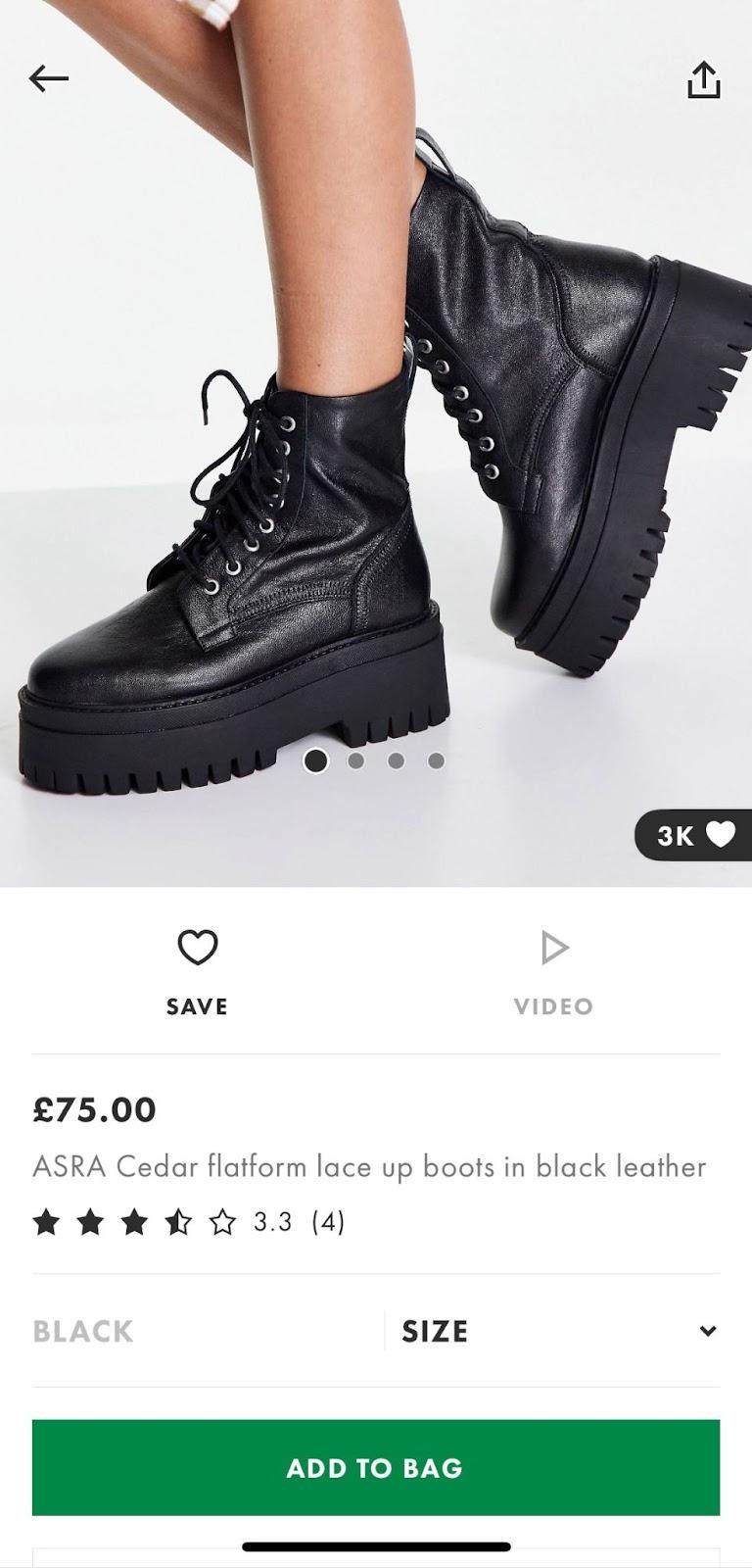
In order for visits to the online store to end with a purchase, all the necessary functions and keys must be at the client’s fingertips. More precisely, in the lower area, including the corner points, it is convenient to control with the thumb. Accordingly, these are the “Buy” or “Add to cart” functions. That is, the design should be such that the user can control the gadget with one hand.

Ease of reading
Readability in mobile format is one of the most important conditions for successful commerce. Therefore, it is important to analyze how accessible and convenient your application is for mobile access.


The rule of three touches
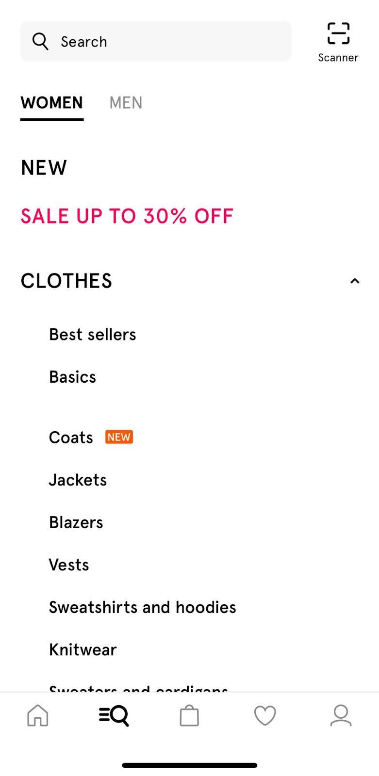
The search bar in the application should be as simple as possible – categories, subcategories, products. Of course, other filters may be present, but they should not visually harm a person to navigate among the assortment. The user must make a minimum number of clicks before proceeding to purchase. The simplified design of the mobile application should help him in this.

Simplified ordering
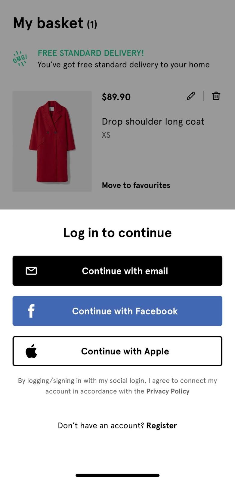
The order registration process should be simple and quick, otherwise, there is a chance that the product will remain in the cart. You should not ask for personal information from the client if there is no real need for it. An additional incentive for the user is the auto-filling of the field and the ability to change the order quantity before completing the purchase process.

Laconic aesthetics
In order for the user to quickly find and choose the desired product, the application interface should be simple and understandable. In particular:
- monochrome background (use of different shades of the same color);
- use of one font (you can experiment with style and size);
- acceptable intervals (information should not be broken).


Sequence
In order for the client to be guaranteed to go from interest to purchase, you need to apply the algorithm of three elements:
– unobtrusive visualization (uniformity of colors, fonts, and buttons);
– universal functionality, in which the use of the application will be convenient on any screen;
– external similarity (site, application, and catalog must be in the same design).
The user must see the parameters. For this, you should use standard suggestions, it is not advisable to experiment. Quick and efficient use of the mobile application is guaranteed to lead to a purchase. At the same time, the client will remain satisfied and will not get tired of complex operations.
Horizontal filtering is a flexible approach
It will be much more convenient for the user if all active filters are visible in the horizontal position. In particular, the list of goods, tables, etc. It is worth remembering that the client can use the mobile device in the most unexpected place. Therefore, it is necessary to adapt the e-commerce application for this.
Scaling
If the customer has the opportunity to view the product in an enlarged form, it will increase the probability of buying it. Therefore, it is worth adding zoom and double-tap functionality.


Virtual reality
Allow the user to walk through your online store with the same pleasure as a normal one. That is, the client should be able to virtually try on clothes, furniture in the house, etc. The use of virtual reality integration significantly increases the interest in the purchase.
Cart on the main screen
The entry to the shopping cart should be on the main screen with the possibility to immediately continue shopping. If the user will constantly leave and return to the services page, most likely, he will leave empty-handed. Therefore, you should not test the patience of customers.


Intelligent search
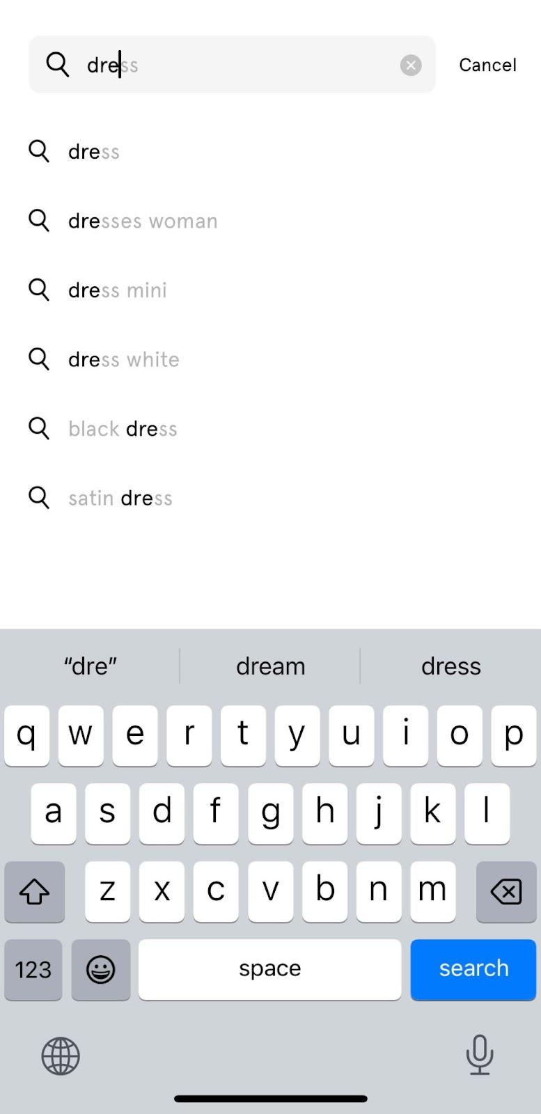
The ability to search for a product by the first input letters will greatly speed up the use of the application and will appeal to users. After all, they will not only receive relevant offers of this series, but also a selection of other hot products.

Fast Download
The user must access the mobile application quickly, otherwise, he will lose interest in the products. If it takes 4-5 seconds, chances are the customer will move to another page. You can apply a progress indicator, which clearly indicates how much time a person has to wait. However, it is better not to encourage her to do this.
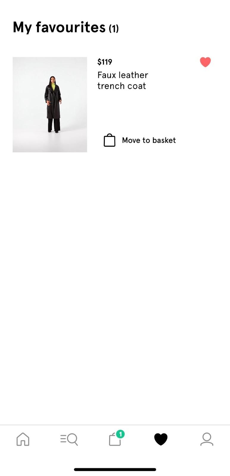
Wish lists
The presence of such a function is beneficial for users who choose many items, and later – several. The ability to save what you like, instead of looking for it in the second circle, will save the customer’s time and he will remain satisfied after the purchase.

Safe use
Since hacking attacks are commonplace today, many online users are reluctant to enter their personal information. Therefore, when requesting them from the client, convince him of the safety and confidentiality of the information. Even if encrypting every transaction will cost the online store owner dearly, reputation costs more…
Choice of payment method
The user must be able to pay for the selected service in a convenient way. Therefore, it is worth thinking about it in advance and giving people the opportunity to choose a payment method. For this, the list should include all the most popular and popular options.
Reverse advertising
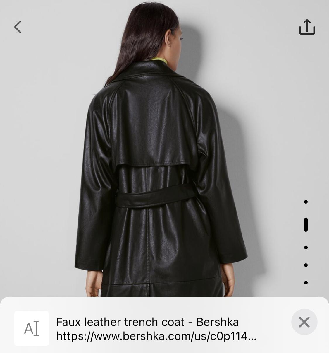
If the mobile application has a “Share” function after making a purchase, it will be useful for both the buyer and the seller. After all, the first one can talk about his successful experience of cooperation with a specific online store and thereby make an advertisement for the second one.

Automatic offer
If a customer browsed the catalog and did not make a purchase, it is useful to create a log of data that is convenient for tracking user behavior and their requests. And later generate an automatic offer based on the results of common search queries.
What will help to develop the best mobile application design?
If you focus on your user and want to create all the conditions for him, then of course you will do everything possible for this. However, a clear understanding of the process of creating a convenient modern interface is the key to success. The main tags of this understanding are accessibility, clarity, consistency, the possibility of choosing and preserving it, trust, and consulting support.
It is worth remembering that the creation and development of the interface is not a one-time task, but a constant improvement in accordance with the requirements of time and the needs of consumers. One way to track customer inquiries is to communicate with them through customer support. It can be a consultant or a bot, it doesn’t matter, the main thing is to satisfy users’ requests for information.
Competition among various online stores today is extremely large and powerful. Therefore, everyone tries to pleasantly impress their client and attract as many new ones as possible. For this, they use all possible methods, experimenting and improving. And it is the focus on the user’s requests that is key in the development of the design of mobile e-commerce applications.


