In this article we will be diving into the world of scrollbars. I know, it doesn’t sound too glamorous, but trust me, a well-designed page goes hand-in-hand with a matching scrollbar. The old-fashioned chrome scrollbar just doesn’t fit in as much.
We will be looking into the nitty gritty details of a scrollbar and then look at some cool examples.
Components of a scrollbar
Table of Contents
This is more of a refresher, really. There are a bunch of posts right here on CSS-Tricks that go into deep detail when it comes to custom scrollbar styling in CSS.
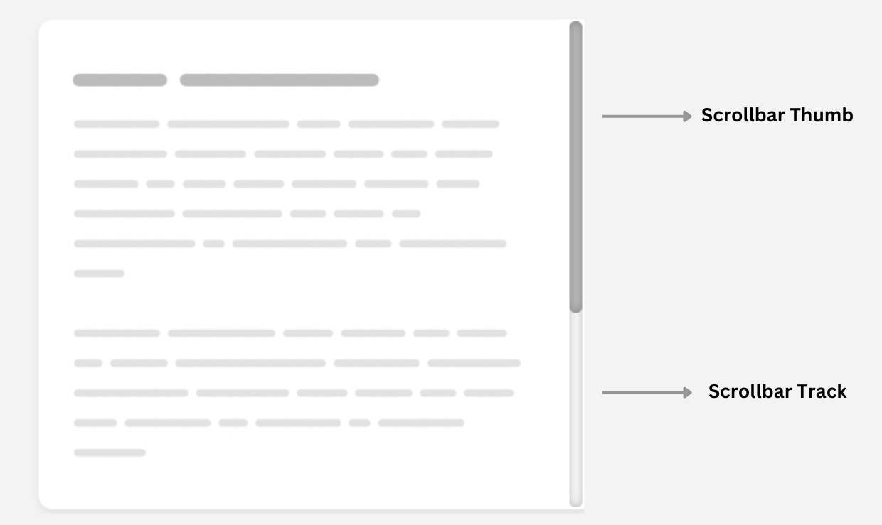
To style a scroll bar you need to be familiar with the anatomy of a scrollbar. Have a look at this illustration:

The two main components to keep in mind here are:
- The track is the background beneath the bar.
- The thumb is the part that the user clicks and drags around.
We can change the properties of the complete scrollbar using the vendor-prefixed::-webkit-scrollbar selector. We can give the scroll bar a fixed width, background color, rounded corners… lots of things! If we’re customizing the main scrollbar of a page, then we can use ::-webkit-scrollbar directly on the HTML element:
html::-webkit-scrollbar { /* Style away! */
}
If we’re customizing a scroll box that’s the result of overflow: scroll, then we can use ::-webkit-scrollbar on that element instead:
.element::-webkit-scrollbar { /* Style away! */
}
Here’s a quick example that styles the HTML element’s scrollbar so that it is wide with a red background:
What if we only want to change the scrollbar’s thumb or track? You guessed it — we have special prefixed pseudo-elements for those two: ::-webkit-scrollbar-thumb and ::-webkit-scrollbar-track, respectively. Here’s an idea of what’s possible when we put all of these things together:
Enough brushing up! I want to show you three degrees of custom scrollbar styling, then open up a big ol’ showcase of examples pulled from across the web for inspiration.
Simple and classy scrollbars
A custom scrollbar can still be minimal. I put together a group of examples that subtly change the appearance, whether with a slight color change to the thumb or track, or some light styling to the background.
As you can see, we don’t have to go nuts when it comes to scrollbar styling. Sometimes a subtle change is all it takes to enhance the overall user experience with a scrollbar that matches the overall theme.
Cool eye-catching scrollbars
But let’s admit it: it’s fun to go a little overboard and exercise some creativity. Here are some weird and unique scrollbars that might be “too much” in some cases, but they sure are eye-catching.
One more…
How about we take the scrollbar for a spin in a train for the thumb and tracks for the, well, the track!


