???? The demos in this article experiment with a non-standard bug related to CSS gradients and sub-pixel rendering. Their behavior may change at any time in the future. They’re also heavy as heck. We’re serving them async where you click to load, but still want to give you a heads-up in case your laptop fan starts spinning.
Do you remember that static noise on old TVs with no signal? Or when the signal is bad and the picture is distorted? In case the concept of a TV signal predates you, here’s a GIF that shows exactly what I mean.
View image (contains auto-playing media)

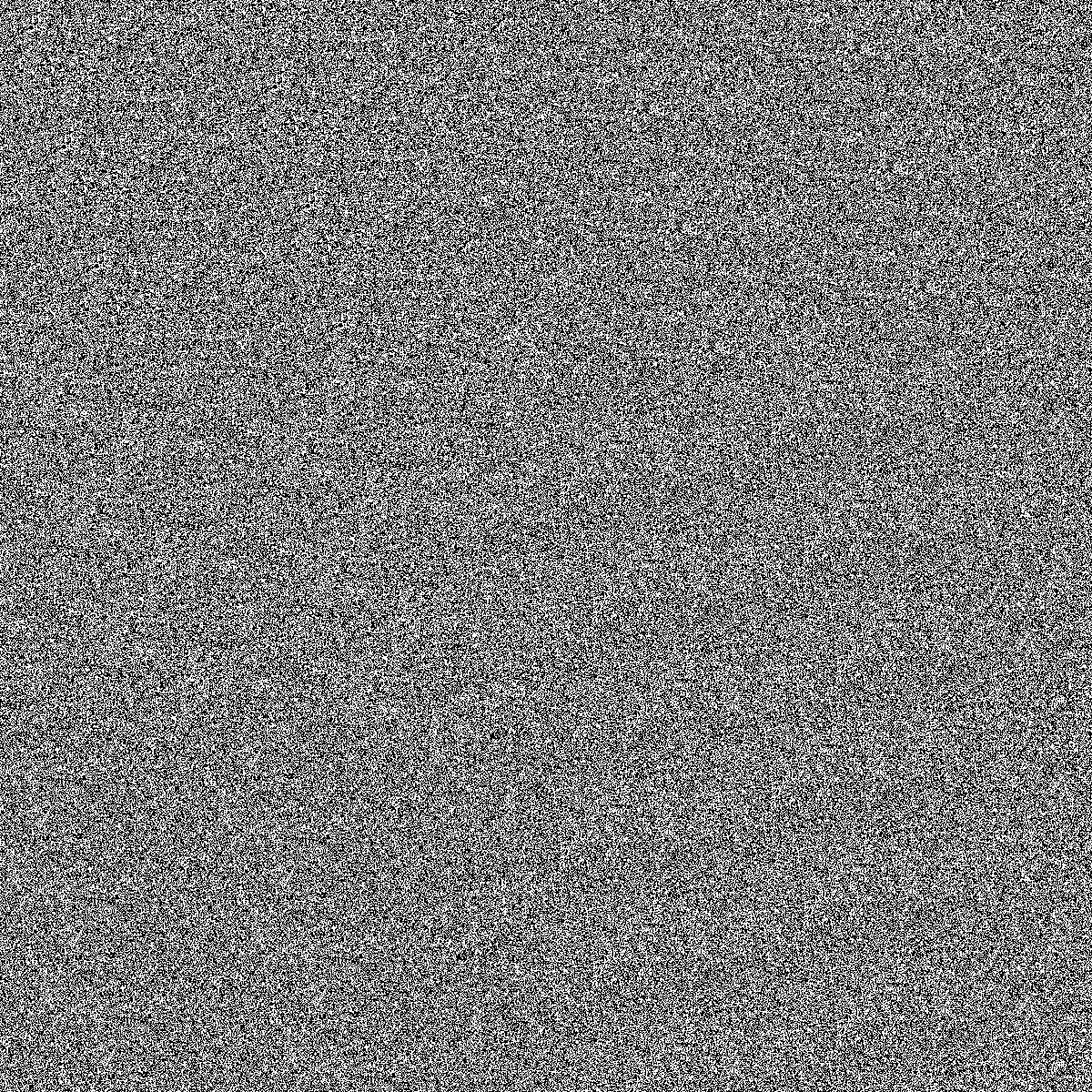
Yes, we are going to do something like this using only CSS. Here is what we’re making:
Before we start digging into the code, I want to say that there are better ways to create a static noise effect than the method I am going to show you. We can use SVG, <canvas>, the filter property, etc. In fact, Jimmy Chion wrote a good article showing how to do it with SVG.
What I will be doing here is kind of a CSS experiment to explore some tricks leveraging a bug with gradients. You can use it on your side projects for fun but using SVG is cleaner and more suitable for a real project. Plus, the effect behaves differently across browsers, so if you’re checking these out, it’s best to view them in Chrome, Edge, or Firefox.
Let’s make some noise!
Table of Contents
To make this noise effect we are going to use… gradients! No, there is no secret ingredient or new property that makes it happen. We are going to use stuff that’s already in our CSS toolbox!
The “trick” relies on the fact that gradients are bad at anti-aliasing. You know those kind of jagged edges we get when using hard stop colors? Yes, I talk about them in most of my articles because they are a bit annoying and we always need to add or remove a few pixels to smooth things out:
As you can see, the second circle renders better than the first one because there is a tiny difference (0.5%) between the two colors in the gradient rather than using a straight-up hard color stop using whole number values like the first circle.
Here’s another look, this time using a conic-gradient where the result is more obvious:
An interesting idea struck me while I was making these demos. Instead of fixing the distortion all the time, why not trying to do the opposite? I had no idea what would happen but it was a fun surprise! I took the conic gradient values and started to decrease them to make the poor anti-aliasing results look even worse.
Do you see how bad the last one is? It’s a kind of scrambled in the middle and nothing is smooth. Let’s make it full-screen with smaller values:
I suppose you see where this is going. We get a strange distorted visual when we use very small decimal values for the hard colors stops in a gradient. Our noise is born!
We are still far from the grainy noise we want because we can still see the actual conic gradient. But we can decrease the values to very, very small ones — like 0.0001% — and suddenly there’s no more gradient but pure graininess:
Tada! We have a noise effect and all it takes is one CSS gradient. I bet if I was to show this to you before explaining it, you’d never realize you’re looking at a gradient. You have to look very carefully at center of the gradient to see it.
We can increase the randomness by making the size of the gradient very big while adjusting its position:
The gradient is applied to a fixed 3000px square and placed at the 60% 60% coordinates. We can hardly notice its center in this case. The same can be done with radial gradient as well:
And to make things even more random (and closer to a real noise effect) we can combine both gradients and use background-blend-mode to smooth things out:
Our noise effect is perfect! Even if we look closely at each example, there’s no trace of either gradient in there, but rather beautiful grainy static noise. We just turned that anti-aliasing bug into a slick feature!
Now that we have this, let’s see a few interesting examples where we might use it.
Animated no TV signal
Getting back to the demo we started with:
If you check the code, you will see that I am using a CSS animation on one of the gradients. It’s really as simple as that! All we’re doing is moving the conic gradient’s position at a lightning fast duration (.1s) and this is what we get!
I used this same technique on a one-div CSS art challenge:
Grainy image filter
Another idea is to apply the noise to an image to get an old-time-y look. Hover each image to see them without the noise.
I am using only one gradient on a pseudo-element and blending it with the image, thanks to mix-blend-mode: overlay.
We can get an even funnier effect if we use the CSS filter property
And if we add a mask to the mix, we can make even more effects!
Grainy text treatment
We can apply this same effect to text, too. Again, all we need is a couple of chained gradients on a background-image and then blend the backgrounds. The only difference is that we’re also reaching for background-clip so the effect is only applied to the bounds of each character.
Generative art
If you keep playing with the gradient values, you may get more surprising results than a simple noise effect. We can get some random shapes that look a lot like generative art!
Of course, we are far from real generative art, which requires a lot of work. But it’s still satisfying to see what can be achieved with something that is technically considered a bug!
Monster face
One last example I made for CodePen’s divtober 2022 collection:
Wrapping up
I hope you enjoyed this little CSS experiment. We didn’t exactly learn something “new” but we took a little quirk with gradients and turned it into something fun. I’ll say it again: this isn’t something I would consider using on a real project because who knows if or when anti-aliasing will be addressed at some point in time. Instead, this was a very random, and pleasant, surprise when I stumbled into it. It’s also not that easy to control and it behaves inconsistently across browsers.
This said, I am curious to see what you can do with it! You can play with the values, combine different layers, use a filter, or mix-blend-mode, or whatever, and you will for sure get something really cool. Share your creations in the comment section — there are no prizes but we can get a nice collection going!


