One of the main goals of the WordPress Site Editor (and, yes, that is now the “official” name) is to move basic block styling from CSS to structured JSON. JSON files are machine-readable, which makes it consumable by the JavaScript-based Site Editor for configuring a theme’s global styles directly in WordPress.
It’s not all the way there yet! If we look at the Twenty Twenty-Two (TT2) default theme, there were two main unresolved issues: styling interactions (like :hover, :active, :focus), and the margins and padding of layout containers. You can see how those were temporarily fixed in the TT2 style.css file rather than making it into the theme.json file.
WordPress 6.1 fixed those issues and what I want to do is look specifically at the latter. Now that we have JSON-ified styles for the margins and padding of layout containers, that opens us up to more flexible and robust ways to define spacing in our theme layouts.
What kind of spacing are we talking about?
Table of Contents
First off, we already have root-level padding which is a fancy way of describing padding on the <body> element. That’s nice because it ensures consistent spacing on an element that is shared on all pages and posts.
But there’s more to it because now we have a way for blocks to bypass that padding and align themselves full-width. That’s thanks to padding-aware alignments which is a new opt-in feature in theme.json. So, even if you have root-level padding, you can still allow, say, an image (or some other block) to break out and go full-width.
That gets us to another thing we get: constrained layouts. The idea here is that any blocks nested in the layout respect the layout’s content width — which is a global setting — and do not flow outside of it. We can override that behavior on a block-by-block basis with alignments, but we’ll get to that.
Let’s start with…
Root-level padding
Again, this isn’t new. We’ve had the ability to set padding on the <body> element in theme.json since the experimental Gutenberg plugin introduced it in version 11.7. We set it on the styles.spacing object, where we have margin and padding objects to define the top, right, bottom, and left spacing on the body:
{ "version": 2, "styles": { "spacing": { "margin": { "top": "60px", "right": "30px", "bottom": "60px", "left": "30px" }, "padding": { "top": "30px", "right": "30px", "bottom": "30px", "left": "30px" } } }
}
This is a global setting. So, if we were to crack open DevTools and inspect the <body> element, we would see these CSS styles:
body { margin-top: 60px; margin-right: 30px; margin-bottom: 60px; margin-left: 30px; padding-top: 30px; padding-right: 30px; padding-bottom: 30px; padding-left: 30px;
}
Cool. But herein lies the issue of how in the world we can allow some blocks to break out of that spacing to fill the full screen, edge-to-edge. That’s why the spacing is there, right? It helps prevent that from happening!
But there are indeed plenty of cases where you might want to break out of that spacing on a one-off instance when working in the Block Editor. Say we plop an Image block on a page and we want it to go full-width while the rest of the content respects the root-level padding?
Enter…
Padding-aware alignments
While attempting to create the first default WordPress theme that defines all styles in the theme.json file, lead designer Kjell Reigstad illustrates the challenging aspects of breaking out of root-level padding in this GitHub issue.
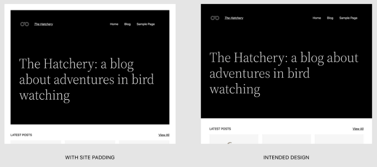
New features in WordPress 6.1 were created to address this issue. Let’s dig into those next.
useRootPaddingAwareAlignments
A new useRootPaddingAwareAlignments property was created to address the problem. It was actually first introduced in the Gutenberg plugin v13.8. The original pull request is a nice primer on how it works.
{ "version": 2, "settings": { "appearanceTools": true, "useRootPaddingAwareAlignments": true, // etc. },Right off the bat, notice that this is a feature we have to opt into. The property is set to false by default and we have to explicitly set it to true in order to enable it. Also notice that we have appearanceTools set to true as well. That opts us into UI controls in the Site Editor for styling borders, link colors, typography, and, yes, spacing which includes margin and padding.
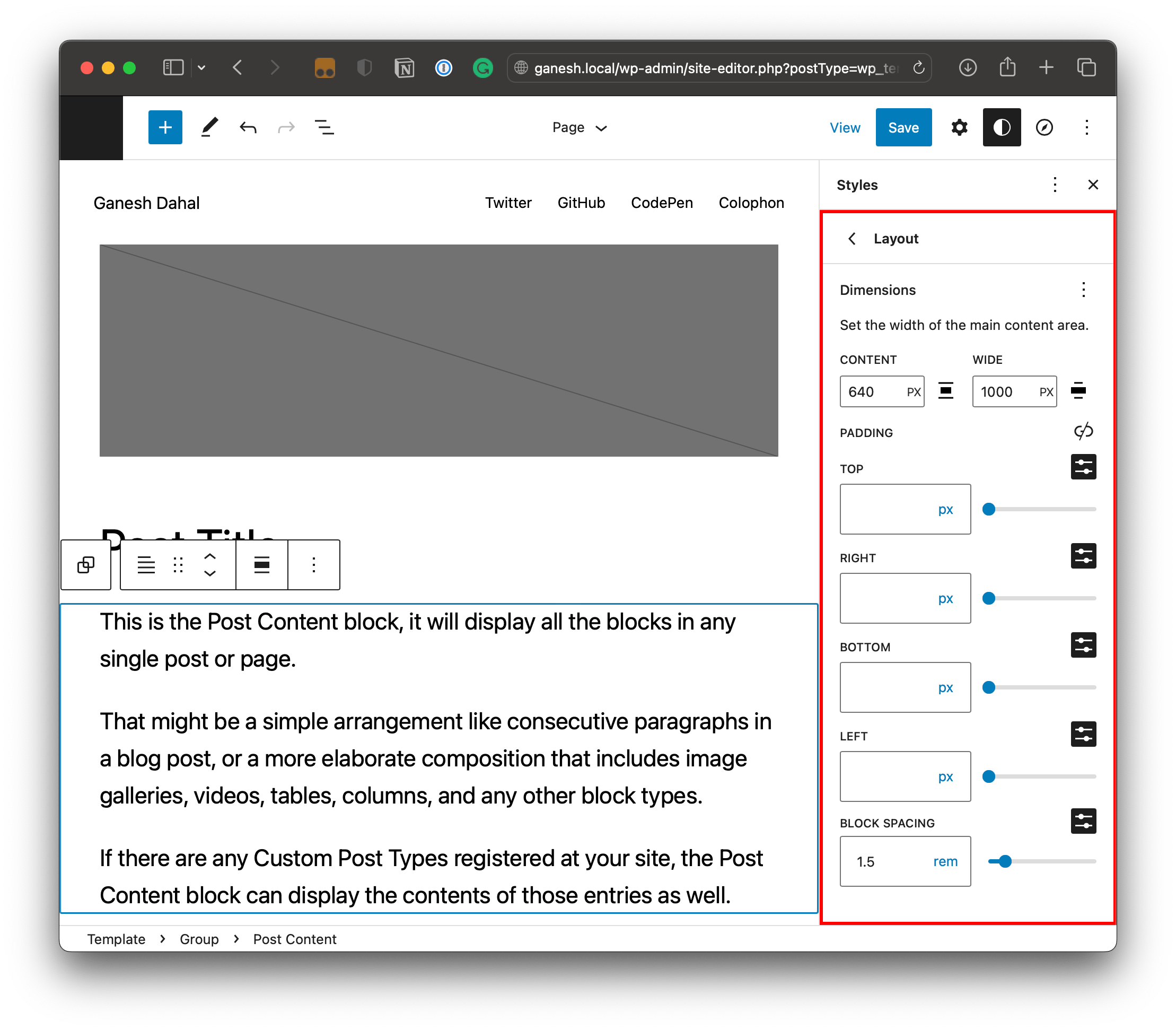
Setting appearanceTools set to true automatically opts blocks into margin and padding without having to set either settings.spacing.padding or setting.spacing.margin to true.
When we do enable useRootPaddingAwareAlignments, we are provided with custom properties with root padding values that are set on the <body> element on the front end. Interestingly, it also applies the padding to the .editor-styles-wrapper class so the spacing is displayed when working in the back-end Block Editor. Pretty cool!
I was able to confirm those CSS custom properties in DevTools while digging around.
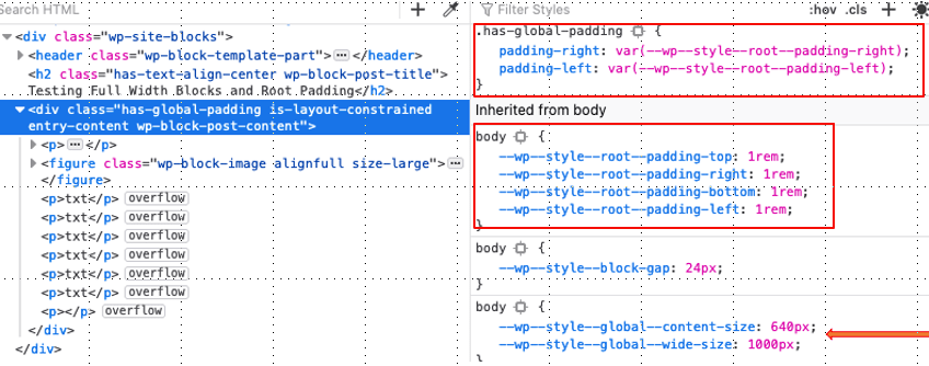
Enabling useRootPaddingAwareAlignments also applies left and right padding to any block that supports the “content” width and “wide” width values in the Global Styles image above. We can also define those values in theme.json:
{ "version": 2, "settings": { "layout": { "contentSize": "640px", "wideSize": "1000px" } }
}
If the Global Styles settings are different than what is defined in theme.json, then the Global Styles take precedence. You can learn all about managing block theme styles in my last article.
contentSizeis the default width for blocks.wideSizeprovides a “wide” layout option and establishes a wider column for blocks to stretch out.
So, that last code example will give us the following CSS:
/* The default content container */
.wp-container-[id] > * { max-width: 640px; margin-left: auto !important; margin-right: auto !important;
} /* The wider content container */
.wp-container-[id] > .alignwide { max-width: 1000px;
}
[id] indicates a unique number automatically generated by WordPress.
But guess what else we get? Full alignment as well!
.wp-container-[id] .alignfull { max-width: none;
}
See that? By enabling useRootPaddingAwareAlignments and defining contentSize and wideSize, we also get a full alignment CSS class for a total of three container configurations for controlling the width of blocks that are added to pages and posts.
This applies to the following layout-specific blocks: Columns, Group, Post Content, and Query Loop.
Block layout controls
Let’s say we add any of those aforementioned layout-specific blocks to a page. When we select the block, the block settings UI offers us new layout settings based on the settings.layout values we defined in theme.json (or the Global Styles UI).
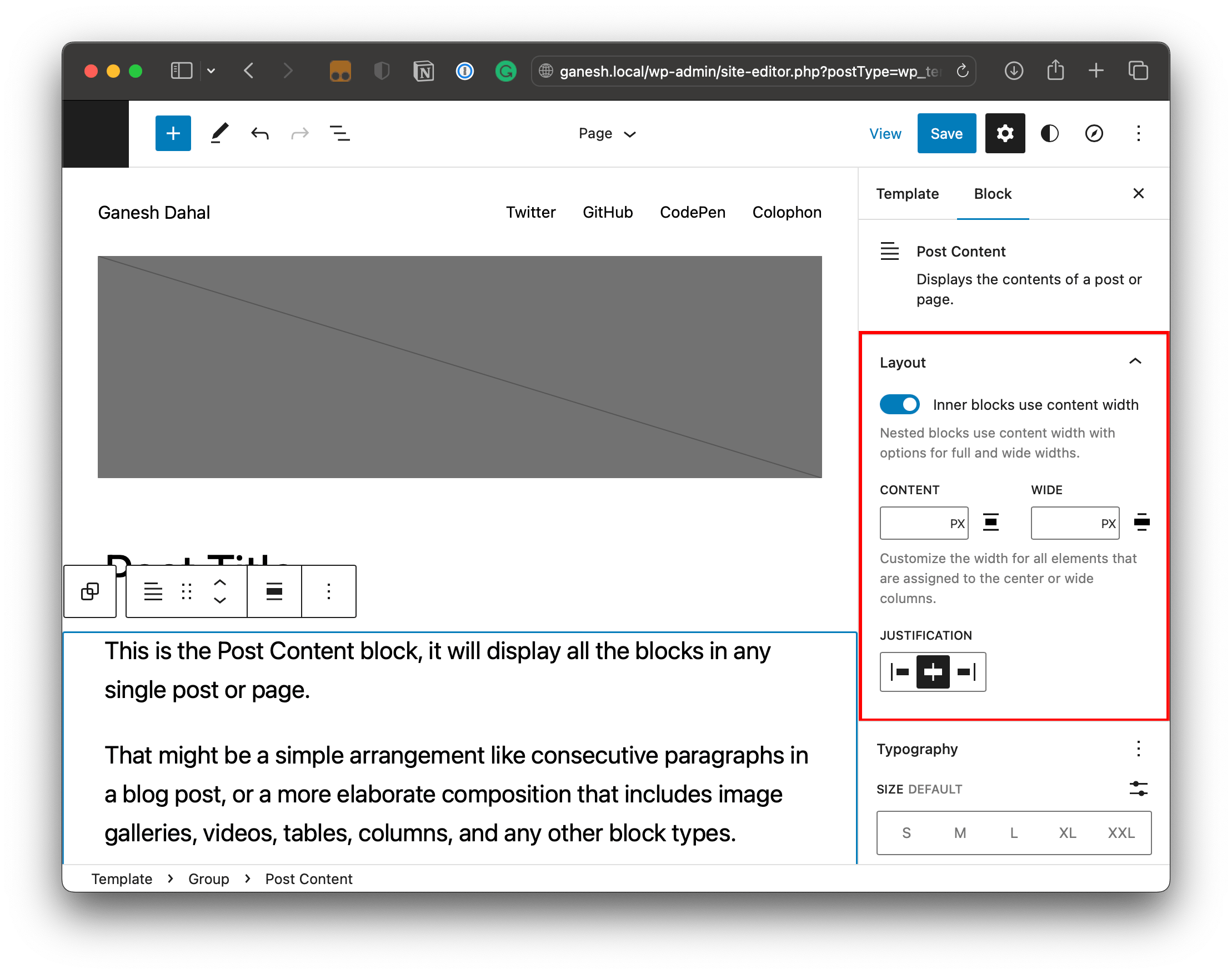
We’re dealing with very specific blocks here — ones that can have other blocks nested inside. So, these Layout settings are really about controlling the width and alignment of those nested blocks. The “Inner blocks use content width” setting is enabled by default. If we toggle it off, then we have no max-width on the container and the blocks inside it go edge-to-edge.
If we leave the toggle on, then nested blocks will adhere to either the contentWidth or wideWidth values (more on that in a bit). Or we can use the numeric inputs to define custom contentWidth and wideWidth values in this one-off instance. That’s great flexibility!
Wide blocks
The settings we just looked are set on the parent block. Once we’ve nested a block inside and select it, we have additional options in that block to use the contentWidth, wideWidth, or go full-width.
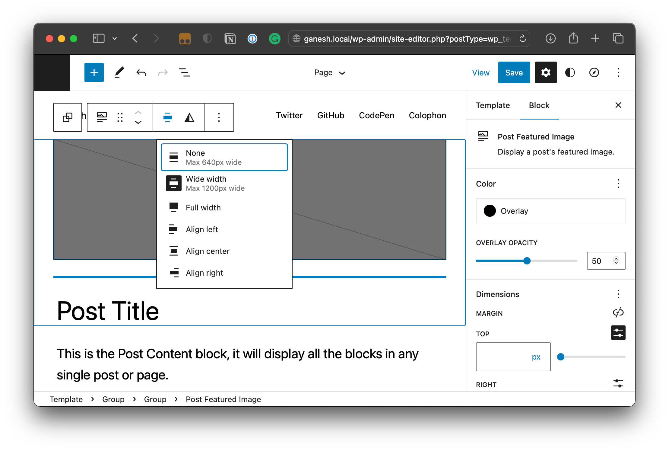
contentWidth setting, labeled “None” in the contextual menu, but can also be set to wideWidth (labeled “Wide width”) or “Full width”.Notice how WordPress multiplies the root-level padding CSS custom properties by -1 to create negative margins when selecting the “Full width” option.

.alignfull class sets negative margins on a nested block to ensure it takes up the full viewport width without conflicting with the root-level padding settings.Using a constrained layout
We just covered the new spacing and alignments we get with WordPress 6.1. Those are specific to blocks and any nested blocks within blocks. But WordPress 6.1 also introduces new layout features for even more flexibility and consistency in a theme’s templates.
Case in point: WordPress has completely restructured its Flex and Flow layout types and gave us a constrained layout type that makes it easier to align block layouts in themes using the content width settings in the Site Editor’s Global Styles UI.
Flex, Flow, and Constrained layouts
The difference between these three layout types is the styles that they output. Isabel Brison has an excellent write-up that nicely outlines the differences, but let’s paraphrase them here for reference:
- Flow layout: Adds vertical spacing between nested blocks in the
margin-blockdirection. Those nested blocks can also be aligned to the left, right, or center. - Constrained layout: Same exact deal as a Flow layout, but with width constraints on nested blocks that are based on the
contentWidthandwideWidthsettings (either intheme.jsonor Global Styles). - Flex layout: This was unchanged in WordPress 6.1. It uses CSS Flexbox to create a layout that flows horizontally (in a row) by default, but can flow vertically as well so blocks stack one on top of another. Spacing is applied using the CSS
gapproperty.
This new slate of layout types creates semantic class names for each layout:
| Semantic layout class | Layout type | Supported blocks |
|---|---|---|
.is-layout-flow |
Flow layout | Columns, Group, Post Content, and Query Loop. |
.is-layout-constrained |
Constrained layout | Columns, Group, Post Content, and Query Loop. |
.is-layout-flex |
Flex layout | Columns, Buttons, Social Icons |
Justin Tadlock has an extensive write-up on the different layout types and semantic classes, including use cases and examples.
Updating your theme to support constrained layouts
If you’re already using a block theme of your own making, you’re going to want to update it to support constrained layouts. All it takes is swapping out a couple of things in theme.json:
{ "version": 2, "settings": { "layout": { "type": "constrained", // replaces `"inherit": true` "type": "default", // replaces `"inherit": false` } }
}
These are recently released block themes that have enabled spacing settings with useRootPaddingAwareAlignments and have an updated theme.json file that defines a constrained layout:
Disabling layout styles
The base layout styles are default features that ship in WordPress 6.1 Core. In other words, they’re enabled right out of the box. But we can disable them if we need to with this little snippet in functions.php:
// Remove layout styles.
add_theme_support( 'disable-layout-styles' );
Big warning here: disabling support for the default layout types also removes all of the base styling for those layouts. That means you’ll need to roll your own styles for spacing, alignments, and anything else needed to display content in different template and block contexts.
Wrapping up
As a great fan of full-width images, the new contained WordPress 6.1 layout and padding aware alignment features are two of my most favorites yet. Taken together with other tools including, better margin and padding control, fluid typography, and updated List and Quote blocks, among others, is solid proof that WordPress is moving towards a better content creation experience.
Now, we have to wait and look at how the imagination and creativity of ordinary designers and content creators use these incredible tools and take it to a new level.
Because of the site editor development iterations in progress, we should always anticipate a difficult path ahead. However, as an optimist, I am eager to see what will happen in the upcoming version of WordPress 6.2. Some of the thing, that I am keeping a close eye on are things like features being considered for inclusion, support for sticky positioning, new layout class names for inner block wrappers, updated footer alignment options, and adding constrained and flow layout options to Cover blocks.
This GitHub issues #44720 lists the layout related discussions slated for WordPress 6.2.
Additional resources
I consulted and referenced a lot of sources while digging into all of this. Here’s a big ol’ list of things I found helpful and think you might enjoy as well.


