In order to understand who your users are, what they want to accomplish, and what they think of your product, you need to conduct user research. User research is the first phase of a design process as it gives you the opportunity to know who you are designing for, one of these research methods being surveys.
Utilizing UX surveys is a quick and simple way to learn more about your users, which is why it’s one of the most commonly employed research methods in the UX profession. In this article, I’ll show you how to design a UX survey and walk you through the tools I use in my UX survey process so you can improve your own survey skills.
Table of contents
Table of Contents
What is a UX survey?
A UX survey is used to collect information about users for a specific product. It is designed specifically for user research and testing. Surveys are an excellent way for user researchers and other developers to determine the needs of the people for whom they are designing as well as collect feedback after the product has been launched.
To make a survey effective, you need to ask the right questions, because asking the wrong questions will lead you to design in the wrong direction, resulting in products that no one will use.
Survey questions are of two types: open and closed questions.
Closed survey questions
Closed questions typically evoke a “yes” or “no” response. They are usually questions with checkboxes. These questions are used to better understand quantitative data. It does not dig deeper into why the users checked those boxes.
Open survey questions
Open questions are of a qualitative nature. They assist you in understanding the needs and behaviors of your users. It shows you how the user sees the problem. The answer type for these questions is typically large text boxes that allow users to elaborate further. “How does using this product make you feel?” is an example of such a question. Open-ended questions require a significant amount of time to analyze and synthesize.
Why should you conduct a user survey?
As a user researcher, your goal is to learn more about your product’s users. Here are a few reasons why you should conduct a user survey to better understand your customers:
- To design a usable solution, your product must solve a problem. You can not solve a problem you know nothing about. This is why we use surveys: to identify user problems in order to design a universal solution
- A UX survey is relevant in exposing edge cases of a product. Apart from finding out the problem in the beginning, a user survey can also be used after launch to gather feedback on what the users think about the product, like a test record. This will help you understand where users find it difficult to use your product as well as features they enjoyed and places that need improvements
- UX surveys help designers uncover data that can help improve user experience. A user-centered design is equally important to a good-looking design. Surveys help us to find out from users areas that can improve their experience while using the app
- UX surveys are cost-effective when understanding users. Conversely, a designer could conduct ethnographic research, where you visit a specific location where the target audience is located and observe them using your products. It is usually expensive to do this type of research, unlike surveys which are cheaper and distributed online
- Unmoderated questionnaires can give very honest feedback. This is a good way to get unbiased data
Where to use surveys
There are a few research types that use surveys. Determining which stage of research you’re conducting will help you formulate your survey:
- Generative research: This is typically done at the start of the design process to generate more data and determine user needs
- Evaluative research: This can be done in the form of user testing during the design process
- Continuous research: This is more of a continuous survey to gather feedback from users at any given time in order to improve the experience
You can see how the different types of research will influence your survey questions, methodology, and target audience. For example, a survey for continuous research would be implemented into a purchasing flow so users are always welcome to provide feedback on the purchasing process
In this case, the target audience would be customers of the products not prospective users. You ask questions like, “How often do you use this product?” and “How would you describe your emotion when you find this product is unavailable?” These types of questions show how often they use your product and if it satisfies their needs.
For generative research, the target audience is prospective users, people who we think would find this product useful, and the survey questions are designed to let us know if these people actually need the product. You ask questions like, “Would you like to use a product that helps you order all your meals in one tap?” and “What product do you currently use to perform this task?” These help you understand user needs and find out competitors.
How to design a UX survey
UX research is an important part of the design process. But the research part must be done correctly; this means getting the right questions, setting the right goals, and using the right tools.
Here are tips for designing a good UX survey:
- Determine your goals and set expectations: Before you set out to create a UX survey, determine a set of goals and objectives for the research. What are you trying to find out from the survey? How would that help the design process? The goal can be designed by the product owner, stakeholders, or even the design team. The objectives and goal also explore the type of data you are planning to collect
- Prepare the questionnaire: Now that you have the goals written down and shared with the team, you can design questions. For best results, your questionnaire should be made up of open and closed questions and also give qualitative and quantitative results
- Recruit participants: This involves identifying the target audience for the research. Some companies have a list of users they can recruit for testing and research, while other companies have to outsource the research and look for communities with users. In either scenario, it is important that the designer and the team know who their target audience is and send the questions to them. The wrong target can also lead to wrong data. For example, if you’re building a software for kids, your target audience should be a mixture of parents and children, not teens or people without kids who have no use for the software
- A/B test different versions of your survey: Before sending out your survey, host mock test sessions within the team to see how each question flows into the next and if a question is necessary to the design solution
- Iterate the questionnaire: From the above step, make the necessary changes to your questionnaire before sending it out
- Pick channels to recruit participants: Your research participants are just as important as your research question if you ask the right questions to the wrong people, you may get an incorrect answer. So if your organization does not have a list of users, you can find communities to recruit participants
- Follow-up and feedback: Follow up on the surveys and respond to participant requests. This could be in the form of a call to action to contact you, or it could be as simple as inviting them to drop their emails for you to contact them
- Stay clear of biases: When setting up the questions, be aware of the biases you and your team might have and find ways to eliminate them in the design of the questionnaires. Sometimes people are not aware of their bias but it can be visible in their words and actions. Also, bias can affect your design solutions if you only choose responses that align with your personal beliefs. Give room for diversity by collecting all data and sorting it appropriately
- Make use of incentives to encourage users: Make use of incentives as a way for people to feel encouraged while filling out the survey. They could either be in form of gift cards, swags, or cash
- Use clear English: Depending on the survey type and target audience, use simple and clear English to ask questions. Frame questions in a way that persuades the user to be honest in their response. Keep the questionnaire short and simple; you can do this by creating a flow to the question
Tips on interpreting research surveys
Organize similar answers
When sorting out your research data, identify how you want to sort the results. You can decide to group similar experiences, demographics, needs, etc. This can help you create a visual representation of the findings in a way that is manageable.
Use visuals or graphics to describe findings
Use visuals to interpret your findings. You can create personas, affinity maps, or user flows. It is an excellent method for communicating research findings to your team and other nontechnical or design members of your organization, such as stakeholders.
Work in teams and use whiteboards
Depending on the type and quantity of the data and also to avoid bias, it is important to share the data from the survey with your teams so you can all work on it. This gives room for innovation to spread through the diversity of the team. Everyone brings their unique problem-solving skills to the table. The team can decide what methods to use: a whiteboard, sticky notes, and so on.
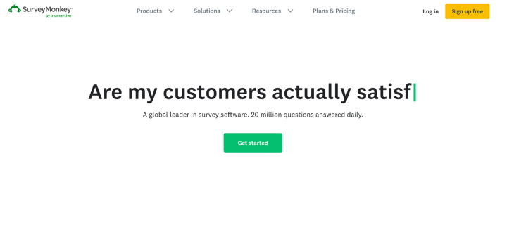
SurveyMonkey
SurveyMonkey is among the first survey platforms launched on the internet. Its ability to handle complex routing has made it a researcher favorite.
The inbuilt recruitment capability is an important feature of SurveyMonkey. It also allows data to be exported and accessed by tools granted access. A con of this platform is that the setup takes a little bit of time and the fee option has a lot of limitations.
Google Forms
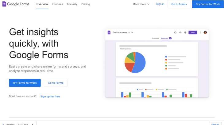
This is a beginner-friendly survey platform that can be accessed from your Google account. Google Forms allows for unlimited questions to be asked in a survey, but it is not a UX survey tool because there are some limitations to organizing and collecting data in comparison to other UX survey tools. It’s a great tool for gathering basic data.
Typeform
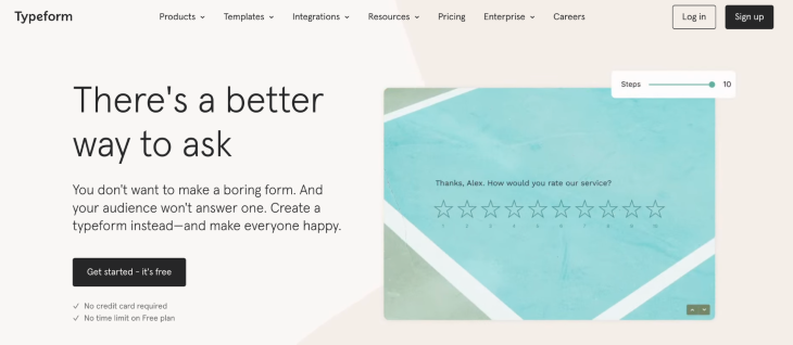
Typeform is one of the most commonly used platforms to design aesthetically pleasing long-form surveys. It allows creators to personalize their surveys by adding follow-ups on previous responses. A con of this is that it redirects participants away from the platform, which interrupts their user experience.
Typeform is said to have an intuitive interface that makes it welcoming to users. With Typeform, you can connect the gathered data to popular apps such as Slack, Google Sheets, and more.
Zonka Feedback
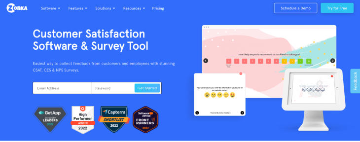
This is a great survey tool and UX management platform. It offers an array of templates that make setting up easy and real-time alerts to designers so they can respond to feedback in a timely manner and close the feedback loop effectively to improve the user experience. It is also available offline!
A UX survey case study
This is a UX case study showing how UX surveys are designed.
Problem statement
NextUp is a non-governmental organization that supports underrepresented countries with basic amenities to make life easier.
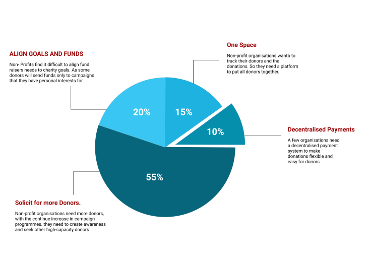
Over the years, NextUp has successfully gathered a donor membership of about 3,000. This year, they hope to make the donor experience more exciting and inviting. To do this, NextUp has decided to send out a survey to understand their users and how to make donations on their platform a more seamless process.
Goals and objectives
- To identify ways to keep all their donors in one space, where they can easily track their donations and their impact
- To understand how users feel about donating in bulk versus choosing projects that align with their goals
- Find ways to motivate already existing donors and solicit other high-capacity donors to provide support
Survey questions
Here are a few questions I’ll be asking in a survey for the said problem: Remember to mix up your questions and put them in the right input field.
- Where are you currently located?
- How often do you donate on our platform? (You can support the participants by adding options like “often,” “always,” “annually,” etc.)
- What is a feature on the platform that excites you and why?
- What is a feature you’re least excited about and why?
- Which projects are you currently donating to? (This would have a list of projects offered and a check box to guide the participants).
Conclusion
A user experience survey can be designed in a variety of ways. To achieve the best results, it must be tested and improved upon before being released, like other design-related items. These may seem overwhelming to a new UX designer, but with the aid of codeless UX survey websites and a clear understanding of the research question, you can connect with relevant users and gather the data you need to enhance your product. The most important thing is to use the appropriate tools and design the proper questions.
The post How to design and conduct a UX survey appeared first on LogRocket Blog.
from LogRocket Blog https://ift.tt/zs03fK2
Gain $200 in a week
via Read more


