Advertisement
Creating a world-class car dealer website can be a daunting process, especially if you are unfamiliar with web design. Looking at some of the top car dealer websites out there, on the other hand, can provide you with inspiration and insight into what makes a successful website.
In this post, we’ll look at some of the best car dealer website designs, emphasizing their distinguishing characteristics and benefits. These websites demonstrate the best in car dealer website design, ranging from modern and slick to traditional and exquisite. This post will give you with wonderful examples to utilize as inspiration if you are a car dealership trying to construct a website for your business or simply seeking inspiration for your next project.
Top Car Dealer Website Designs
Table of Contents
- 1 Top Car Dealer Website Designs
- 2 FAQ on designing a car dealer website
- 2.1 What kind of color scheme should I use for my car dealer website?
- 2.2 How can I make my website look professional and showcase the cars I have for sale?
- 2.3 What are some essential features that a car dealer website should have?
- 2.4 How can I make my website easy to navigate for visitors looking for specific cars or information?
- 2.5 How can I showcase my cars in a visually appealing and informative way?
- 2.6 What type of content should I include on my car dealer website to engage visitors?
- 2.7 How can I optimize my website for search engines to increase visibility and attract more customers?
- 2.8 Should I include an online financing application on my car dealer website, and if so, how should it be designed?
- 2.9 How can I make my website mobile-friendly for visitors who access it on their smartphones or tablets?
- 2.10 What are some best practices for designing a user-friendly and effective car dealer website?
- 3 Conclusion on these dealer websites
Creamfields
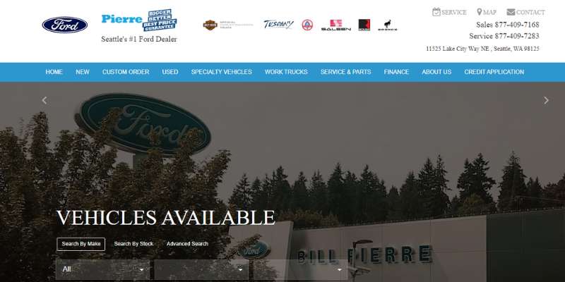
The top Ford dealer in Seattle is called Creamfields. The website for this car dealership has a neat feature with its straightforward filter and category system. With this very targeted site search, you can find the model you want without a problem.
Only high-quality pictures of specialist vehicles, work trucks, new cars, and used automobiles are shown. Also, they placed their contact information in the top right corner of their website, making it impossible to overlook.
When it comes to meeting the customer’s unique automobile wants, this car dealership website is simply great and amazing.
Infiniti
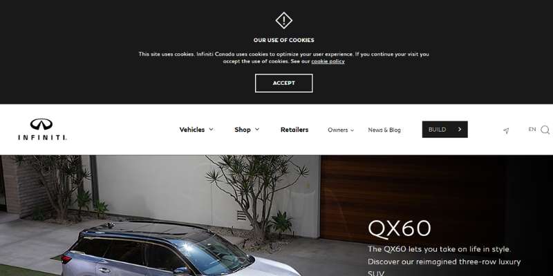
The website for the south Infiniti brand car dealership is wonderful because it has plenty of white space that gives customers room to breathe.
The site has full-width photos on the hero header, a key CTA, a slogan, and a header with a white backdrop, all of which contribute to its ultra-clean appearance. This website uses clean, organized tabs to display the featured autos nicely.
/*div{padding-right:0!important;padding-bottom:10px}.ml-form-formContent.horozintalForm .ml-button-horizontal{width:100%!important}.ml-form-formContent.horozintalForm .ml-button-horizontal.labelsOn{padding-top:0!important}}
/*]]>*/
/**/
![]()
Each car has a link to a different web page with further information about it. A picture slider with simple swipe navigation has been employed by Infiniti.
Toyota
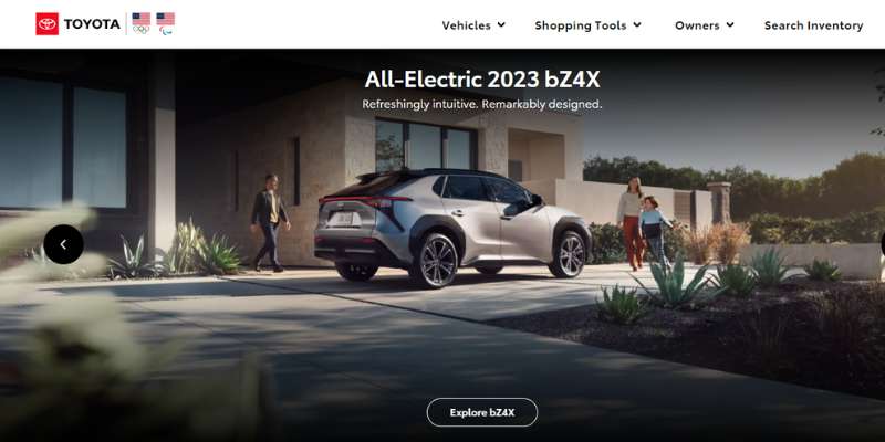
Its minimal layout is clear and uncluttered without sacrificing functionality. The website is quite authentic, with all the necessary elements, CTA buttons, photos, and a brand-specific red and white color scheme.
A visitor may browse your car dealer website, use the drop-down menu to access various car kinds, find local checkout discounts, easily search inventory, get a price, look at brochures, and do much more. A blog, a fantastic slider, social media integration, and more are other standout user friendly features.
Volvo Cars New York
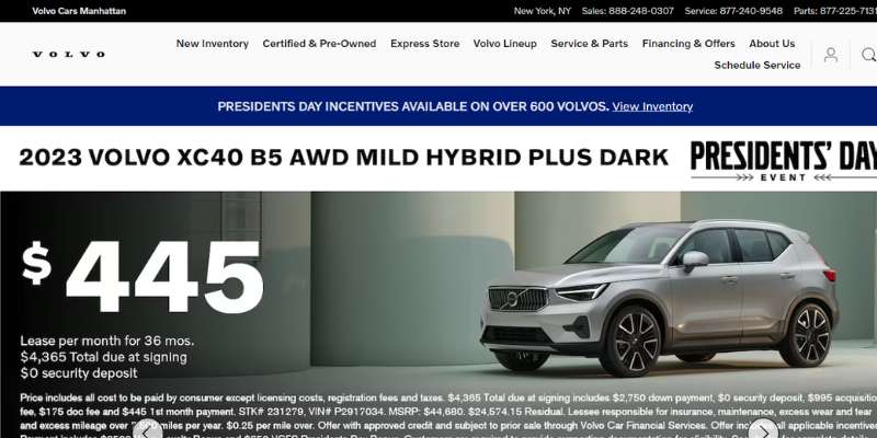
The website for the Volvo Cars Manhattan brand is really well-designed for car dealers. It features a modern and seamless design with plenty of empty space. The website’s hero header includes a relevant picture, a call to action, and an advanced search function.
A “See [Specific Trending Model]” option and a “Browse Inventory” option with corresponding blank fields for model, year, and quantity of used or new versions of a certain automobile are the first items you notice while perusing their inventory.
For customers to get in touch with the company, the website’s header has a customized display of phone numbers. The car dealer website now includes text and chat options as well.
Moreover, Volvo Cars Manhattan has a sticky menu that may be used to reach the website’s key pages. In particular, this car dealer website uses a slider to show notable vehicles in a tidy and clean manner.
Chrysler
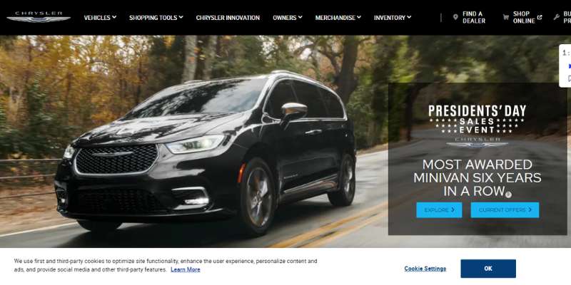
Chrysler uses eye-catching video background that customers may scroll through using a slider.
The CTAs and special offers might very well earn this place since, in most cases, the hero header quickly grabs the visitor’s attention.
Chrysler, in particular, elegantly displays highlighted models utilizing the vehicle’s picture linked to their specific car dealer websites. Also, the Chrysler car dealer website makes it simple for users to browse inventories and utilize the “build & price” feature to examine the inside, exterior, packages, etc.
Tesla
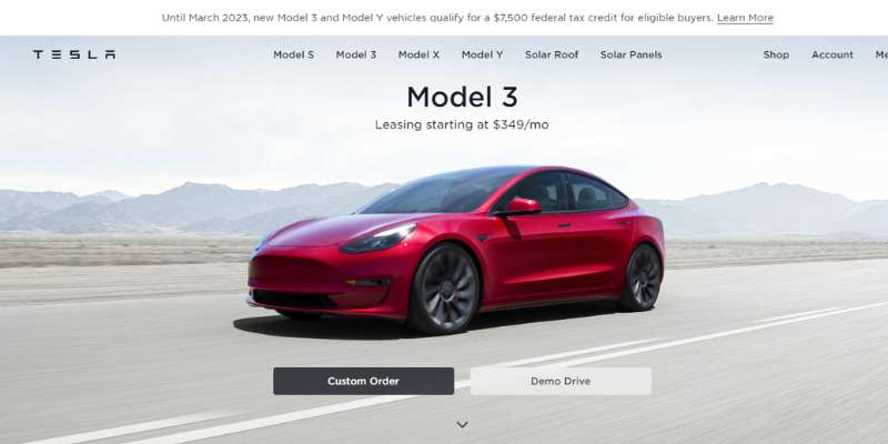
The car dealer website for Tesla Motors has a simple, minimalistic style. It features visual appeal with its logo, clear CTAs, an off-canvas menu, full-width, high-quality photos, and a straightforward but attractive homepage layout.
It becomes more intriguing due to its cool and creative transition effect. Potential consumers are never impressed by the pricing page, the inventory/build page, or the movie backdrop.
Dodge
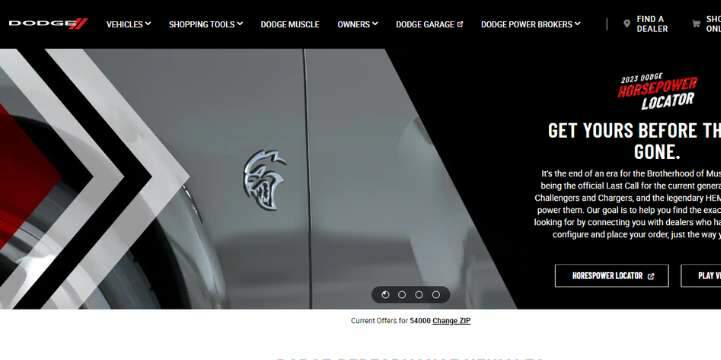
You should also check out the fantastic website for Dodge, a vehicle dealer. It features a gorgeous asymmetrical design that seems original and inventive.
Advertisement
In particular, the fascinating slider in the hero header, together with the visually appealing CTAs, appealing graphics, and interesting promos, leaves visitors in awe. The website features several auto models with links to all pertinent information.
This car dealer website offers a fantastic visual representation of the appearance, interior, packages, powertrain, and overview of the vehicle. It also includes helpful features like a price calculator and a financing calculator.
Chevrolet
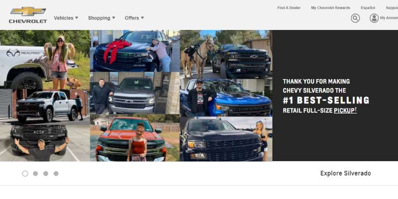
Customers who are looking from various areas may use the site search alongside the language filter. A slider is used to display several copies of pictures on the hero header.
The website’s search inventory, live offers, build & price, and trade-in value links all feature monochromatic icons. To increase trust, it also features several accolades on the website.
Chevy thus incorporates the Awards page with a simple and clean design. Similar to other automotive websites, this one incorporates blogging and social networking for SEO.
USA Alfa Romeo
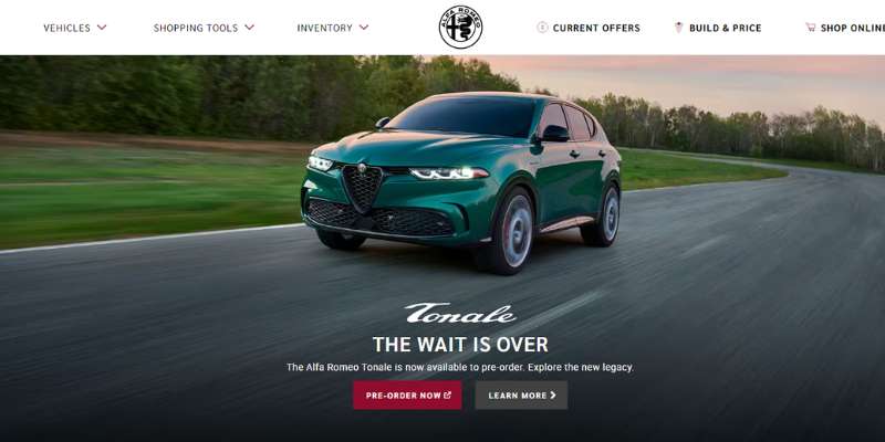
While the homepage contains little information, the sticky menu allows rapid access to other crucial sections.
In particular, by utilizing the mega menu, shopping options such as construct & price, locating car dealers, current specials, and searching new inventory, a website visitor may simply reach the automobiles page.
This car dealer website makes sure that the logo is prominently displayed in the middle of the page since it symbolizes the company.
Royce Automobiles
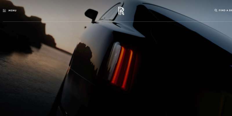
The homepage of Rolls-Royce Motorcars’ website has a video backdrop, especially in the hero header. The cursor effect on the Rolls-Royce website is one of its coolest elements.
The box-style layout employed by Rolls Royce Motorcars highlights the website’s opulence and polished appearance. Rolls-Royce uses the sticky menu to access the off-canvas menu, logo, and inquiry button since navigation is an essential component of a website.
A split-screen clean layout, video integration, and hover effects for the photos and buttons make certain sites appear amazing in the meantime.
CarDekho
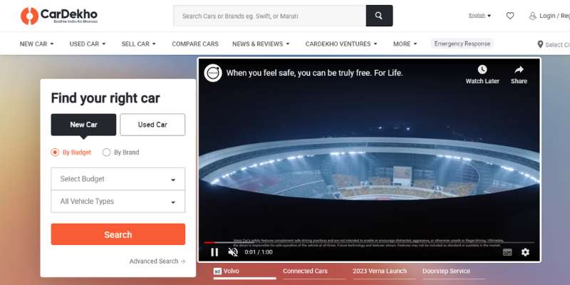
The website places your website on the sticky header and heavily encourages users or website visitors to use the search tool. The website looks and feels better because of the usage of white space and orange as its main hue.
To attract more customers, CarDekho includes a straightforward, clearly labeled form for an additional fantastic, in-depth search feature.
It selects the material based on the most searched cars, newest, popular, and forthcoming, and then presents it in a boxed style to offer prospective customers an indication of which items are popular in each category.
Las Vegas Lexus
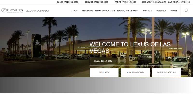
The hero header of this impressive website combines a search feature with a nice image backdrop. Next, for fast and simple navigation, it incorporates the sticky menu and the crucial phone digits on the top. A slider, social networking, accessibility, a dropdown menu, and more fantastic features are included.
Subaru
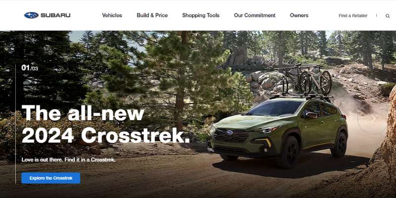
Increase your market and successfully sell your goods and services. The website for Subaru is a nice blend of intuitive design and excellent performance. This website may establish a reputation since it has all the necessary components for a vehicle dealer website.
The website has a full-width picture, a sticky menu, and a fixed sidebar menu with icons. The animation that plays as you scroll also injects some originality into the overall design. The contents of the boxes, meanwhile, appear stunning against the backdrop.
Land Rover Tampa
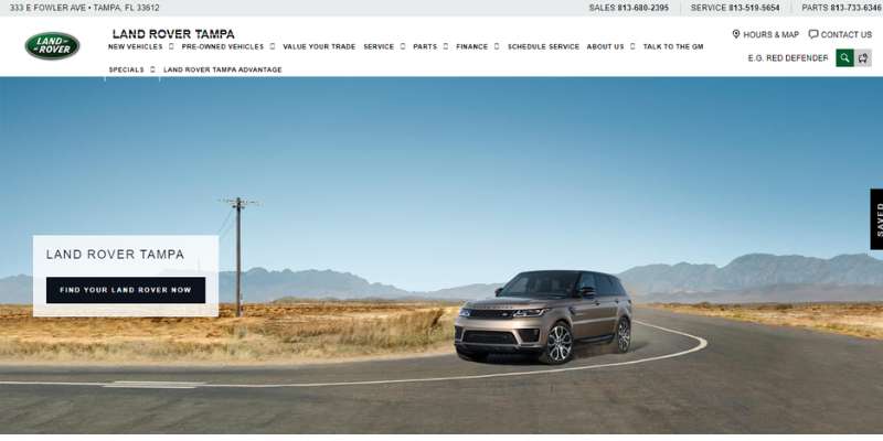
This website effectively conveys important information without deviating from a more traditional layout. On their homepage slider, they feature fresh automobile advertisements with call-to-action buttons and explicit pricing for each.
A more specialized view of models depending on user selection is available by scrolling between the generic models they provide just below.
While their header bar provides a comprehensive menu of all the services they provide, the remainder of the website mostly consists of an instructive explanation of their goal and an accessible menu of their most sought-after services, such as car maintenance and finance alternatives.
The Elite cars
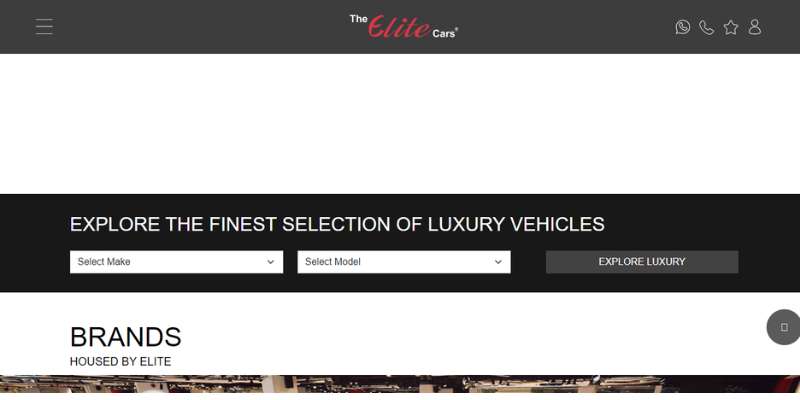
The Elite Cars website only features opulent and fashionable auto dealer website designs. On their website, they offer a live chat feature and an obvious Site Search to respond to questions from visitors.
The Elite Cars has some intriguing deals and possibilities for its customers looking to purchase and sell high-end cars. This car dealership website stands out because of its use of the primary color scheme of black and red.
Segrex
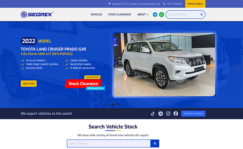
Segrex’s header design is eye-catching and has a gorgeous logo, a map, phone numbers, and social network integration. The innovative use of a slider to show pictures in the hero header also makes it appear fantastic.
In particular, the website uses boxes to display available cars in the company. Also, it impressively displays deals utilizing a different cool slider.
AAA Auto
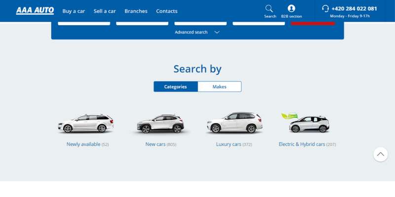
With a simple and attractive design, AAA Auto deserves to be included among the best car dealer websites. It uses a lot of white space, enhancing readability and conveying elegance.
On the webpage, there is a sophisticated search attribute that allows prospective consumers to browse for a certain automobile. On the other hand, AAA Auto makes it easy for him to shop by brand or category.
Also, the website looks amazing because of the sticky menu, clear images, detailed CTAs, and inventive sliders.
Anderson Lincoln
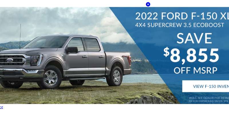
Before you navigate to the middle of the homepage on their own site, high-resolution images promoting its most well-liked items are shown right at the top of the page.
With three extremely clear calls to action, “Find,” “Sale,” or “Serve,” the website’s backdrop film delivers a lovely perspective of the company’s location in general.
A series of slides that more clearly define who they are and what they provide is located underneath the more complicated query menu that allows you to narrow down which automobiles are in stock for each customer’s wants.
FAQ on designing a car dealer website
What kind of color scheme should I use for my car dealer website?
A car dealer website’s color palette should be consistent with the brand and communicate a sense of reliability and professionalism.
Consider using neutral colors like as grey, black, and white, as well as bolder hues such as red or blue, to enhance interest and highlight crucial information.
How can I make my website look professional and showcase the cars I have for sale?
Use high-quality photographs and content, make your website easy to use, and include clear information about the cars and services you offer to make your website look professional and highlight the automobiles you have for sale.
Consider employing a professional design that includes a custom logo, uniform font, and a simple layout.
Provide clear contact information as well as links to social media profiles.
What are some essential features that a car dealer website should have?
A searchable inventory of cars, thorough car descriptions and specifications, a financing calculator or application, and contact information for the dealership are all required features for a car dealer website.
Customer feedback, a virtual showroom, and instructional resources such as car buying tips could also be valuable.
Use clear and simple labels for each page and area, include a search bar, and make sure your menu is easily accessible and arranged to make your website easy to use.
Employ filters and sorting options to assist users in finding the cars or information they seek, and include clear calls to action throughout the website.
How can I showcase my cars in a visually appealing and informative way?
Use high-quality photographs and films that highlight the characteristics and features of each car to exhibit your cars in a visually appealing and educational manner.
Provide information on the vehicle’s make, model, year, and specifications, as well as clear and succinct descriptions, to assist visitors in making informed decisions.
What type of content should I include on my car dealer website to engage visitors?
Provide educational and entertaining content about vehicles and car buying to captivate visitors. Consider producing blog entries or articles regarding car maintenance, safety, and industry news.
You may also include useful resources such as automobile purchase recommendations, financing advice, or a glossary of automotive words.
How can I optimize my website for search engines to increase visibility and attract more customers?
Use relevant keywords in your content, including meta tags and descriptions, utilize alt text for photos, and make sure your website is mobile-friendly and loads quickly to optimize it for search engines. Try obtaining links to your website from other related websites and promoting your content through social media.
Should I include an online financing application on my car dealer website, and if so, how should it be designed?
Adding an online financing application will help customers apply for financing and purchase vehicles from your dealership.
Create the application to be user-friendly and simple to complete, and just request the information required for the transaction. Consider including a privacy policy as well as clear information regarding financing options and interest rates.
How can I make my website mobile-friendly for visitors who access it on their smartphones or tablets?
Choose a responsive design that automatically adjusts to fit the screen size of the device being used to make your website mobile-friendly.
Make sure your website loads swiftly and has readable fonts and photos. Try employing larger buttons and touch-friendly features for a better mobile user experience.
What are some best practices for designing a user-friendly and effective car dealer website?
Using a clean and consistent design, prioritizing ease of use and accessibility, providing clear and concise information about your cars and services, and showcasing your inventory with high-quality images and content are all best practices for designing a user-friendly and effective car dealer website.
It’s also critical to keep your website up to date with new cars, content, and special deals, as well as to test its usability and performance on a number of devices and browsers.
Finally, consider incorporating consumer input and making adjustments depending on user behavior to continuously improve the effectiveness of your website.
Conclusion on these dealer websites
Without a digital presence, it may be hard for a vehicle dealership to thrive. Thus, you want an effective website to keep your rivals at bay and create a channel of active connection with your current and new clients.
Since the only way to surpass your competition is to have a usable dealership website that has the confidence of your consumers, the future of auto dealerships is fully digital, and the more you spend on your website today, the more it will pay off five years from now.
If you enjoyed reading this article about dealer websites, you should read these as well:


