During 2022, there were more than 4.5M apps and games in the App Store. The sheer volume of options makes it important for apps to provide a fresh, novel experience or find other ways of standing out.
Creating a unique interface can help make an app more attractive and go a long way toward increasing its user acquisition and retention. Customizing the default look and feel of the controls or creating unique tabs or a switch for dark/light themes can help make an application more appealing.
In this tutorial, we’ll explore how to create a customizable segmented control in SwiftUI. First, we’ll explore this scenario by discussing how to use the SwiftUI Picker with a segmented style. Then, we’ll explore its limitations. Finally, we’ll build our own picker that allows for easy customization and usage.
Jump ahead:
Prerequisites
Table of Contents
To follow along with this guide, you should have the following:
- Working knowledge of iOS development and Swift
- Experience creating user interfaces using SwiftUI
Getting started
To follow along with this SwiftUI Picker showcase project, see the open source code on GitHub. If you feel like jumping straight into a specific section, you can check out the different Git branches. There’s a specific branch for each section of this article.
Here’s a quick rundown of some important files you should be aware of:
- Domain: Defines business logic objects, in this case,
enumstructures; you won’t need to change anything in this directory - Extensions: Contains a couple of handy extensions for this article; you won’t need to change anything in this directory
- UI: Stores all reusable components in the project. In this case, it contains PickerPlus, the customizable picker that we’ll build in the tutorial
PickerLimitations.swift,StyledPicker.swift,DefaultPickerExamples.swift: SwiftUI Views that will help visualize the theory explained in this article
Using the SwiftUI Picker
Before we start creating custom component Views, let’s take a closer look at how the SwiftUI default Picker works. This will help us better understand how to build Views that support multiple configurations.
The SwiftUI Picker is a control for selecting from a set of mutually exclusive values. Let’s look at a few Picker examples: simple, complex, and segmented.
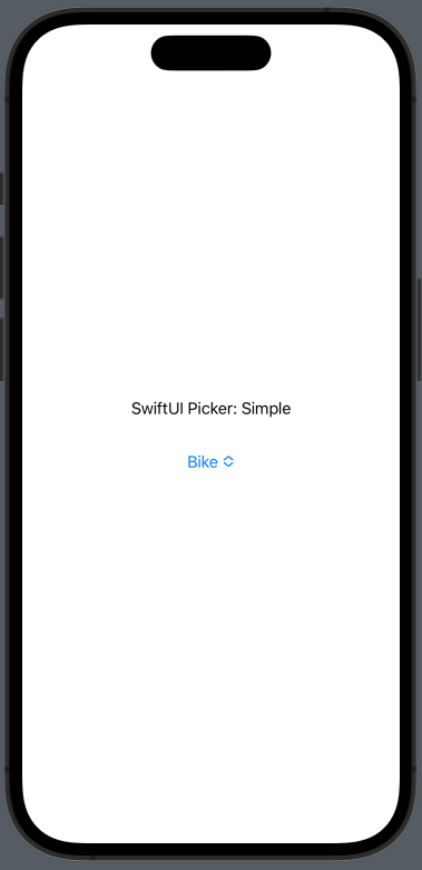
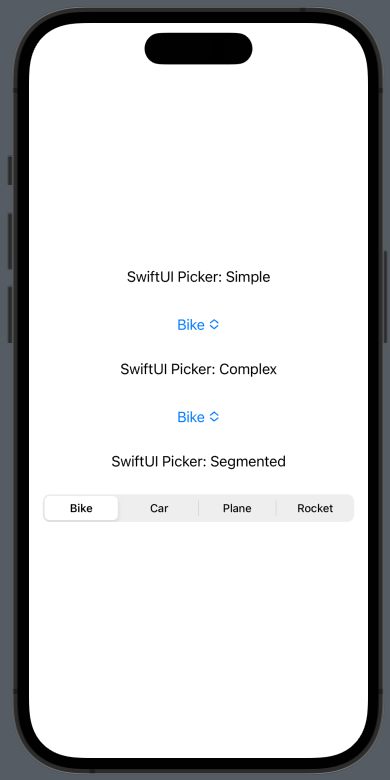
Building a simple Picker
This View also has an extensive selection of initializers for us to choose from. The init(_:selection:content:) initializer is a good choice for a simple Picker. We can use this when we want the user to be able to select from a list of options.
Let’s say we have a list of vehicle options (e.g., bicycle, car, plane, or rocket) and we want the user to choose their preference. Open the DefaultPickerExamples.swift file and paste the following code into line 19 to create a new Picker using the init(_:selection:content:) initializer:
//swift
Text("SwiftUI Picker: Simple")
Picker("Types of Vehicles", selection: $selectedItem) {
ForEach(Vehicles.allCases) { vehicle in
Text(vehicle.rawValue.capitalized) }
}
.padding()
Here’s a preview of the code, using Xcode’s preview canvas for SwiftUI:
This is a quite simple way to display a dropdown. We could also choose a different approach to support more complex scenarios. Let’s take a look at another example.
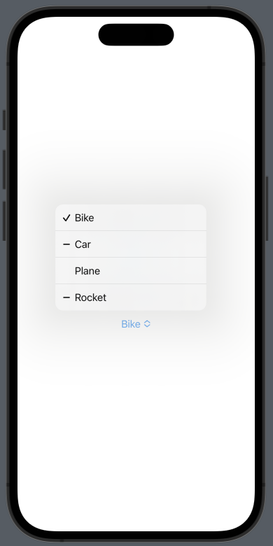
Building a complex Picker
Suppose we own some of the vehicles and want to display them in the Picker in such a way that the user can select a list of the type of vehicle from which they’d like to choose.
Copy the following code and paste it into line 27:
//swift
Text("SwiftUI Picker: Complex")
Picker("Owned Vehicles", sources: $ownedVehicles, selection: .vehicle) {
ForEach(Vehicles.allCases) { vehicle in
Text(vehicle.rawValue.capitalized) }
}
.padding()
Now, if we take a look at the preview, we should see something like this:
Building a segmented Picker
We can use the pickerStyle to specify the way the Picker is displayed (menu, wheel, segmented, etc.). For this example, we’ll choose segmented. Go ahead and add this code to the DefaultPickerExamples at line 35:
//swift
Text("SwiftUI Picker: Segmented")
Picker("Types of Vehicles - Segmented", selection: $selectedItem) {
ForEach(Vehicles.allCases) { vehicle in
Text(vehicle.rawValue.capitalized) }
}
.pickerStyle(.segmented)
.padding()
The preview canvas should display something like this:
This ViewModifier allows us to set a style depending on the context around the control. For this article, we’re going to focus on the .segmented style and explore its limitations.
Understanding the SwiftUI Picker’s limitations
Using the SwiftUI default Picker with a .segmented style can be a convenient option, but there are a couple of limitations to be aware of. The default Picker can’t display more than one line of text or display vertical items. Also, styling the default Picker is not SwiftUI friendly.
Limitations with display
The UISegmentedControl is the base of any Picker with .segmented style, so it is also restricted by it. For example, if we try to set customized items that contain different heights, the default Picker will fail to display them properly.
To see how the default Picker handles vertical items, open the PickerLimitations.swift file and paste the following code replacing the to-do in line 15:
//swift
Text("SwiftUI Picker: Vertical Items")
Picker("Types of Vehicles", selection: $selectedItem) {
ForEach(Vehicles.allCases) { vehicle in VStack {
Text(vehicle.rawValue.capitalized) vehicle.indicatorImage .resizable() .frame(width: 24, height: 24) .scaledToFit() } }
}
.pickerStyle(.segmented)
.padding()
// TODO: Uncomment the following line after applying custom styles to `Picker`
// StyledPicker()
Now, take a look at the preview, it should look like this:
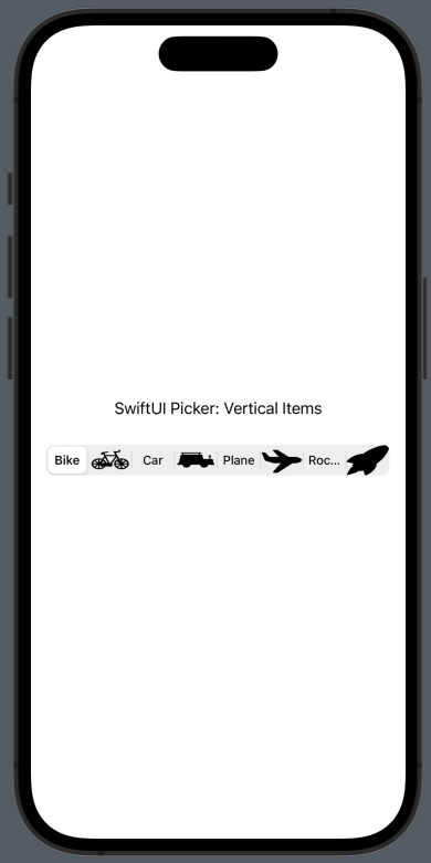
By default, UISegmentedControl defines the height of the View. Another issue is that the Picker aligns both the Text and the Image as options. As a result, the View does not behave as expected when selecting each Text or Image contained within.
Limitations with styling
Another issue with the SwiftUI default Picker is that styling options are very limited. We can try to add ViewModifiers to the Picker, but they will have little to no effect on the View. The most reliable way to style a Picker is to use UIAppearance to style the default Picker. It can be difficult to understand the code necessary for modifying a Picker since you may end up combining both UIAppearance and ViewModifiers in your app.
Open the StyledPicker.swift file and take a look at the preview; you should see the following:
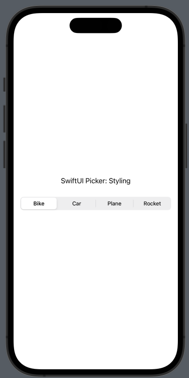
Despite configuring an accentColor in the Picker, the preview shows no visual evidence of any color. This is because the default Picker does not use many of the SwiftUI inbuilt color systems.
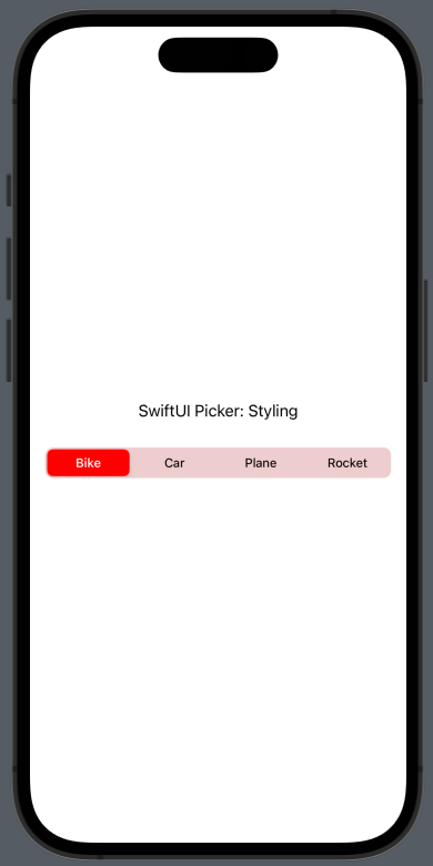
To change the styling of the Picker, we’ll have to override the appearance of the UISegmentedControl. We can add an initializer to StyledPicker like the following:
//swift
init() {
// Sets the background color of the Picker UISegmentedControl.appearance().backgroundColor = .red.withAlphaComponent(0.15)
// Disappears the divider UISegmentedControl.appearance().setDividerImage(UIImage(), forLeftSegmentState: .normal, rightSegmentState: .normal, barMetrics: .default)
// Changes the color for the selected item UISegmentedControl.appearance().selectedSegmentTintColor = .red
// Changes the text color for the selected item UISegmentedControl.appearance().setTitleTextAttributes([.foregroundColor: UIColor.white], for: .selected)
}
Here’s a preview showing the new styling of the Picker:
This is not exactly the most intuitive approach since we’re building a Picker with SwiftUI. The added code is common in apps that use the UIKit instead of SwiftUI, making the syntax a bit confusing.
Also, there are also limitations as to what we can customize. The control also has its own shade on top of the background, making its appearance inaccurate. This results in a darker background color.
Now open the PickerLimitations.swift file again and uncomment line 32. You should see something like this:
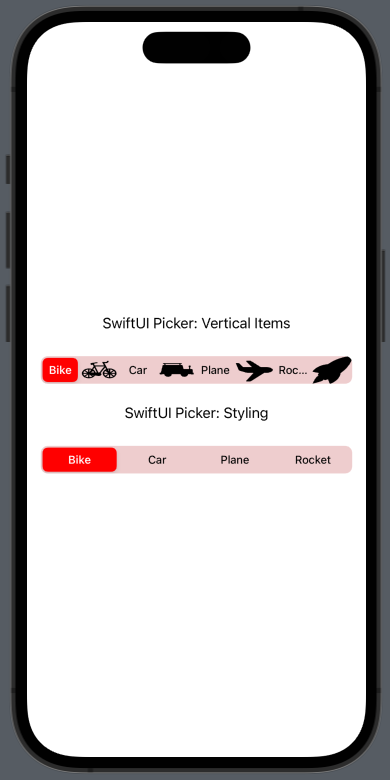
Overriding the appearance of the UISegmentedControl will override the on-screen appearance of all Pickers — not just one. This is not ideal since the style is not customized to the View to which we’re applying it. Behaviors like this are error-prone and can restrict our ability to scale our code. It also can lead to a bad developer experience.
Creating a customizable picker
Now that we have a clear idea of the SwiftUI Picker’s issues and limitations, let’s address some of these by creating our own customizable picker — we’ll call it PickerPlus.
Let’s get right on it!
Open the PickerPlus.swift file and replace the to-do in line 4 with the following code:
//swift
public let sources: [Data]
public let selection: Data?
private let itemBuilder: (Data) -> Content
// TODO: Add default background
// TODO: Add borders and corner radius.
// TODO: Add support for custom indicators
public init(
_ sources: [Data],
selection: Data?, @ViewBuilder itemBuilder: @escaping (Data) -> Content
) { self.sources = sources self.selection = selection self.itemBuilder = itemBuilder
}
Similar to the initializers from the default Picker, we have three different properties for PickerPlus:
sources: An array of the data that PickerPlus will iterate overselection: A nullable item that should belong tosources; it helps determine what the currently selected index is when styling and positioning the indicatoritemBuilder: A function for building each item’s corresponding View insidePickerPlus; it can support different configurations
Now replace the to-do in line 29 with the following:
//swift
HStack(spacing: 0) { ForEach(sources, id: .self) { item in itemBuilder(item) }
}
Here, we’re building the Views needed to display the options available in the picker. It does this by iterating sources and making use of itemBuilder.
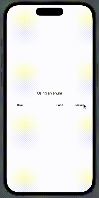
Let’s add a visual example to PickerPlus to see it in action. Replace the to-do in line 50 with the following:
//swift
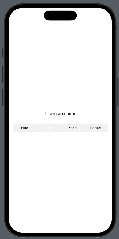
Text("Using an enum")
PickerPlus( Vehicles.allCases,
selection: selectedItem ) { item in
Text(item.rawValue.capitalized) .font(Font.footnote.weight(.medium)) .foregroundColor(selectedItem == item ? .white : nil) .padding(.vertical, 8) .padding(.horizontal, 8) .frame(maxWidth: .infinity) .multilineTextAlignment(.center) .onTapGesture {
withAnimation(.easeInOut(duration: 0.150)) { selectedItem = item } } } .accentColor(.green) .padding()
Below is a preview of PickerPlus. The user can select any item and see the preview change with it:
Implementing a default background
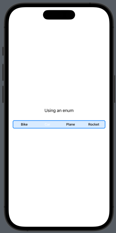
The text used for each option in the above PickerPlus preview has some styling to it, but the selected option is not visible. Let’s fix this by adding a background.
Replace the to-do in line 8 with this code:
//swift
@State private var backgroundColor: Color = Color.black.opacity(0.05)
func pickerBackgroundColor(_ color: Color) -> PickerPlus {
var view = self view._backgroundColor = State(initialValue: color)
return view
}
Now, jump to line 40 and change it to the following:
//swift
.background(
RoundedRectangle(cornerRadius: 6.0) .fill(backgroundColor)
)
Now if you look back at the preview, you should see the following:
Supporting corner radius and borders
Next, let’s add some corner radius and support borders to the custom picker view; this will enable more styles for our PickerPlus.
Start by replacing the to-do in line 16 with the following code:
//swift
@State private var cornerRadius: CGFloat?
func cornerRadius(_ cornerRadius: CGFloat) -> PickerPlus {
var view = self view._cornerRadius = State(initialValue: cornerRadius)
return view
}
@State private var borderColor: Color?
func borderColor(_ borderColor: Color) -> PickerPlus {
var view = self view._borderColor = State(initialValue: borderColor)
return view
}
@State private var borderWidth: CGFloat?
func borderWidth(_ borderWidth: CGFloat) -> PickerPlus {
var view = self view._borderWidth = State(initialValue: borderWidth)
return view
}
This will enable new modifying functions for our PickerPlus. Now we need to change the RoundedRectangle to support borders and corner radius options when drawing a background.
Change .background in line 62 to the following:
//swift
.background(
RoundedRectangle(cornerRadius: cornerRadius ?? 6.0) .fill( backgroundColor,
strokeBorder: borderColor ?? Color.clear,
lineWidth: borderWidth ?? .zero )
)
With this code, we’re enabling PickerPlus to support custom border colors, border width, and corner radius. We’re also specifying a default cornerRadius of 6pt which is similar to the default provided by the SwiftUI Picker.
Now look at the preview and you should see the default cornerRadius applied to the background. Play around with the preview and add borders and a custom background to it. Here’s a preview showing how it might look:
Adding indicator Views
So far, our PickerPlus is looking nice, but there’s an important part missing: the selection indicator. This View should meet the following requirements if we want it to improve on the default settings available from the SwiftUI Picker:
- Animate the position when the selection changes
- Check for and apply the accent color
- Support custom implementations
To support these requirements, let’s update the to-do in line 40 with the following code:
//swift
private var customIndicator: AnyView? = nil
public init(
_ sources: [Data],
selection: Data?,
indicatorBuilder: @escaping () -> some View, @ViewBuilder itemBuilder: @escaping (Data) -> Content
) { self.sources = sources self.selection = selection self.itemBuilder = itemBuilder self.customIndicator = AnyView(indicatorBuilder())
}
Here, we added an indicator — this will allow us to support custom indicators. In fact, the custom initializer enables support for that. It wraps indicatorBuilder with AnyView and allows us to build anything we want as an indicator.
Now, let’s change the to-do in line 66 with the following code:
//swift
if let selection = selection, let selectedIdx = sources.firstIndex(of: selection) {
if let customIndicator = customIndicator { customIndicator } else { GeometryReader { geo in
RoundedRectangle(cornerRadius: cornerRadius ?? 6.0) .foregroundColor(.accentColor) .padding(EdgeInsets(top: borderWidth ?? 2, leading: borderWidth ?? 2, bottom: borderWidth ?? 2, trailing: borderWidth ?? 2)) .frame(width: geo.size.width / CGFloat(sources.count)) .shadow(color: .black.opacity(0.1), radius: 2, x: 1, y: 1) .animation(.spring().speed(1.5)) .offset(x: geo.size.width / CGFloat(sources.count) * CGFloat(selectedIdx), y: 0) }.frame(height: 32) }
}
With this code we:
- Check if
selectionis set and confirm it belongs to an item insources. This way we’re only rendering the indicator when it’s needed, which is the default criteria in the Picker too - Determine if
PickerPlusshould render thecustomIndicatoror the default implementation - Add a default implementation that has an animation for its position and also checks for the current
.accentColor
Finally, let’s add an example that showcases the usage of indicatorBuilder to build a custom indicator. Change the code in the <body> of PreviewPickerPlus with the following:
//swift
VStack {
Text("Custom Picker: Vintage Style")
PickerPlus( Vehicles.allCases,
selection: selectedItem ) { item in
Text(item.rawValue.capitalized) .font(Font.footnote.weight(.medium)) .foregroundColor(selectedItem == item ? .white : nil) .padding(.vertical, 8) .padding(.horizontal, 8) .frame(maxWidth: .infinity) .multilineTextAlignment(.center) .onTapGesture {
withAnimation(.easeInOut(duration: 0.150)) { selectedItem = item } } } .pickerBackgroundColor(.blue.opacity(0.15)) .cornerRadius(0) .borderWidth(1) .borderColor(.blue) .accentColor(.blue) .padding()
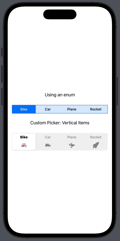
Text("Custom Picker: Vertical Items")
PickerPlus( Vehicles.allCases,
selection: selectedItem,
indicatorBuilder: { GeometryReader { geo in
Rectangle() .foregroundColor(.white) .cornerRadius(6.0) .padding(1) .frame(width: geo.size.width / CGFloat(Vehicles.allCases.count)) .shadow(color: .black.opacity(0.1), radius: 2, x: 1, y: 1) .animation(.spring().speed(1.5)) .offset(x: geo.size.width / CGFloat(Vehicles.allCases.count) * CGFloat(Vehicles.allCases.firstIndex(of: selectedItem!)!), y: 0) }.frame(height: 64) } ) { item in
VerticalItem(
item: item,
isSelected: selectedItem == item ) .padding(.vertical, 8) .onTapGesture {
withAnimation(.easeInOut(duration: 0.150)) { selectedItem = item } } } .padding()
}
Here’s the preview, showing the indicator View:
And, that’s a wrap!
I hope you’ve enjoyed this tutorial and have a better understanding of how to use SwiftUI to build a customizable segmented control for your iOS apps. If you have any questions or comments, please feel free to leave them in the comments section below.
The post Build a SwiftUI customizable segmented control appeared first on LogRocket Blog.
from LogRocket Blog https://ift.tt/GfgPmJb
Gain $200 in a week
via Read more