As a web design and development company, you can’t neglect web accessibility.
If you do, your clients will end up violating the Americans with Disabilities Act (ADA) and suffer severe penalties because of the websites you made for them. They can be slapped with lawsuits left and right, ruining their brand image beyond recognition.
You don’t want to be the cause of that, do you?
We’d like to help you get over this hurdle by reviewing accessiBe, an AI-powered automated web accessibility solution for web design and development agencies.
In this review, we’ll check out the ins-and-outs of the platform so you know how it can help you create ADA-compliant websites for your clients.
But before that…
Brief on Web Accessibility and the ADA
The World Wide Web Consortium (W3C), the primary international organization for developing the World Wide Web standards, defines web accessibility in this way:
“[It] means that websites, tools, and technologies are designed and developed so that people with disabilities (be it physical, neurological, visual, speech, auditory, or cognitive) can use them. More specifically, people can: perceive, understand, navigate, and interact with the Web, and contribute to the Web.”
Websites achieving this goal comply with the ADA, which guarantees all people, including people with disabilities (PWDs), equal access to opportunities in areas of public life.
These areas involve public accommodations and commercial facilities, among others, in physical and digital places (such as websites), as confirmed by the US Department of Justice in 2018.
The Need for Modifications and Assistive Technologies
Table of Contents
- 1 The Need for Modifications and Assistive Technologies
- 2 Challenges of Manually Designing Accessible Sites
- 3 accessiBe: a robust, automatic, and AI-powered solution
- 4 Why AI and How It Works with accessiBe
- 5 Installation, Customization, and Integrations
- 6 aCe: Free, Reliable Accessibility Auditing Tool
- 7 accessiBe Features
- 8 Accessibility Profiles
- 9 Specific Modifications
- 10 Pricing
- 11 accessiBe vs Alternatives
- 12 Partnering with accessiBe
- 13 accessiBe Partners’ Success Stories
- 14 Conclusion
For physical and online public spaces to become accessible, the ADA Title III mandates establishment and website owners to execute “reasonable modifications” and use assistive technologies.
Among websites, that can be redesigning and modifying specific elements through code changes, helpful mechanisms, and others.
Web developers and design agencies often do that manually — but it poses several difficulties.
Challenges of Manually Designing Accessible Sites
Manually designing your clients’ sites to become accessible is painstaking and inefficient, since it involves plenty of coding.
If your client’s site has over a thousand web pages, you should check that every link, icon, text, etc. — including every update or new element — are accessible to any PWD.
Otherwise, your client’s site becomes inaccessible and non-compliant.
Plus, manual redesigning processes for accessibility often have long turnaround times (six to ten months), depending on how sophisticated your client’s site is.
If you’re thinking there must be a better way, there is — with accessiBe.
accessiBe: a robust, automatic, and AI-powered solution
accessiBe is the first fully automated web accessibility solution leveraging the power of artificial intelligence (AI).
It is an all-encompassing technology that helps you comply with several accessibility regulations besides the ADA:
- Web Content Accessibility Guidelines (WCAG) 2.1,
- Section 508 of the Rehabilitation Act of 1973 (US Federal Law),
- Accessibility Canada Act (ACA),
- Accessibility for Ontarians with Disabilities Act (AODA),
- Israel Standard (IS) 5568,
- European Accessibility Act (EAA/EN301549), and others.
Several industry leaders use accessiBe, such as BigCommerce, Digital Ocean, RealPage, Volusion, and thousands more.
That and accessiBe’s AI make this solution the leading technology in the web accessibility market. Let’s explore how accessiBe’s AI works.
Why AI and How It Works with accessiBe
Artificial intelligence is critical in achieving accessibility for around 1.6 billion dynamic websites worldwide and one billion PWDs globally.
With that huge number of disabled users and websites (plus their pages and updates), an ultra-efficient solution like AI is the only way to hasten and preserve accessibility comprehensively.
AI significantly reduces the amount of time, initial remediation, and ongoing maintenance, among others.
That’s why accessiBe employs AI to make website elements always PWD-friendly. It’s what makes accessiBe unique and a cut above its competitors.
Its AI engine fulfills 70% of the WCAG 2.1 requirements, which are screen reader compatibility and keyboard navigation.
These are also the biggest, most toilsome, and often manually fulfilled requirements.
Here’s how accessiBe’s AI addresses them:
Screen Readers
Blind persons depend on screen readers to know what’s on a web page. Screen readers are software programs translating on-screen information into understandable outputs.
They can transmit it audibly through text-to-speech (TTS) engines, and blind persons can hear the information via their headsets or speakers.
They can also transform on-screen text into Braille symbols. As the information changes, so do the Braille characters, giving blind people updated content.
Additionally, screen reading software can explain photos, images, and videos by relaying their alternative texts.
For blind persons, screen readers substitute their devices’ screens entirely, coordinating with both the operating system and the website browser.
Which is why the WCAG 2.1 prescribes sites to become compatible with screen reading software through accessibility rich internet applications (aria) attributes.
aria attributes supplement HTML, allowing widgets and interactions often used in applications to be relayed to assistive technologies (if there are no previously available mechanisms).
However, most websites lack these aria attributes and behavior-related enhancements that help visitors surf the site smoothly.
So, here’s what accessiBe’s AI does: It analyzes your client’s site design, functions, and applications (forms, pop-ups, menus, validations, and dropdowns) and learns their purposes in a page the same way we do.
To give screen readers complete context and help blind surfers use the site correctly, the AI incorporates aria attributes, tags, and behavioral changes according to the elements’ states and functionalities.
For instance, if a blind user points to a Twitter social button on your client’s site, a screen reader may only describe it as “Link” because to it, the icon is just a shape with a hyperlink.
Here’s how that looks like in the code:
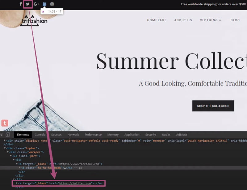

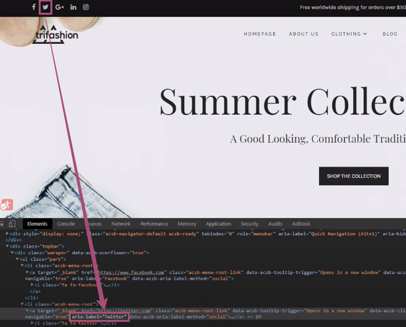
However, accessiBe’s AI, with the aria attributes inserted, recognizes it as a clickable Twitter social button leading to the platform’s site.
Below, you’ll see that, once accessiBe is turned on, the AI added the right aria labels on the fly, so the screen reader can relay the icon as “Twitter.”

The same goes for your client’s visuals. Once users with screen readers enter the site, the AI automatically creates alt tags through image recognition and Optical Character Recognition (OCR) technologies.
This banner image, for example, has alt tags in its code stating what the image contains: “summer, nature, vacation, business, bright” — and what the text in it says: “Summer Shop.”
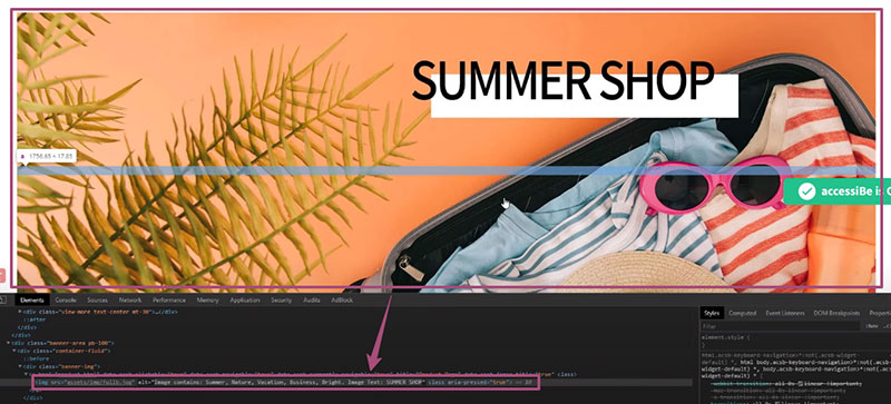

With those alt tags, screen readers can properly describe the image to the blind user.
Keyboard Navigation
Site visitors can activate accessiBe using Tab, the standard navigation key. Pressing it, they’ll find options at the top to skip to content, read the accessibility statement, go to header, and more.
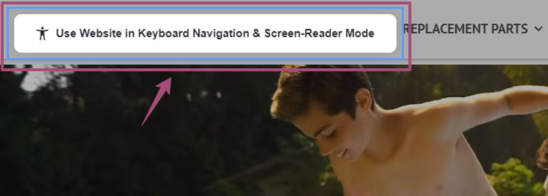

They’ll also turn the accessible mode on, enabling them to move through the entire site using the keyboard.
Plus, continually pressing the Tab key (or Alt + 1), they’ll access the Quick Navigation Panel. This lets them go straight to their desired destinations, search for specific pages, and more, without browsing the whole site.
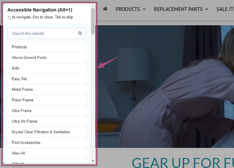

accessiBe optimizes the site elements to the fullest level required by the WCAG 2.1.
For example, accessiBe lets you navigate menus using keyboard arrows: left and right across the menu bar, up and down for the dropdowns, including Esc to close sub-menus.
accessiBe also follows the WCAG 2.1 requirements for pop-ups:
- That the keyboard focus should move from the bottom area to the inside of pop-ups when they appear;
- Websites must lock the navigation within the pop-up, preventing visitors from moving beyond it;
- Users can close the active pop-up with the Esc key and go back to the last element focused on before the pop-up appeared.
For forms, accessiBe uses the browser’s built-in validation API to let the visitor jump back immediately to fields with invalid entries before allowing them to submit.
Moreover, WCAG 2.1 requires that the site be entirely operable using letters on the keyboard:
- K- Links
- M – Menus
- B – Buttons
- H – Headings
- L – Lists
- F – Forms
- T – Tables
- G – Images
- I – Items, etc.
Without acessiBe, navigating using the Tab key can bring the person to some elements only and miss out other relevant parts. Keyboard focus is also barely visible when it’s on a dark element or image.
Maintenance
Maintaining your client’s ADA compliance is even harder than achieving it. As mentioned, every update has to be optimized so you leave no accessibility holes.
Thanks to accessiBe, all that toil becomes a breeze. Its AI automatically re-scans and fixes each update and page every 24 hours.
Because of that, you and your client’s IT staff don’t need to check the site manually every so often to ensure their ADA compliance.
Installation, Customization, and Integrations
Begin installing accessiBe by clicking “Start Free Trial” and entering your client’s company and website details. You’ll then receive a one-line JavaScript code for the installation.
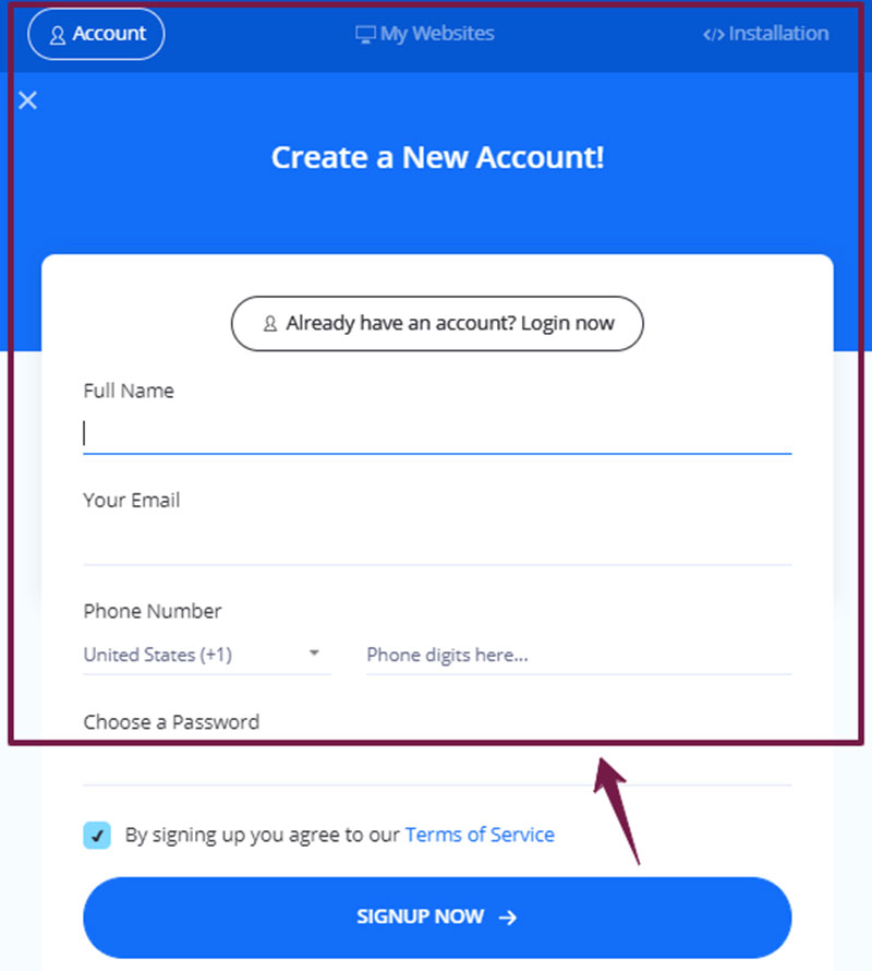

Upon inserting the code, you’ll immediately see the accessibility icon on your client’s interface.

accessiBe’s AI scans the website and fills in any accessibility gaps — making your client ADA-compliant — in 48 hours.
The company then gets daily AI maintenance scans and monthly compliance audits.
If your client wants to reposition the accessibility icon on their interface and match it with their branding colors, go to the “Advanced & Customized Installation” section found below the field for entering the installation code.
Look for these settings and select the desired colors for every category:
- Interface Lead Color
- Inner Focus Color
- Trigger Button Color
- Outer Focus Color
accessiBe also integrates with several websites, such as WordPress, Drupal, Wix, Site123, Shopify, Bigcommerce, Joomla, via Google Tag Manager, and lots more.
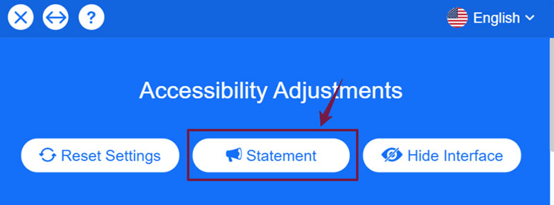
Visitors can view your client’s Accessibility Statement, which doubles as a certificate of performance, on the accessiBe interface. PDF copies of it are emailed to your client.

Additionally, it’s worth noting (and emphasizing to your clients) that site enhancements aren’t permanent, nor will they affect their other customers’ user experience.
Enhancements are saved in the persons’ browser cookies and displayed only on their devices’ screens.
aCe: Free, Reliable Accessibility Auditing Tool
Determine first your client’s site PWD-friendliness through aCe, a reliable accessibility auditing tool powered by accessiBe.
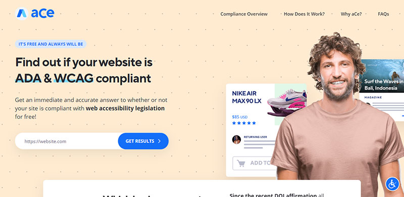

Serving as the industry standard for accessibility checking, aCe is developed to help you jumpstart your client’s full ADA, WCAG, and other regulatory compliance.
While most tools only flag errors based on presets, aCe accurately tests your client’s site against WCAG 2.1 Level AA success criteria and determines their accessibility.
It then gives you insightful feedback in just a few seconds, and free of charge as it works to serve the community in achieving a more accessible web.
To use aCe, type in your client’s URL and hit enter. As a sample, I put in “etsy.com,” and aCe delivered these results:
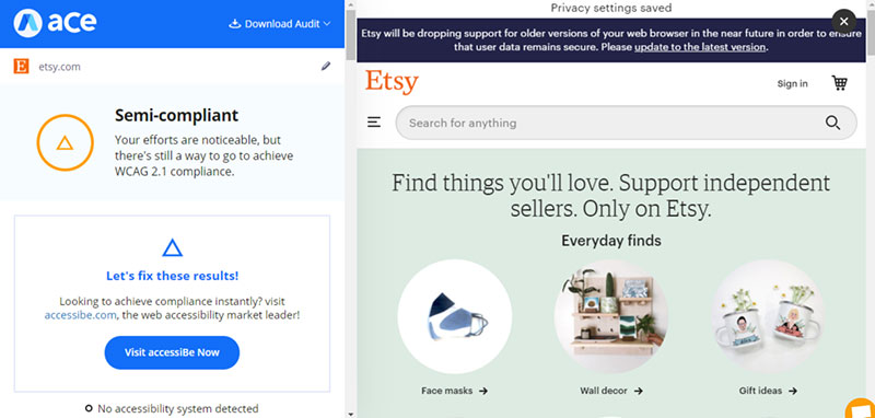

aCe shows your client’s overall site accessibility assessment, whether it’s “Compliant,” “Semi-compliant,” or “Non-compliant.”
Below that, aCe lists the requirements for these categories: clickables, titles, orientation, menus, graphics, forms, readability, document, carousels, tables, and general aspects.
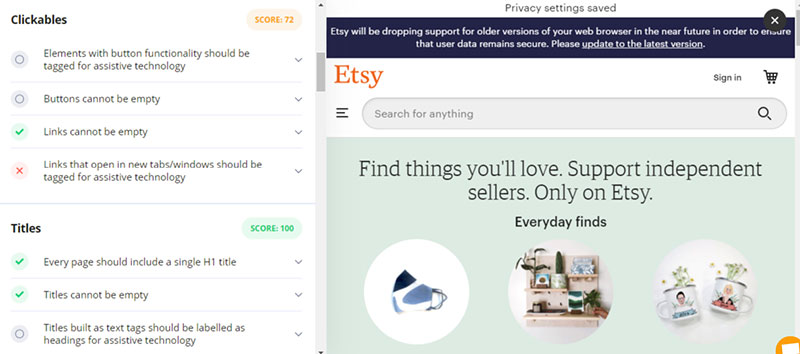

aCe also presents the scores for those categories, compliance status icons for each requirement under them, and specific comments in every requirement dropdown.
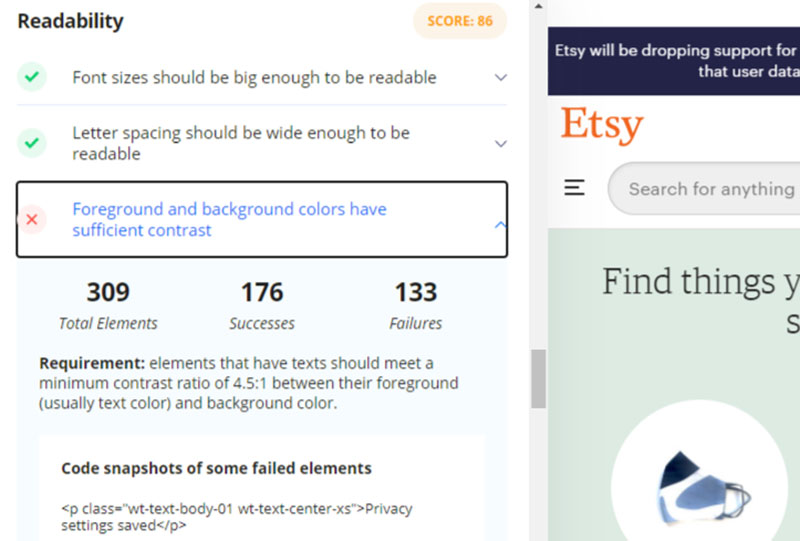

Green check marks indicate that sites met the requirement, yellow triangles as partially satisfied, and red X’s as failed. Grey circles mean that the condition doesn’t apply to the website.
In the image above, for instance, Etsy scored 86 for Readability, passed two of its requirements, and failed in one.
Clicking the dropdown for the failed condition, you’ll see the feedback in numbers, the relevant WCAG 2.1 provision, and code snapshots of failed elements for your reference.
This gives you an idea of what you missed in achieving accessibility and how to correct it.
aCe also lets you download the audit report by clicking the option on the top right of the feedback panel:
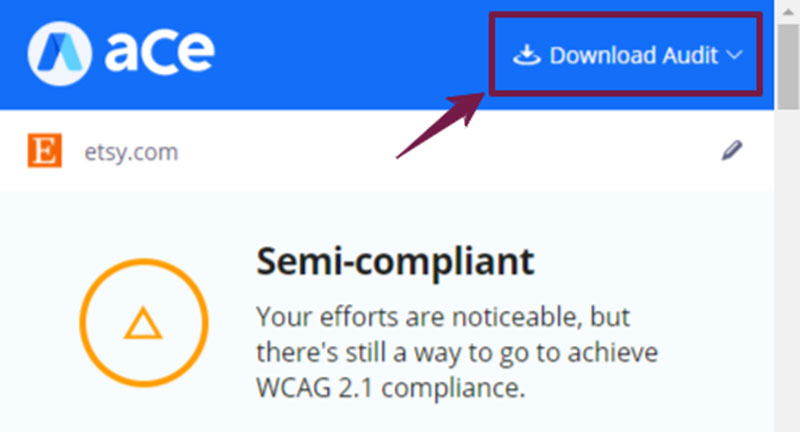

Supply your email address to receive your report securely. Note that accessiBe follows data privacy laws and does not collect data from your agency’s or client’s website.
accessiBe Features
After checking your client’s compliance status and accessibility issues, you can proceed with correcting them accordingly with accessiBe.
To appreciate how its features work, we’ll use Intex as a sample site, which originally appears like this:
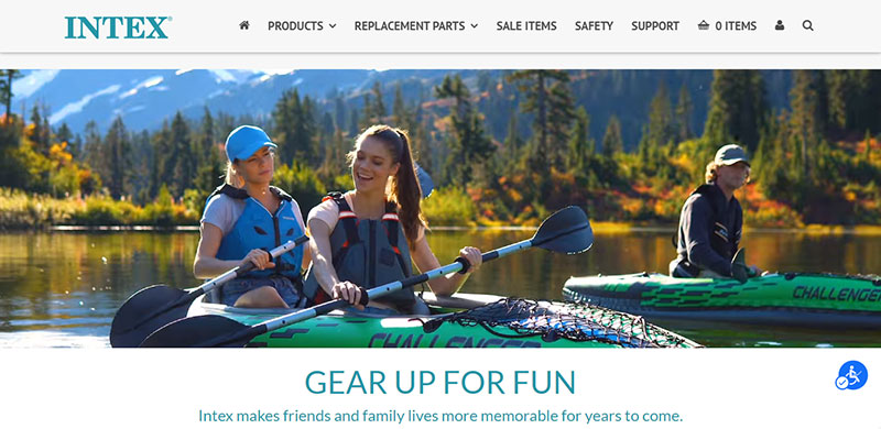

Comparing that design, we’ll apply the changes using accessiBe and see how they look like.
Accessibility Profiles
accessiBe provides accessibility profiles that, when activated, instantly applies changes addressing specific PWD needs (more on accessiBe’s front end features here).
It has the Visually Impaired Profile which caters to people with glaucoma, degrading eyesight, tunnel vision, cataracts, and other related disabilities.
Here’s how Intex appears when you switch on this profile:
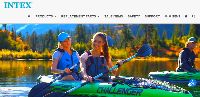

Initially, Intex used narrow font styles and smaller sizes, which accessiBe replaced with a Sans serif typeface, so they’re more readable.
accessiBe also set the display in high saturation to make the colors pop and more recognizable.
Next, accessiBe has the Epilepsy Safe Profile designed for visitors with photo- or light-sensitive epilepsy.
This feature is critical. For epileptic users, the internet is chock-full of bold, colorful visuals that can trigger seizures anytime, preventing them from browsing your client’s site for long.
To make the website safer, accessiBe turns off all flashing animations and minimizes color intensity once users enable the profile. Check out how Intex looks like when that happens:
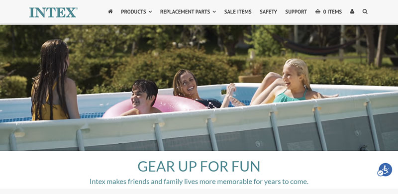

As you can see, colors are paler and almost greyed out, and the banner video stops playing.
If your client’s visitors have attention deficit hyperactivity disorder (ADHD) and neurodevelopmental disabilities, they can switch on the ADHD Friendly Profile.
This feature instantly provides a reading mask, which extends crosswise up and down the site as the cursor moves and blackens the remaining portions of the site, like this:
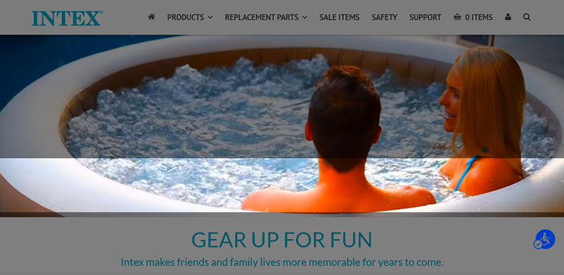

This enables the disabled visitors to focus on significant site elements or the content they’re reading with fewer distractions. The banner video here also stops playing.
For persons with dyslexia, autism, cerebrovascular accident (CVA), and other cognitive disorders, accessiBe has the Cognitive Disability Profile.
This lets such users focus on essential site elements more easily through assistive features — one of which is a reading guide, a thick, blue horizontal bar that moves with the cursor to aid in reading texts and written content.
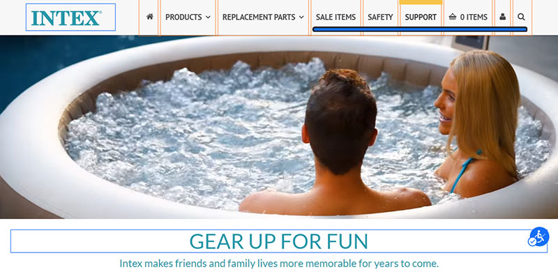

The profile even surrounds titles with blue-outlined boxes and links with orange-lined rectangles to help users distinguish those elements clearly.
Through the Blind Users (Screen Readers) profile, accessiBe assists blind persons in recognizing your content and navigating your client’s site.
Upon profile activation, accessiBe communicates with the blind users’ screen readers and makes them compatible with your client’s website.
Switching to this profile also enables the Keyboard Navigation features, since screen reading software programs provide smooth site navigation through specific keys.
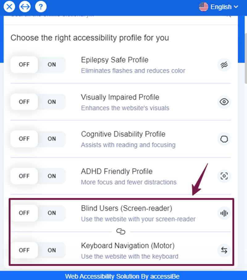

The Keyboard Navigation profile is also designed to assist motor-disabled users move around your client’s site more smoothly.
These customers can press Tab to activate this profile and move from one site element to another, Esc to close pop-ups, etc., and specific letters mentioned in the previous section.
Specific Modifications
Accessibility profiles make it convenient for your client’s customers to enhance their site and apply the right changes for their disabilities and needs.
However, they can also implement these and other changes themselves — individually or simultaneously. Scrolling down the accessiBe window, they’ll find more settings for various aspects.
Content
accessiBe provides a set of features that improve content readability, especially for visually impaired individuals.
By specific percentages, they can scale your client’s content, line height, font sizes, and letter spacing.
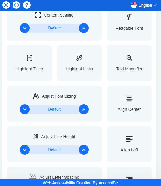

They can also change the site’s font styles into San serif, which are more eye-friendly, and align paragraphs to the left, center, or right.
They can even emphasize titles and links, as shown earlier, and enlarge texts with the Text Magnifier. See how it looks like below:
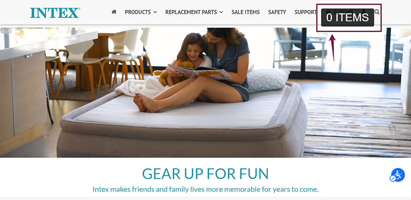

When you hover over a text, accessiBe displays a bigger, readable text overlay in uppercase letters. This helps users read the content more easily.
Colorization and Display
accessiBe lets your client’s customers enhance website colorization.
These features are helpful particularly for people with varying degrees of colorblindness, who may not recognize buttons, links, and other elements due to their hues.
These adjustments also assist customers with light sensitivity and struggle browsing sites with white backgrounds.
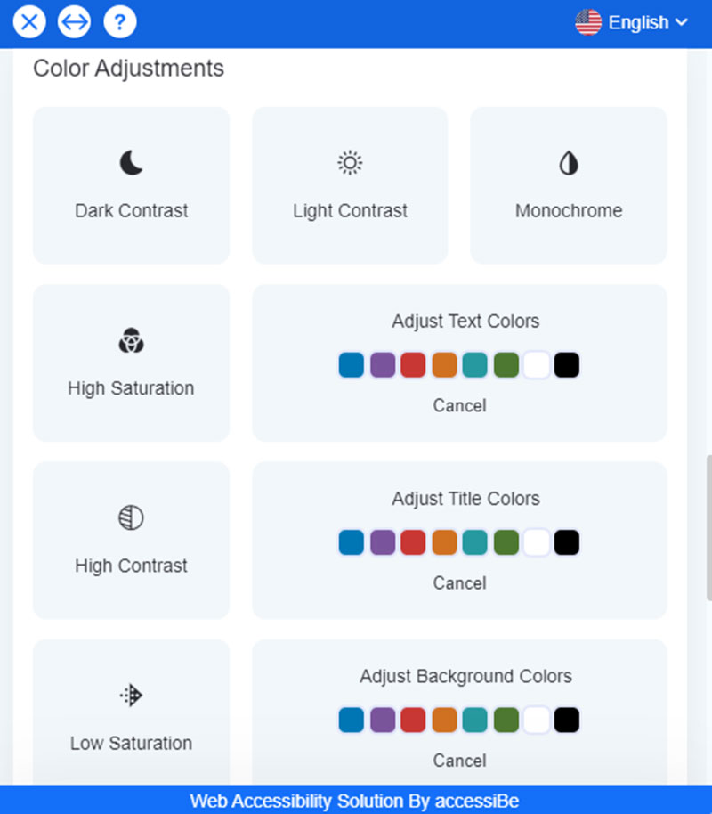

For one, customers can adjust text, title, and background colors. As an example, I applied orange for the background, white for titles, and black for the text. Intex now appears this way:
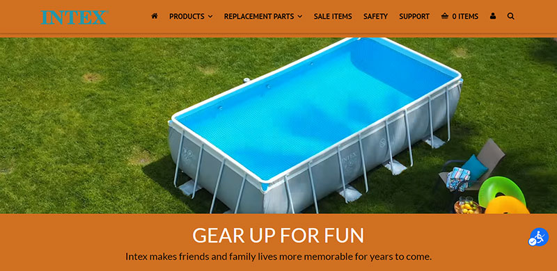

If they want to remove the applied colors, they can click “Cancel” below each of those categories.
Site visitors can also set the display in high and low saturations, high and light contrasts, and dark contrast, which looks like this:


They can even view the site in monochrome:
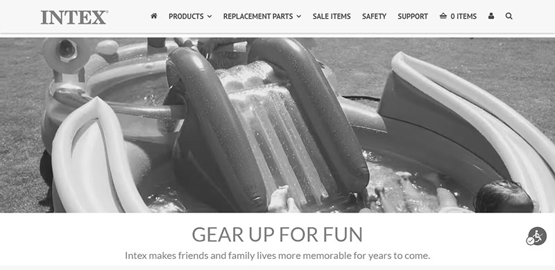

Orientation
For better site orientation and navigation, accessiBe offers modifications for users with visual, cognitive, and motor impairments.
These adjustments are designed to lessen noise and distraction and guide visitors in content browsing and reading. Keyboard shortcuts and alternatives are also included.
accessiBe provides reading guides and masks (shown previously) and options to highlight focus, pause moving visuals, hide images, and mute sounds.
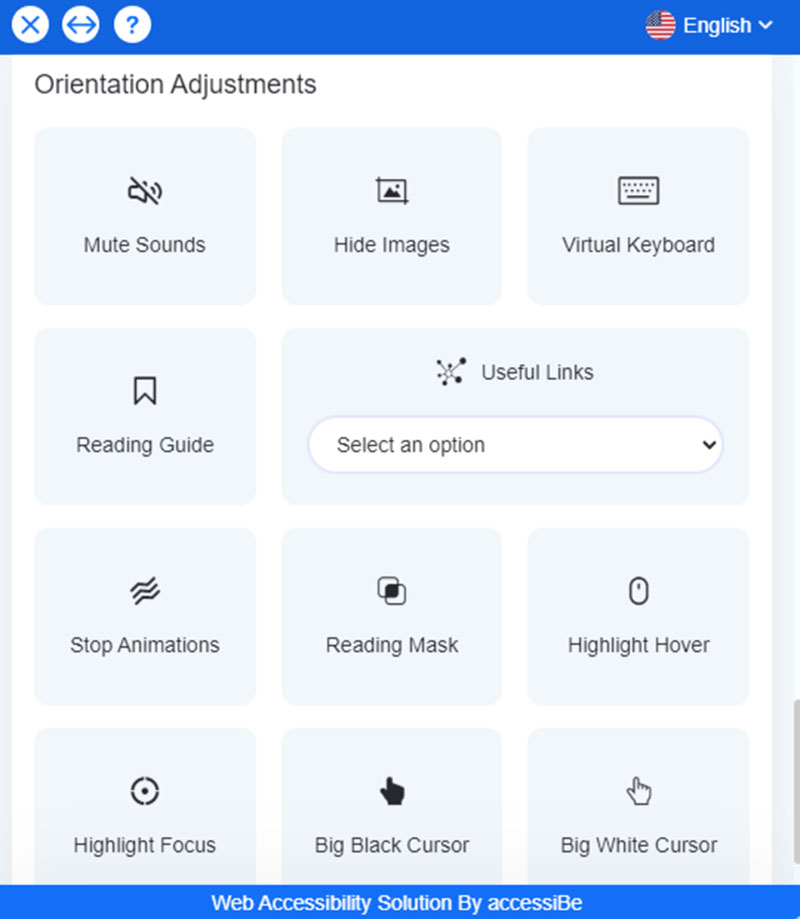

Clicking Highlight Hover, customers can highlight site elements their mouse pointers are on, like this:
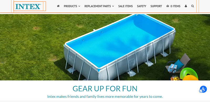

When my cursor pointed to “Intex,” accessiBe displayed orange boxes around the brand logo and the menu bar beside it.
Visitors can also activate big black or white cursors to help them find and track their mouse pointers and what they’re trying to click.
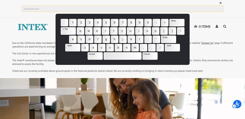
The virtual keyboard is especially practical for motor-disabled users who struggle with using their computer mouse.
When activated and users proceed to search boxes or entries in forms, log-ins, sign-ups, and other parts of the site requiring typing, the virtual keyboard appears instantly.
For example, I went to the search box at the top right of the website and this is what I saw:

Additionally, accessiBe has a Useful Links section which lists the various categorical pages of the site. Your client’s customers can click on any of them to go directly to the right places as desired.
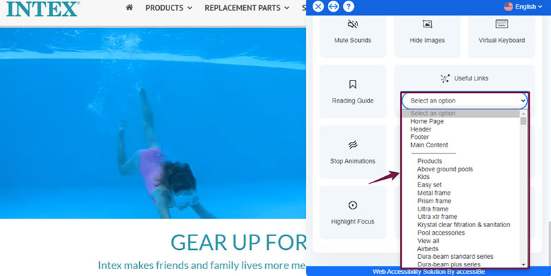

In the case of Intex, the section listed, for instance, the homepage, header, footer, and the main content sub-menus, such as Products, Above ground pools, Kids, Easy set, etc.
Other Adjustments
Above the accessibility profiles, you’ll find an Online Dictionary meant to help elderly persons, those with cognitive disabilities, and others, understand words and phrases they don’t understand.
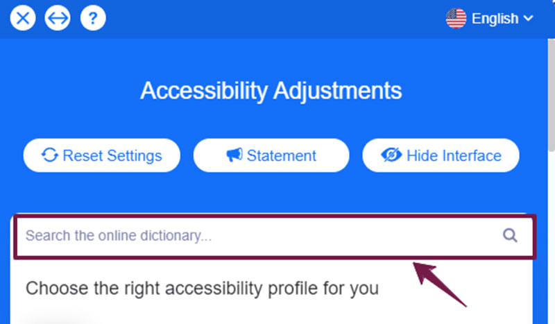

They can type in slang terms, abbreviations, concepts, references to famous people or events, etc. on the search box, and accessiBe delivers instant results from the internet.
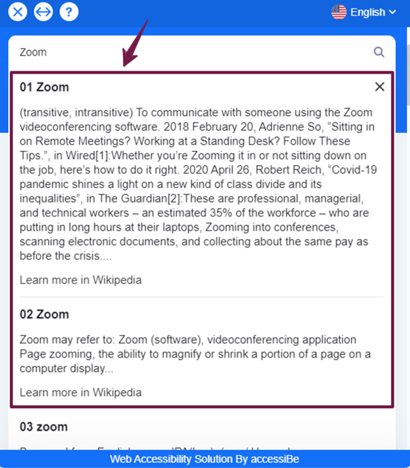
For example, I entered “Zoom” in the live glossary, and accessiBe presented a list of definitions:

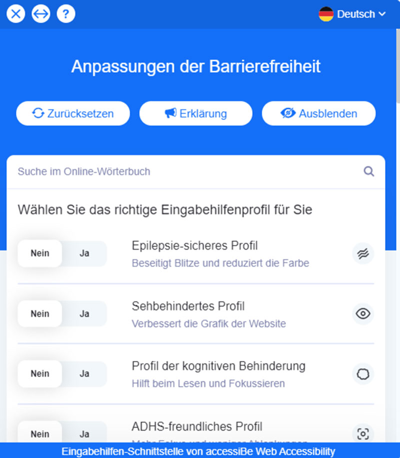
If visitors can’t read in English, accessiBe can translate the window’s texts into any of the 12 popular, built-in languages, such as Français, Italiano, Nederlands, Español, Português, German, and more.
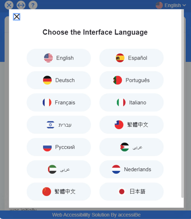

They can click on the top right portion of the accessiBe panel to choose their preferred language:
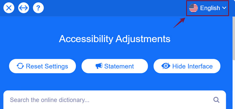

For instance, I selected Deutsch (German). Here’s how accessiBe’s interface looks like:

Some of these features are automatically enabled along with the accessibility profiles.
For instance, the Epilepsy Safe Profile instantly turns on the Stop Animations and Low Saturation adjustments.
The ADHD Friendly Profile automatically freezes videos and animations, sets the display in high saturation, and activates the reading mask.
For the Visually Impaired Profile, the Readable Font and High Saturation settings are switched on.
The Cognitive Disability Profile displays the reading guide and activates the Highlight Titles, Highlight Links, and Stop Animations features.
Pricing
accessiBe’s four pricing packages cover all the solution’s features and services. They only differ according to the number of web pages your client’s website has.
accessiBe considers each unique URL as one page. If the page has URL parameters, accessiBe includes the variations in that single count.
For instance, “https://domain.com/about” is regarded as one unique URL. Parameter variants such as “?param=value” are still part of that page.
Check out accessiBe’s pricing plans:
- Standard – For websites under 1,000 unique pages. $490/year or $49/month.
- Large – For sites with under 10,000 unique pages. Get it at $1490/year or $149/month.
- Huge – For sites under 100,000 unique pages. $1,990/year or $199/month.
- Jumbo – Offered to sites under 1,000,000 unique pages at $3,490/year or $349/month.
Opt for a monthly subscription or save 20% when you sign up for yearly billing.
Besides covering all features and services, these packages also provide free 7-day trials and don’t require credit card payments.
These services include:
- Compliance with ADA Title III, WCAG 2.1, EAA/EN301549, ACA/AODA, IS 5568
- Accessibility Certification and Statement
- Automatic daily scans and monitoring
- Monthly compliance audits
- Screen reader and navigation adjustments
- UI and design revamps
- Automatic seamless cloud updates
accessiBe vs Alternatives
accessiBe far outranks other accessibility widgets or methods because of its comprehensive, contextual understanding AI engine.
Plus, it’s the only automated solution in the industry, making your revamp projects more cost-efficient and long-lasting.
Allow me to explain.
First, accessiBe helps your client follow several accessibility regulations around the world, while third-party services only limit compliance depending on project scope.
Plugins are worse, since they don’t strictly follow the legislative provisions.
accessiBe also works immediately in only 48 hours after installation. However, other services can take three to 26 weeks, and plugins don’t provide a full turnaround.
Maintenance for accessiBe runs 24/7, but is not provided by plugins. It’s even an additional service for third-party technologies.
Moreover, compared to the highest industry success rate by accessiBe, other services’ performances nosedive to 50% within six months. Plugins also satisfy only 5% to 15% of the requirements.
And the best part is: With accessiBe, you can get all broad accessibility compliance, success rate, etc. affordably for a starting price of $490/year.
Other technologies charge you $5,000 to $50,000 a year. Plugins may have free to low-cost subscriptions but will get you almost nowhere in achieving and preserving your client’s accessibility.
Clearly, accessiBe is much more sustainable than manual approaches and other technological alternatives.
Partnering with accessiBe
accessiBe offers great partnership opportunities that better empower you to ensure your clients are ADA-compliant.
You can buy accessiBe licenses (with 20% discounts) for each of your clients, or receive commissions (20%) for every purchased license.
You’ll even get a free license on your website to safeguard your design agency and without any commitment or signup charges.
To join this partnership program, schedule a demo with accessiBe and supply your company details, such as email address and website link:


accessiBe’s Partnership Managers will show you how the whole solution works and sign up your agency for the program.
accessiBe will also give you a partner account, enabling you to create child accounts for your clients and help process their license purchases.
Here’s how you can specifically partner with accessiBe:
- Client Referrals. Get 20% of commissions for every new client that purchases an accessiBe license.
- White Label. Have your agency’s name on the accessiBe solution.
- Classic Affiliation. If you run a blog site or active mailing list, you can become an accessiBe affiliate.
- Events, Courses, etc. Collaborate with accessiBe for your events, online courses, and other ways.
accessiBe Partners’ Success Stories
accessiBe has helped its partner agencies reach their revenue, legal compliance and protection, and other goals for their company and clients’ websites.
For instance, Your Store Wizards, a solutions provider for ecommerce websites, such as those powered by Shopify and BigCommerce, sought an accessibility solution with these criteria:
(1) Affordable, 2) seamlessly worked with their clients’ platforms, and 3) gave them flexibility in building sites, instead of being forced into adopting performance-hampering designs.
From the detailed product demo, Your Store Wizards found that accessiBe was the exact solution they were looking for.
Since taking on the solution, they’ve taken in numerous clients and interacted productively with the accessiBe team, who were always looking for ways to help their agency and their clients.
Another satisfied accessiBe partner is online marketing agency SellSide Media. They aimed to drive growth for their clients, but have not considered web accessibility until recently.
After their client received a lawsuit from a blind plaintiff, SellSide Media met accessiBe, who demonstrated the solution and helped their legal team respond to the complaint — resolving the issue.
SellSide Media is amazed at how simply adding a line of accessiBe installation code makes the website accessible and compliant.
This empowers their clients to open their online services to more customers, increase revenue, and avoid litigation — all at minimal cost and effort.
Conclusion
Remember that creating ADA-compliant sites for your clients doesn’t have to be rocket science.
You don’t have to spend days, weeks, even months to pull this off.
By installing accessiBe, you can achieve compliance, protect your clients against nerve-racking web accessibility lawsuits, and help them close more customers by making their sites easily navigable to PWDs.

