I recently came across an interesting problem. I had to implement a grid of cards with a variable (user-set) aspect ratio that was stored in a --ratio custom property. Boxes with a certain aspect ratio are a classic problem in CSS and one that got easier to solve in recent years, especially since we got aspect-ratio, but the tricky part here was that each of the cards needed to have two conic gradients at opposite corners meeting along the diagonal. Something like this:
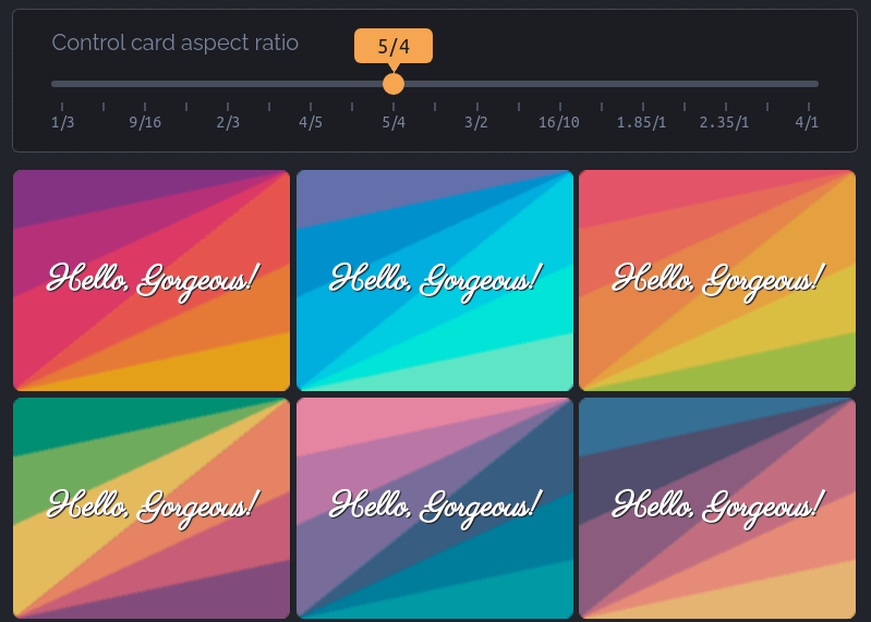
The challenge here is that, while it’s easy to make an abrupt change in a linear-gradient() along the diagonal of a variable aspect ratio box using for example a direction like to top left which changes with the aspect ratio, a conic-gradient() needs either an angle or a percentage representing how far it has gone around a full circle.
Check out this guide for a refresher on how conic gradients work.
The simple solution
Table of Contents
The spec now includes trigonometric and inverse trigonometric functions, which could help us here — the angle of the diagonal with the vertical is the arctangent of the aspect ratio atan(var(--ratio)) (the left and top edges of the rectangle and the diagonal form a right triangle where the tangent of the angle formed by the diagonal with the vertical is the width over the height — precisely our aspect ratio).
Putting it into code, we have:
--ratio: 3/ 2;
aspect-ratio: var(--ratio);
--angle: atan(var(--ratio));
background: /* below the diagonal */ conic-gradient(from var(--angle) at 0 100%, #319197, #ff7a18, #af002d calc(90deg - var(--angle)), transparent 0%), /* above the diagonal */ conic-gradient(from calc(.5turn + var(--angle)) at 100% 0, #ff7a18, #af002d, #319197 calc(90deg - var(--angle)));
However, no browser currently implements trigonometric and inverse trigonometric functions, so the simple solution is just a future one and not one that would actually work anywhere today.
The JavaScript solution
We can of course compute the --angle in the JavaScript from the --ratio value.
let angle = Math.atan(1/ratio.split('/').map(c => +c.trim()).reduce((a, c) => c/a, 1));
document.body.style.setProperty('--angle', `${+(180*angle/Math.PI).toFixed(2)}deg`)
But what if using JavaScript won’t do? What if we really need a pure CSS solution? Well, it’s a bit hacky, but it can be done!
The hacky CSS solution
This is an idea I got from a peculiarity of SVG gradients that I honestly found very frustrating when I first encountered.
Let’s say we have a gradient with a sharp transition at 50% going from bottom to top since in CSS, that’s a gradient at a 0° angle. Now let’s say we have the same gradient in SVG and we change the angle of both gradients to the same value.
In CSS, that’s:
linear-gradient(45deg, var(--stop-list));In SVG, we have:
<linearGradient id='g' y1='100%' x2='0%' y2='0%' gradientTransform='rotate(45 .5 .5)'> <!-- the gradient stops -->
</linearGradient>
As it can be seen below, these two don’t give us the same result. While the CSS gradient really is at 45°, the SVG gradient rotated by the same 45° has that sharp transition between orange and red along the diagonal, even though our box isn’t square, so the diagonal isn’t at 45°!
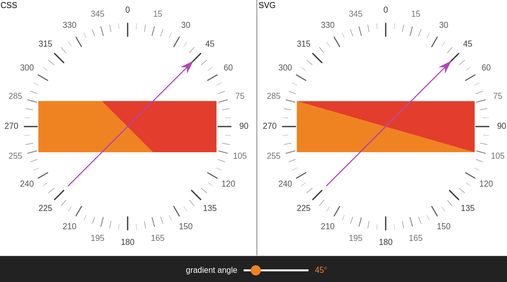
45° CSS vs. SVG gradient (live demo).This is because our SVG gradient gets drawn within a 1x1 square box, rotated by 45°, which puts the abrupt change from orange to red along the square diagonal. Then this square is stretched to fit the rectangle, which basically changes the diagonal angle.
Note that this SVG gradient distortion happens only if we don’t change the gradientUnits attribute of the linearGradient from its default value of objectBoundingBox to userSpaceOnUse.
Basic idea
We cannot use SVG here since it only has linear and radial gradients, but not conic ones. However, we can put our CSS conic gradients in a square box and use the 45° angle to make them meet along the diagonal:
aspect-ratio: 1/ 1;
width: 19em;
background: /* below the diagonal */ conic-gradient(from 45deg at 0 100%, #319197, #ff7a18, #af002d 45deg, transparent 0%), /* above the diagonal */ conic-gradient(from calc(.5turn + 45deg) at 100% 0, #ff7a18, #af002d, #319197 45deg);
Then we can stretch this square box using a scaling transform – the trick is that the ‘/’ in the 3/ 2 is a separator when used as an aspect-ratio value, but gets parsed as division inside a calc():
--ratio: 3/ 2;
transform: scaley(calc(1/(var(--ratio))));
You can play with changing the value of --ratio in the editable code embed below to see that, this way, the two conic gradients always meet along the diagonal:
Note that this demo will only work in a browser that supports aspect-ratio. This property is supported out of the box in Chrome 88+ (current version is 90), but Firefox still needs the layout.css.aspect-ratio.enabled flag to be set to true in about:config. And if you’re using Safari… well, I’m sorry!

Issues with this approach and how to get around them
Scaling the actual .card element would rarely be a good idea though. For my use case, the cards are on a grid and setting a directional scale on them messes up the layout (the grid cells are still square, even though we’ve scaled the .card elements in them). They also have text content which gets weirdly stretched by the scaley() function.
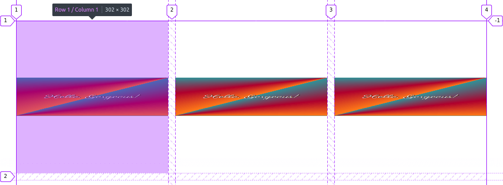
The solution is to give the actual cards the desired aspect-ratio and use an absolutely positioned ::before placed behind the text content (using z-index: -1) in order to create our background. This pseudo-element gets the width of its .card parent and is initially square. We also set the directional scaling and conic gradients from earlier on it. Note that since our absolutely positioned ::before is top-aligned with the top edge of its .card parent, we should also scale it relative to this edge as well (the transform-origin needs to have a value of 0 along the y axis, while the x axis value doesn’t matter and can be anything).
body { --ratio: 3/ 2; /* other layout and prettifying styles */
} .card { position: relative; aspect-ratio: var(--ratio); &::before { position: absolute; z-index: -1; /* place it behind text content */ aspect-ratio: 1/ 1; /* make card square */ width: 100%; /* make it scale relative to the top edge it's aligned to */ transform-origin: 0 0; /* give it desired aspect ratio with transforms */ transform: scaley(calc(1/(var(--ratio)))); /* set background */ background: /* below the diagonal */ conic-gradient(from 45deg at 0 100%, #319197, #af002d, #ff7a18 45deg, transparent 0%), /* above the diagonal */ conic-gradient(from calc(.5turn + 45deg) at 100% 0, #ff7a18, #af002d, #319197 45deg); content: ''; }
}
Note that we’ve moved from CSS to SCSS in this example.
This is much better, as it can be seen in the embed below, which is also editable so you can play with the --ratio and see how everything adapts nicely as you change its value.
Padding problems
Since we haven’t set a padding on the card, the text may go all the way to the edge and even slightly out of bounds given it’s a bit slanted.

padding causing problems.That shouldn’t be too difficult to fix, right? We just add a padding, right? Well, when we do that, we discover the layout breaks!
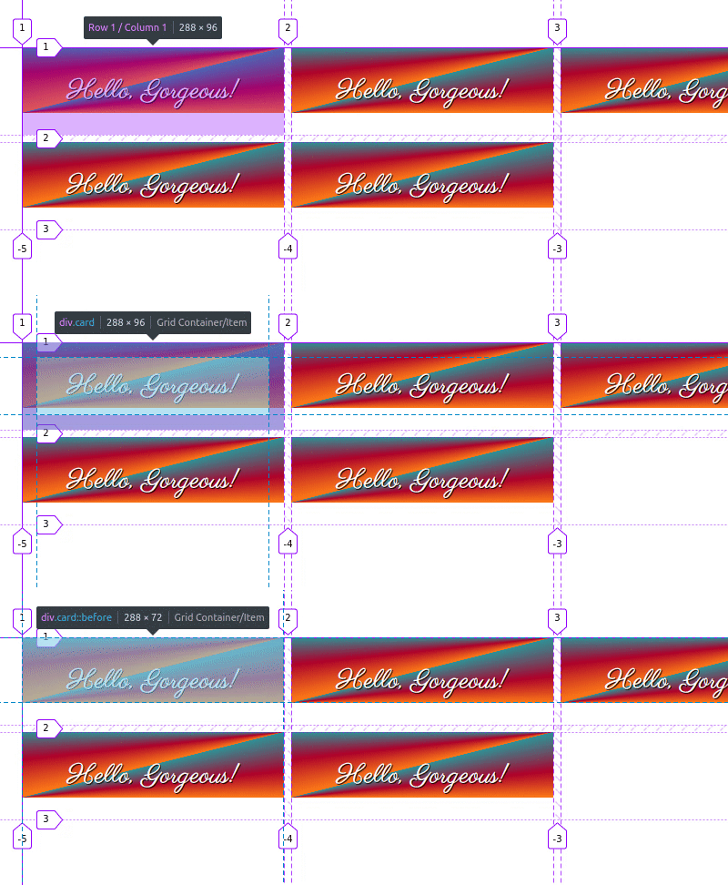
padding breaks the layout. (Demo)This is because the aspect-ratio we’ve set on our .card elements is that of the .card box specified by box-sizing. Since we haven’t explicitly set any box-sizing value, its current value is the default one, content-box. Adding a padding of the same value around this box gives us a padding-box of a different aspect ratio that doesn’t coincide with that of its ::before pseudo-element anymore.
In order to better understand this, let’s say our aspect-ratio is 4/ 1 and the width of the content-box is 16rem (256px). This means the height of the content-box is a quarter of this width, which computes to 4rem (64px). So the content-box is a 16rem×4rem (256px×64px) rectangle.
Now let’s say we add a padding of 1rem (16px) along every edge. The width of the padding-box is therefore 18rem (288px, as it can be seen in the animated GIF above) — computed as the width of the content-box, which is 16rem (256px) plus 1rem (16px) on the left and 1rem on the right from the padding. Similarly, the height of the padding-box is 6rem (96px) — computed as the height of the content-box, which is 4rem (64px), plus 1rem (16px) at the top and 1rem at the bottom from the padding).
This means the padding-box is a 18rem×6rem (288px×96px) rectangle and, since 18 = 3⋅6, it has a 3/ 1 aspect ratio which is different from the 4/ 1 value we’ve set for the aspect-ratio property! At the same time, the ::before pseudo-element has a width equal to that of its parent’s padding-box (which we’ve computed to be 18rem or 288px) and its aspect ratio (set by scaling) is still 4/ 1, so its visual height computes to 4.5rem (72px). This explains why the background created with this pseudo — scaled down vertically to a 18rem×4.5rem (288px×72px) rectangle — is now shorter than the actual card — a 18rem×6rem (288px×96px) rectangle now with the padding.
So, it looks like the solution is pretty straightforward — we need to set box-sizing to border-box to fix our problem as this applied the aspect-ratio on this box (identical to the padding-box when we don’t have a border).
Sure enough, this fixes things… but only in Firefox!
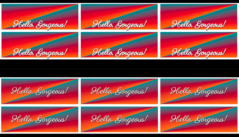
The text should be middle-aligned vertically as we’ve given our .card elements a grid layout and set place-content: center on them. However, this doesn’t happen in Chromium browsers and it becomes a bit more obvious why when we take out this last declaration — somehow, the cell in the card’s grid gets the 3/ 1 aspect ratio too and overflows the card’s content-box:
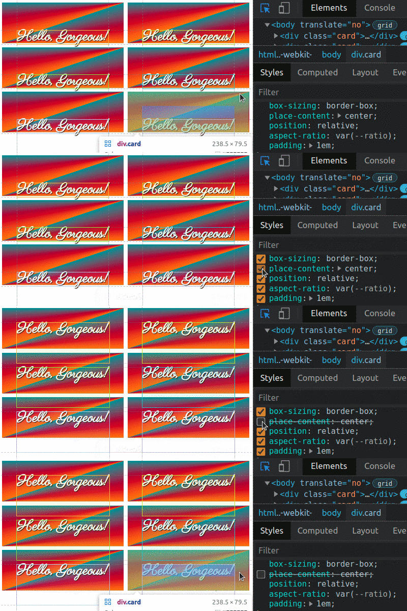
place-content: center.Fortunately, this is a known Chromium bug that should probably get fixed in the coming months.
In the meantime, what we can do to get around this is remove the box-sizing, padding and place-content declarations from the .card element, move the text in a child element (or in the ::after pseudo if it’s just a one-liner and we’re lazy, though an actual child is the better idea if we want the text to stay selectable) and make that a grid with a padding.
.card { /* same as before, minus the box-sizing, place-content and padding declarations the last two of which which we move on the child element */ &__content { place-content: center; padding: 1em }
}
Rounded corners
Let’s say we also want our cards to have rounded corners. Since a directional transform like the scaley on the ::before pseudo-element that creates our background also distorts corner rounding, it results that the simplest way to achieve this is to set a border-radius on the actual .card element and cut out everything outside that rounding with overflow: hidden.
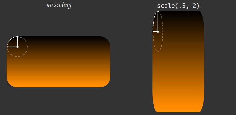
However, this becomes problematic if at some point we want some other descendant of our .card to be visible outside of it. So, what we’re going to do is set the border-radius directly on the ::before pseudo that creates the card background and reverse the directional scaling transform along the y axis on the y component of this border-radius:
$r: .5rem; .card { /* same as before */ &::before { border-radius: #{$r}/ calc(#{$r}*var(--ratio)); transform: scaley(calc(1/(var(--ratio)))); /* same as before */ }
}
Final result
Putting it all together, here’s an interactive demo that allows changing the aspect ratio by dragging a slider – every time the slider value changes, the --ratio variable is updated:


