With iOS 11 having now been officially rolled out across Apple devices, we are beginning to see some beautiful examples of what can be achieved using the revised design language.
Aspects such as the larger title text, heavily rounded corners, subtle shadows, and refined buttons and icons, are all inspiring designers and developers to put forward their own take on iOS 11.
Last month’s announcement of the iPhone X has also lead to some beautiful app designs, with designers all pushing for their own unique take on elements such as the status bar and increased screen real estate.
In this article we are going to review some of the finest iOS 11 app designs and concepts that we have seen so far.
All the Mobile UI Kits You Could Ask For
Table of Contents
DOWNLOAD NOW![]()
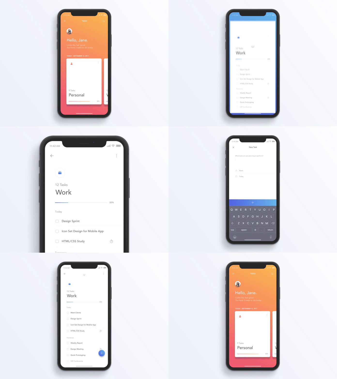
iPhone X Todo App
This beautiful iOS 11 design for iPhone X uses a visually clear and colorful design language with well-refined interactions to match.
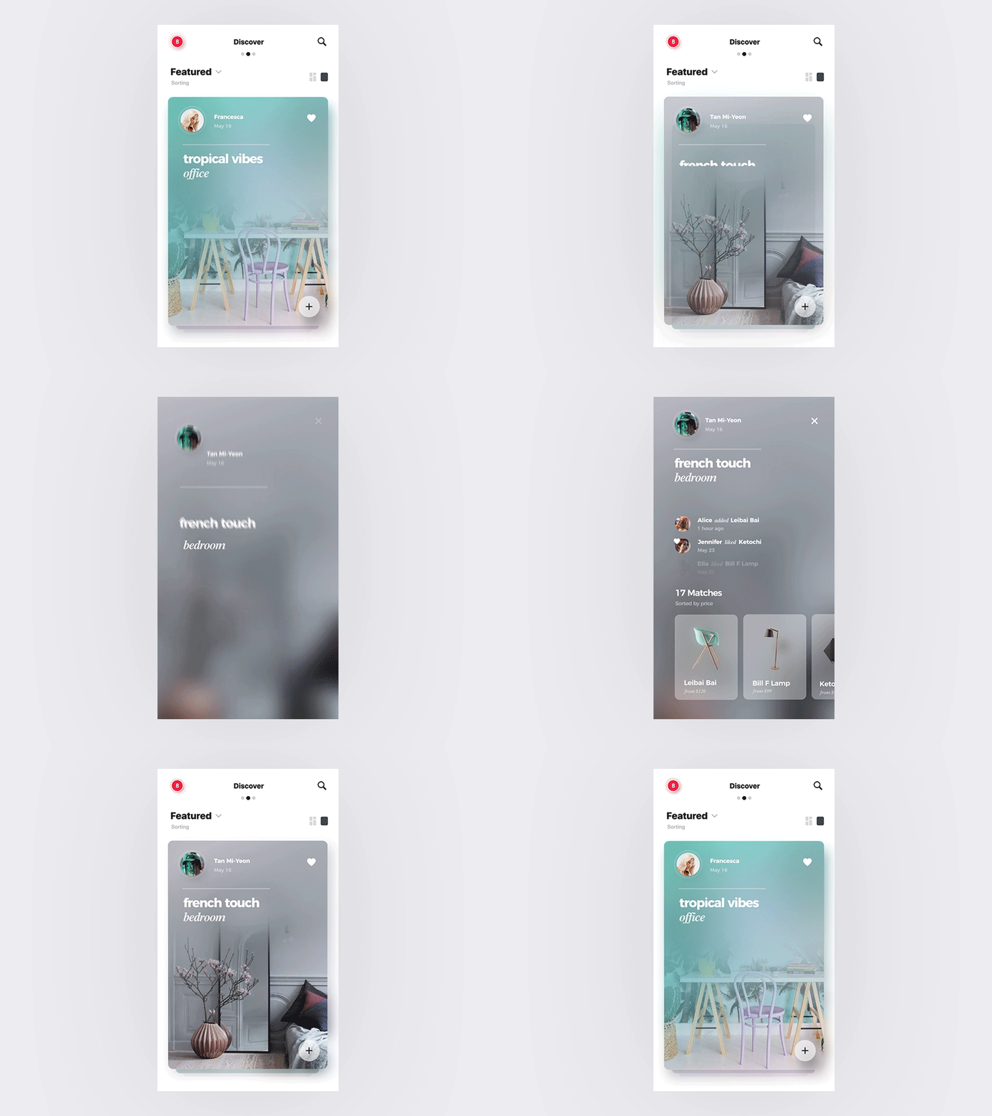
Shopping Cards
This shopping app uses the beautiful shadowed card designs that have now become an integral part of the iOS 11 design language. The cards are featured prominently in the podcasts and app store apps.
Kids Event App
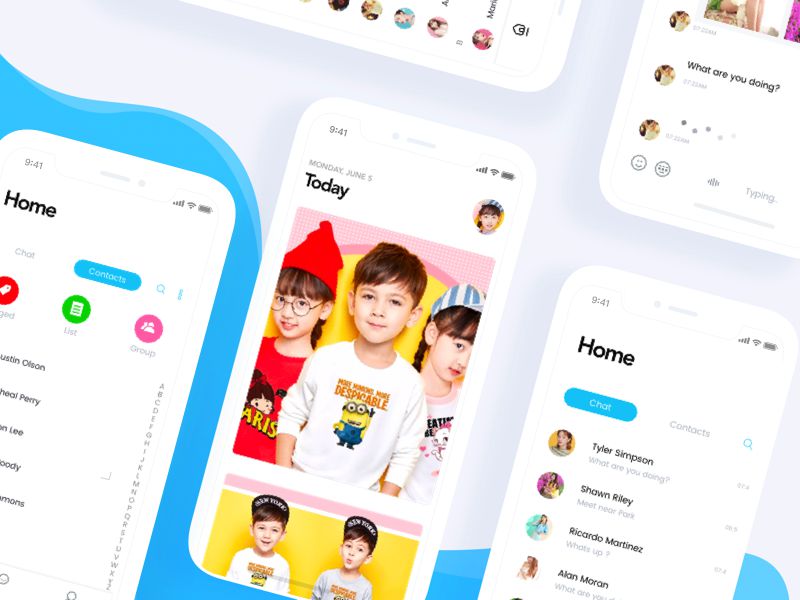
Using an abundance of color, this kids event app is a really well-executed example of iOS 11. It uses the emphatic title type and plenty of rounded imagery with white space around.
User Profile
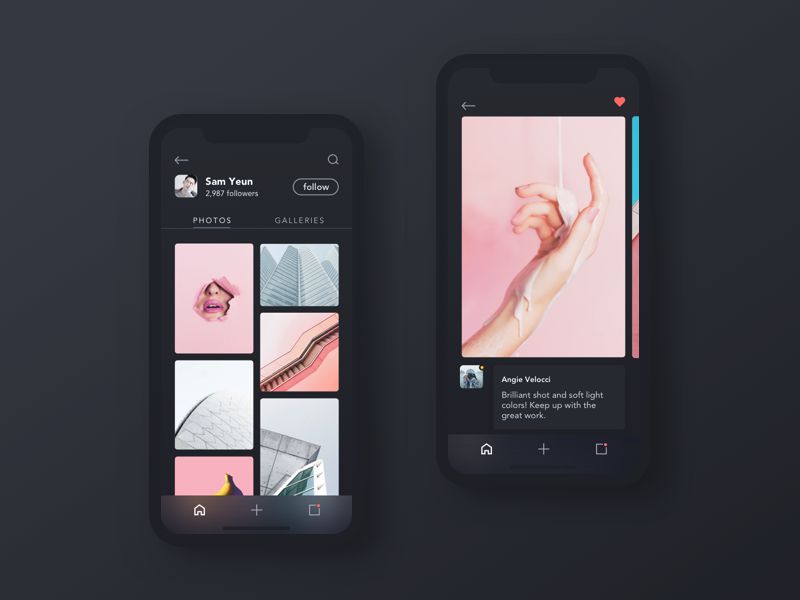
Dark apps like this user profile are particularly impressive when displayed within an iPhone X mockup. The dark background blends seamlessly with the bezel and camera notch.
Sales Dashboard
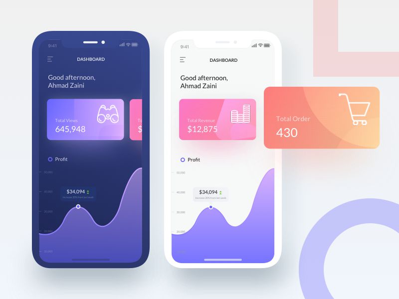
This sales dashboard concept shows how beautiful colors and gradients can look in both day and night modes on iOS 11. The graphs span edge-to-edge and make excellent use of the expanded real estate.
Property Developer Finder Mobile App
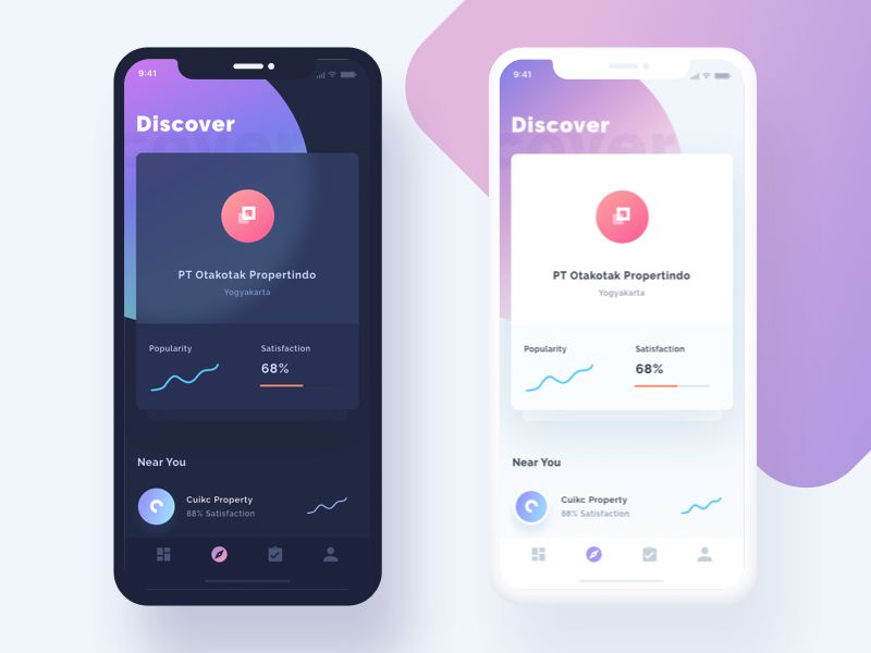
This property developer finder app for iOS uses simple, yet effective icons, as well as shadowed cards and a large title. It’s been executed perfectly and makes tremendous use of gradients and depth.
News & Account
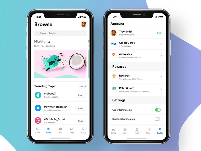
While a more ‘default’ implementation of iOS 11, this news and account app is nevertheless a stunning example of how to work within Apple’s guidelines. The spacing, iconography, and typography have been designed with exactitude.
Newbank Today
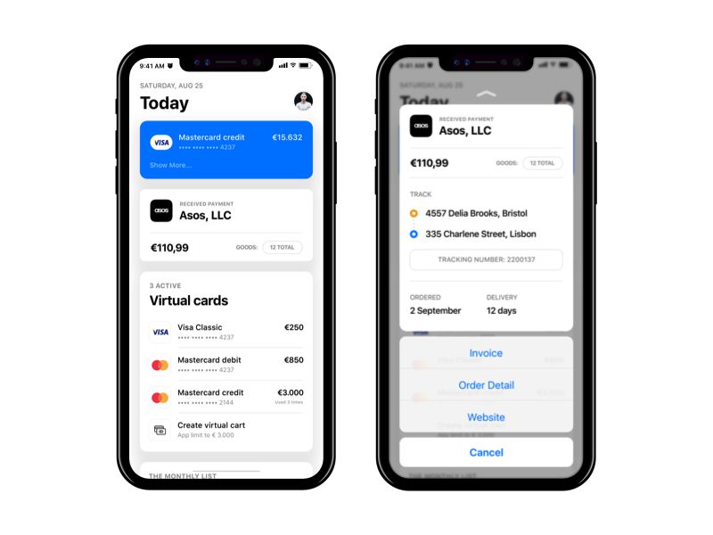
Another more ‘default’ implementation, Newbank utilises a limited color scheme with precision, and makes excellent use of depth elements and a card-based layout.
Text Vote
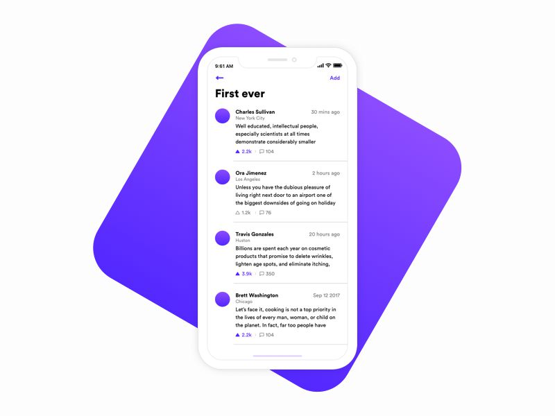
Text Vote showcases one of the more minimal approaches to iOS 11 app design. It keeps both the iconography and typography very simple with a focus on written content.
Photography Product
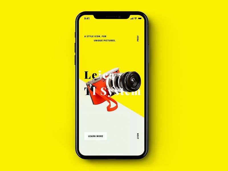
This photography app is an example of a more visual iOS 11 design. It’s something more akin to a fashion app where visuals are of great importance and shows off the edge-to-edge display of the iPhone X in all its glory.
This post may contain affiliate links. See our disclosure about affiliate links here.


