The role of animation in website design is a hot button issue. Some people love it, some people hate it, and some are non-committal.
Regardless of what side of the fence you sit on, there’s no denying the fact that animation is playing a larger role in website design than ever before.
How to Use Animation to Your Advantage
Table of Contents
If you have a strong interest in what animation can do for your website’s design, it’s time to consider your options to implement it. On the plus side, there’s no shortage of ideas to consider. Of course, this can also be a bad thing–too much animation will clutter your site and drive visitors away. Thus, you have to carefully pick and choose what you use.
If you look at the websites launched by any credible web development agency, you’ll be sure to find animation in use on both small and large projects.
“It’s important to find that right balance of animation that’s in line with your brand identity while not trying too hard to impress the user,” says Rocco Bombardieri, Multimedia Designer at The Influence Agency. “The best kinds of website animation are subtle and thoughtful, or bold and impactful. It’s the space in between that can get murky.”
With that in mind, let’s check some of the best ways to use animation in website design:
Loading Animation
The internet is faster than ever, but that doesn’t mean it’s fast enough to suit the needs of everyone who lands on your website.
Rather than leave your audience wondering if their page will load, use loading animation as a visual cue.
The goal is simple: hold the user’s attention until the page they’re looking at loads.
Get this: 40% of people abandon a website that takes more than 3 seconds to load. That’s not very long.
While loading animation won’t keep everyone on your site if it’s running slow, it will help. Every little bit counts.
Whole Page Motion
It’s not something you see often, but when you do, it’s sure to hold your attention. While this doesn’t have anything to do with the overall user experience, it does give your website a nice, unique touch.
Examples of whole page motion include a virtual panning camera, shaking screen, and an image that appears to be getting closer to you (or farther away).
If you’re going to use whole page motion, make sure it doesn’t distract the user to the point of driving them away before finding what they’re looking for. There’s a fine line that you don’t want to cross.
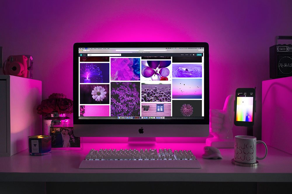
Image Galleries
Image galleries have been around for quite some time, but they’re just beginning to become a bigger part of the user experience.
An image gallery is more than just a fancy way of displaying images. It’s a way to make life easier on your users, which keeps them engaged and stay on your website for a longer period of time
A common example is the use of image galleries in the real estate and design industries. Maybe you’re a real estate agent who wants to showcase a home to prospective buyers. Or, maybe, you’re an interior designer interested in connecting with your target audience.
You can use a slideshow to catch the attention of the user and keep them focused on what you want.
Tip: image galleries are easy to implement and don’t take up a lot of space, so working with these in your design is often a good idea.
Skeleton Screens
This is one of the newest forms of animation in website design. You’ve probably experienced it before, even if you didn’t know what it was called.
With this, the information on a web page gradually comes into view. This ensures that the user doesn’t have to wait until the entire page is ready.
The first thing they’ll see is a general outline of the page. From there, each major component will become clearer in succession. This helps keep impatient users engaged.
Tip: if you’re going to use a skeleton screen, don’t combine it with a lot of additional animation as it can be too much for users to digest.
Hover Animation
Have you ever visited a website that you find hard to navigate? And, not because of the layout, but because you don’t know what to click on?
In some cases, it’s difficult to determine which buttons, images, and text are clickable. However, with the use of hover animation, you show users that an element is interactive. This clues them in as they move their mouse, as opposed to making them figure it out on their own (and possibly leaving before they do).
Hover animation has been used for years, and it remains one of the best ways to improve user experience.
Final Thoughts on Animation in Web Design
Now, what do you think? Are you on board with the idea that animation in web design is a growing trend? Are you already brainstorming ideas on how you can use it?
The next time you’re browsing the internet, stop and pay attention to any and all animation you come across. Take notes regarding what you do and don’t like. From there, decide how you can take your website to the next level.