The key to making a Retina Display-driven site is the quality of images that’s being used. The image has to be at least two times larger so to make it clearer when viewed on Retina devices.
For instance, if you want to display an image with a width of 400px, then the original width of the image must be 800px. Otherwise, if you try to stretch this out in Photoshop, the image will look blurry.
To give you a clear insight on how this Retina Display works, let’s look at the following options on how to Retina-fy websites.
Your Designer Toolbox
Unlimited Downloads: 500,000+ Web Templates, Icon Sets, Themes & Design Assets
Table of Contents
- 1 Your Designer ToolboxUnlimited Downloads: 500,000+ Web Templates, Icon Sets, Themes & Design Assets
- 2 Resource you will need to complete this tutorial:
- 3 Optimizing Basic Retina Display
- 4 Testing Retina Display through Opera Mobile Emulator
- 5 Using SVGs and CSS3 Effects
- 6 Using Web Fonts
- 7 Web Fonts Resources
- 8 Using Sprite Images
- 9 Other Ways to Optimize Retina Displays
- 10 Final Words

DOWNLOAD NOW![]()
Resource you will need to complete this tutorial:
Optimizing Basic Retina Display
Step 1:
Create a new folder on your preferred location and name it retina. Then, inside the retina folder, create another folder and name it img for our images.
Next, we need to find a high quality image to be used for this tutorial. So let’s download a countryside trail landscape picture. This image has a dimension of 1555px x 1037px, which has a higher density pixel and a good example for our demo.
Step 2:
Open the countryside_trail_landscape.jpg file in Photoshop and save it as [email protected] under the img folder.
Next, resize the image to 50%. To do this, go to Image -&> Image size and then change the width to 50%. This will resize the image file to half. Save it under img folder with the filename retina_image.jpg.
Step 3:
Now let’s go ahead and display these images to our web page. Create a new HTML file and name it retinaDisplay.html. Inside the body tag, place this code below.
<img alt="" src="img/retina_image[AT]2x.jpg" width="778" height="519" >
<img alt="" src="img/retina_image.jpg" width="778" height="519" >
You can also use internal and external CSS to display Retina images on your site. As an example check the code below.
<img class="imgRetina" alt="" src="img/[email protected]" >
<img class="imgRetina" alt="" src="img/retina_image.jpg" >
<style>
.imgRetina { width: 778px; height: 519px; }
</style>
Now you can check this on your retina device and you will clearly see that the first image is sharper than the second one. No retina device? No problem!
Testing Retina Display through Opera Mobile Emulator
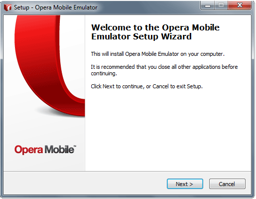
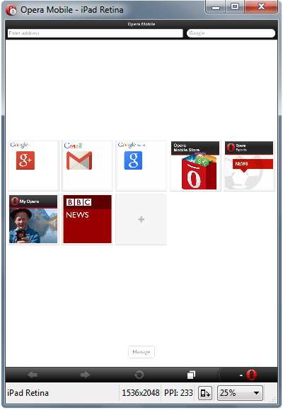
Download the Opera Mobile Emulator and install it on your computer and then launch it.
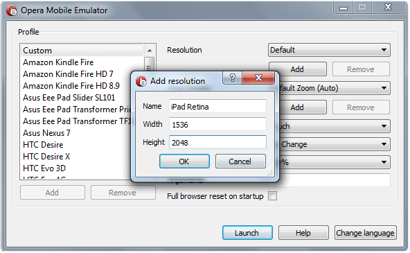
Since iPad has a resolution of 1536px by 2048px, let’s add this resolution on the Opera Mobile Emulator. To do this, click Add Button under the Resolution label and give it a name of iPad Retina and with a dimension of 1536px by 2048px and then click OK.
Afterwards, click Launch and put the URL of the your HTML file. By then, you can see both images on the screen. Please take note that you can also zoom in to clearly compare the images.
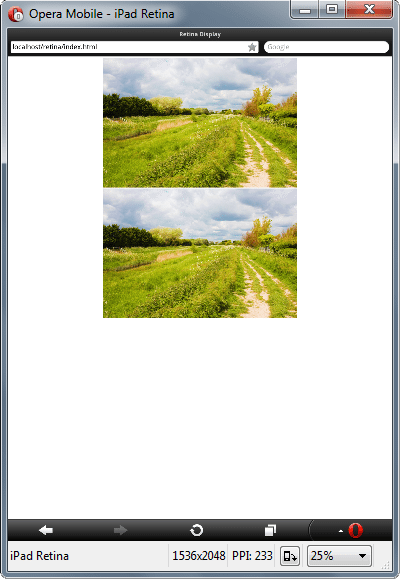
You’ve seen how high quality pixels can improve your visitors’ experience on their Retina devices. A Retina device will see the extra pixel data. It will use those data to fill the extra PPI (pixels per inch) that the screen contains.
There are a lot of ways to Retina-fy your web pages. Check out the following examples how they can help you improve your Retina websites.
Using SVGs and CSS3 Effects

If you have a logo and some vectors you want to display on Retina devices, it’s highly recommended to use SVG files. SVG (Scalable Vector Graphics) uses scalable 2D images based on shapes and lines.
This means the image will be displayed sharp on Retina Devices. Basically, SVG files are created on Adobe Illustrator.
On the other hand, you can also use CSS3 Effects to Retina-fy your website. CSS3 Effects add looks like those effects you see and use in Photoshop such as shadow and strokes.
Using CSS3 to create buttons and boxes will enable you to display sharp elements no matter where screen its being viewed
Using Web Fonts

Web fonts are great because they offer font accessibility and creativity to our modern websites. These are fonts that are available on the web. These can be embedded into the HTML Markup using the link tag provided by the hosts site of the web fonts. The addition of @font-face rule for CSS3 is a dazzling idea for designers.
@font-face
{
font-family: Sansation Light;
src: url('Sansation_Light.ttf'), url('Sansation_Light.eot'); /* IE9 */
}
Web fonts like Google Fonts also make the design workflow easier since you don’t need to import your available fonts to your websites. You just need to copy and paste a piece of link code and you’re good.
<link href="http://fonts.googleapis.com/css?family=Arbutus" rel="stylesheet" type="text/css" >
body { font-family: 'Arbutus'; }
Good thing about web fonts is that they work responsibly on modern responsive web designs. They give web designers more freedom on their designs without thinking how their fonts will look like on responsive web pages.
Web Fonts Resources
You can use the following services for your websites fonts.
Using Sprite Images
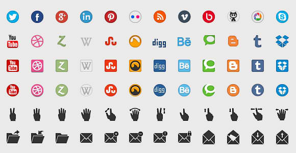
When you’re building large sites, it is important to minimize the amount of images that the user has to download. Image sprites can help you accomplish this by just putting a group of images into a single image and then displaying them on your web pages by just changing the background position.
You easily create a sprite image in Photoshop. To learn how to create an image sprite for web use click here.
Other Ways to Optimize Retina Displays
Aside from the basic way of Retina-fying web pages, there are other ways to optimize your users’ experience on their Retina devices.
CSS Media Queries
Letting Retina devices download high quality images every now and then is not the ideal way. This will make web pages load slower. Luckily, media queries can solve this problem for you.
Media queries image replacement technique will give your users ease of access to your Retina images. Let’s apply this on our previous example.
Step 1:
Create a new HTML file and name it mediaRetina.html. Inside the body tag, put the following code.
<div class="”imgRetina”"></div>
Step 2:
And then inside our internal/external CSS, place this code for our non-Retina image.
.imgRetina { background: (‘../img/retina_image.jpg’)no-repeat; width: 778px; height: 519px; margin: 0 auto; }
Step 3:
Next, let’s add the CSS code for our Retina image. We’re going to replace the normal image to a Retina image if the user is on a Retina display.
@media only screen and (-webkit-min-device-pixel-ratio: 2), only screen and (min-device-pixel-ratio: 2) {
.imgRetina { background: (‘../img/[email protected])no-repeat; width: 778px; height: 519px; margin: 0 auto; }
}
Our media query starts with &< @media query statement followed by only, which means only the screen device must execute the code. Then we added min-device-pixel-ratio, which means the screen must be equal or greater that two.
We also added -webkit browser prefix to make sure that our code will work on older Safari browsers. Congratulations!
You just used Media Queries replacement technique. Each time a user will view your web page on their Retina display device, the non-Retina image will be replaced by the Retina image.
jQuery Retina Display Optimization
We can also use jQuery to replace images if the user is using a high density device. For this tutorial, we’re going to take advantage of the functionality of retina.js. Retina.js is an open source script that makes it easy to serve high-resolution images to devices with retina displays. Let’s try this out.
Step 1:
Create a new HTML file and name it jqueryRetina.html. On the head section, place the jQuery library source link from Google.
<script type="text/javascript" src="//ajax.googleapis.com/ajax/libs/jquery/1.10.2/jquery.min.js"></script>
Step 2:
Next, create a new folder for our Retina folder and name it js. Now let’s download retina.js and then place the link code below before your closing tag.
<script type="text/javascript" src="js/retina.js.js"></script>
Step 3:
Place the following code on our body section. This will include our basic retina image markup with a class of imgRetina.
</pre>
<div class="imgRetina"></div>
<pre>
Step 4:
Afterwards, inside our internal/external CSS, place this code for our non-Retina image. This contains the source of the image together with its width and the height. Then, in the end, we just center the image using margin: 0 auto.
.imgRetina { background: (‘../img/retina_image.jpg’)no-repeat; width: 778px; height: 519px; margin: 0 auto; }
And that’s it! No, I’m not kidding, that’s really it!. The script assumes you use Apple’s prescribed high-resolution modifier (@2x) to denote high density image variants on our img folder.
If you remember the name of our non-Retina image is retina_image.jpg so it will look for our Retina image [email protected] and replace it when a user is browsing on a Retina display device.
Final Words
Retina Displays have a higher number of pixels per inch than a normal display. Before uploading it to your web server, it would help a lot if you would check first if it contains high density pixels. If you’re not sure, you can use other methods as means of replacement for your images.
In this tutorial, I’ve introduced to you other resources on how to improve your site for Retina Display experience. I also introduced to you steps on how to properly optimize your web images for Retina Display devices. You can use all these approaches to improve your site and avoid site visitors complaining about the quality of images on their Retina display devices.
This post may contain affiliate links. See our disclosure about affiliate links here.

