Recently, while looking for some ideas on what to code as I have zero artistic sense so the only thing I can do is find pretty things that other people have come up with and remake them with clean and compact code… I came across these candy ghost buttons!
They seemed like the perfect choice for a cool little thing I could quickly code. Less than fifteen minutes later, this was my Chromium result:
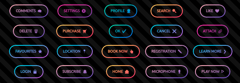
I thought the technique was worth sharing, so in this article, we’ll be going through how I first did it and what other options we have.
The starting point
Table of Contents
A button is created with… are you ready for this? A button element! This button element has a data-ico attribute in which we drop an emoji. It also has a stop list custom property, --slist, set in the style attribute.
<button data-ico="????" style="--slist: #ffda5f, #f9376b">boo!</button>After writing the article, I learned that Safari has a host of problems with clipping to text, namely, it doesn’t work on button elements, or on elements with display: flex (and perhaps grid too?), not to mention the text of an element’s children. Sadly, this means all of the techniques presented here fail in Safari. The only workaround is to apply all the button styles from here on a span element nested inside the button, covering its parent’s border-box. And, in case this helps anyone else who, like me, is on Linux without physical access to an Apple device (unless you count the iPhone 5 someone on the fourth floor — who you don’t want to bother with stuff like this more than twice a month anyway — bought recently), I’ve also learned to use Epiphany in the future. Thanks to Brian for the suggestion!
For the CSS part, we add the icon in an ::after pseudo-element and use a grid layout on the button in order to have nice alignment for both the text and the icon. On the button, we also set a border, a padding, a border-radius, use the stop list, --slist, for a diagonal gradient and prettify the font.
button { display: grid; grid-auto-flow: column; grid-gap: .5em; border: solid .25em transparent; padding: 1em 1.5em; border-radius: 9em; background: linear-gradient(to right bottom, var(--slist)) border-box; font: 700 1.5em/ 1.25 ubuntu, sans-serif; text-transform: uppercase; &::after { content: attr(data-ico) }
}
There’s one thing to clarify about the code above. On the highlighted line, we set both the background-origin and the background-clip to border-box. background-origin both puts the 0 0 point for background-position in the top-left corner of the box it’s set to and gives us the box whose dimensions the background-size is relative to.
That is, if background-origin is set to padding-box, the 0 0 point for background-position is in the top left-corner of the padding-box. If background-origin is set to border-box, the 0 0 point for background-position is in the top-left corner of the border-box. If background-origin is set to padding-box, a background-size of 50% 25% means 50% of the padding-box width and 25% of the padding-box height. If background-origin is set to border-box, the same background-size of 50% 25% means 50% of the border-box width and 25% of the border-box height.
The default value for background-origin is padding-box, meaning that a default-sized 100% 100% gradient will cover the padding-box and then repeat itself underneath the border (where we cannot see it if the border is fully opaque). However, in our case, the border is fully transparent and we want our gradient to stretch across the entire border-box. This means we need to change the background-origin value to border-box.

The simple, but sadly non-standard Chromium solution
This involves using three mask layers and compositing them. If you need a refresher on mask compositing, you can check out this crash course.
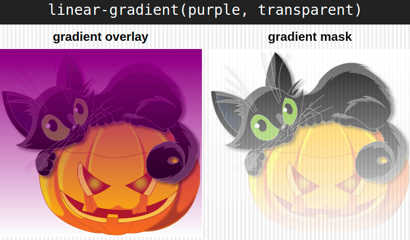
Note that in the case of CSS mask layers, only the alpha channel matters, as every pixel of the masked element gets the alpha of the corresponding mask pixel, while the RGB channels don’t influence the result in any way, so they may be any valid value. Below, you can see the effect of a purple to transparent gradient overlay versus the effect of using the exact same gradient as a mask.
We’re going to start with the bottom two layers. The first one is a fully opaque layer, fully covering the entire border-box, meaning that it has an alpha of 1 absolutely everywhere. The other one is also fully opaque, but restricted (by using mask-clip) to the padding-box, which means that, while this layer has an alpha of 1 all across the padding-box, it’s fully transparent in the border area, having an alpha of 0 there.
If you have a hard time picturing this, a good trick is to think of an element’s layout boxes as nested rectangles, the way they’re illustrated below.
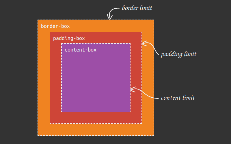
In our case, the bottom layer is fully opaque (the alpha value is 1) across the entire orange box (the border-box). The second layer, that we place on top of the first one, is fully opaque (the alpha value is 1) all across the red box (the padding-box) and fully transparent (with an alpha of 0) in the area between the padding limit and the border limit.
One really cool thing about the limits of these boxes is that corner rounding is determined by the border-radius (and, in the case of the padding-box, by the border-width as well). This is illustrated by the interactive demo below, where we can see how the corner rounding of the border-box is given by the border-radius value, while the corner rounding of the padding-box is computed as the border-radius minus the border-width (limited at 0 in case the difference is a negative value).
Now let’s get back to our mask layers, one being fully opaque all across the entire border-box, while the one on top of it is fully opaque across the padding-box area and fully transparent in the border area (between the padding limit and the border limit). These two layers get composited using the exclude operation (called xor in the non-standard WebKit version).
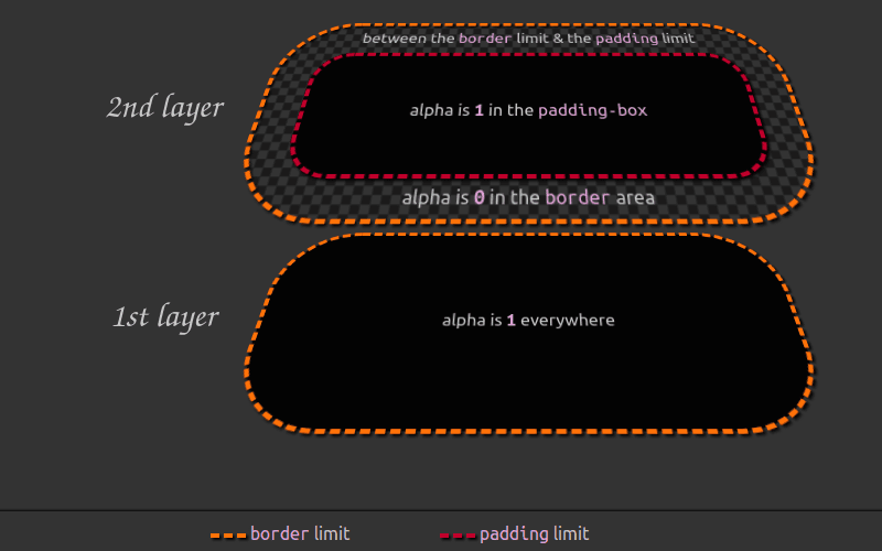
The name of this operation is pretty suggestive in the situation where the alphas of the two layers are either 0 or 1, as they are in our case — the alpha of the first layer is 1 everywhere, while the alpha of the second layer (that we place on top of the first) is 1 inside the padding-box and 0 in the border area between the padding limit and the border limit.
In this situation, it’s pretty intuitive that the rules of boolean logic apply — XOR-ing two identical values gives us 0, while XOR-ing two different ones gives us 1.
All across the padding-box, both the first layer and the second one have an alpha of 1, so compositing them using this operation gives us an alpha of 0 for the resulting layer in this area. However, in the border area (outside the padding limit, but inside the border limit), the first layer has an alpha of 1, while the second one has an alpha of 0, so we get an alpha of 1 for the resulting layer in this area.
This is illustrated by the interactive demo below, where you can switch between viewing the two mask layers separated in 3D and viewing them stacked and composited using this operation.
Putting things into code, we have:
button { /* same base styles */ --full: linear-gradient(red 0 0); -webkit-mask: var(--full) padding-box, var(--full); -webkit-mask-composite: xor; mask: var(--full) padding-box exclude, var(--full);
}
Before we move further, let’s discuss a few fine-tuning details about the CSS above.
First off, since the fully opaque layers may be anything (the alpha channel is fixed, always 1 and the RGB channels don’t mater), I usually make them red — only three characters! In the same vein, using a conic gradient instead of a linear one would also save us one character, but I rarely ever do that since we still have mobile browsers that support masking, but not conic gradients. Using a linear one ensures we have support all across the board. Well, save for IE and pre-Chromium Edge but, then again, not much cool shiny stuff works in those anyway.
Second, we’re using gradients for both layers. We’re not using a plain background-color for the bottom one because we cannot set a separate background-clip for the background-color itself. If we were to have the background-image layer clipped to the padding-box, then this background-clip value would also apply to the background-color underneath — it would be clipped to the padding-box too and we’d have no way to make it cover the entire border-box.
Third, we’re not explicitly setting a mask-clip value for the bottom layer since the default for this property is precisely the value we want in this case, border-box.
Fourth, we can include the standard mask-composite (supported by Firefox) in the mask shorthand, but not the non-standard one (supported by WebKit browsers).
And finally, we always set the standard version last so it overrides any non-standard version that may also be supported.
The result of our code so far (still cross-browser at this point) looks like below. We’ve also added a background-image on the root so that it’s obvious we have real transparency across the padding-box area.

padding-box (live demo).This is not what we want. While we have a nice gradient border (and by the way, this is my preferred method of getting a gradient border since we have real transparency all across the padding-box and not just a cover), we are now missing the text.
So the next step is to add back the text using yet another mask layer on top of the previous ones, this time one that’s restricted to text (while also making the actual text fully transparent so that we can see the gradient background through it) and XOR this third mask layer with the result of XOR-ing the first two (result that can be seen in the screenshot above).
The interactive demo below allows viewing the three mask layers both separated in 3D as well as stacked and composited.
Note that the text value for mask-clip is non-standard, so, sadly, this only works in Chrome. In Firefox, we just don’t get any masking on the button anymore and having made the text transparent, we don’t even get graceful degradation.
button { /* same base styles */ -webkit-text-fill-color: transparent; --full: linear-gradient(red 0 0); -webkit-mask: var(--full) text, var(--full) padding-box, var(--full); -webkit-mask-composite: xor; /* sadly, still same result as before :( */ mask: var(--full) padding-box exclude, var(--full);
}
If we don’t want to make our button unusable this way, we should put the code that applies the mask and makes the text transparent in a @supports block.
button { /* same base styles */ @supports (-webkit-mask-clip: text) { -webkit-text-fill-color: transparent; --full: linear-gradient(red 0 0); -webkit-mask: var(--full) text, var(--full) padding-box, var(--full); -webkit-mask-composite: xor; }
}
I really like this method, it’s the simplest we have at this point and I’d really wish text was a standard value for mask-clip and all browsers supported it properly.
However, we also have a few other methods of achieving the candy ghost button effect, and although they’re either more convoluted or more limited than the non-standard Chromium-only one we’ve just discussed, they’re also better supported. So let’s take a look at those.
This involves setting the same initial styles as before, but, instead of using a mask, we clip the background to the text area.
button { /* same base styles */ background: linear-gradient(to right bottom, var(--slist)) border-box; -webkit-background-clip: text; background-clip: text; -webkit-text-fill-color: transparent
}
Just like before, we need to also make the actual text transparent, so we can see through it to the pastel gradient background behind it that is now clipped to its shape.

Alright, we have the gradient text, but now we’re missing the gradient border. So we’re going to add it using an absolutely positioned ::before pseudo-element that covers the entire border-box area of the button and inherits the border, border-radius and background from its parent (save for the background-clip, which gets reset to border-box).
$b: .25em; button { /* same as before */ position: relative; border: solid $b transparent; &::before { position: absolute; z-index: -1; inset: -$b; border: inherit; border-radius: inherit; background: inherit; background-clip: border-box; content: ''; }
}
inset: -$b is a shorthand for:
top: -$b;
right: -$b;
bottom: -$b;
left: -$b
Note that we’re using the border-width value ($b) with a minus sign here. The 0 value would make the margin-box of the pseudo (identical to the border-box in this case since we have no margin on the ::before) only cover the padding-box of its button parent and we want it to cover the entire border-box. Also, the positive direction is inwards, but we need to go outwards by a border-width to get from the padding limit to the border limit, hence the minus sign — we’re going in the negative direction.
We’ve also set a negative z-index on this absolutely positioned element since we don’t want it to be on top of the button text and prevent us from selecting it. At this point, text selection is the only way we can distinguish the text from the background, but we’ll soon fix that!

Note that since pseudo-element content isn’t selectable, the selection only includes the button’s actual text content and not the emoji in the ::after pseudo-element as well.
The next step is to add a two layer mask with an exclude compositing operation between them in order to leave just the border area of this pseudo-element visible.
button { /* same as before */ &::before { /* same as before */ --full: linear-gradient(red 0 0); -webkit-mask: var(--full) padding-box, var(--full); -webkit-mask-composite: xor; mask: var(--full) padding-box exclude, var(--full); }
}
This is pretty much what we did for the actual button in one of the intermediate stages of the previous method.

I find this to be the best approach in most cases when we want something cross-browser and that doesn’t include IE or pre-Chromium Edge, none of which ever supported masking.
The border-image solution
At this point, some of you may be screaming at the screen that there’s no need to use the ::before pseudo-element when we could use a gradient border-image to create this sort of a ghost button — it’s a tactic that has worked for over three quarters of a decade!
However, there’s a very big problem with using border-image for pill-shaped buttons: this property doesn’t play nice with border-radius, as it can be seen in the interactive demo below. As soon as we set a border-image on an element with border-radius, we lose the corner rounding of the border, even through, funny enough, the background will still respect this rounding.
Still, this may be a simple solution in the case where don’t need corner rounding or the desired corner rounding is at most the size of the border-width.
In the no corner rounding case, save for dropping the now pointless border-radius, we don’t need to change the initial styles much:
button { /* same base styles */ --img: linear-gradient(to right bottom, var(--slist)); border: solid .25em; border-image: var(--img) 1; background: var(--img) border-box; -webkit-background-clip: text; background-clip: text; -webkit-text-fill-color: transparent;
}
The result can be seen below, cross-browser (should be supported supported even in pre-Chromium Edge).

border-image method (live demo).The trick with the desired corner rounding being smaller than the border-width relies on the way border-radius works. When we set this property, the radius we set represents the rounding for the corners of the border-box. The rounding for the corners of the padding-box (which is the inner rounding of the border) is the border-radius minus the border-width if this difference is positive and 0 (no rounding) otherwise. This means we have no inner rounding for the border if the border-radius is smaller than or equal to the border-width.
In this situation, we can use the inset() function as a clip-path value since it also offers the possibility of rounding the corners of the clipping rectangle. If you need a refresher on the basics of this function, you can check out the illustration below:
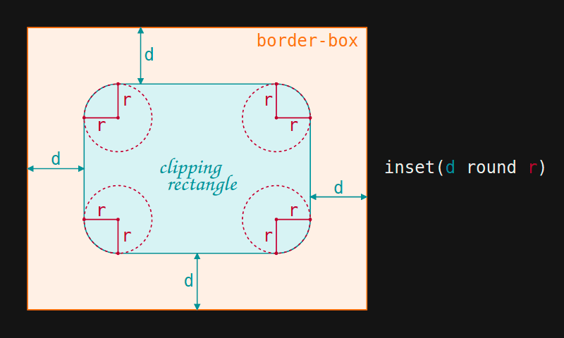
inset() function works.inset() cuts out everything outside a clipping rectangle defined by the distances to the edges of the element’s border-box, specified the same way we’d specify margin, border or padding (with one, two, three or four values) and the corner rounding for this rectangle, specified the same way we’d specify border-radius (any valid border-radius value is also valid here).
In our case, the distances to the edges of the border-box are all 0 (we don’t want to chop anything off any of the edges of the button), but we have a rounding that has to be at most at big as the border-width so that not having any inner border rounding makes sense.
$b: .25em; button { /* same as before */ border: solid $b transparent; clip-path: inset(0 round $b)
}
Note that the clip-path is also going to cut out any outer shadows we may add on the button element, whether they’re added via box-shadow or filter: drop-shadow().

border-image method (live demo).While this technique cannot achieve the pill shape look, it does have the advantage of having great support nowadays and it may be all we need in certain situations.
The three solutions discussed so far can be seen compiled in the demo below, which also comes with a YouTube link where you can see me code each of them from scratch if you prefer to learn by watching things being built on video rather than reading about them.
All these methods create real transparency in the padding-box outside the text, so they work for any background we may have behind the button. However, we also have a couple of other methods that may be worth mentioning, even though they come with restrictions in this department.
The cover solution
Just like the border-image approach, this is a pretty limited tactic. It doesn’t work unless we have a solid or a fixed background behind the button.
It involves layering backgrounds with different background-clip values, just like the cover technique for gradient borders. The only difference is that here we add one more gradient layer on top of the one emulating the background behind our button element and we clip this top layer to text.
$c: #393939; html { background: $c; } button { /* same as before */ --grad: linear-gradient(to right bottom, var(--slist)); border: solid .25em transparent; border-radius: 9em; background: var(--grad) border-box, linear-gradient($c 0 0) /* emulate bg behind button */, var(--grad) border-box; -webkit-background-clip: text, padding-box, border-box; -webkit-text-fill-color: transparent;
}
Sadly, this approach fails in Firefox due to an old bug — just not applying any background-clip while also making the text transparent produces a pill-shaped button with no visible text.

background-clip cover solution (live demo).We could still make it cross-browser by using the cover method for the gradient border on a ::before pseudo and background-clip: text on the actual button, which is basically just a more limited version of the second solution we discussed — we still need to use a pseudo, but, since we use a cover, not a mask, it only works if we have a solid or fixed background behind the button.
$b: .25em;
$c: #393939; html { background: $c; } button { /* same base styles */ --grad: linear-gradient(to right bottom, var(--slist)); border: solid $b transparent; background: var(--grad) border-box; -webkit-background-clip: text; background-clip: text; -webkit-text-fill-color: transparent; &::before { position: absolute; z-index: -1; inset: -$b; border: inherit; border-radius: inherit; background: linear-gradient($c 0 0) padding-box, var(--grad) border-box; content: ''; }
}
On the bright side, this more limited version should also work in pre-Chromium Edge.

background behind the button (live demo).Below, there’s also the fixed background version.
$f: url(balls.jpg) 50%/ cover fixed; html { background: $f; } button { /* same as before */ &::before { /* same as before */ background: $f padding-box, var(--grad) border-box }
}
background behind the button (live demo).Overall, I don’t think this is the best tactic unless we both fit into the background limitation and we need to reproduce the effect in browsers that don’t support masking, but support clipping the background to the text, such as pre-Chromium Edge.
The blending solution
This approach is another limited one as it won’t work unless, for each and every gradient pixel that’s visible, its channels have values that are either all bigger or all smaller than than the corresponding pixel of the background underneath the button. However, this is not the worst limitation to have as it should probably lead to our page having better contrast.
Here, we start by making the parts where we want to have the gradient (i.e. the text, icon and border) either white or black, depending on whether we have a dark theme with a light gradient or a light theme with a dark gradient, respectively. The rest of the button (the area around the text and icon, but inside the border) is the inverse of the previously chosen color (white if we set the color value to black and black otherwise).
In our case, we have a pretty light gradient button on a dark background, so we start with white for the text, icon and border, and black for the background. The hex channel values of our two gradient stops are ff (R), da (G), 5f (B) and f9 (R), 37 (G), 6b (B), so we’d be safe with any background pixels whose channel values are at most as big as min(ff, f9) = f9 for red, min(da, 37) = 37 for green and min(5f, 6b) = 5f for blue.
This means having a background-color behind our button with channel values that are smaller or equal to f9, 37 and 5f, either on its own as a solid background, or underneath a background-image layer we blend with using the multiply blend mode (which always produces a result that’s at least as dark as the darker of the two layers). We’re setting this background on a pseudo-element since blending with the actual body or the html doesn’t work in Chrome.
$b: .25em; body::before { position: fixed; inset: 0; background: url(fog.jpg) 50%/ cover #f9375f; background-blend-mode: multiply; content: '';
} button { /* same base styles */ position: relative; /* so it shows on top of body::before */ border: solid $b; background: #000; color: #fff; &::after { filter: brightness(0) invert(1); content: attr(data-ico); }
}
Note that making the icon fully white means making it first black with brightness(0) and then inverting this black with invert(1).

black and white button (live demo).We then add a gradient ::before pseudo-element, just like we did for the first cross-browser method.
button { /* same styles as before */ position: relative; &::before { position: absolute; z-index: 2; inset: -$b; border-radius: inherit; background: linear-gradient(to right bottom, var(--slist); pointer-events: none; content: ''; }
}
The only difference is that here, instead of giving it a negative z-index, we give it a positive z-index. That way it’s not just over the actual button, but also over the ::after pseudo and we set pointer-events to none in order to allow the mouse to interact with the actual button content underneath.

black and white button (live demo).Now the next step is to keep the black parts of our button, but replace the white parts (i.e., the text, icon and border) with the gradient. We can do this with a darken blend mode, where the two layers are the black and white button with the ::after icon and the gradient pseudo on top of it.
For each of the RGB channels, this blend mode takes the values of the two layers and uses the darker (smaller) one for the result. Since everything is darker than white, the resulting layer uses the gradient pixel values in that area. Since black is darker than everything, the resulting layer is black everywhere the button is black.
button { /* same styles as before */ &::before { /* same styles as before */ mix-blend-mode: darken; }
}
Alright, but we’d only be done at this point if the background behind the button was pure black. Otherwise, in the case of a background whose every pixel is darker than the corresponding pixel of the gradient on our button, we can apply a second blend mode, this time lighten on the actual button (previously, we had darken on the ::before pseudo).
For each of the RGB channels, this blend mode takes the values of the two layers and uses the lighter (bigger) one for the result. Since anything is lighter than black, the resulting layer uses the background behind the button everywhere the button is black. And since a requirement is that every gradient pixel of the button is lighter than the corresponding pixel of the background behind it, the resulting layer uses the gradient pixel values in that area.
button { /* same styles as before */ mix-blend-mode: lighten;
}
For a dark gradient button on a light background, we need to switch up the blend modes. That is, use lighten on the ::before pseudo and darken on the button itself. And first of all, we need to ensure the background behind the button is light enough.
Let’s say our gradient is between #602749 and #b14623. The channel values of our gradient stops are 60 (R), 27 (G), 49 (B) and b1 (R), 46 (G), 23 (R), so the background behind the button needs to have channel values that are at least max(60, b1) = b1 for red, max(27, 46) = 46 for green and max(49, 23) = 49 for blue.
This means having a background-color on our button with channel values that are bigger or equal to b1, 46 and 49, either on its own as a solid background, or underneath a background-image layer, uses a screen blend mode (which always produces a result that’s at least as light as the lighter of the two layers).
We also need to make the button border, text and icon black, while setting its background to white:
$b: .25em; section { background: url(fog.jpg) 50%/ cover #b14649; background-blend-mode: screen;
} button { /* same as before */ border: solid $b; background: #fff; color: #000; mix-blend-mode: darken; &::before { /* same as before */ mix-blend-mode: lighten } &::after { filter: brightness(0); content: attr(data-ico); }
}
The icon in the ::after pseudo-element is made black by setting filter: brightness(0) on it.

We also have the option of blending all the button layers as a part of its background, both for the light and dark theme, but, as mentioned before, Firefox just ignores any background-clip declaration where text is a part of a list of values and not the single value.
Well, that’s it! I hope you’re having (or had) a scary Halloween. Mine was definitely made horrific by all the bugs I got to discover… or rediscover, along with the reality that they haven’t been fixed in the meanwhile.


