Have you ever tried to make CSS borders in a repeating zig-zag pattern? Like where a colored section of a website ends and another differently colored section begins — not with a straight line, but angled zig zags, rounded humps, or waves. There are a number of ways you could do this sort of CSS border, dating all the way back to using a background-image. But we can get more modern and programmatic with it. In this article, we’ll look at some modern CSS mask techniques to achieve the look.
Before we dig into the technical parts, though, let’s take a look at what we are building. I have made a CSS border generator where you can easily generate any kind of border within a few seconds and get the CSS code.
Did you see that? With the CSS mask property and a few CSS gradients, we get a responsive and cool-looking border — all with CSS by itself. Not only this, but such effect can be applied to any element where we can have any kind of coloration (e.g. image, gradient, etc). We get all this without extra elements, pseudo elements, or magic numbers coming from nowhere!
Oh great! All I have to do is to copy/paste code and it’s done!
True, but it’s good to understand the logic to be able to manually adjust the code if you need to.
Masking things
Table of Contents
Since all our effects rely on the CSS mask property, let’s take a quick refresh on how it works. Straight from the spec:
The effect of applying a mask to a graphical object is as if the graphical object will be painted onto the background through a mask, thus completely or partially masking out parts of the graphical object.
If we check the formal syntax of the mask property we can see it accepts an <image> as a value, meaning either a URL of an image or a color gradient. Gradients are what we’ll be using here. Let’s start with basic examples:
In the first example of this demo, a gradient is used to make it appear as though the image is fading away. The second example, meanwhile, also uses a gradient, but rather than a soft transition between colors, a hard color stop is used to hide (or mask) half of the image. That second example illustrates the technique we will be using to create our fancy borders.
Oh, and the CSS mask property can take multiple gradients as long as they are comma-separated. That means we have even more control to mask additional parts of the image.
That example showing multiple masking gradients may look a bit tricky at first glance, but what’s happening is the same as applying the multiple gradients on the background property. But instead of using a color that blends in with the page background, we use a “transparent” black value (#0000) for the hidden parts of the image and full black (#000) for the visible parts.
That’s it! Now we can tackle our fancy borders.
Zig-Zag CSS borders
As we saw in the video at the start of this article, the generator can apply borders on one side, two sides, or all sides. Let’s start with the bottom side using a step-by-step illustration:
- We start by adding the first gradient layer with a solid color (
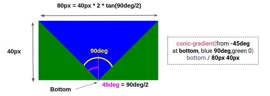
red) at the top. A height that’s equal tocalc(100% - 40px)is used to leave40pxof empty space at the bottom. - We add a second gradient placed at the bottom that takes the remaining height of the container. There’s a little bit of geometry happening to make this work.

- Next, we repeat the last gradient horizontally (replacing
no-repeatwithrepeat-x). We can already see the zig-zag shape! - Gradients are known to have anti-aliasing issues creating jagged edges (especially on Chrome). To avoid this, we add a slight transition between the colors, changing
blue 90deg, green 0togreen, blue 1deg 89deg, green 90deg. - Then we update the colors to have a uniform shape
- Last, we use everything inside the
maskproperty!
We can extract two variables from those steps to define our shape: size (40px) and angle (90deg). Here’s how we can express that using placeholders for those variables. I will be using JavaScript to replace those variables with their final values.
mask: linear-gradient(red 0 0) top/100% calc(100% - {size}) no-repeat, conic-gradient( from {-angle/2} at bottom, #0000, #000 1deg {angle - 1} ,#0000 {angle} ) bottom/{size*2*tan(angle/2)} {size} repeat-x;We can use CSS custom properties for the size and the angle, but trigonometric functions are unsupported features at this moment. In the future, we’ll be able to do something like this:
--size: 40px;
--angle: 90deg;
mask: linear-gradient(red 0 0) top/100% calc(100% - var(--size)) no-repeat, conic-gradient( from calc(var(--angle)/-2) at bottom, #0000, #000 1deg calc(var(--angle) - 1deg), #0000 var(--angle) ) bottom/calc(var(--size)*2*tan(var(--angle)/2)) var(--size) repeat-x;
Similar to the bottom border, the top one will have almost the same code with a few adjustments:
mask: linear-gradient(red 0 0) bottom/100% calc(100% - {size}) no-repeat, conic-gradient( from {180deg - angle/2} at top, #0000, #000 1deg {angle - 1}, #0000 {angle} ) top/{size*2*tan(angle/2)} {size} repeat-x;We changed bottom with top and top with bottom, then updated the rotation of the gradient to 180deg - angle/2 instead of -angle/2. As simple as that!
That’s the pattern we can use for the rest of the sides, like the left:
mask: linear-gradient(red 0 0) right/calc(100% - {size}) 100% no-repeat, conic-gradient( from {90deg - angle/2} at left, #0000, #000 1deg {angle - 1}, #0000 {angle} ) left/{size} {size*2*tan(angle/2)} repeat-y;…and the right:
mask: linear-gradient(red 0 0) left/calc(100% - {size}) 100% no-repeat, conic-gradient( from {-90deg - angle/2} at right, #0000, #000 1deg {angle - 1}, #0000 {angle} ) right/{size} {size*2*tan(angle/2)} repeat-y;Let’s make the borders for when they’re applied to two sides at once. We can actually reuse the same code. To get both the top and bottom borders, we simply combine the code of both the top and bottom border.
We use the conic-gradient() of the top side, the conic-gradient() of the bottom side plus a linear-gradient() to cover the middle area.
mask: linear-gradient(#000 0 0) center/100% calc(100% - {2*size}) no-repeat, conic-gradient( from {-angle/2} at bottom, #0000, #000 1deg {angle - 1}, #0000 {angle} ) bottom/{size*2*tan(angle/2)} {size} repeat-x; conic-gradient( from {180deg - angle/2} at top, #0000, #000 1deg {angle - 1}, #0000 {angle} ) top/{size*2*tan(angle/2)} {size} repeat-x;The same goes when applying borders to the left and right sides together:
mask: linear-gradient(#000 0 0) center/calc(100% - {2*size}) 100% no-repeat, conic-gradient( from {90deg - angle/2} at left, #0000, #000 1deg {angle - 1}, #0000 {angle} ) left/{size} {size*2*tan(angle/2)} repeat-y, conic-gradient( from {-90deg - angle/2} at right, #0000, #000 1deg {angle - 1}, #0000 {angle} ) right/{size} {size*2*tan(angle/2)} repeat-y;So, if we want to apply borders to all of the sides at once, we add all the gradients together, right?
Exactly! We have four conic gradients (one on each side) and one linear-gradient() in the middle. We set a fixed angle equal to 90deg because it the only one that results in nicer corners without weird overlapping. Note that I’m also using space instead of repeat-x or repeat-y to avoid bad result on corners like this:
Rounded CSS borders
Now let’s tackle rounded borders!
Oh no! another long explanation with a lot of calculation?!
Not at all! There is nothing to explain here. We take everything from the zig-zag example and update the conic-gradient() with a radial-gradient(). It’s even easier because we don’t have any angles to deal with — only the size variable.
Here is an illustration for one side to see how little we need to do to switch from the zig-zag border to the rounded border:
Again, all I did there was replace the conic-gradient() with this (using placeholders for size):
background: radial-gradient(circle farthest-side, #0000 98%, #000) 50% calc(100% + {size})/{1.85*size} {2*size} repeat-xAnd this for the second one:
background: radial-gradient(circle farthest-side, #000 98%, #0000) bottom/{1.85*size} {2*size} repeat-xWhat is the logic behind the magic numbers 1.85 and 98%?
Logically, we should use 100% instead of 98% to have a circle that touches the edges of the background area; but again, it’s the anti-aliasing issue and those jagged edges. We use a slightly smaller value to prevent weird overlapping.
The 1.85 value is more of a personal preference than anything. I initially used 2 which is the logical value to get a perfect circle, but the result doesn’t look quite as nice, so the smaller value creates a more seamless overlap between the circles.
Here’s the difference:
Now we need to replicate this for the rest of the sides, just as we did with the zig-zag CSS border.
There is a small difference, however, when applying all four sides at once. You will notice that for one of the rounded borders, I used only one radial-gradient() instead of four. That makes sense since we can repeat a circular shape over all the sides using one gradient like illustrated below:
Here’s the final CSS:
mask: linear-gradient(#000 0 0) center/calc(100% - {1.85*size}) calc(100% - {1.85*size}) no-repeat, radial-gradient(farthest-side,#000 98%,#0000) 0 0/{2*size} {2*size} round;Note how I’m using the round value instead of repeat. That’s to make sure we don’t cut off any of the circles. And, again, that 1.85 value is a personal preference value.
For the other type of rounded border, we still have to use four radial gradients, but I had to introduce the CSS clip-path property to correct an overlapping issue at the corners. You can see the difference between with and without clip-path in the following demo:
It’s an eight-point path to cut the corners:
clip-path: polygon( {2*size} 0,calc(100% - {2*size}) 0, 100% {2*size},100% calc(100% - {2*size}), calc(100% - {2*size}) 100%,{2*size} 100%, 0 calc(100% - {2*size}),0 {2*size}
);
Wavy CSS borders
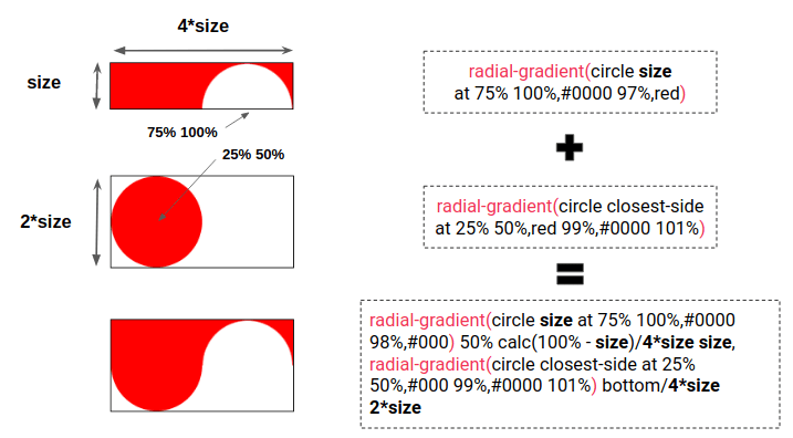
Both the zig-zag and rounded CSS borders needed one gradient to get the shapes we wanted. What about a wavy sort of border? That take two gradients. Below is an illustration to understand how we create one wave with two radial gradients.

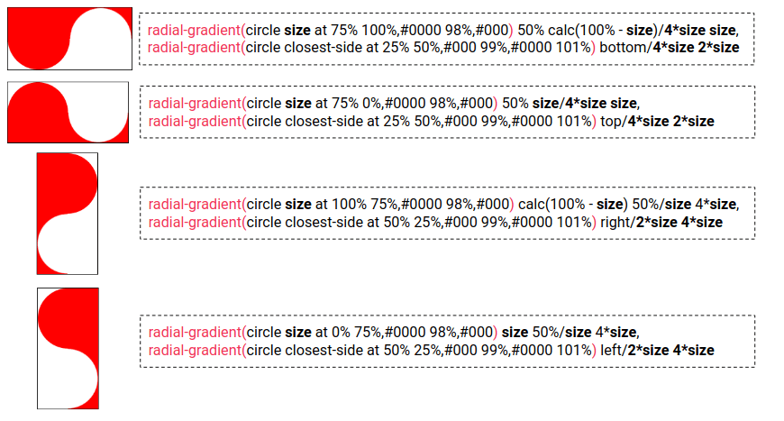
We repeat that shape at the bottom plus a linear gradient at the top and we get the wavy border at the bottom side.
mask: linear-gradient(#000 0 0) top/100% calc(100% - {2*size}) no-repeat, radial-gradient(circle {size} at 75% 100%,#0000 98%,#000) 50% calc(100% - {size})/{4*size} {size} repeat-x, radial-gradient(circle closest-side at 25% 50%,#000 99%,#0000 101%) bottom/{4*size} {2*size} repeat-x;We do the same process for the other sides as we did with the zig-zag and rounded CSS borders. All we need is to update a few variables to have a different wave for each side.

What about applying a wavy CSS border on all four sides? Will we have 9 gradients in total??”
Nope, and that’s because there is no demo where a wavy border is applied to all four sides. I was unable to find a combination of gradients that gives a good result on the corners. Maybe someone reading this knows a good approach? ????
That’s borderline great stuff!
So, you know the ins and outs of my cool little online CSS border generator! Sure, you can use the code it spits out and do just fine — but now you have the secret sauce recipe that makes it work.
Specifically, we saw how gradients can be used to mask portions of an element. Then we went to work on multiple gradients to make certain shapes from those gradient CSS masks. And the result is a pattern that can be used along the edges of an element, creating the appearance of fancy borders that you might otherwise result to background-image for. Only this way, all it takes is swapping out some values to change the appearance rather than replace an entire raster image file or something.


