An attractive, well-designed label will catch the eye of potential customers, and also make a bold statement about your company brand.
The tips we share here will vastly improve your labels, communicate who you are, and beat out the competition!
Conduct Ample Research
Before your team designs a product label that goes to print, do a ton of research and sketches. While researching effective product labels in your industry, think about who your target market is. What is their gender, age, education, and values? All of these factors are essential to designing the best product label.
The product label design team should also study competing products, brands, and labels. What works well for those organizations and what needs improvement?
Emphasize Readability
It’s obviously important that the product label is as readable as possible. The most effective product labels are simple and highly readable, usually featuring the product name, brand logo, and tagline. Some labels may also include the quantity and a very short product description.
Less is more, though.
The label text should be highly readable, with large font so everyone can read it from a distance. It’s also important that the label is highly readable even in less-than-perfect light.
Many say the label text font should be at least 6 point and probably bigger. For really critical brand and product information, 10 point type is effective.
Your company also can boost readability by choosing a font color with high contrast to the background shade. Advertising experts say choosing brighter colors for consumer products is often smart because it subconsciously improves their confidence in the product.
Once you have a readable label, your design team can move on to how to create effective custom labels.
Add White Space
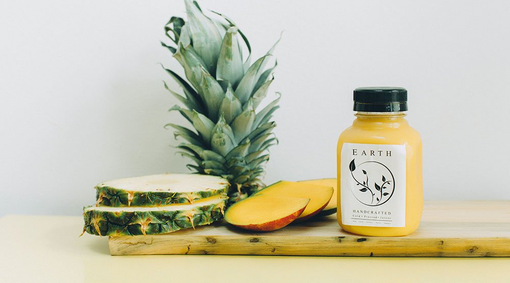
Many product manufacturers are tempted to include a lot of information on the product label. Don’t we all know that more is better? Not with product labels! White space is really important to enhance readability.
White space also helps the consumer to separate different types of information on the label. Providing more space and breathing room on the label makes it easier to read.
Using white space well also helps it stand out from others. Some marketing authorities add that a lot of white space can make your product seem steadier and calmer. That’s why we often see a lot of white space on labels for cosmetics and baby products.
Choose Ideal Colors
The colors chosen for your product label are critical because they have a huge impact on consumers’ buying decisions.
Make sure to consider the color of the container and shipping package, as well. It’s also critical to think about the color of your product, too. It’s undesirable to have the label clash with any of these things.
Think About Label Material
It’s also important to select the ideal product label material. However the label is designed, it needs to mesh with the material on which it’s printed. Many vendors choose product labels that are clear, white, silver, or cream colored. A white material makes the label stand out more, and using a clear label can make your label blend with the item container.
Always Use Adobe Illustrator Or Similar Software
Most design professionals recommend creating product labels in Adobe Illustrator. You shouldn’t use Photoshop or Microsoft Word.
Microsoft Word is especially problematic because it produces artwork that won’t yield a high-quality label. Your product labels will look amateurish – not the impression you seek with consumers.
Specifically, Word converts your images to the color mode RGB which isn’t supported by most large label presses. That means any label made in Word must be edited before printing. This just costs more time and money.
Additionally, colors created in Word’s RGB will not convert nicely to CMYK, making your label colors look washed out.
Photoshop is also a superior choice but it also has negatives. This software still isn’t as good as Adobe Illustrator when you are using vectors. Also, it’s impossible to export vectors from Photoshop at all. And many say the image and text quality in Photoshop doesn’t hold a candle to Illustrator.
Remember, it takes a lot of time and research to create desirable and effective quality labeling. Following our simple tips here will help your team create a product label that beats the competition.


